Make the complex simple
Stats NZ commissioned Gusto to create an infographic to accompany the release of their 2019 Environmental-Economic accounts. The report is unique in the way it considers the social and economic context of greenhouse gas emissions.
The infographic tells a story about the relationship between GDP (New Zealand’s favoured metric of success) and greenhouse gas emissions, showing us that the biggest polluters are not necessarily the highest earners. It also allows us to compare household emissions with industries.
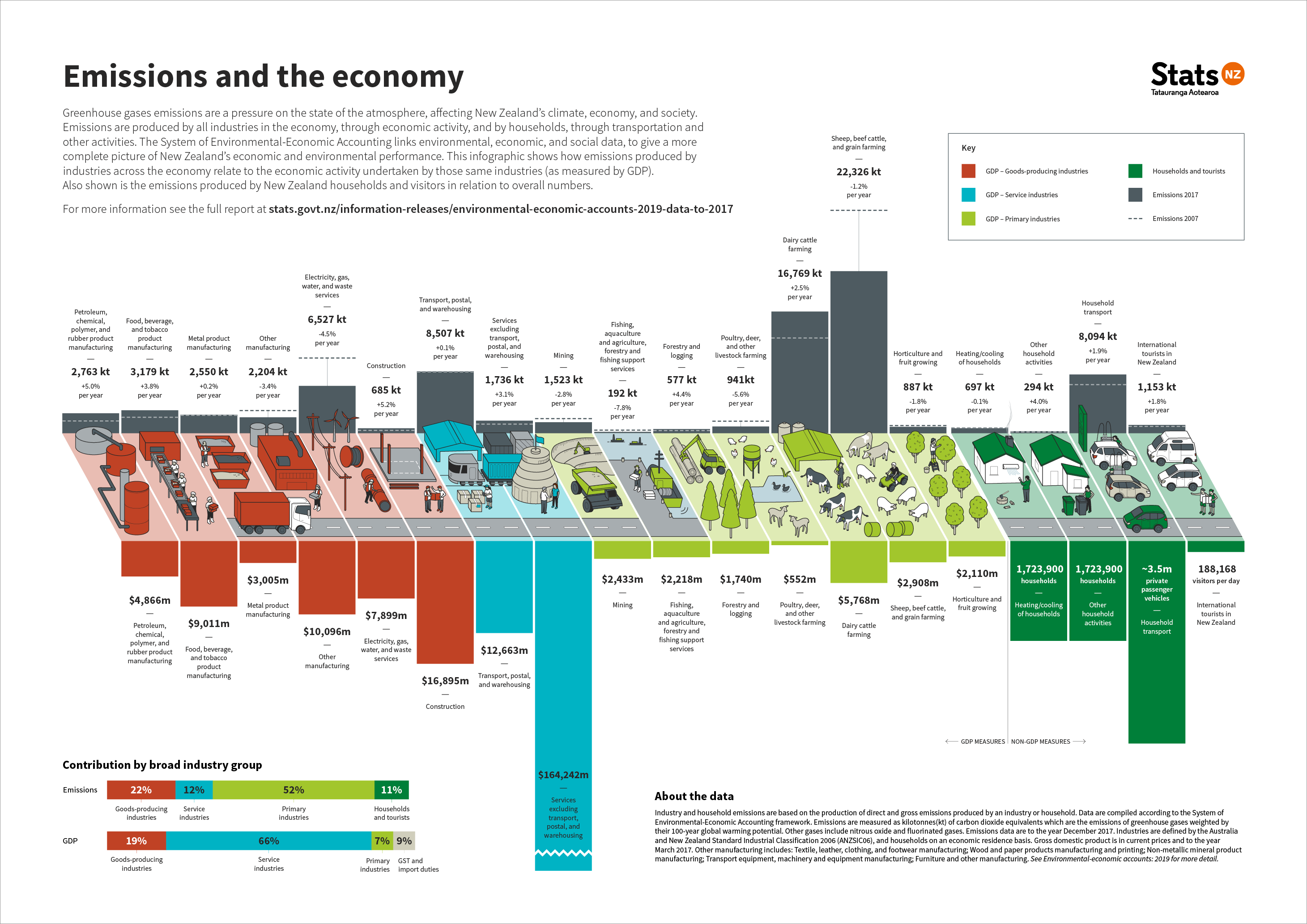
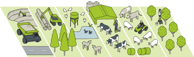
The infographic combines data visualisation with illustration, resulting in a graphic that strikes a balance between the environment and the economy. The illustrations bring each industry to life, depicting the context and drivers of emissions in each area.