
Transform the old to new
Penrose Data is a data analytics and consumer insights company that helps New Zealand export businesses to know more about consumers in overseas markets. They required a bold, new brand identity to take them from a start-up to an established business making waves in this niche field.
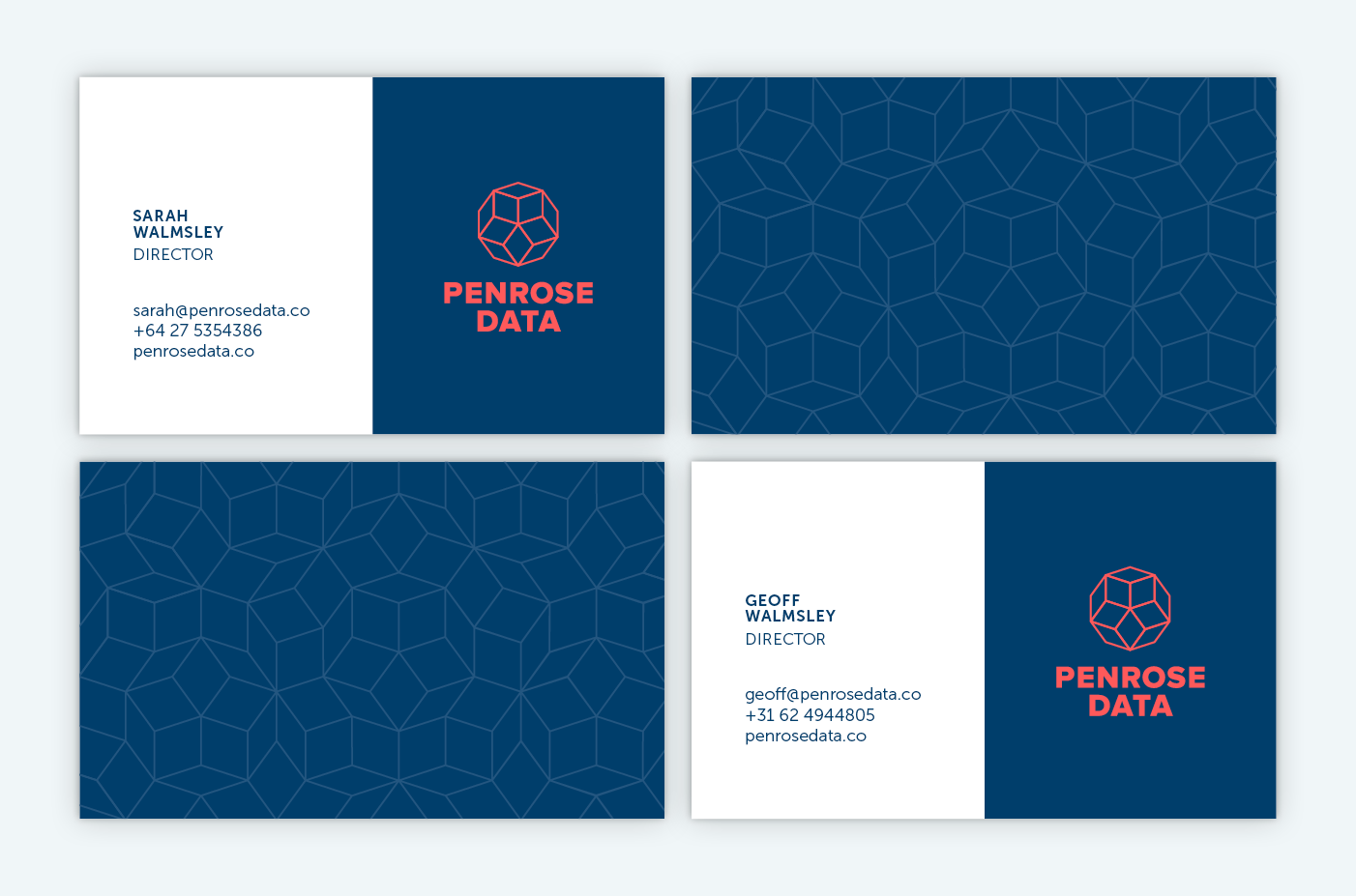
The logomark references the mathematician Sir Roger Penrose, who Penrose Data is named after. It uses a segment of the Penrose tile pattern to create a unique shape that evokes export boxes and diamonds, representing the ‘gems’ of information, cut-through and clarity Penrose Data can provide to enable exporters to be successful on the global stage.


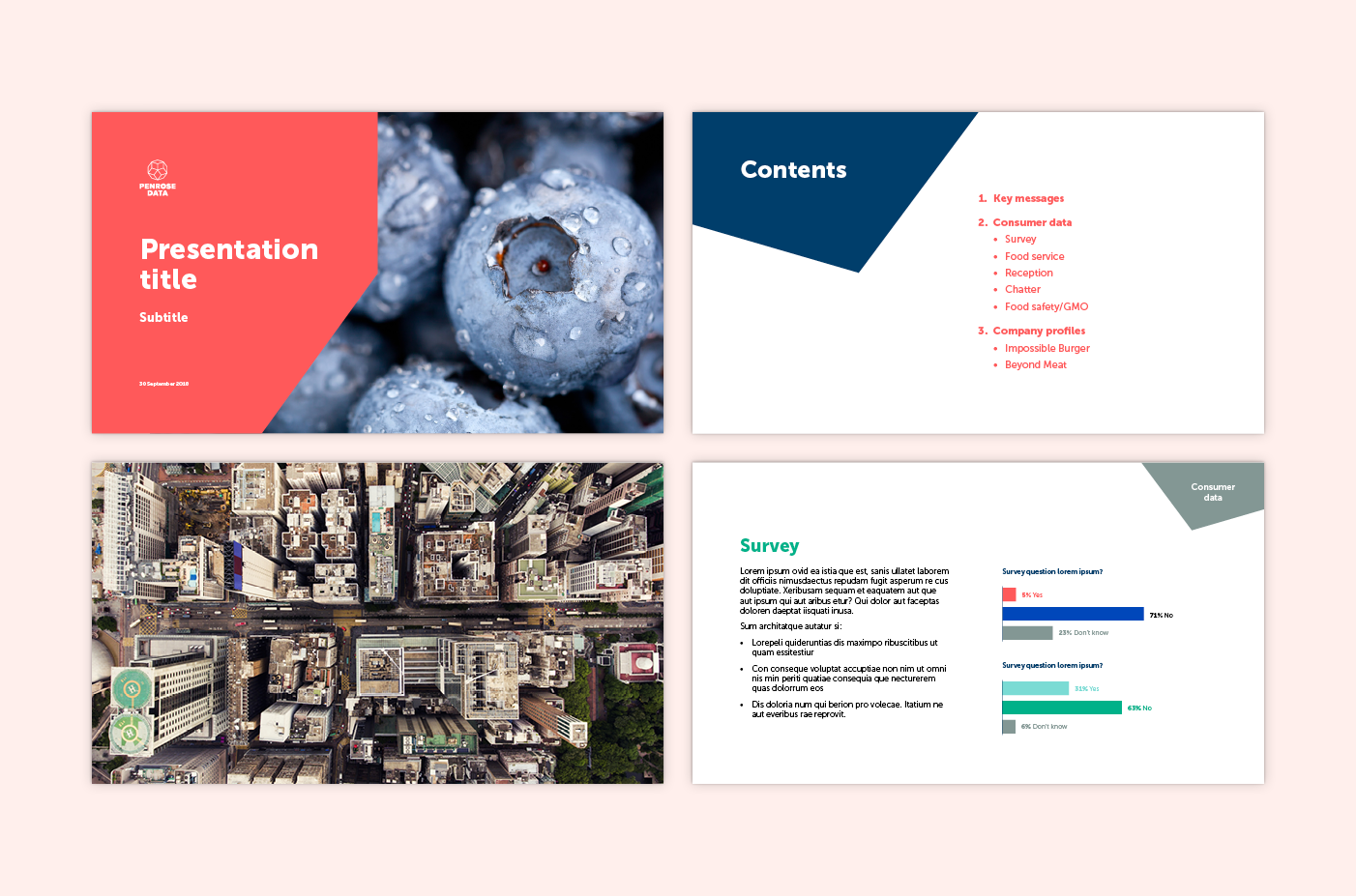
The brand is supported by an image library which showcases a modern perspective on export markets and consumers – no clichéd skylines here.
A bespoke icon set was developed for Penrose Data to use across presentations and collateral. The icons uniquely belong to the Penrose Data brand, using the same angles and lines as the logo.

The bold and consistent brand identity helps build Penrose Data’s reputation and establish their credibility within the analytics and consumer insights landscape.
Penrose Data feedback:
“The Penrose Data team thoroughly enjoyed working with Gusto, and we were very impressed with the whole process from briefing to final deliverables. The Gusto team worked hard to ensure we got a brand identity that we are proud of, and it has helped us to go to the market with confidence and a strong sense of who we are.”