Emergency Toilet Campaign
Access and Choice website and campaign design
Digital annual report
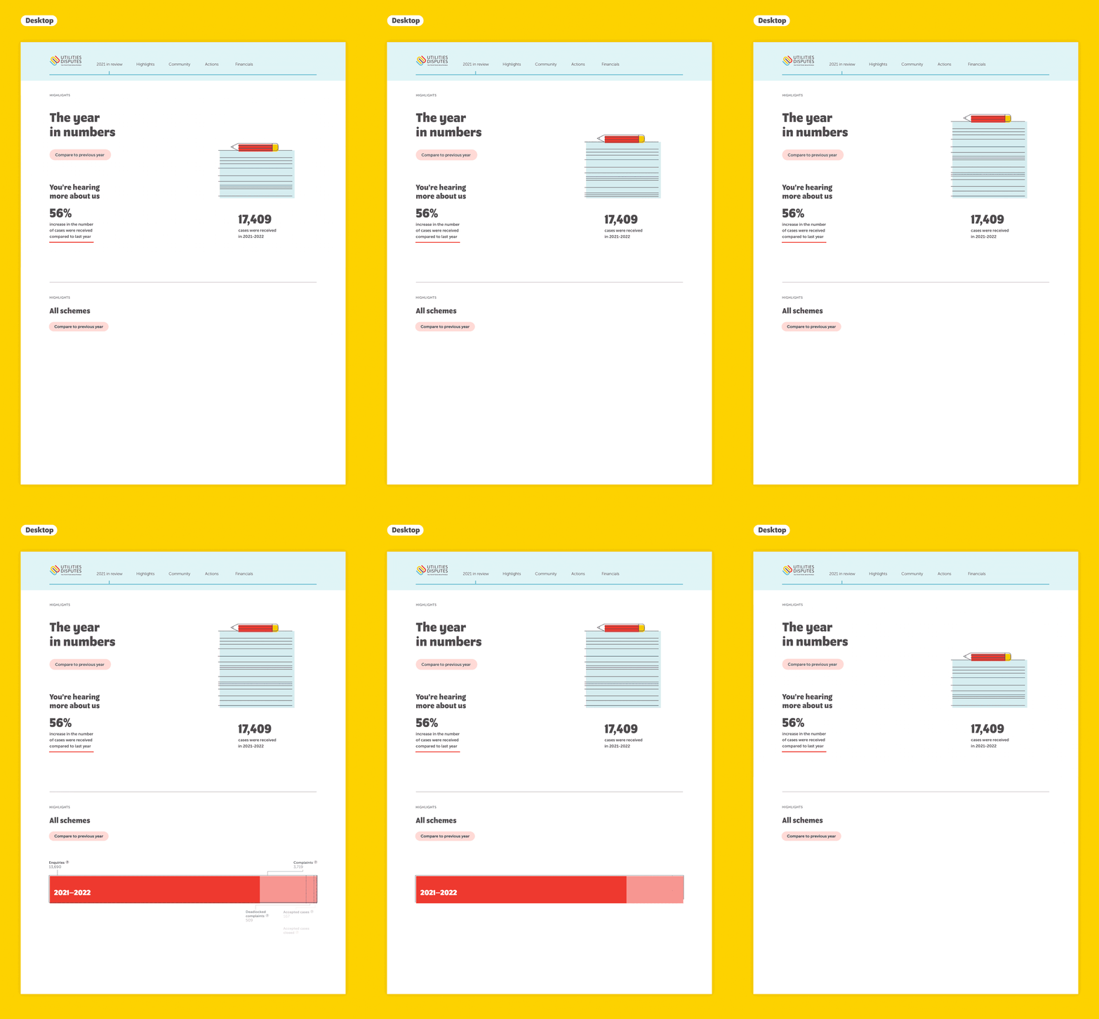
Branding the city – Visual language and information design
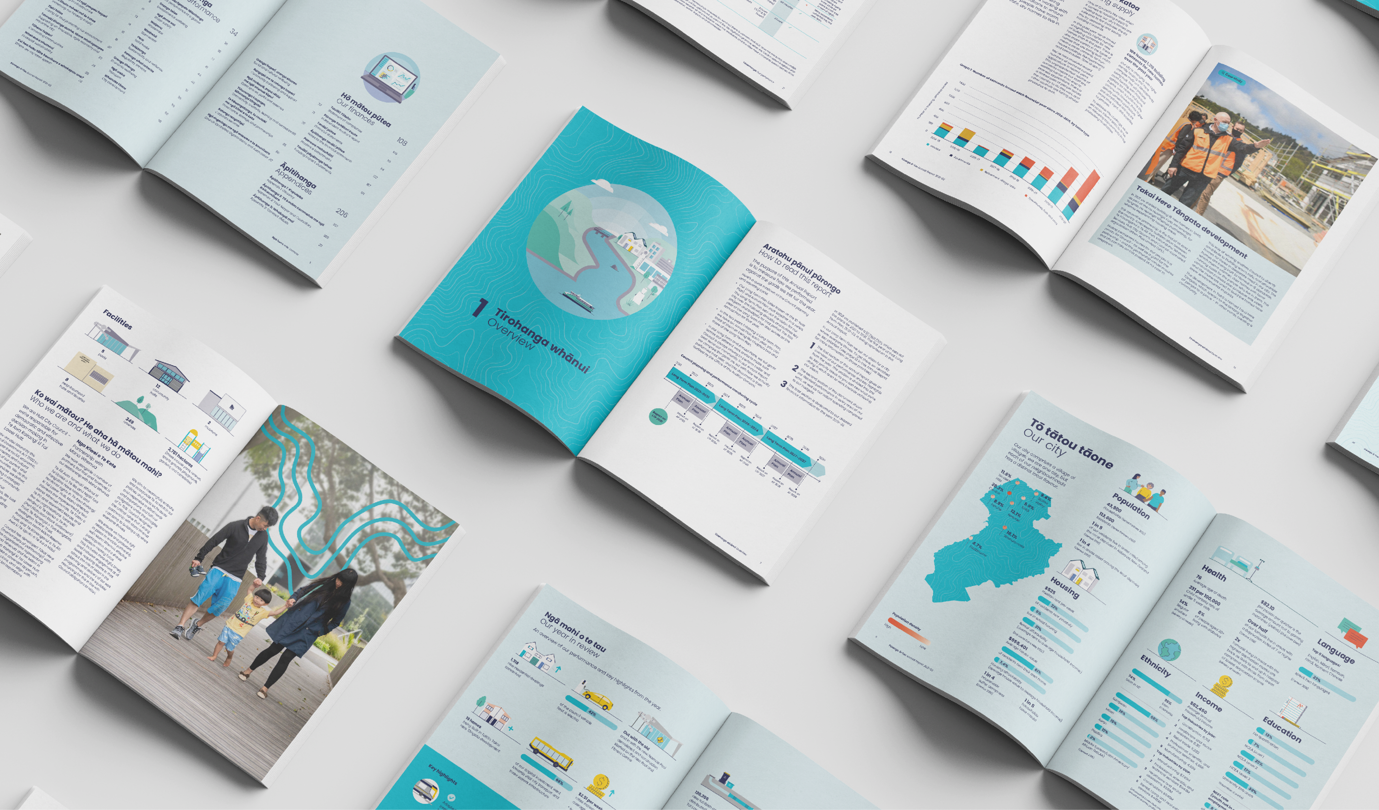
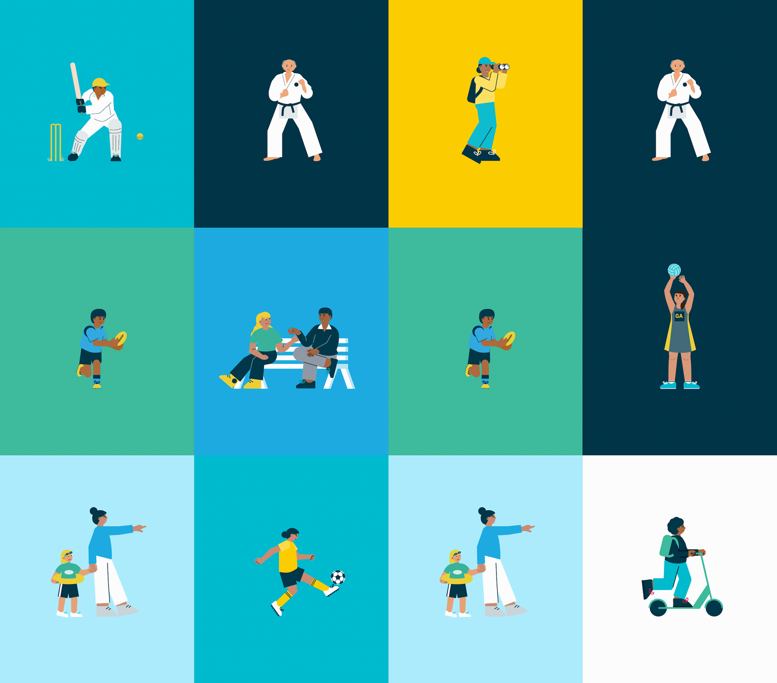
HCC wanted to show they were responding to the vision and aspirations of their community. Giving them a sense of the progress being made. The Annual Plan, like all the resources developed, has been created with the community in mind. Its aim is to be transparent about the council’s work, how it impacts their residents, outlining what’s next, and prompting engagement. Our visual language had to feature recognisable connections to the city and the people that live within it. The illustrations and photos included are representative of the diverse range of people living in Hutt City. Landmarks such as local shops, the Council building, even the ‘Welcome to Lower Hutt’ sign were all featured in the Plan too.
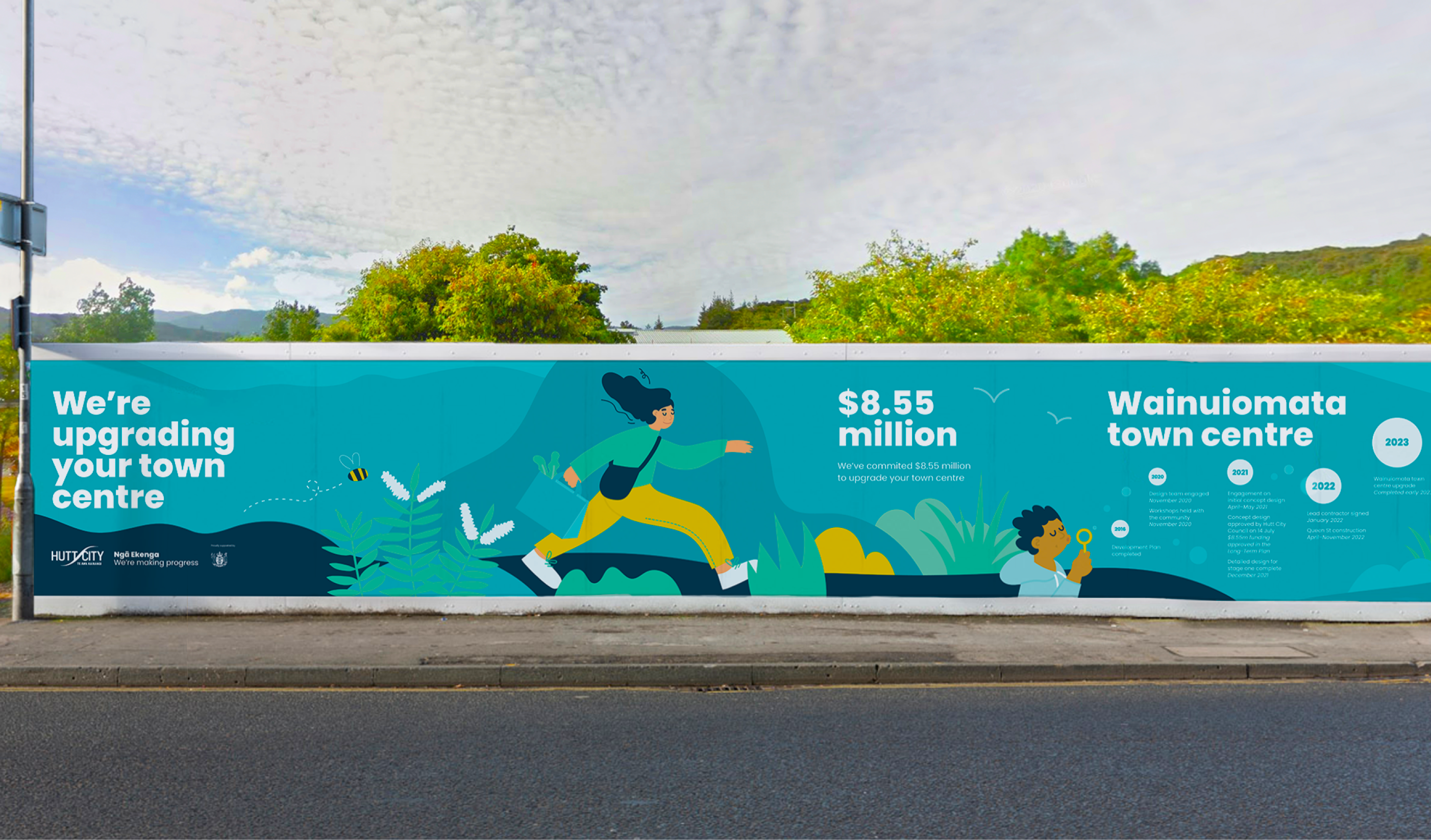
The visual billboards we designed help connect the community to the exciting HCC infrastructure projects in the works, and act as an effective way to boldly and clearly alert people to work happening in their area. Detailing in-situ; what the project is, how much money is being spent, the progress residents can expect to see, and when it can expect to be finished.
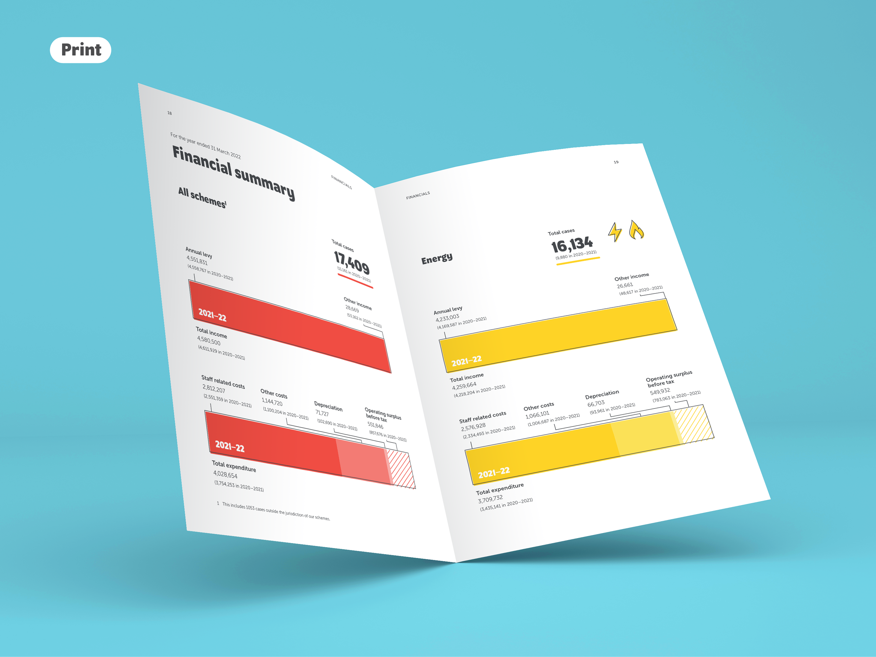
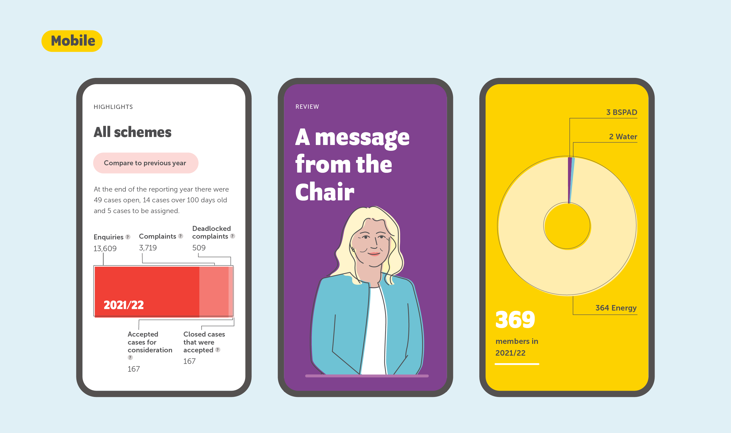
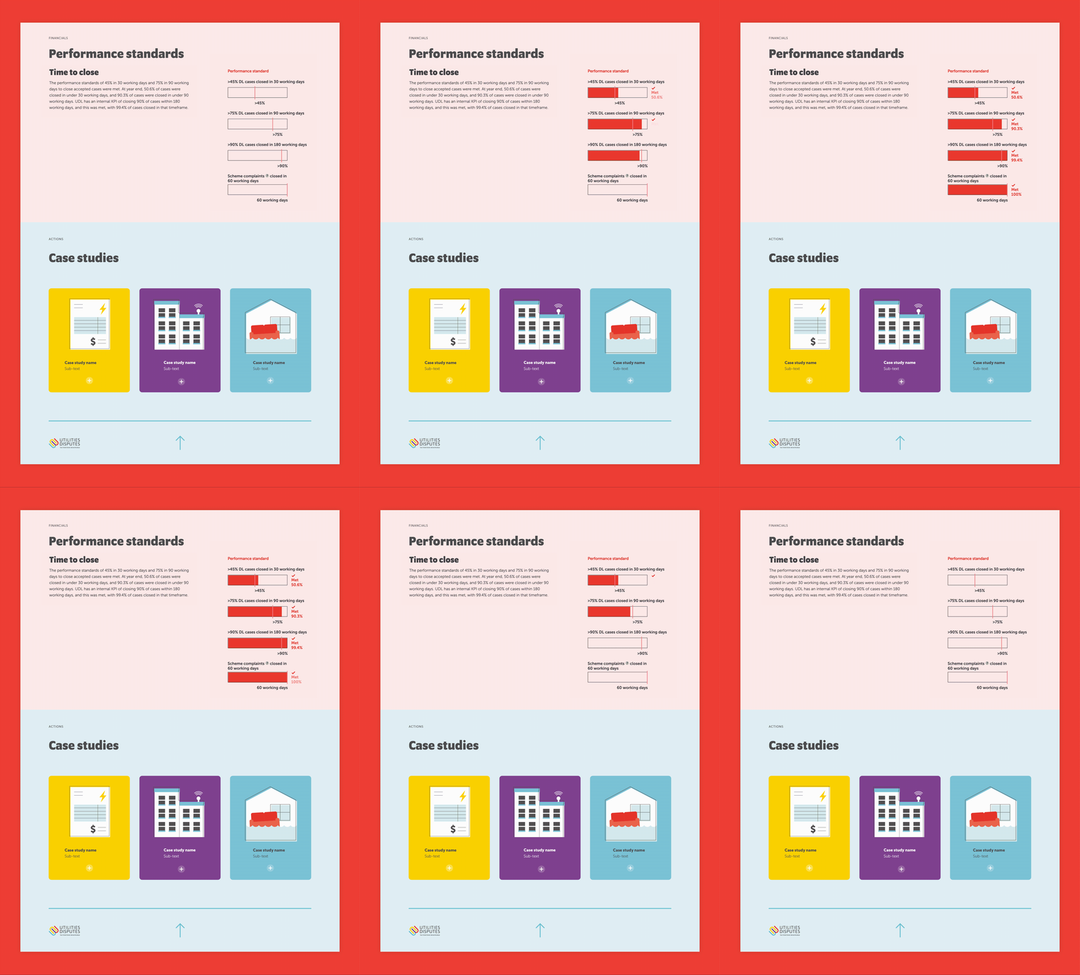
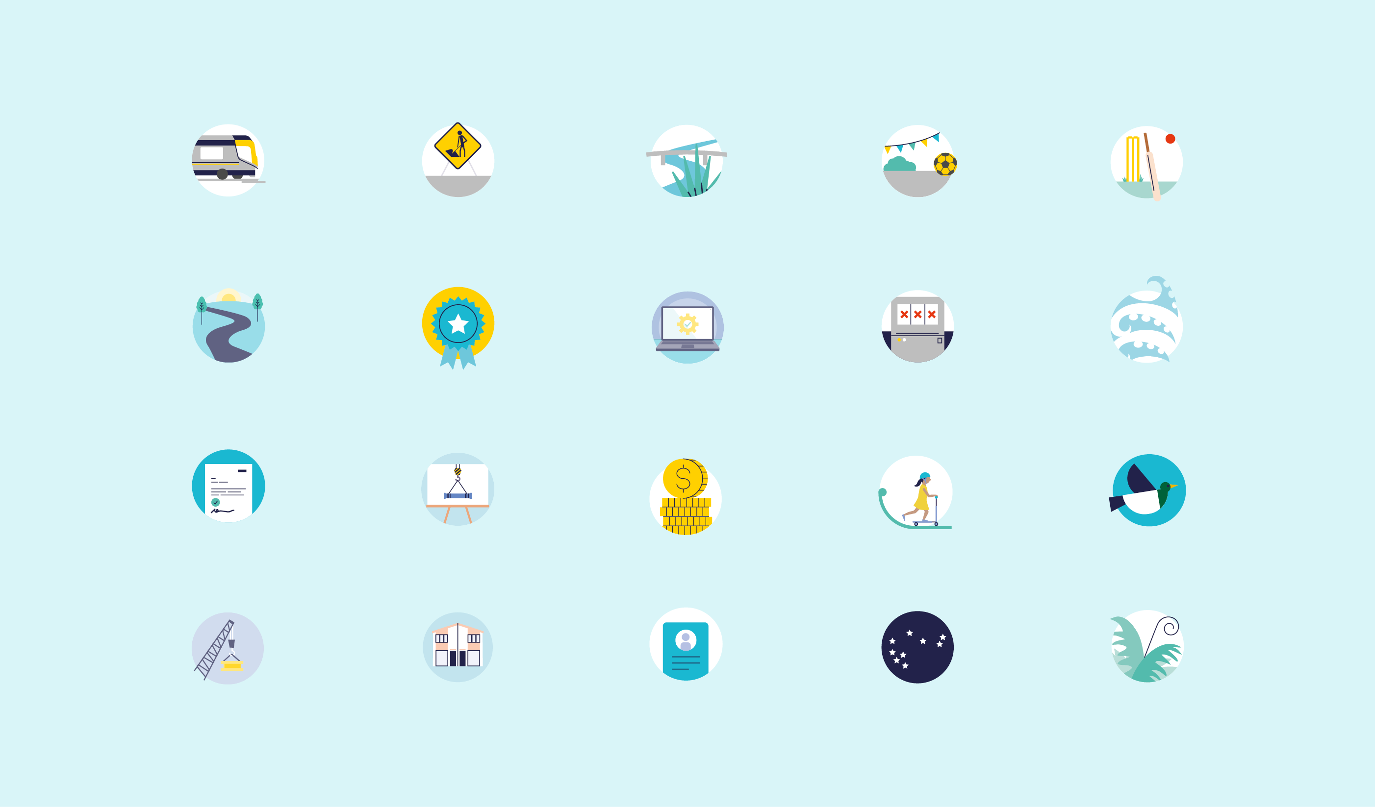
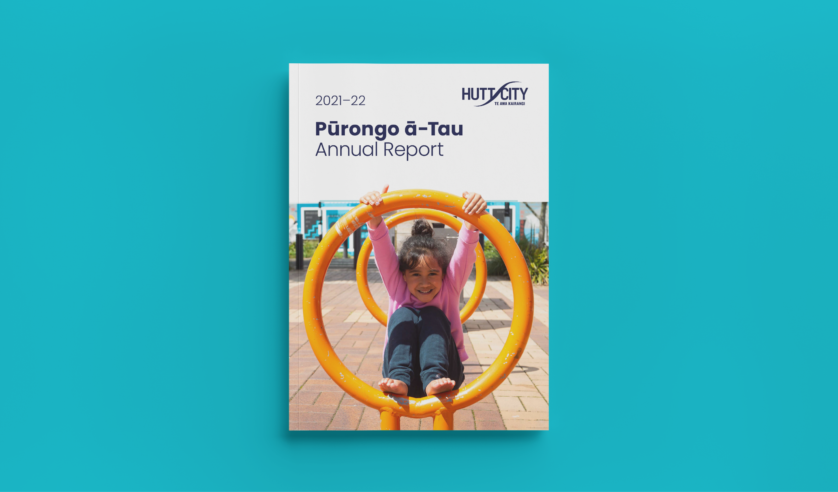
For the Pūrongo ā-Tau – Annual Report and summary we had to ensure the essential information stood out. So that navigation throughout the 200 page document was clear and easy, so HCC could effectively tell their performance story. The document needed visual design to assist in communicating the wealth of information inside. Using all the tools in our belt; a mix of photography, illustration, infographic spreads, clear design, and incorporating local landmarks and regional attributes, with a consistent visual style, we created a cohesive and engaging suite of resources for HCC that they’re proud to share with their community.
Consultation on the proposed changes to the Annual Plan was live from 31 March to 30 April 2023.
HCC published the proposed changes online, along with supporting information to help their community understand the decisions they were facing. The website was viewed by 1616 people during the consultation period.
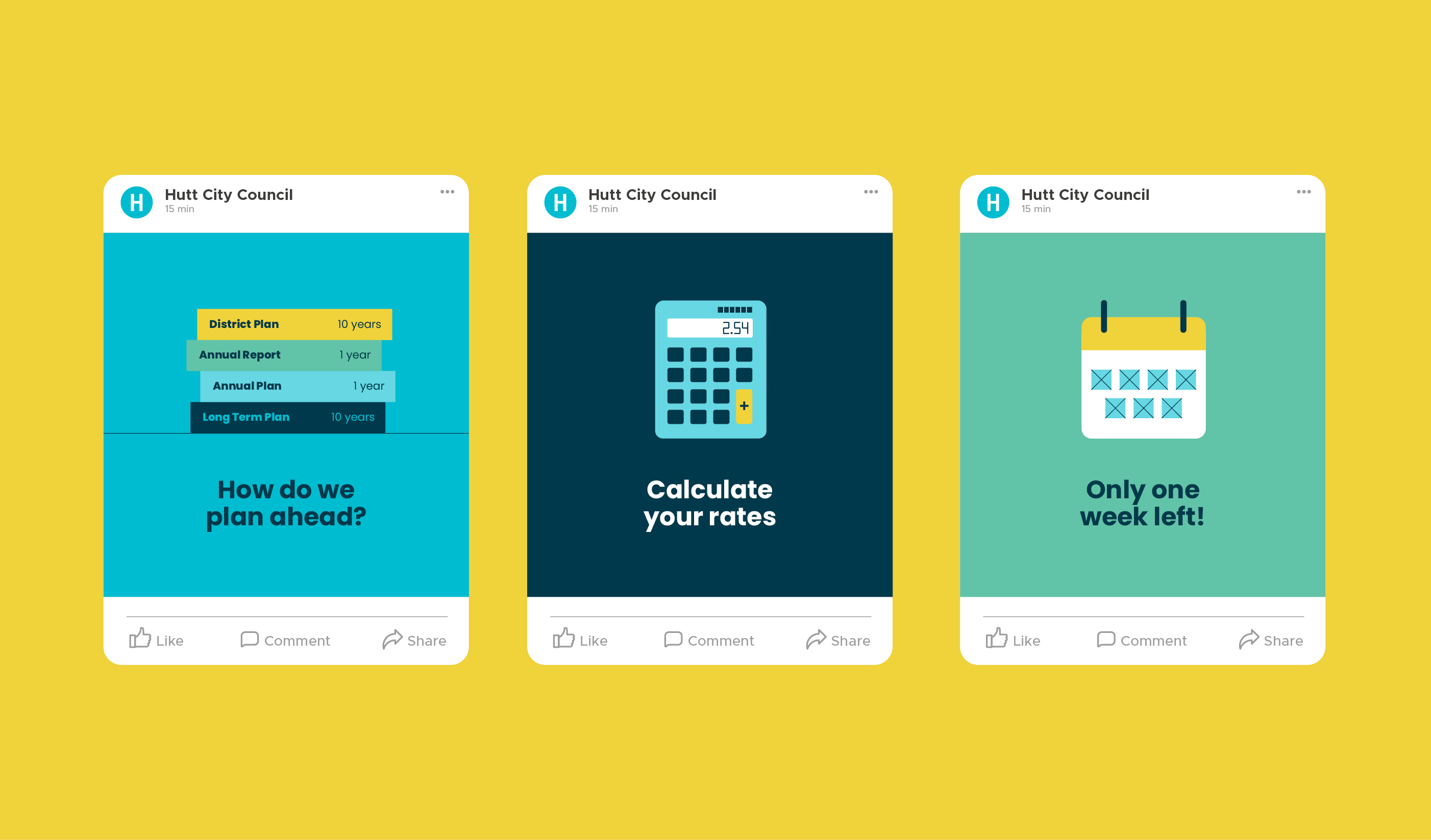
HCC also published an online survey for our community to provide feedback on their proposals. They received 124 responses to the survey, and heard from people who sent emails and came to speak to their submission in person. They also had over 1000 people view the HCC online rates calculator to see the impact of the proposed Annual Plan on their rates bill.
Neptune Explainer Animation
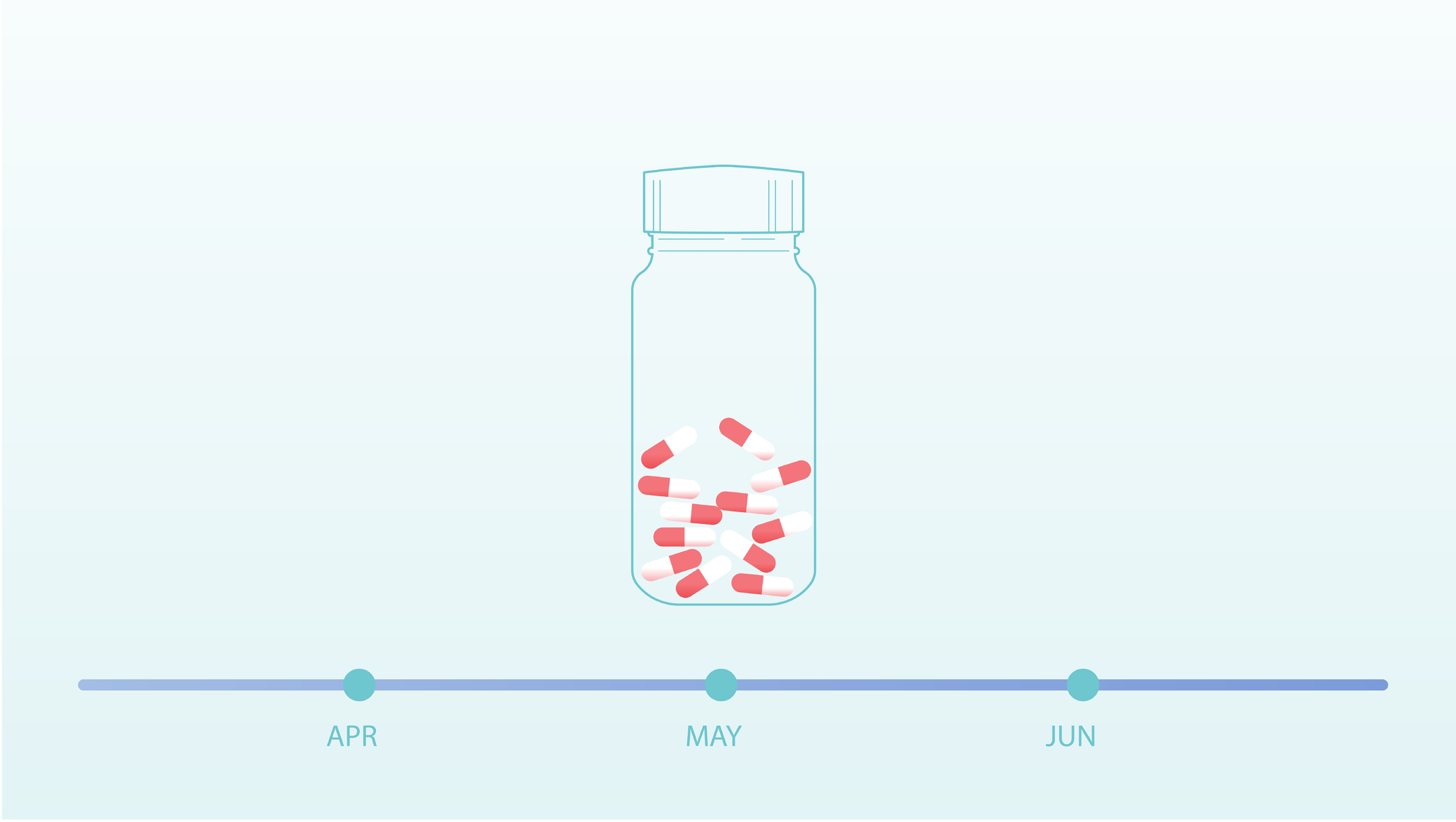
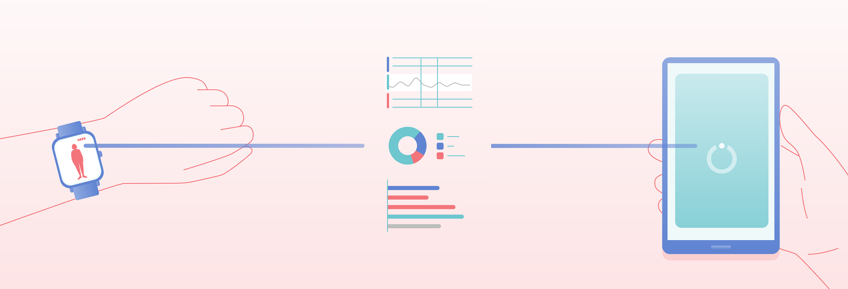
The illustration style is contemporary and clear, bringing a feeling of warmth to the use of medication and smart technology. Full colour illustrations are used to highlight important scenes, with supporting information illustrated as linework. The colours and gradients used build on the visual language established for the Neptune brand and UX design.
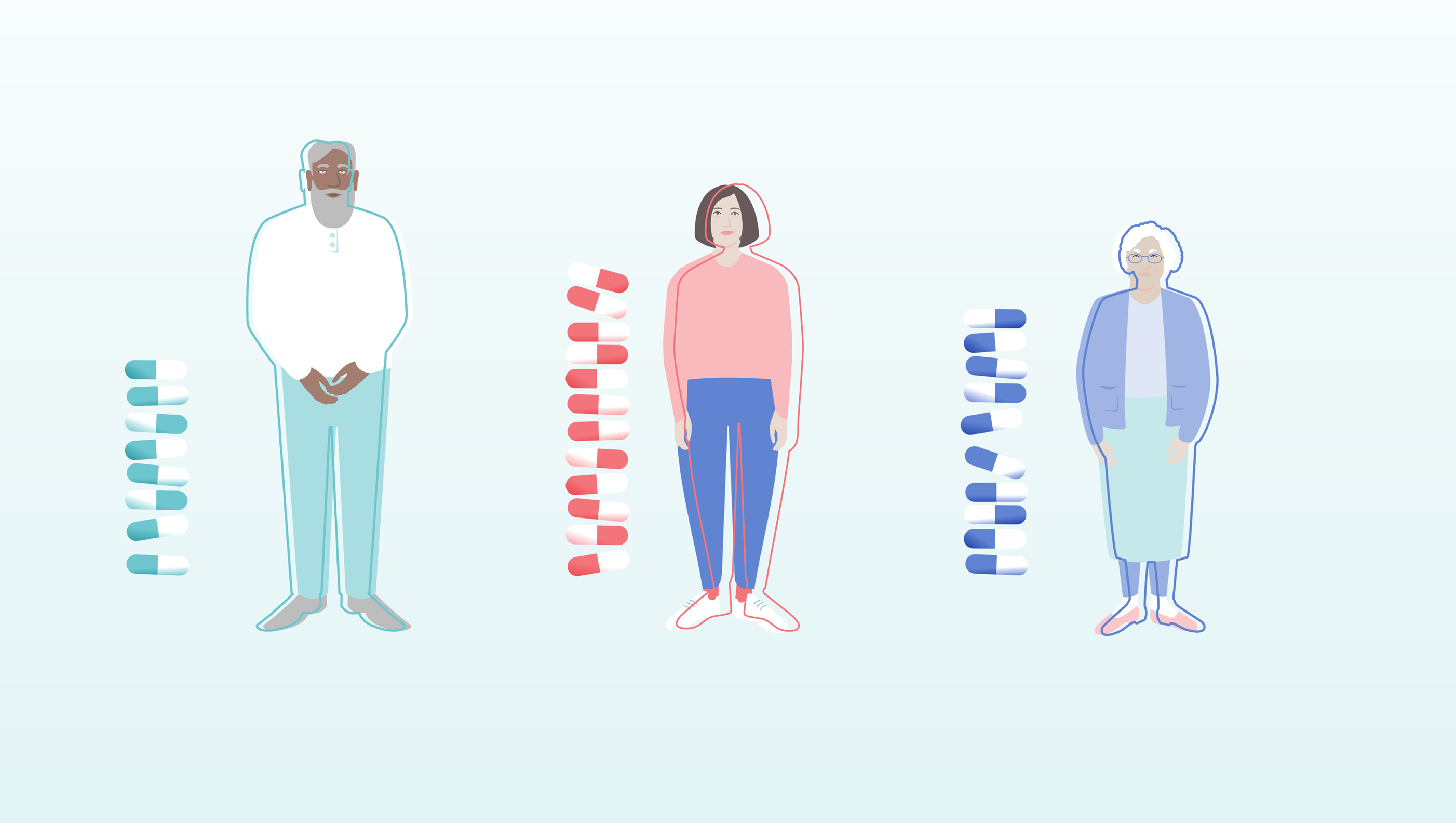
As the animation explains, every Parkinson’s patient is different and so too is their Parkinson’s journey. We follow the lead character, Jamie, on hers. We created a bold bright outline that moves on and off the character bodies to illustrate sensitive scenes of the experience and treatment of symptoms of Parkinson’s. When symptoms are under control, the line moves back to fit their silhouettes and fades away. Each character’s line moves uniquely to help reinforce the importance of personalisation of treatment.
This animation is an exciting extension of work Gusto has previously completed with Orbit Health. Our design of a clear and engaging pitch deck helped Orbit Health successfully secure funding from EIT Health to further their important work in digital health innovation, such as Neptune.
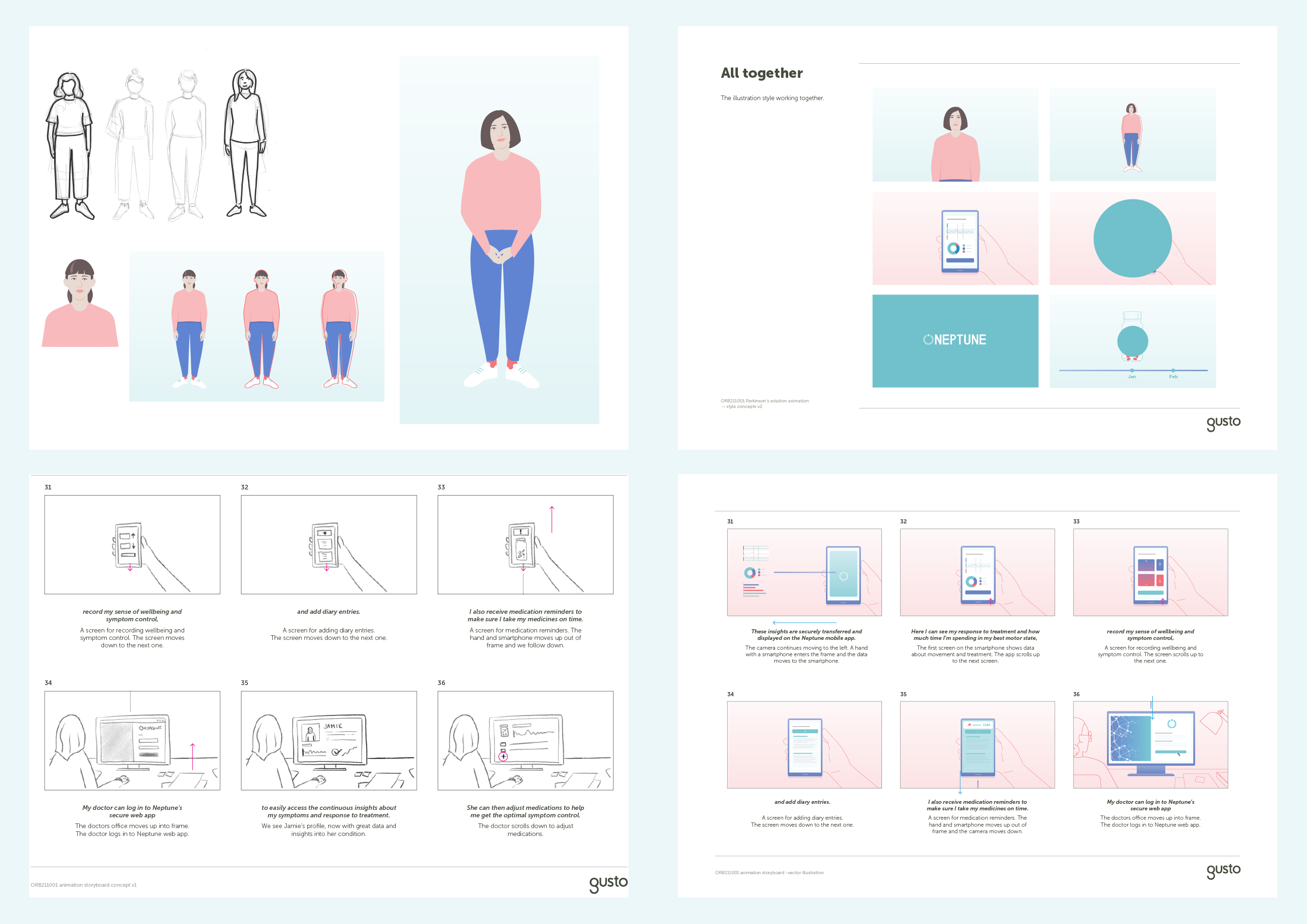
Behind the scenes: Our character development and storyboarding process.
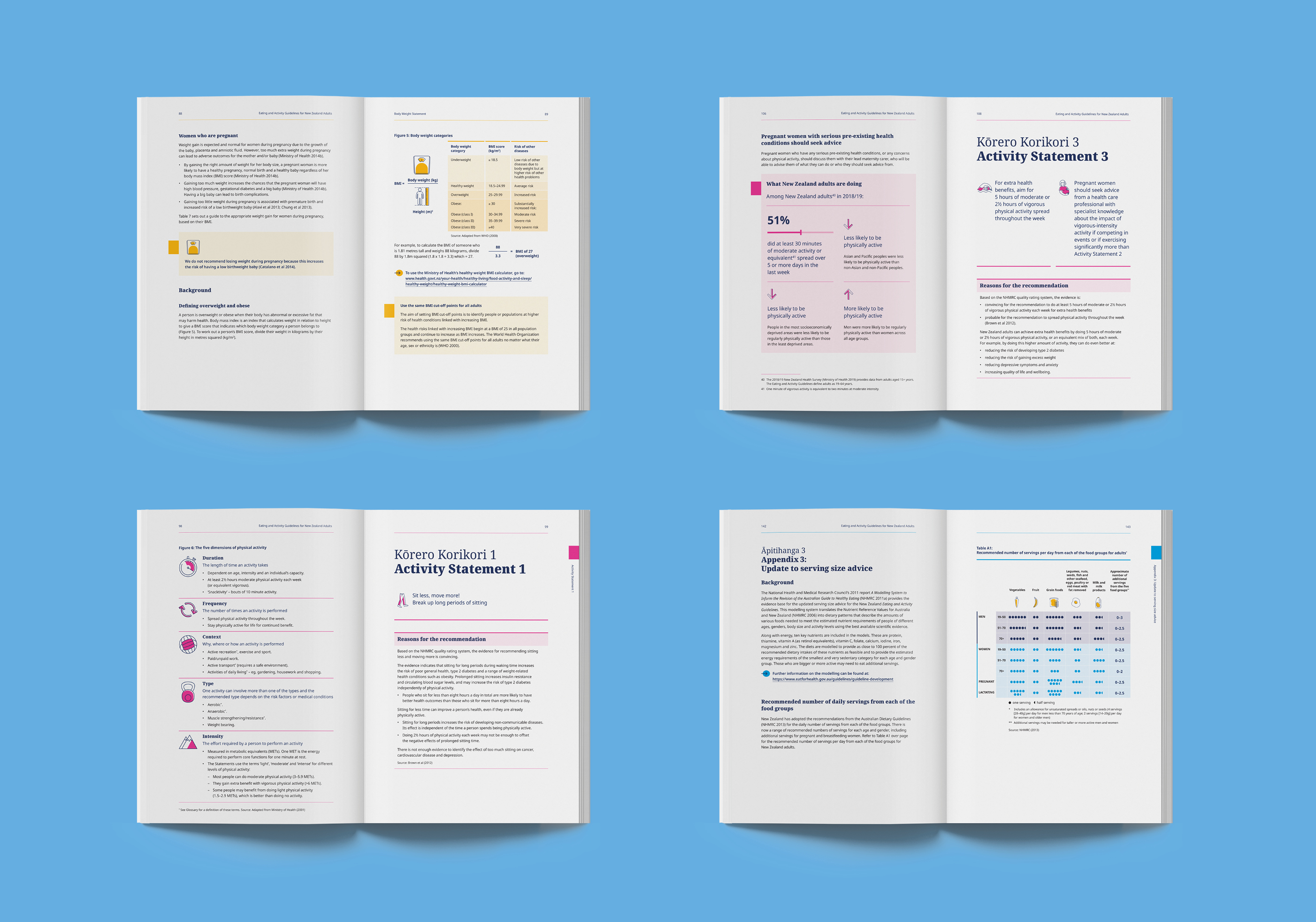
Eating and Activity Guidelines
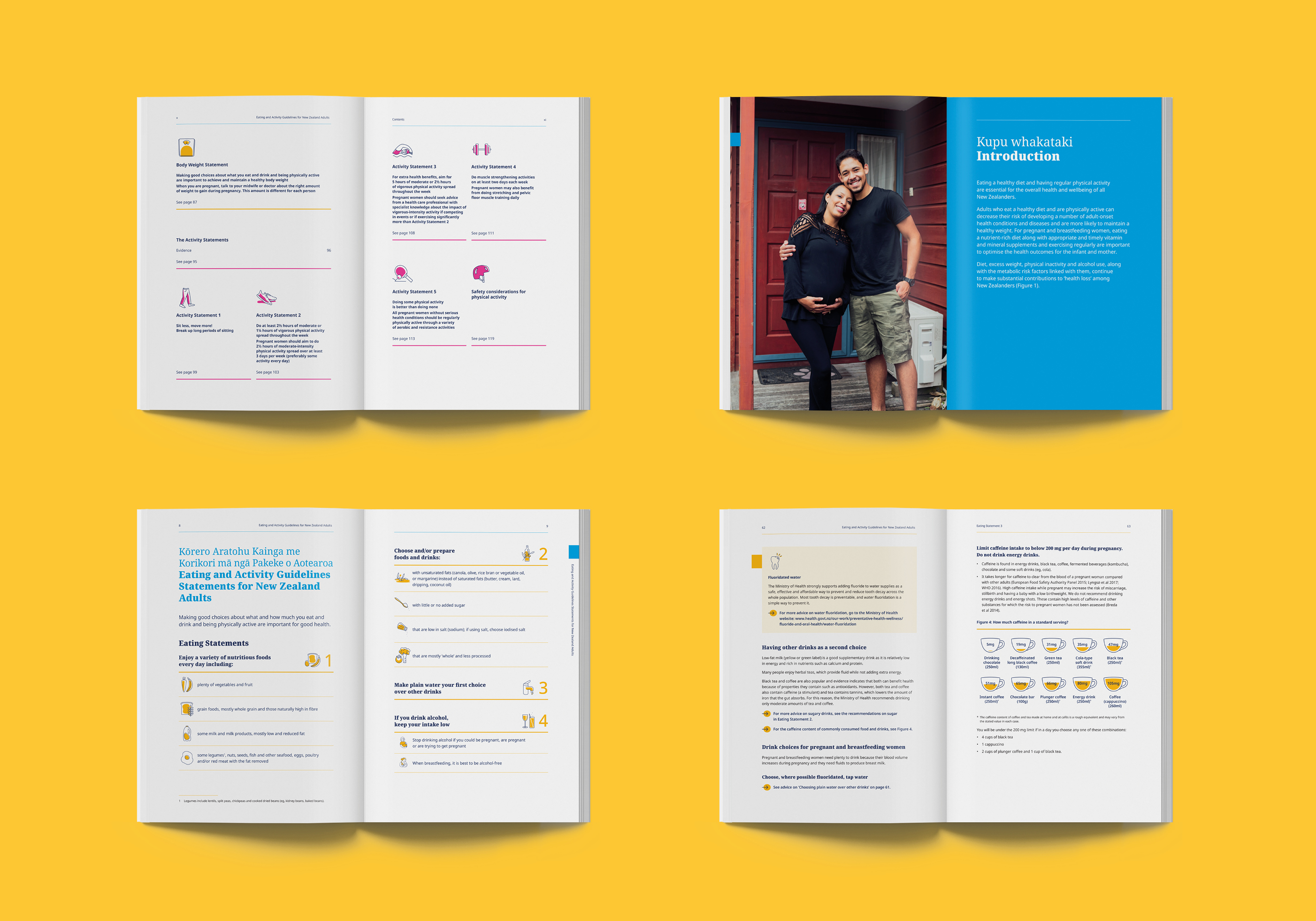
A large, bespoke suite of icons were created to support content headings and make it easy to navigate through the different eating and activity sections.
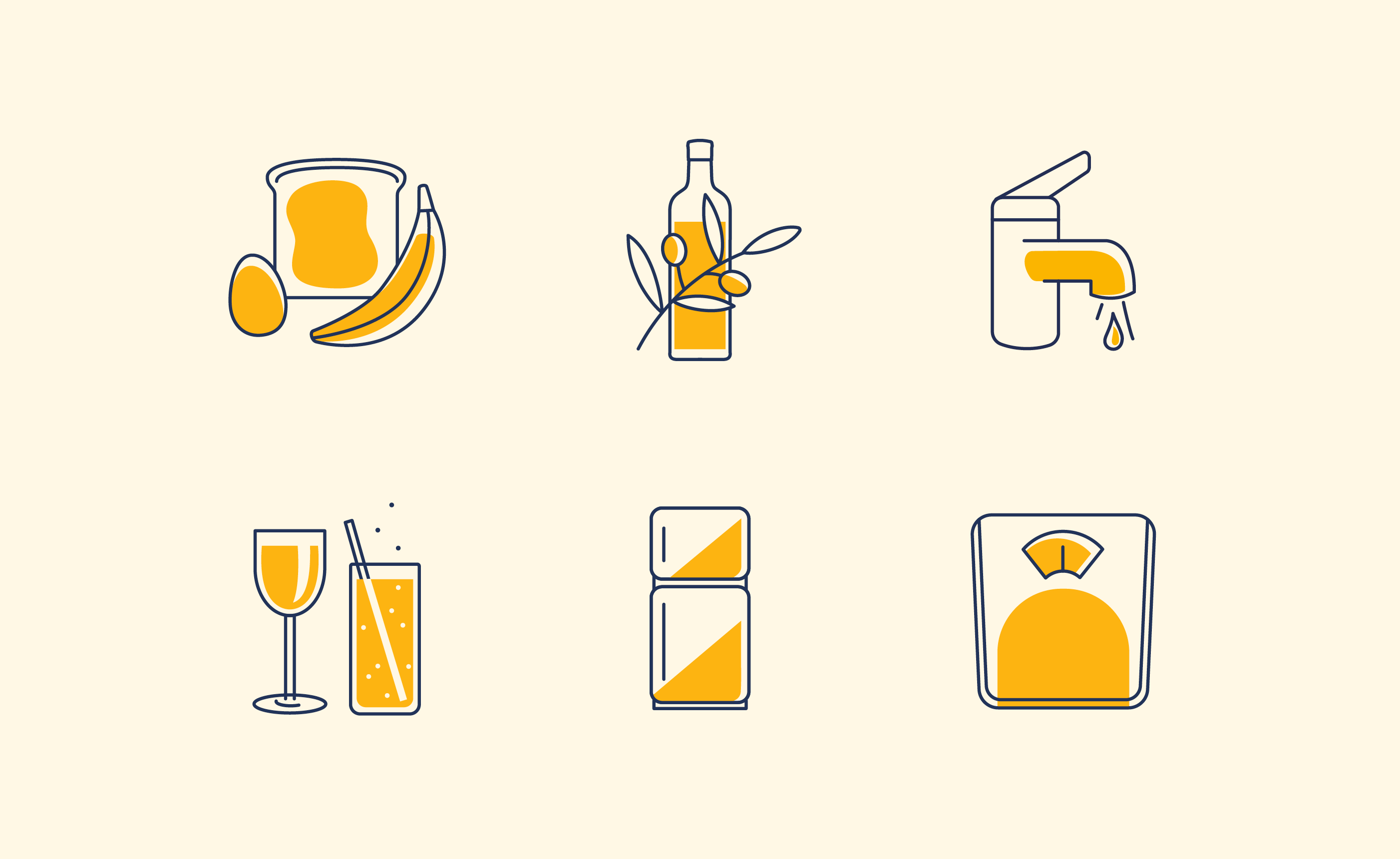
The document’s recommendations are easy to digest through a consistent use of infographics, iconography, and typographic structure.
The Eating and Activity Guidelines is now a visually inviting, contemporary document that clearly communicates evidence-based recommendations for New Zealand adults.
Kia Manawanui animation
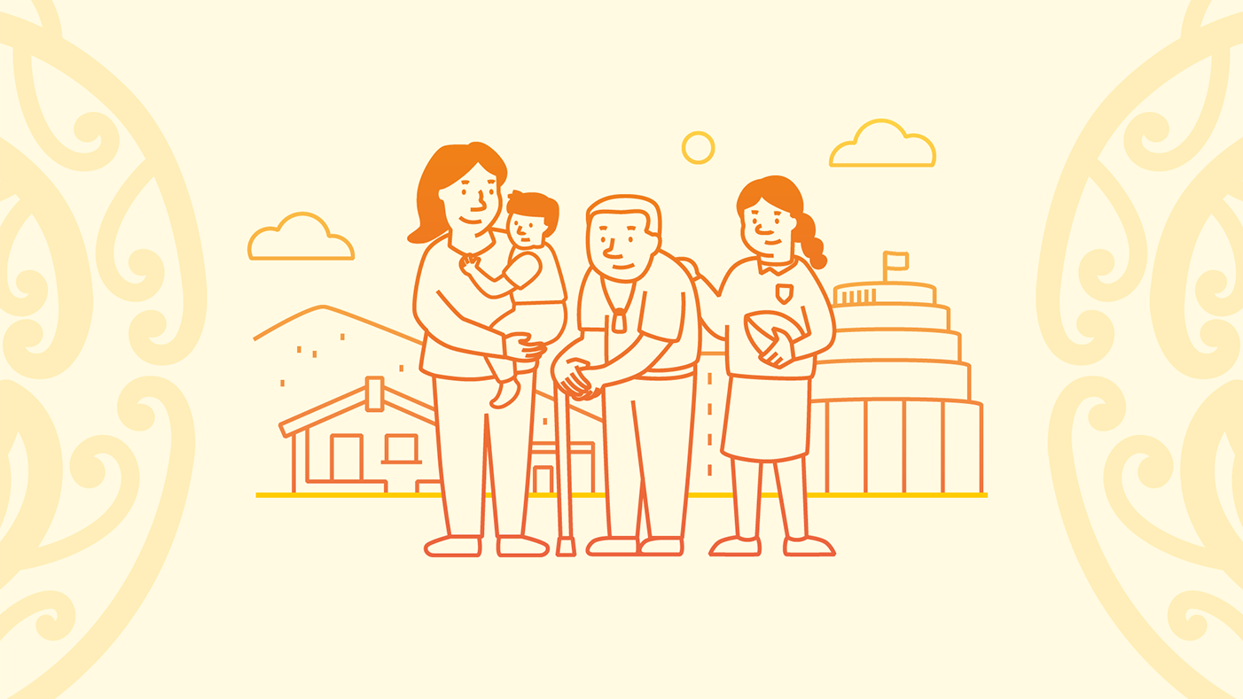
The visual style follows the Kia Manawanui document design created by the Ministry’s inhouse team. We expanded on this design with simple line illustrations and icons that represent the five focus areas. The animation is calm and inviting, with smooth transitions and warm music pushing the video forward.
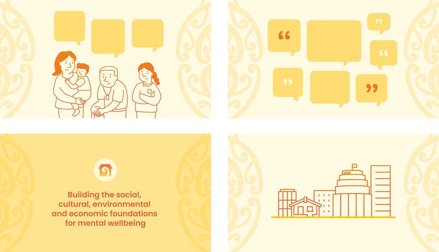
We also made a cut-down 15-second version to share the plan’s launch on social media. Following the launch, Kia Manawanui was discussed on The Spinoff, RNZ and Stuff.
Feedback from MOH:
‘Thank you for the amazing work you did on our Kia Manawanui video – I’ve had so many people remark how great it is. And the fact that you created such a brilliant product so quickly really shows the calibre of your whole team.’
Publication design
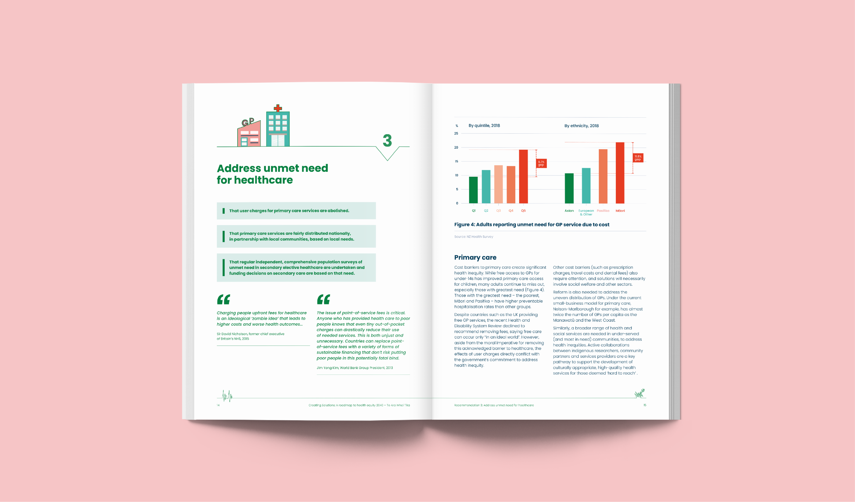
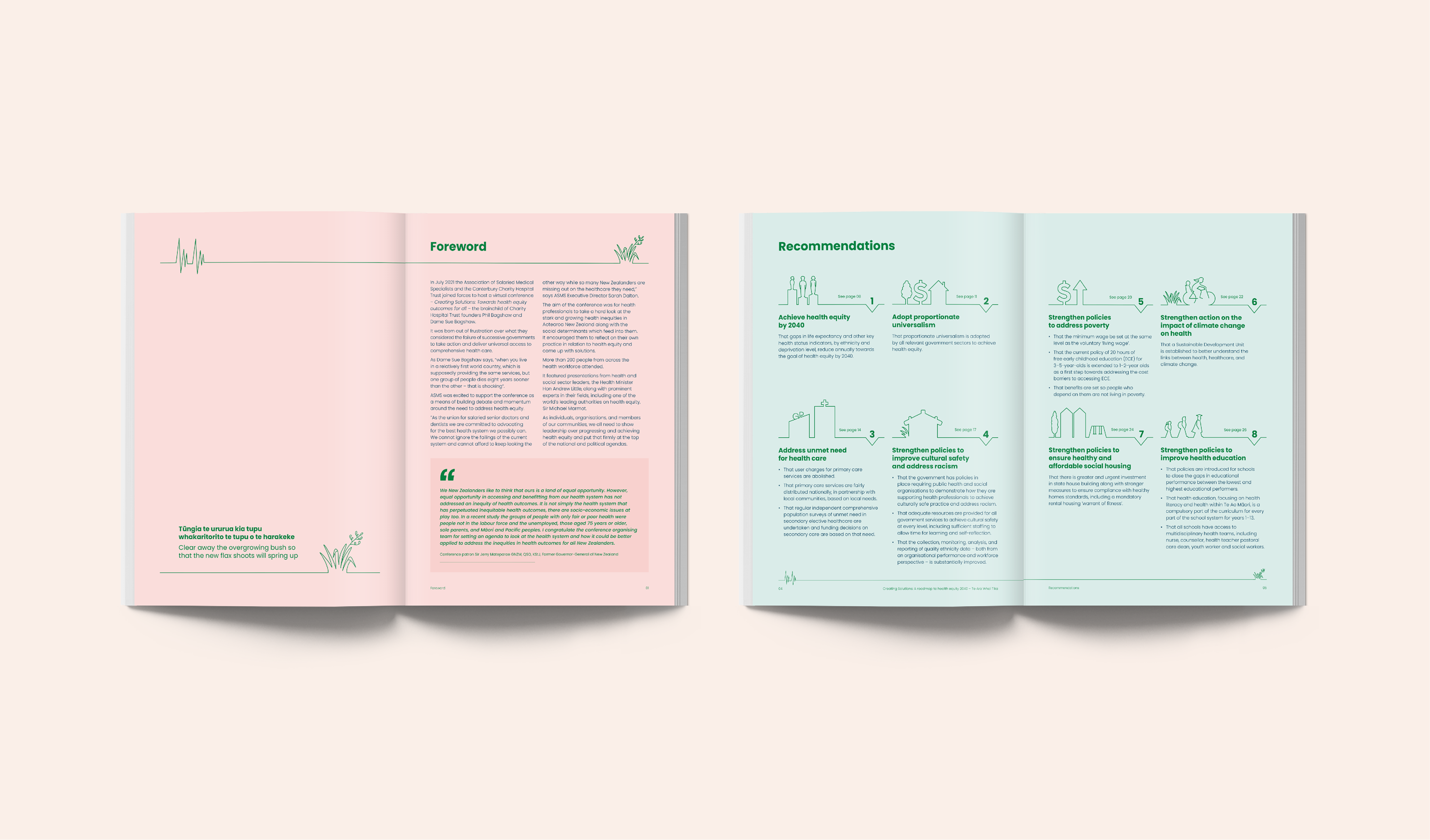
Our design uses consistent layout, illustration, colour and typography to guide the reader and help them focus on the information in a structured way. Key messages and quotes from leading professionals are given particular focus. We re-designed the graphs and tables to highlight the data referenced in the text – particularly the current problems of the health system.
Each recommendation has a unique illustration to visually describe the message, summarise and support the content. Our illustration design builds on the existing conference icon of the heartbeat and harakeke flax so that the audience can connect the document to the event. The cover illustrations reinforce the idea of equity, supporting the message that ASMS wants to communicate to New Zealand’s leaders.
Feedback from ASMS:
‘We have teamed up with Gusto on several projects – it’s always a pleasure and they deliver exceptional results. They are able to analyse data and information and turn it into engaging, eye-catching content which helps tell a story and convey key messages. The team is professional and make the creative and editing processes so easy. They are great to deal with and definitely give our publications the X-factor.’
Hoki ki ngā tūāpapa – Back to basics animation campaign series
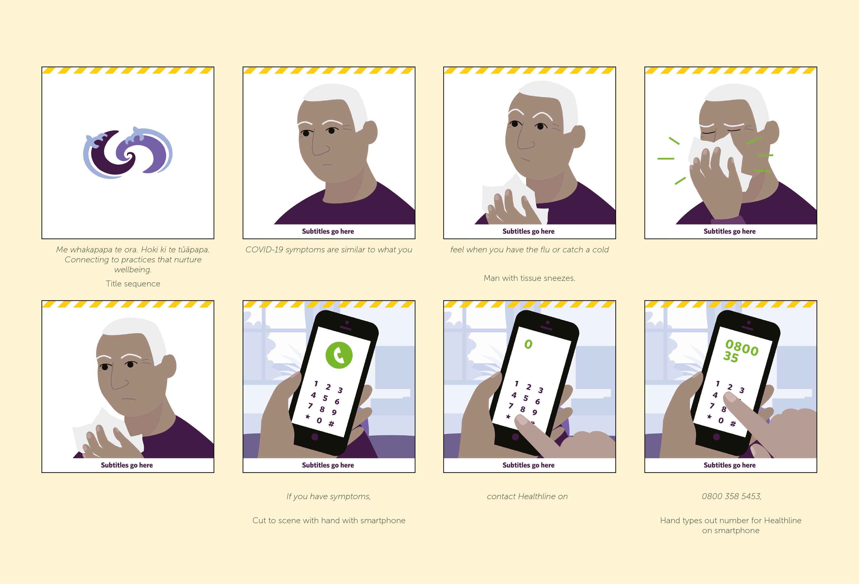
We created a beginning sequence using NDHB’s gifted Ngā Tātai Ihorangi branding to frame each message. Another familiar detail you’ll spot throughout these animations is the yellow COVID-19 branding. We used this as a transition device for the end sequence, ensuring people connect their broader wellbeing and the COVID-19 response.
The peppy voiceover and music track was repurposed from a recent radio campaign. It helps drive the animations along at a quick pace.
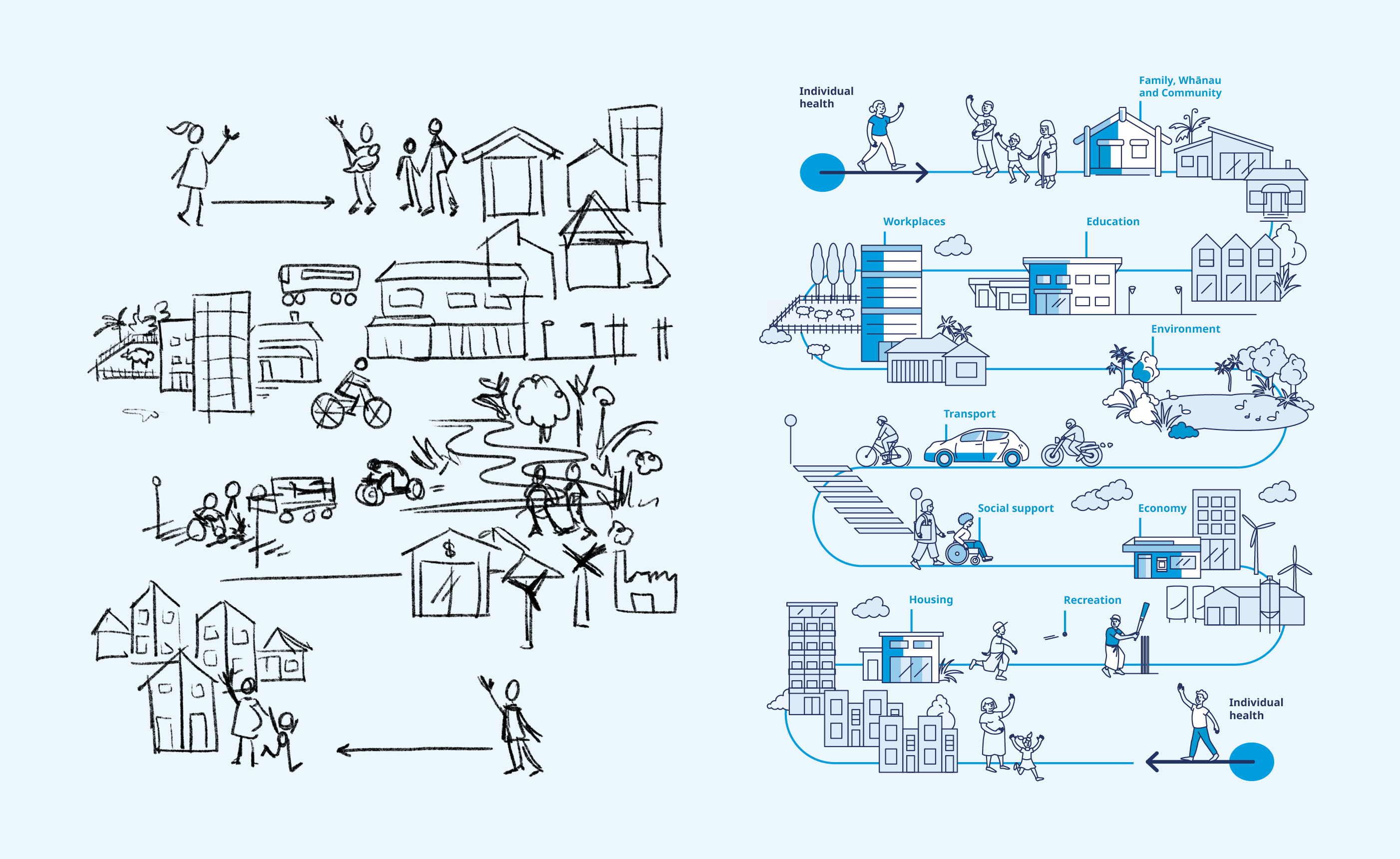
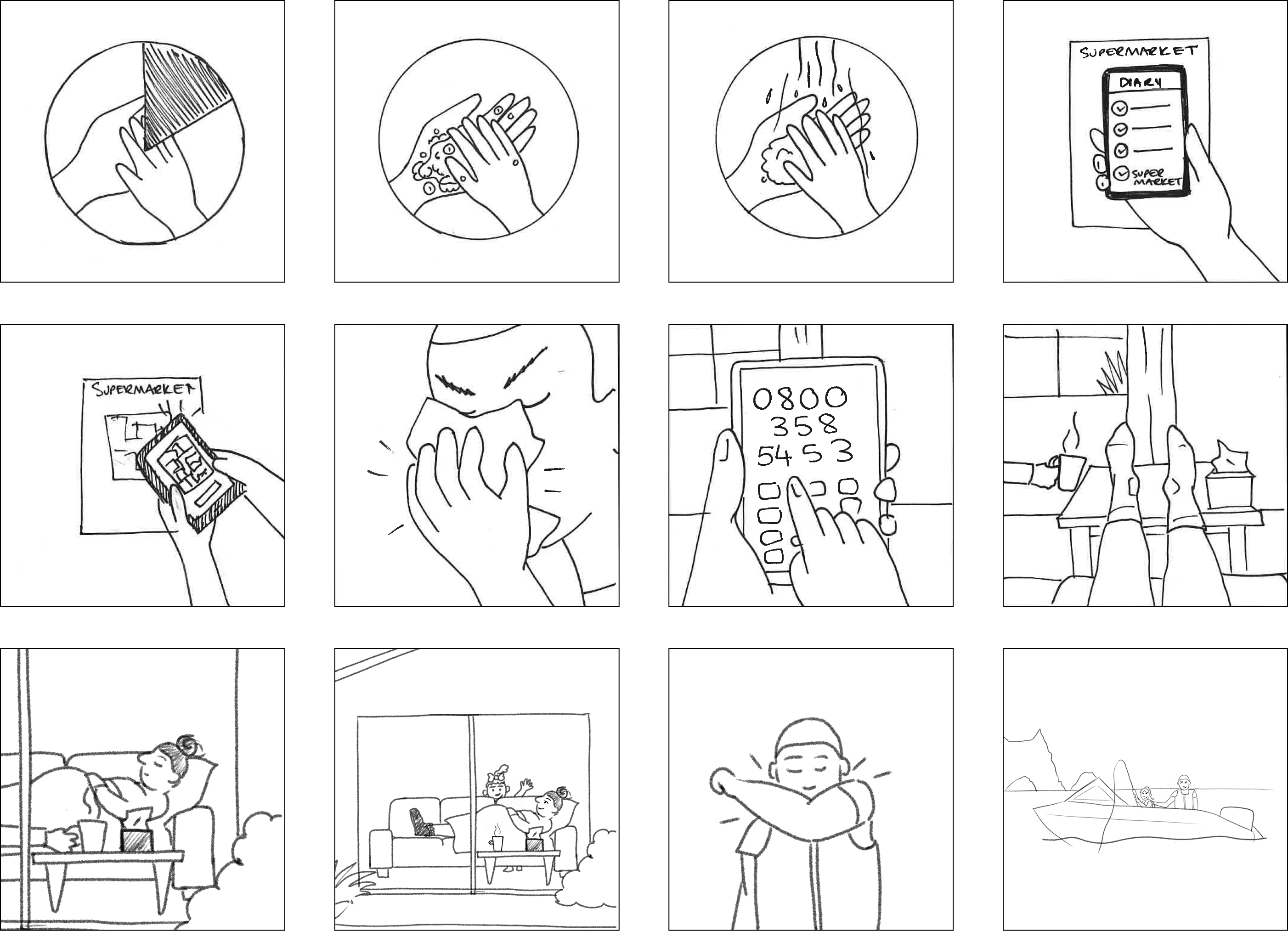
A selection of initial sketches for the storyboards
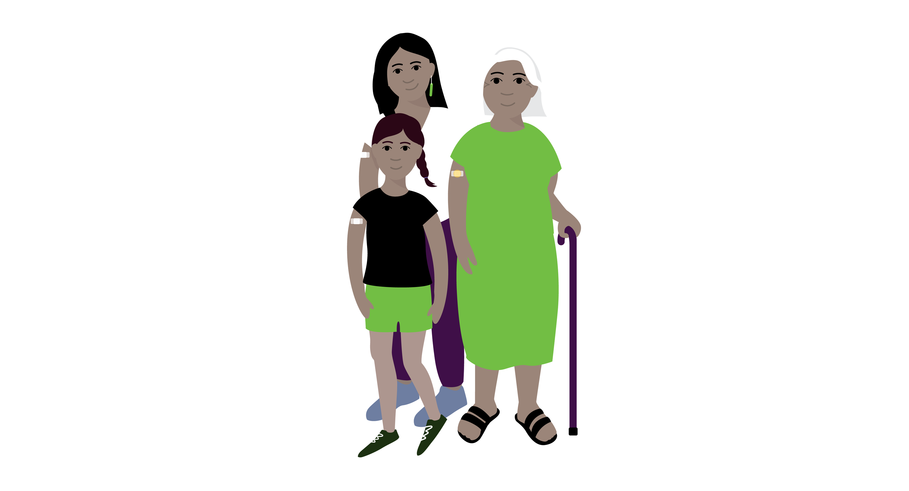
Character style concept design
For this project we also created fully illustrated storyboards to help the client visualise the animation
Northland District Health Board feedback:
“Throughout the process, the team at Gusto were excellent to work with, and they have done a great job. The design team members used their initiative and offered creative solutions, which has resulted in the production of six 30-sec animations for broadcast on digital platforms.”
