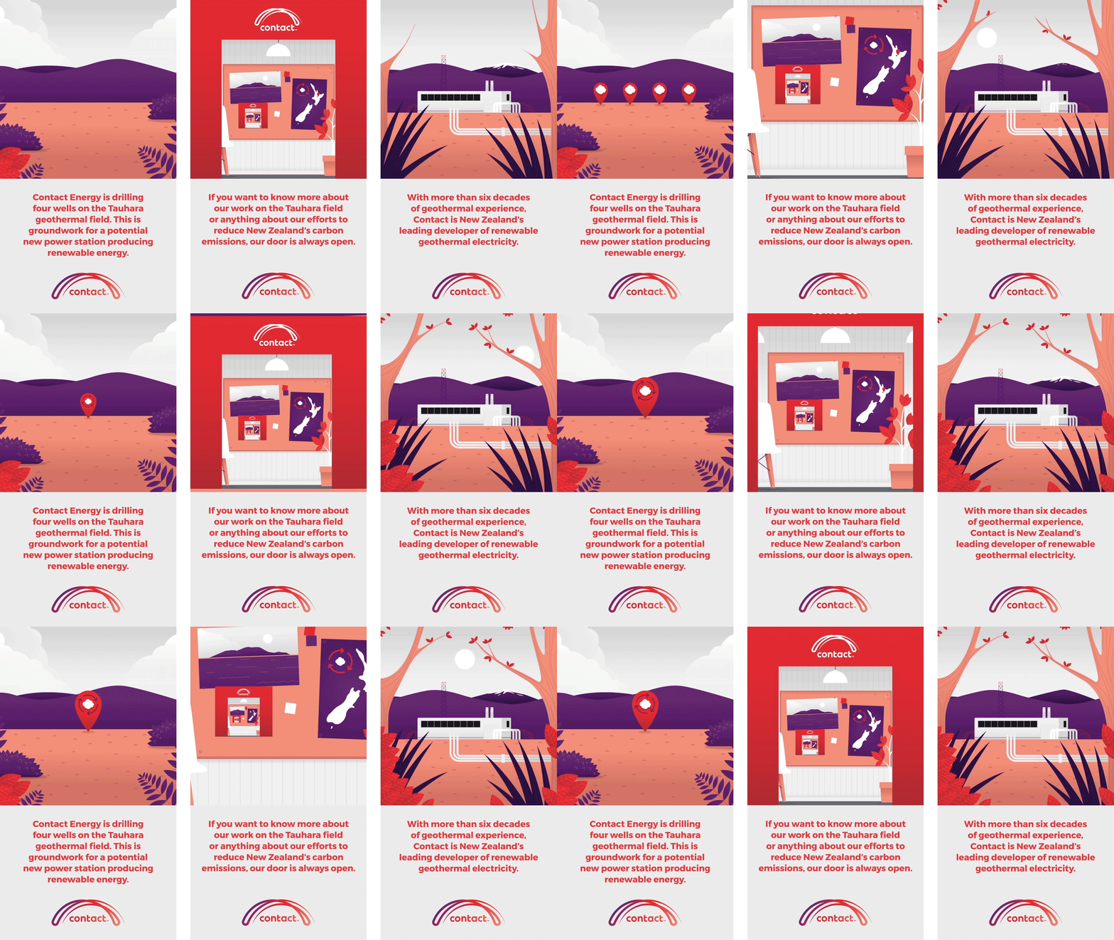
Instagram Stories animation series
Contact Energy
A series of short stories spreading an important message.
The animations were to act as high level messages focusing on the site selection, Contact’s long history in the Taupō region, and their open-door policy when it came to any questions or concerns from residents.
As Contact didn’t have an official illustration style as part of their brand guidelines, it was our job to develop one using their palette and overall tone. We used a clean and friendly aesthetic that was not only unique to Contact, but supported the simple messaging and tone they wanted to get across to their audience.
This series of animations gave Contact the ability to use a simple social media platform to communicate important information to the Taupō community.
'This is the second time across two different companies I have chosen to use Gusto to help us bring a complicated topic to life. The team at Gusto listen, take on the brand and are able to simplify highly technical information into a digestible format. I would definitely choose Gusto again.'
Keen to chat?
Get in touch with our team or have a look at our work to see if we’d be a good fit.

