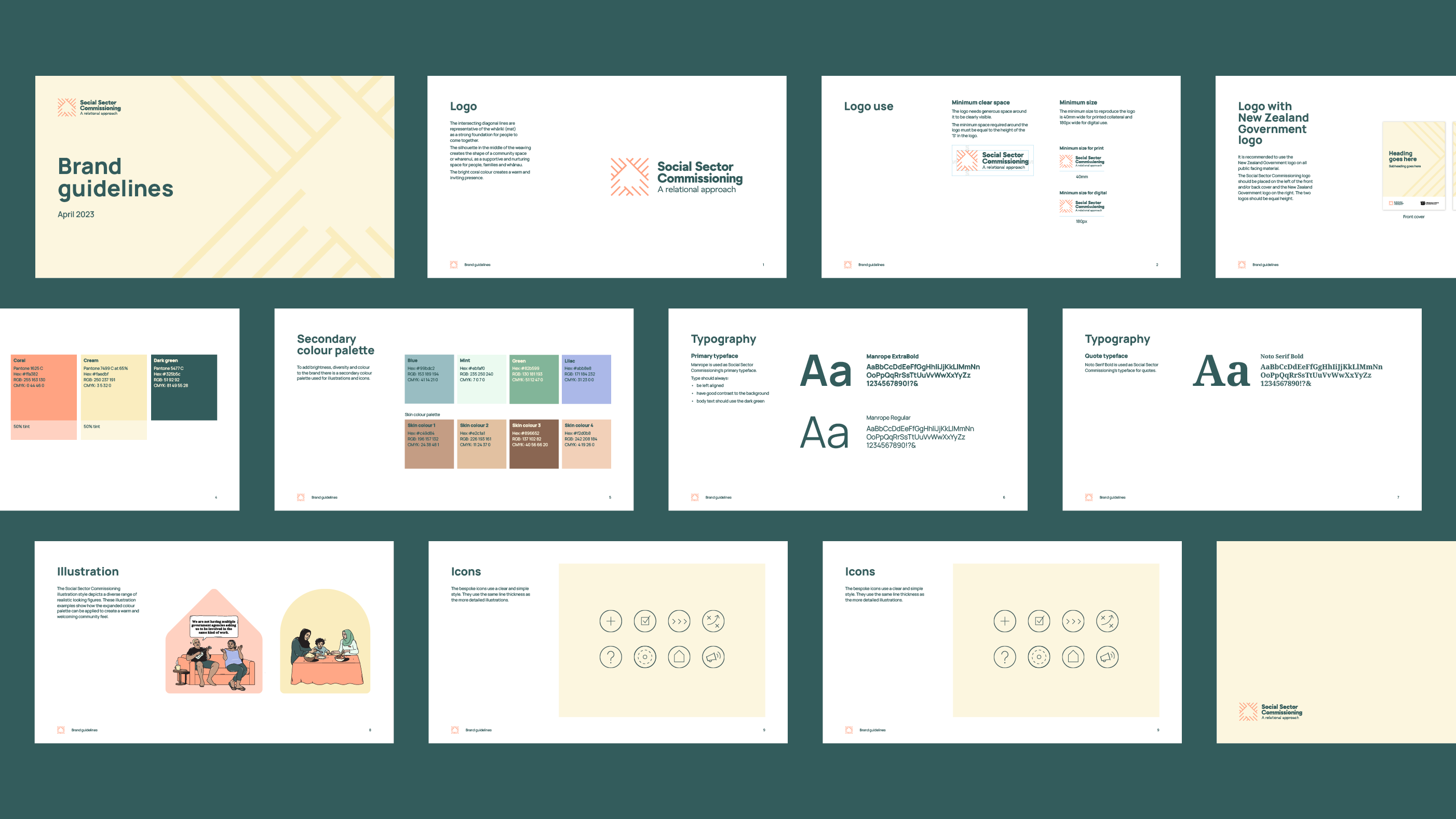
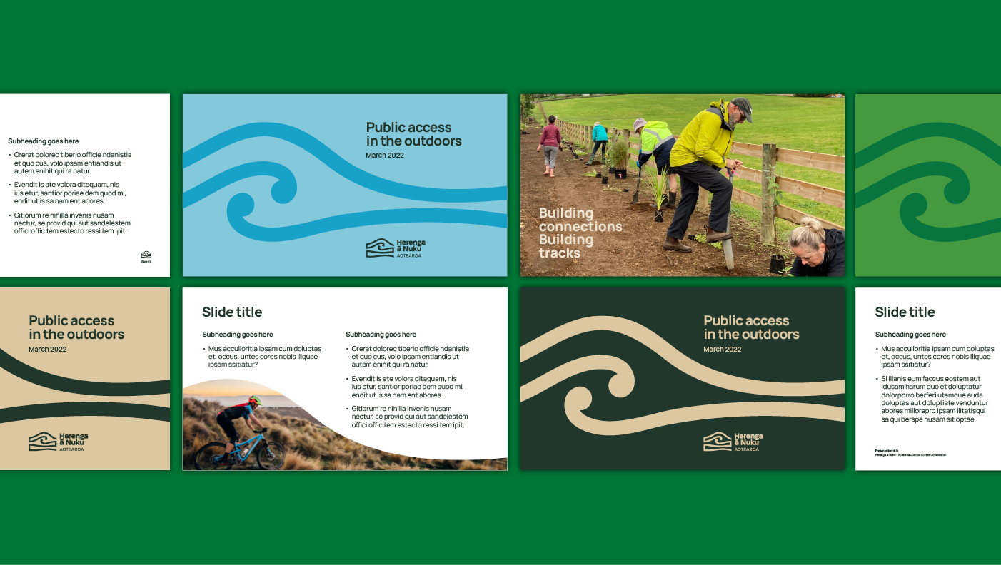
A visual identity transforming Social Sector Commissioning
Our design approach recognises that to successfully deliver the Action Plan, MSD need to communicate regularly with three key audiences:
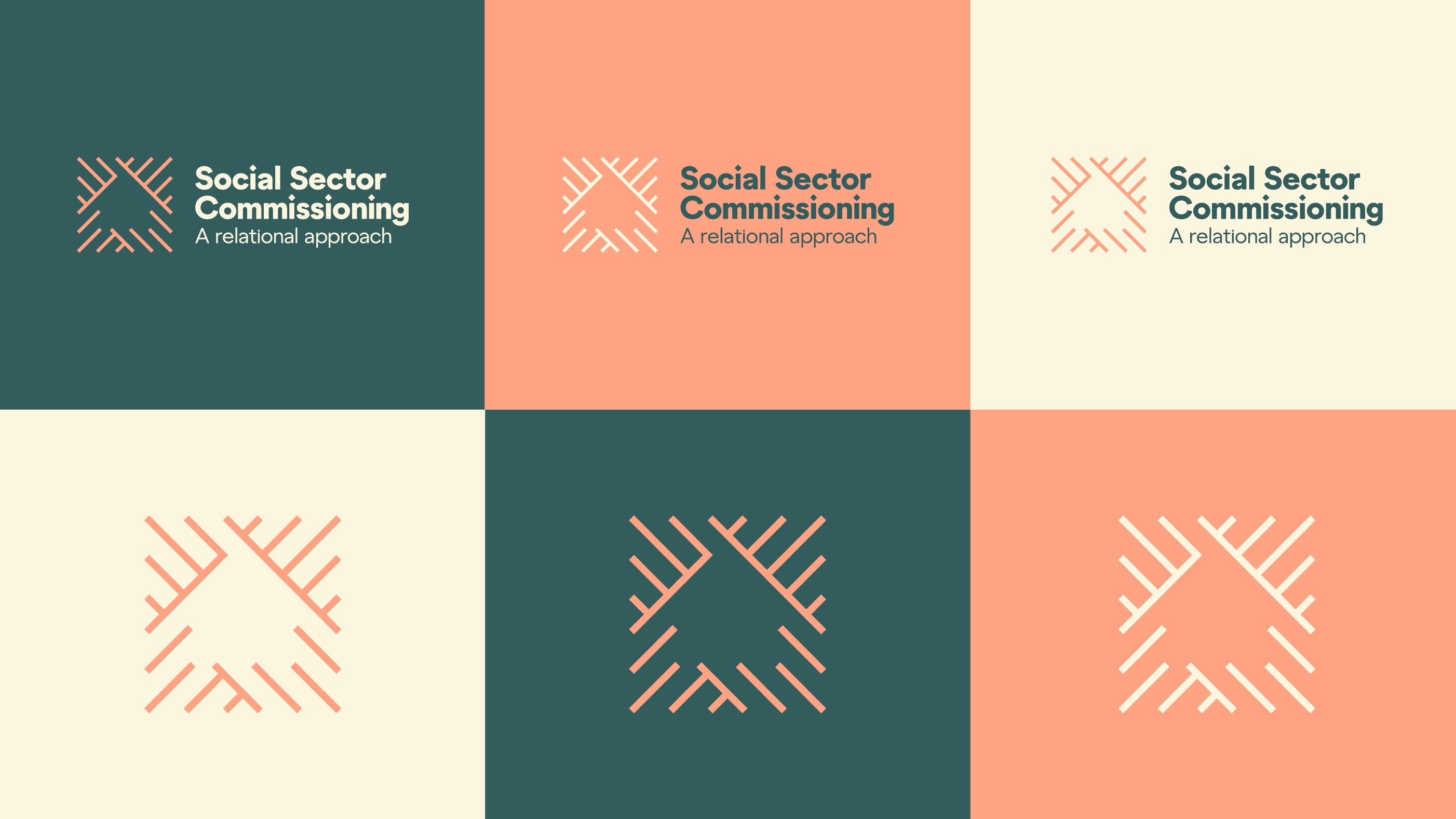
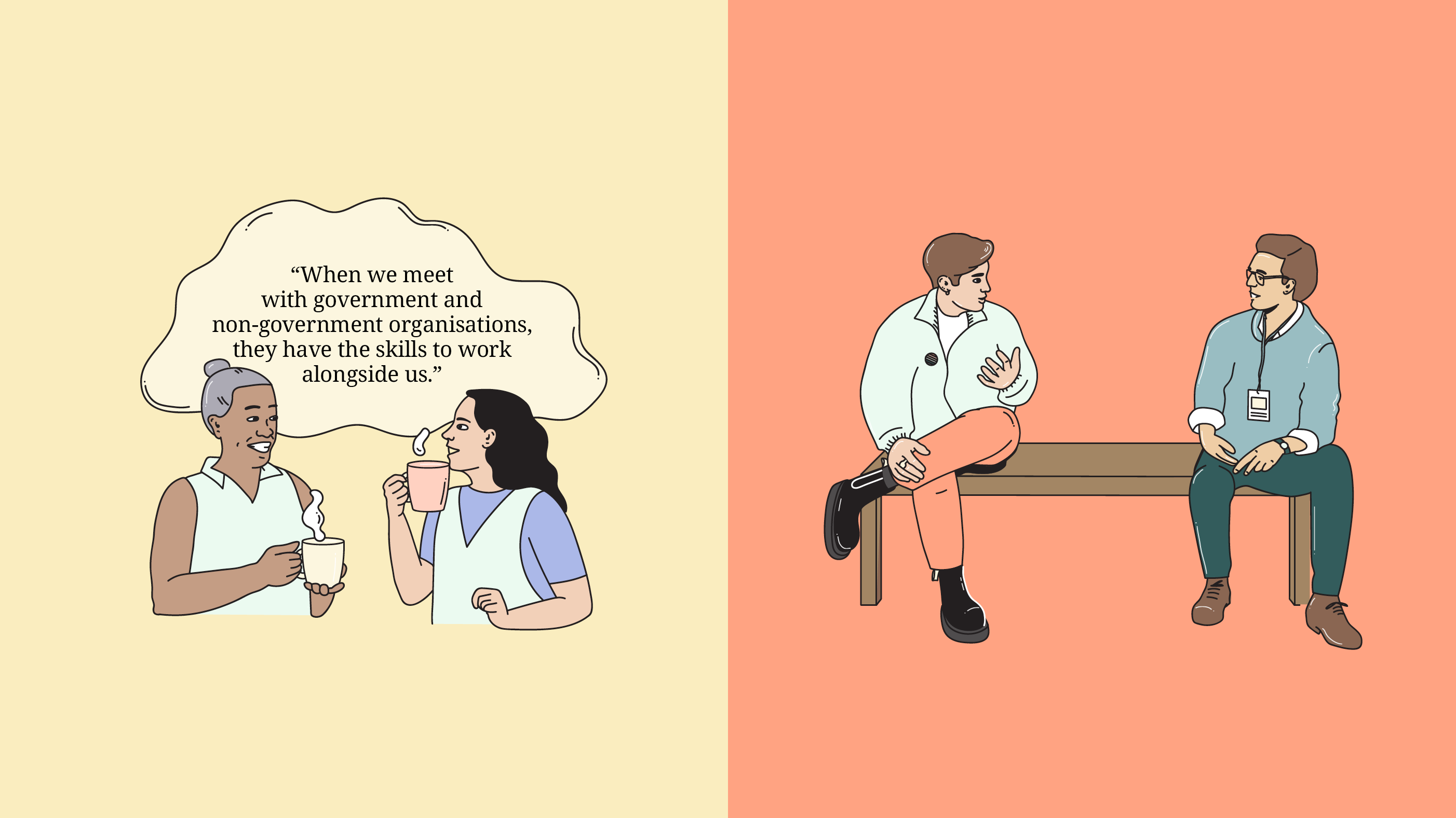
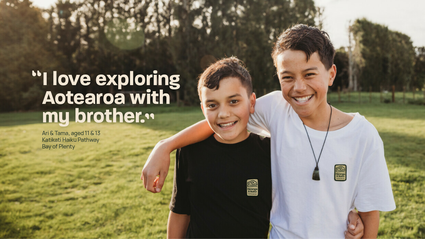
- The Social Sector: This includes non-government organisations, community organisations, iwi affiliated/trust organisations, and philanthropic organisations that receive government funding to deliver social supports. It was crucial for the logo to showcase the strength that comes with community.
- Government Agencies: We aimed to engage government agencies involved in delivering change specifically.
- Decision Makers: Our communication efforts also targeted decision makers who play a key role in the commissioning process.
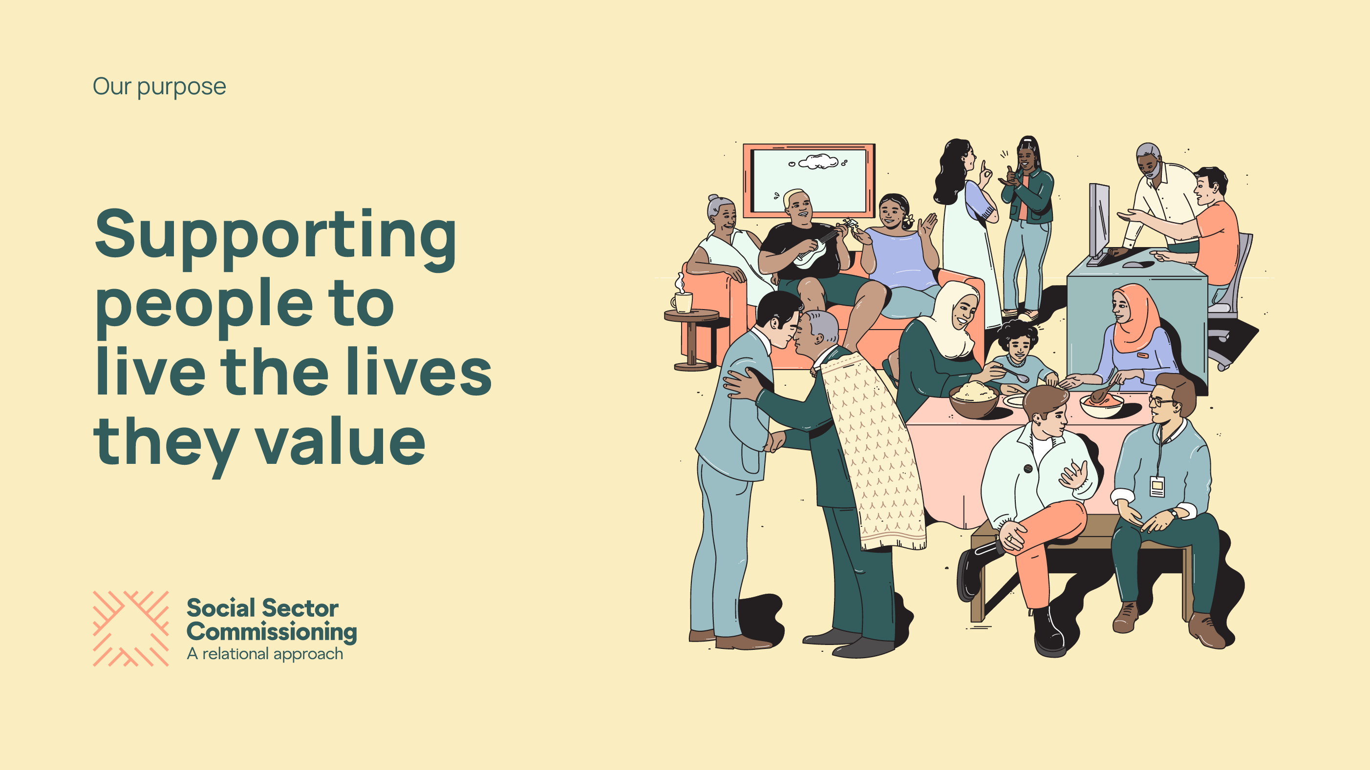
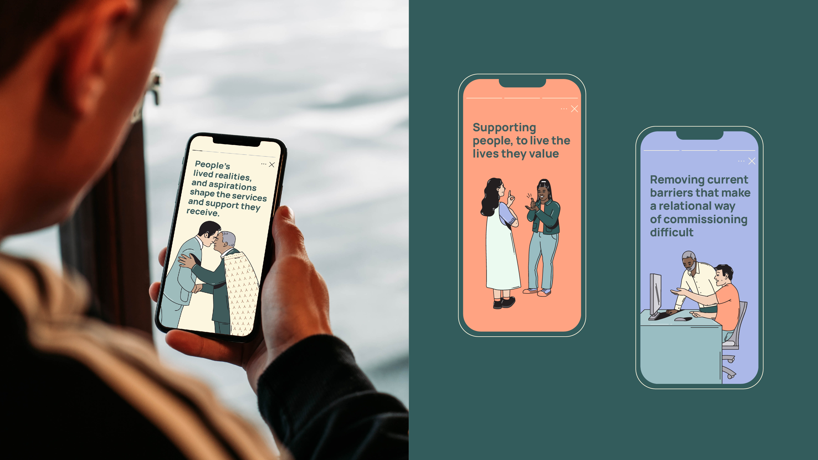
Our goal was to create an accessible and engaging document and summary for MSD that outlines the future direction of social sector commissioning. By doing so, we aimed to help the social sector understand the proposals and their implications on their work. An accessible and inviting design demonstrates the government’s commitment to take action, while infographics enhance the content and visualise key messages. These infographics simplify the complexity of the systems, making them clear and easy to understand.
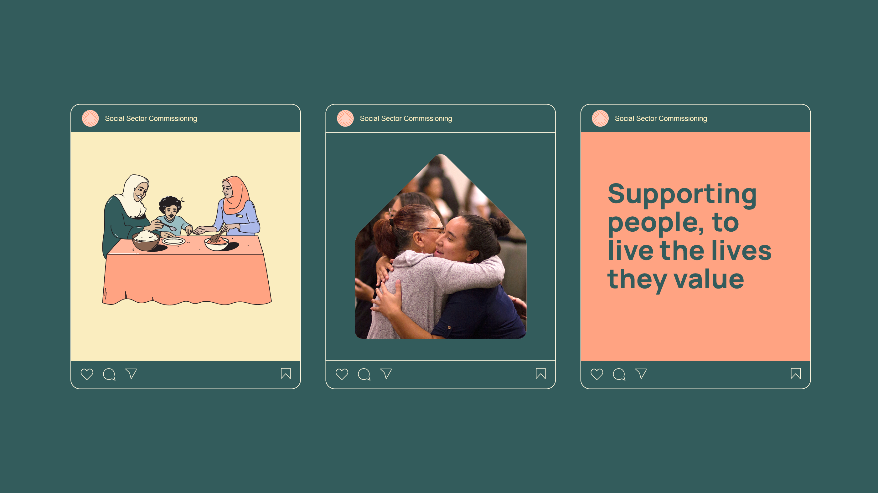
The purpose of the document and summary was to set a clear high-level direction for the future of social sector commissioning. It emphasises the importance of government agencies, social service providers, communities, and other key stakeholders working together in a deliberate and transparent manner to improve the wellbeing of New Zealanders.
Collaboration for clarity:
To ensure the overall result was clear and accessible to the broad audience, we joined forces with our regular partners, plain language consultants Write, and also collaborated with professional translation services. This ensured information included across these resources could be easily shared and understood in both Te Reo Māori and English. We wanted to help the social sector understand the proposals, and any implications on the way they work, emphasising the value for everyone in the system and clearly explaining how MSD plans to achieve their goals.
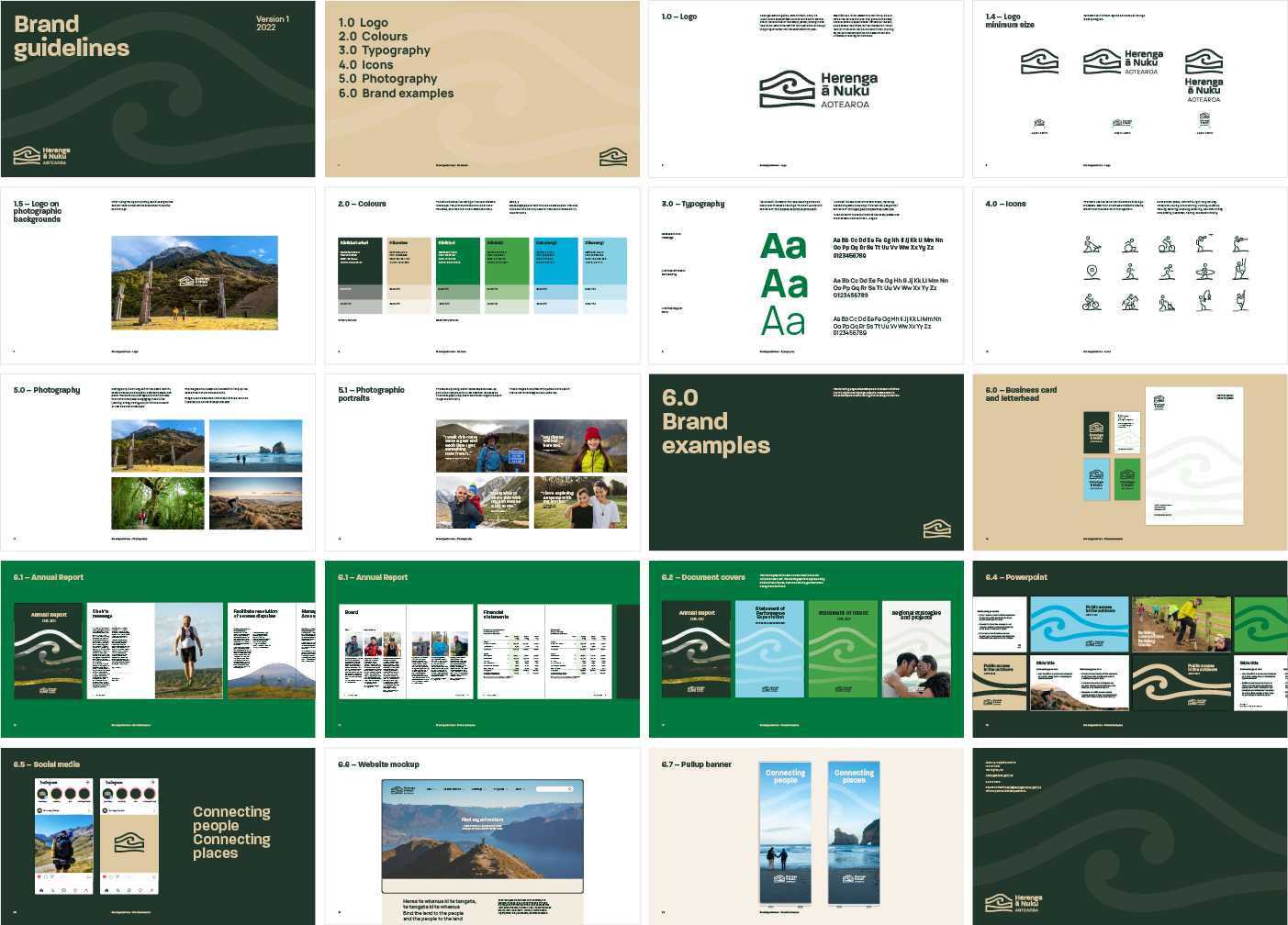
New brand creation

Website visual redesign
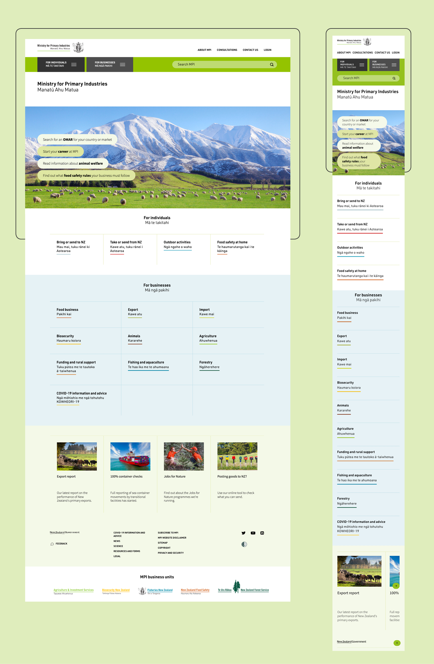
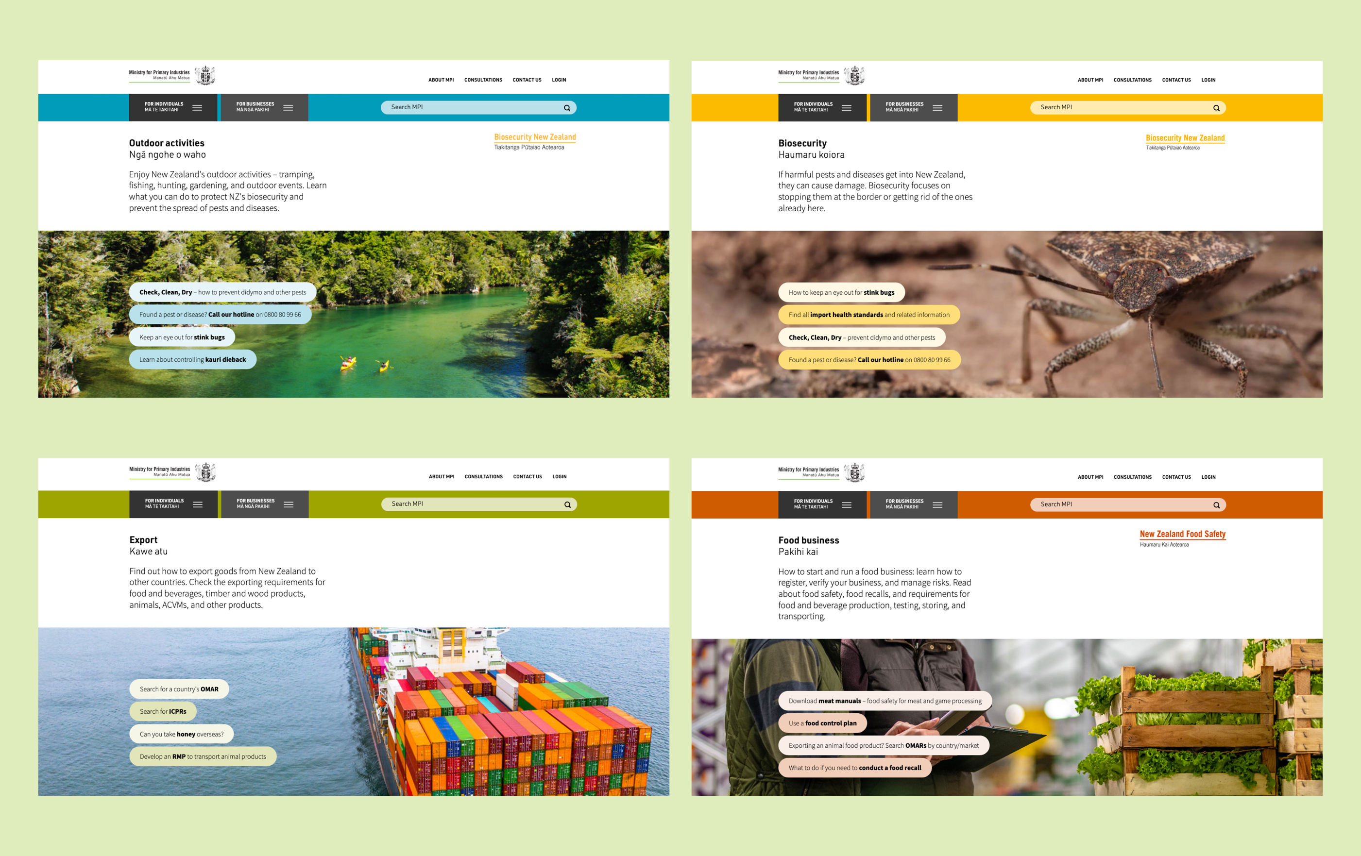
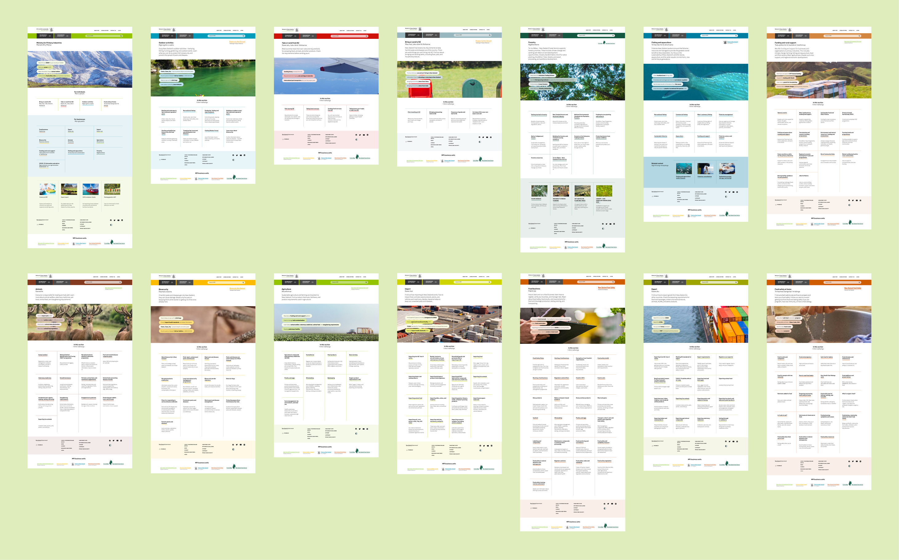
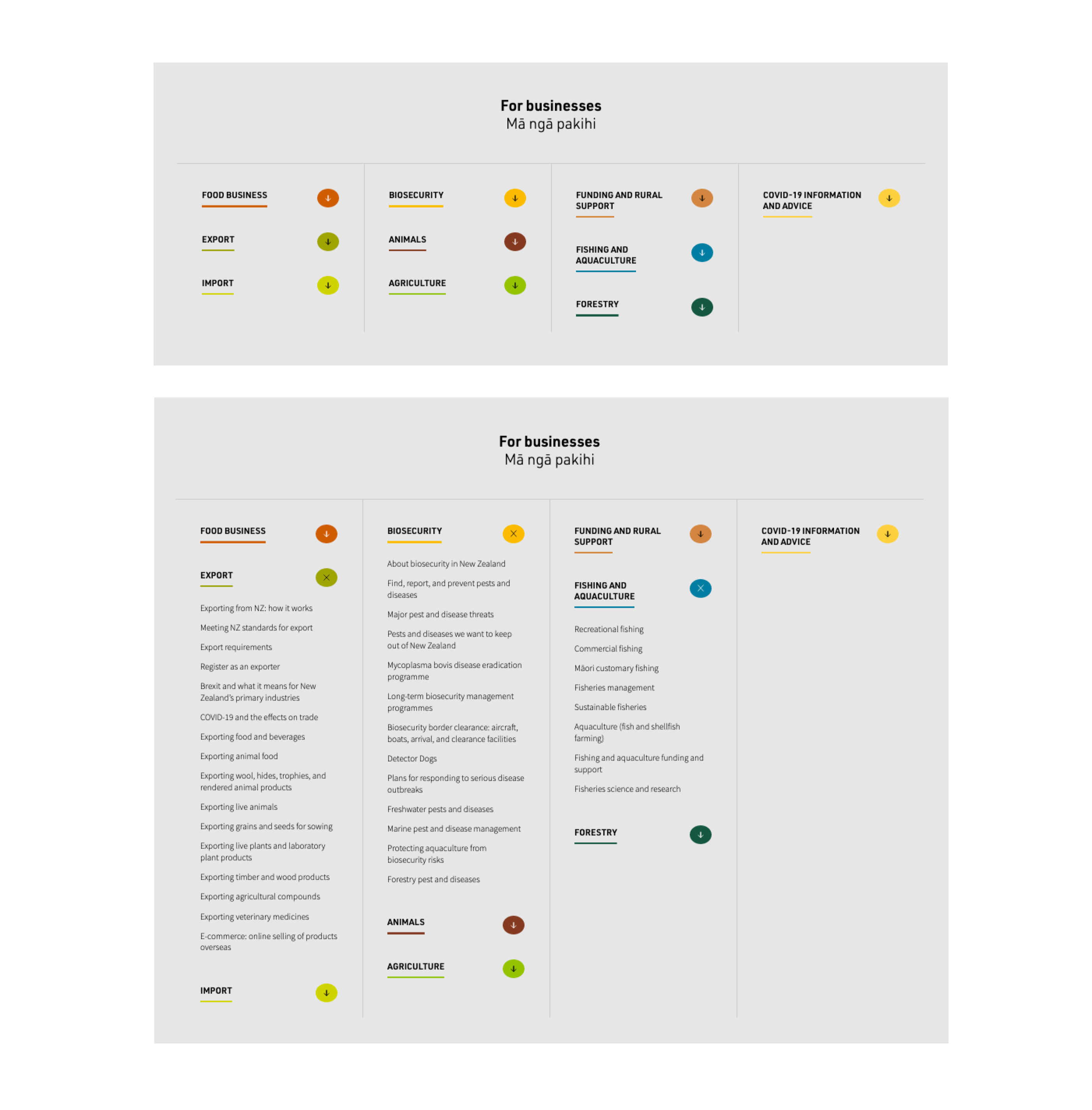
We approached this large scale website project with an information design lens. Reviewing and refining the essential details. Something as simple as colour coding makes this monster site easy to navigate by visually differentiating key categories.
We created a visual language that we applied consistently across over 1000 pages. This enables different users, whether they be individuals or businesses, to easily find what they’re looking for.
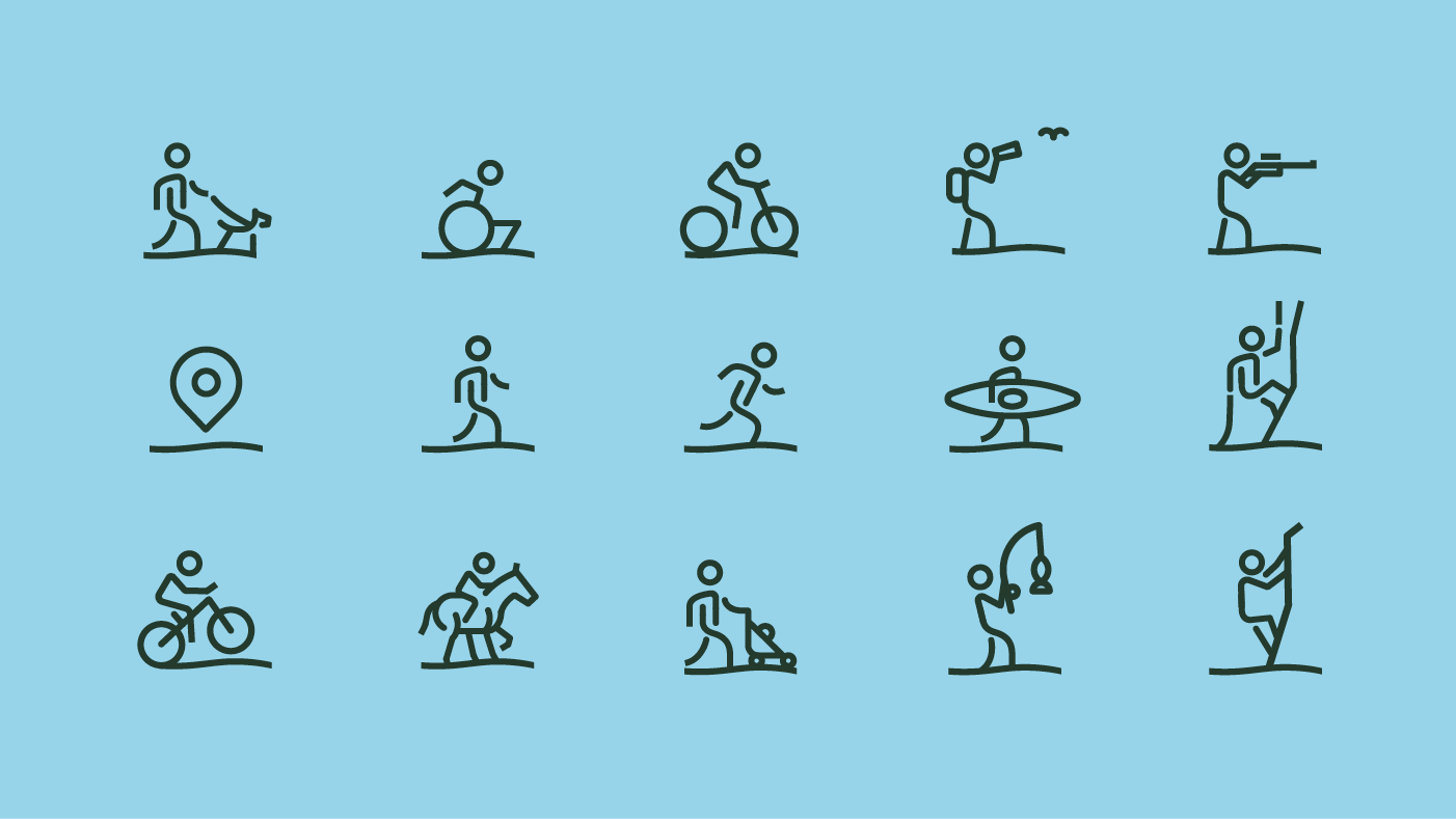
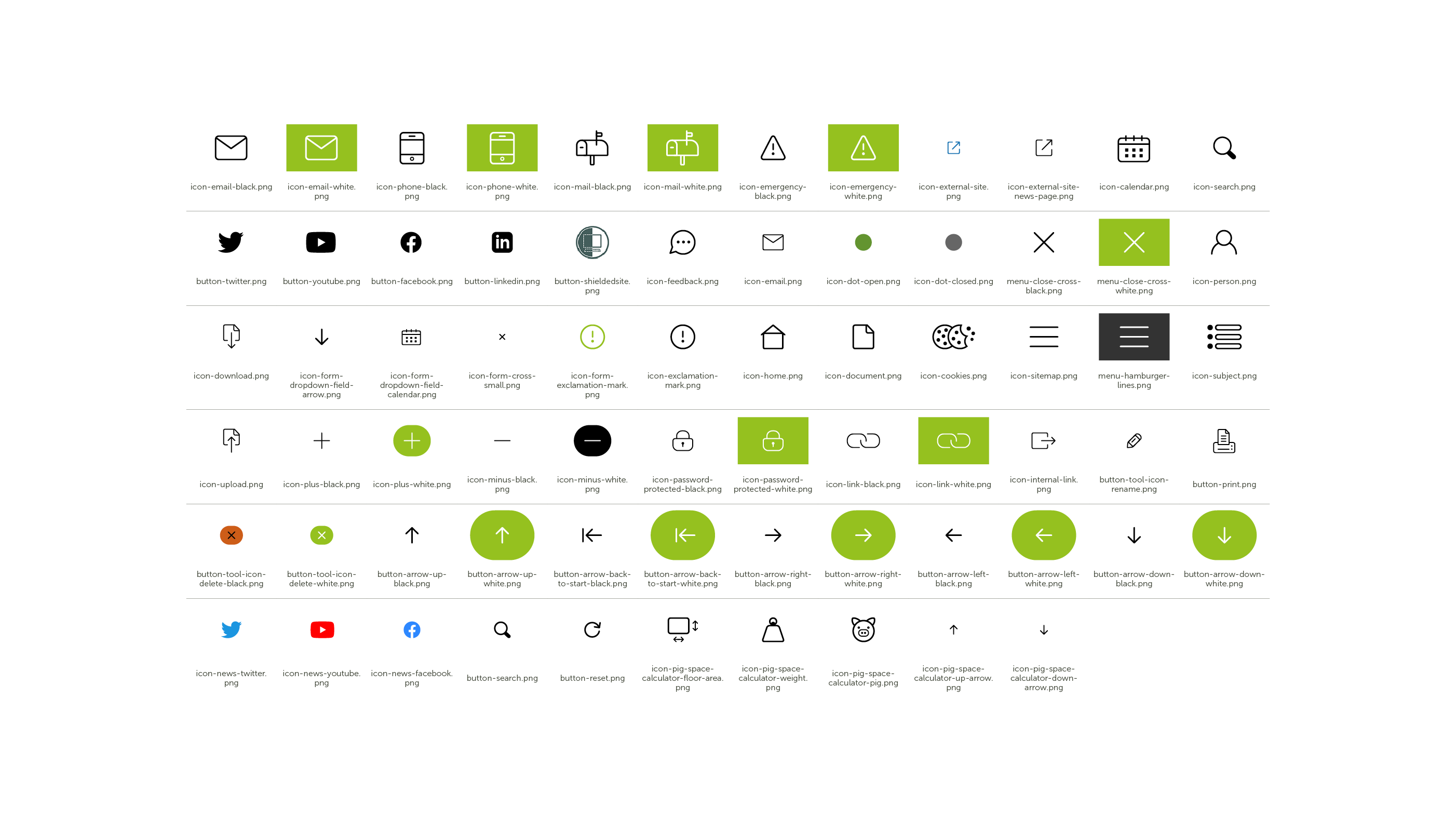
We created icons to draw attention to key repeatable information or actions across the site, providing the user with a consistent experience wherever they are on the site.
Through design each section of the site has its own unique identity, while still sitting within the overall aesthetic for the site. The modern design makes a large site welcoming for multiple audiences. And it’s easy for them to navigate and find what they are looking for.
MPI Feedback:
“The challenge we set Gusto was complex and they were up to the challenge. They listened to our requirements, were flexible with their delivery, and presented us with clean modern designs. We look forward to working with Gusto in the future.”
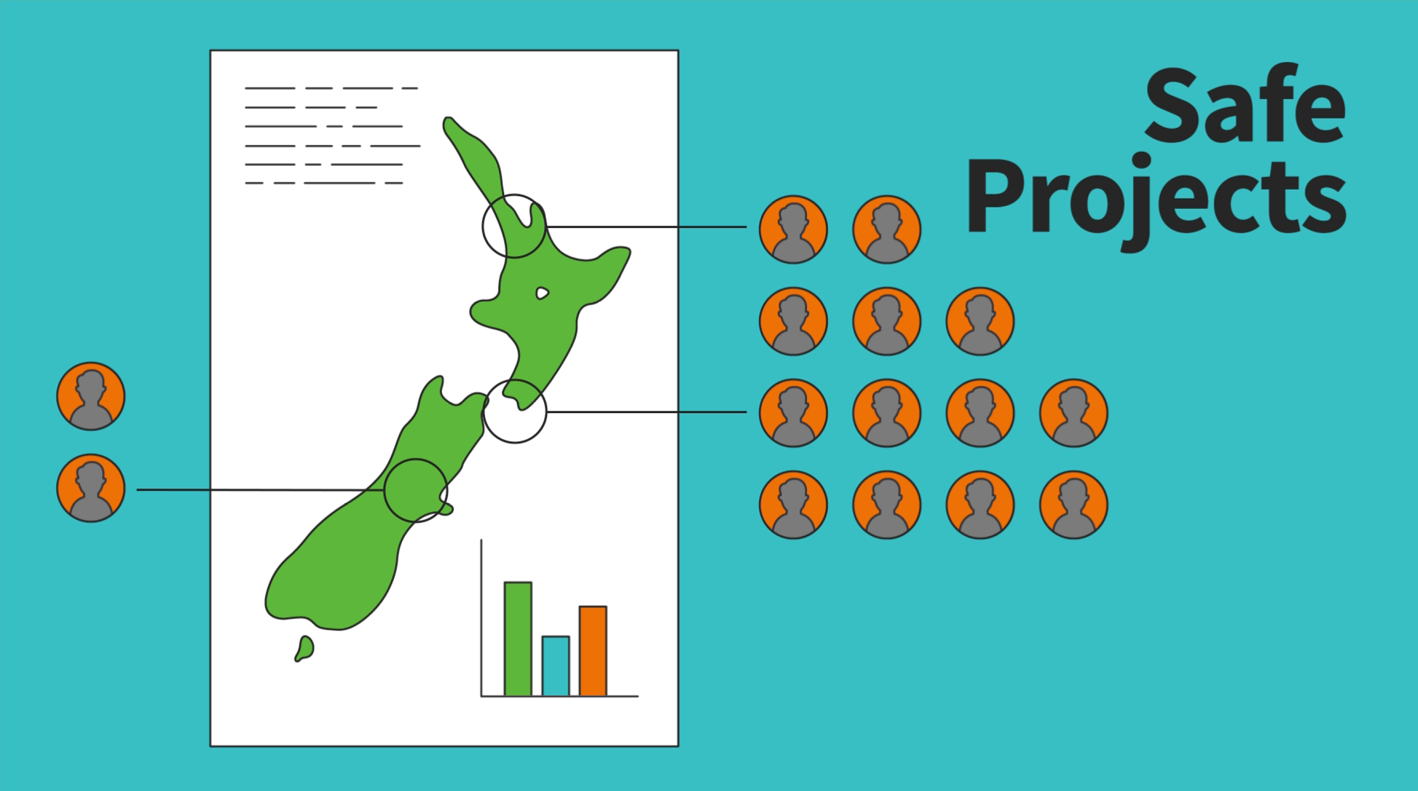
‘How we keep data safe’ animation and infographic
We created an animated infographic that tells a visual story of Stats NZ’s commitment to protecting privacy.
Designed to engage and educate New Zealanders about the stringent processes Stats NZ have in place to protect our data, this infographic informs the public what data is collected, what Stats NZ do with the data, and most importantly how they protect it.
The animation was posted on the Stats NZ website, YouTube and social media channels to celebrate the start of Privacy Week.


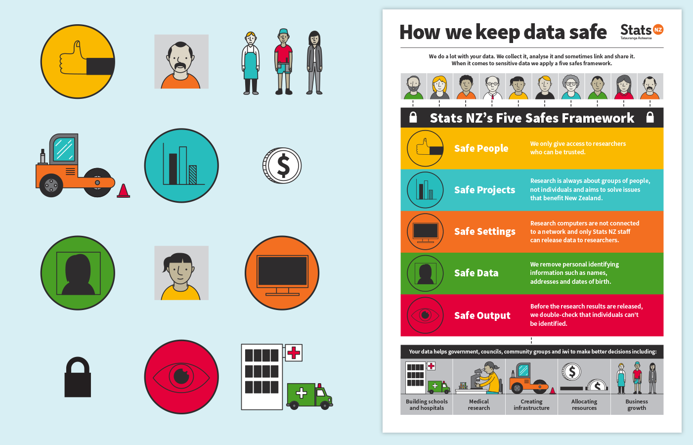
A suite of design elements developed during the animation process can now be drawn from for future Stats NZ projects.