Strategy Deck
Brand refresh, visual language and website design
New Zealand Air Ambulance Service is the largest air ambulance service across New Zealand and the Pacific. With over 35 years of providing life-saving care in the air, they’ve built a trusted reputation. But their brand wasn’t reflecting their strong position in the industry. So they approached us to modernise and elevate their brand, ensuring it aligned with their values and would stand out in a competitive market.
A discovery session helped us to understand their team, philosophy, and long history of service. From there, we evolved their existing logo and tagline to set the foundation for the brand refresh. We developed the wider brand visual language to establish a consistent, professional, and modern look across all collateral. To help them implement the new brand seamlessly, we created a suite of user-friendly templates for online and print, as well as comprehensive brand guidelines —everything they needed to bring the brand to life.
As part of the refresh, NZAAS also sought to improve their online presence by consolidating two websites into one. The new website design organises their core businesses—Skyline Aviation, New Zealand Air Ambulance Service, Med Assist, and Jet Charters—in a clear, logical way. The result is a fresh, engaging website that tells their story clearly and encourages visitors to learn more about the incredible work they do.
Community Planning for Climate Disruption
How do we effectively communicate the urgency of climate disruption while inspiring public and action understanding? This question guided The Workshop’s three-year collaboration with Auckland Council to develop narratives that encourage community planning as a key solution to climate challenges.
Through extensive research The Workshop identified and tested messages to help communities engage with climate adaptation. Their findings emphasise the importance of connecting climate action to better lives and enabling collective, community-based solutions.
Our design team then transformed their in-depth research into two impactful design outputs:
• A framing report: A detailed and robust record of The Workshop’s findings and actionable recommendations.
• A messaging guide: A concise, visually engaging resource designed for community leaders to quickly access and share key insights.
Using thoughtful design strategies, we ensured these resources were easy to navigate and understand. Tools like clear information hierarchy, signposting, and engaging visuals highlighted key messages while fostering accessibility.
A consistent structure and colourful graphics brought the concepts to life, supported by Megan Salole’s vibrant cover illustration.
Our goal was to empower The Workshop’s audience – community leaders, local government, climate advocates, communicators and decision-makers – with the tools to share narratives that inspire action and build public confidence in climate solutions. By creating content that is as engaging as it is informative, we helped transform complex research into accessible guides for meaningful change.
Guidance report
We designed new guidance from the World Health Organization for managing ecological and health risks associated with the manufacturing of antibiotics.
Pollution from antibiotic manufacturing is a significant yet underregulated contributor to antibiotic resistance, risking the effectiveness of life-saving medicines. This new guidance offers a scientific framework for setting targets and implementing best practices across sectors.
This guidance is a critical tool, and practical application by regulators, inspectors, procurers and industry stakeholders across the world is key in managing the environmental challenge.
Our report design makes the complex information clear and easy to navigate using colour coding, a logical document structure and visual cues for repeating content types. Illustration depicting the environmental and health impacts of antibiotic manufacturing gives the information an emotional weight and underlines the importance of this guidance.
The challenge was to create an illustrated landscape that would engage a global audience and avoid specific details that may ground it in one particular place. We needed to show human presence to help demonstrate the creation of pollution and its impact on our health.
Consultation Document and Campaign for the 10 Year Plan
Animated complaints process infographic
School Carbon Emission Reduction Infographics
Emergency Toilet Campaign
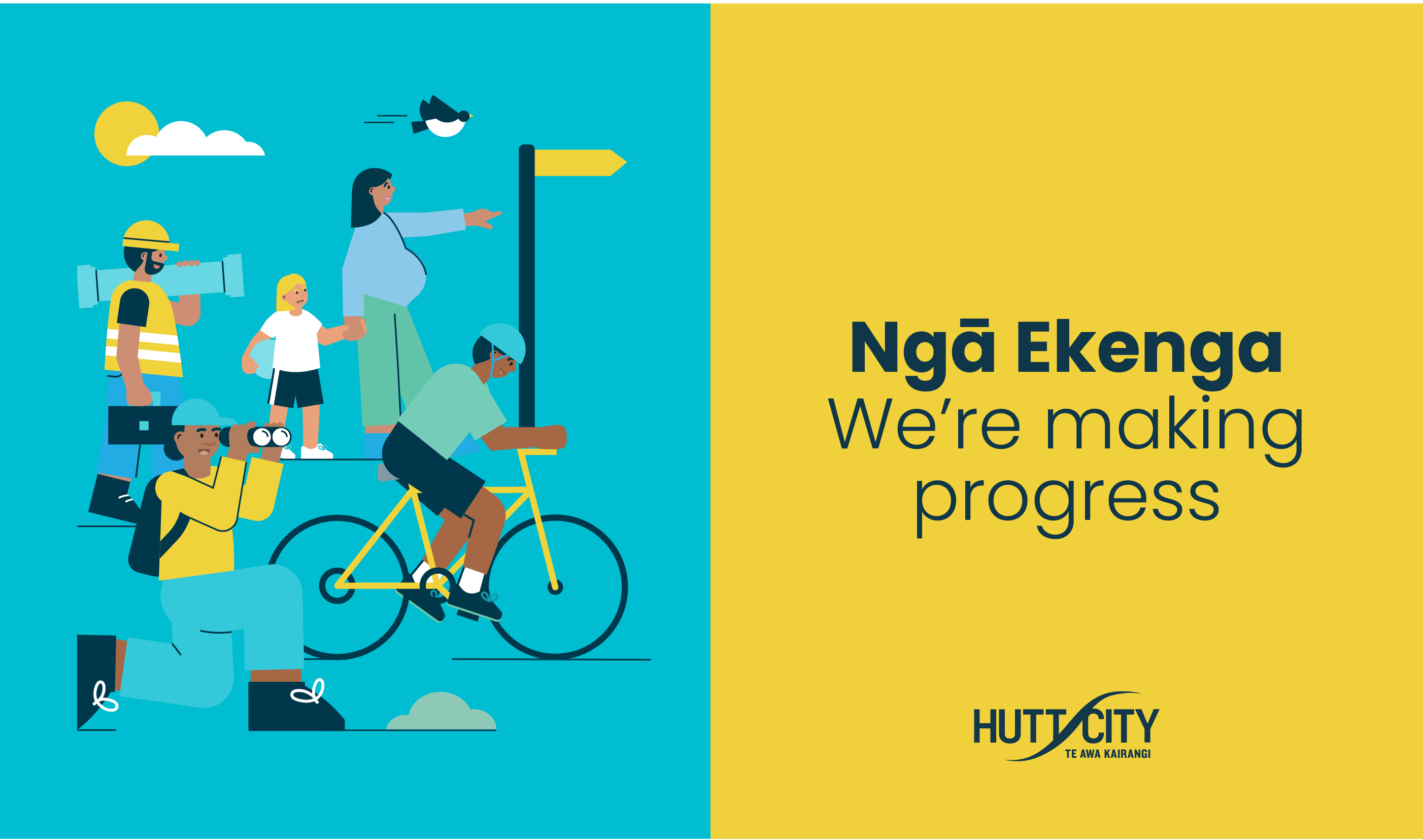
Branding the city – Visual language and information design
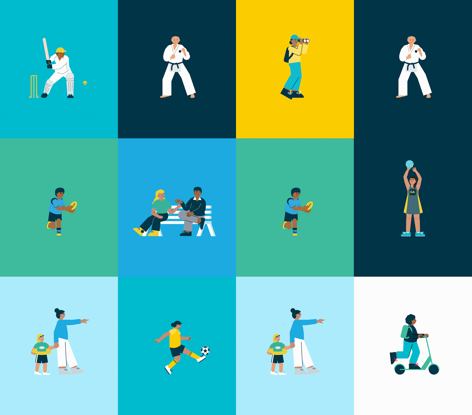
HCC wanted to show they were responding to the vision and aspirations of their community. Giving them a sense of the progress being made. The Annual Plan, like all the resources developed, has been created with the community in mind. Its aim is to be transparent about the council’s work, how it impacts their residents, outlining what’s next, and prompting engagement. Our visual language had to feature recognisable connections to the city and the people that live within it. The illustrations and photos included are representative of the diverse range of people living in Hutt City. Landmarks such as local shops, the Council building, even the ‘Welcome to Lower Hutt’ sign were all featured in the Plan too.
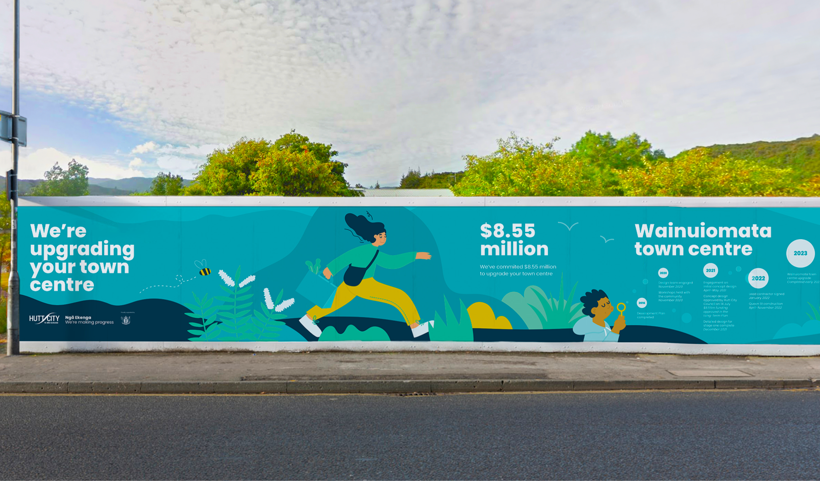
The visual billboards we designed help connect the community to the exciting HCC infrastructure projects in the works, and act as an effective way to boldly and clearly alert people to work happening in their area. Detailing in-situ; what the project is, how much money is being spent, the progress residents can expect to see, and when it can expect to be finished.
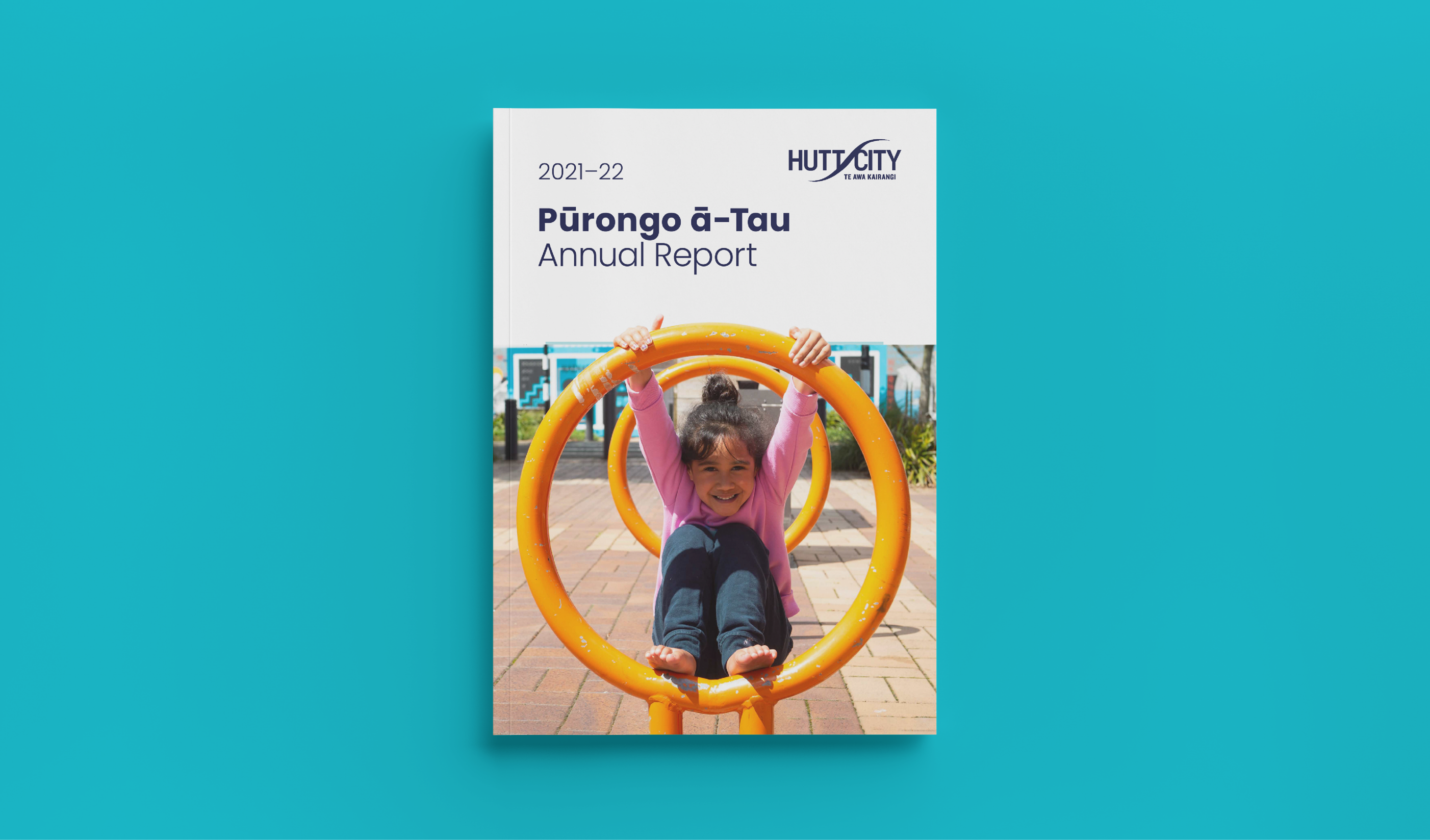
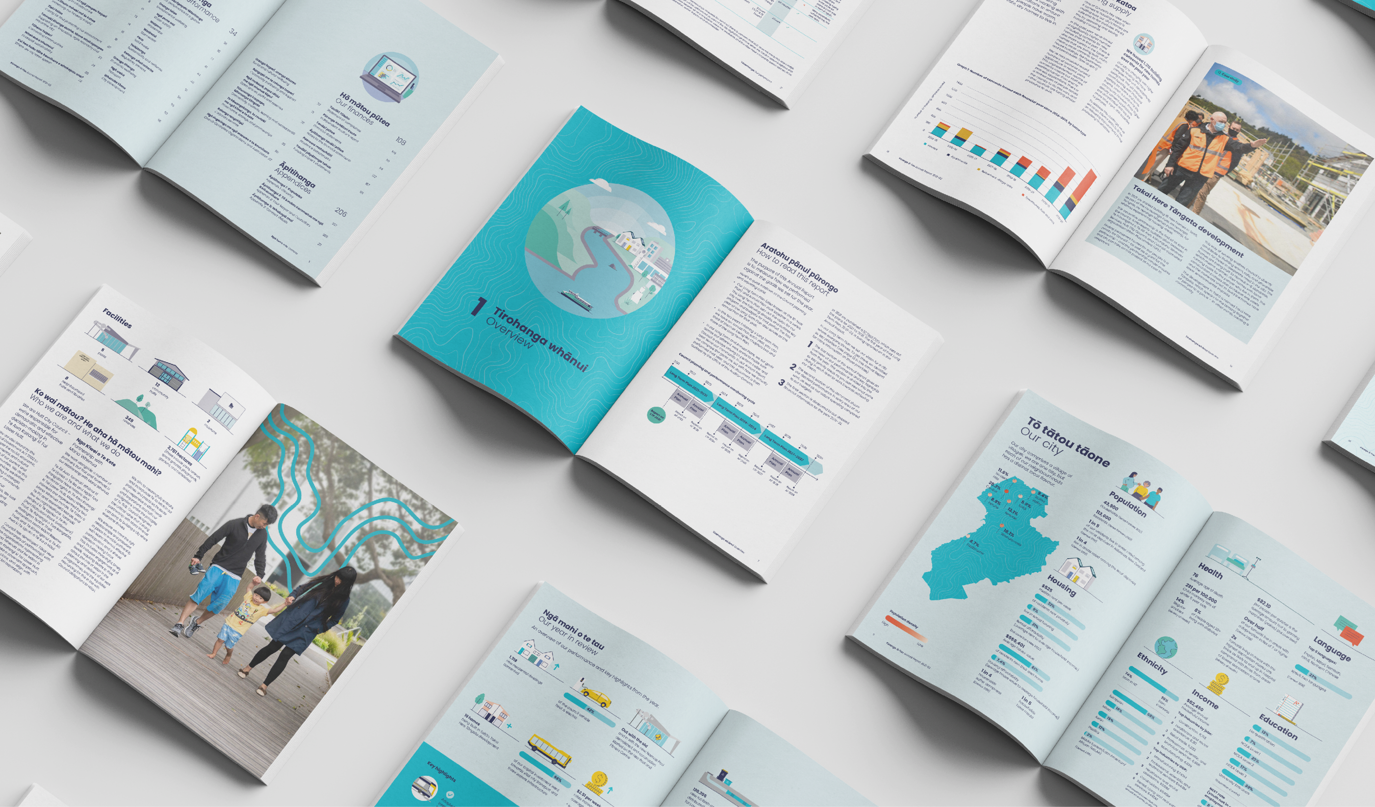
For the Pūrongo ā-Tau – Annual Report and summary we had to ensure the essential information stood out. So that navigation throughout the 200 page document was clear and easy, so HCC could effectively tell their performance story. The document needed visual design to assist in communicating the wealth of information inside. Using all the tools in our belt; a mix of photography, illustration, infographic spreads, clear design, and incorporating local landmarks and regional attributes, with a consistent visual style, we created a cohesive and engaging suite of resources for HCC that they’re proud to share with their community.
Consultation on the proposed changes to the Annual Plan was live from 31 March to 30 April 2023.
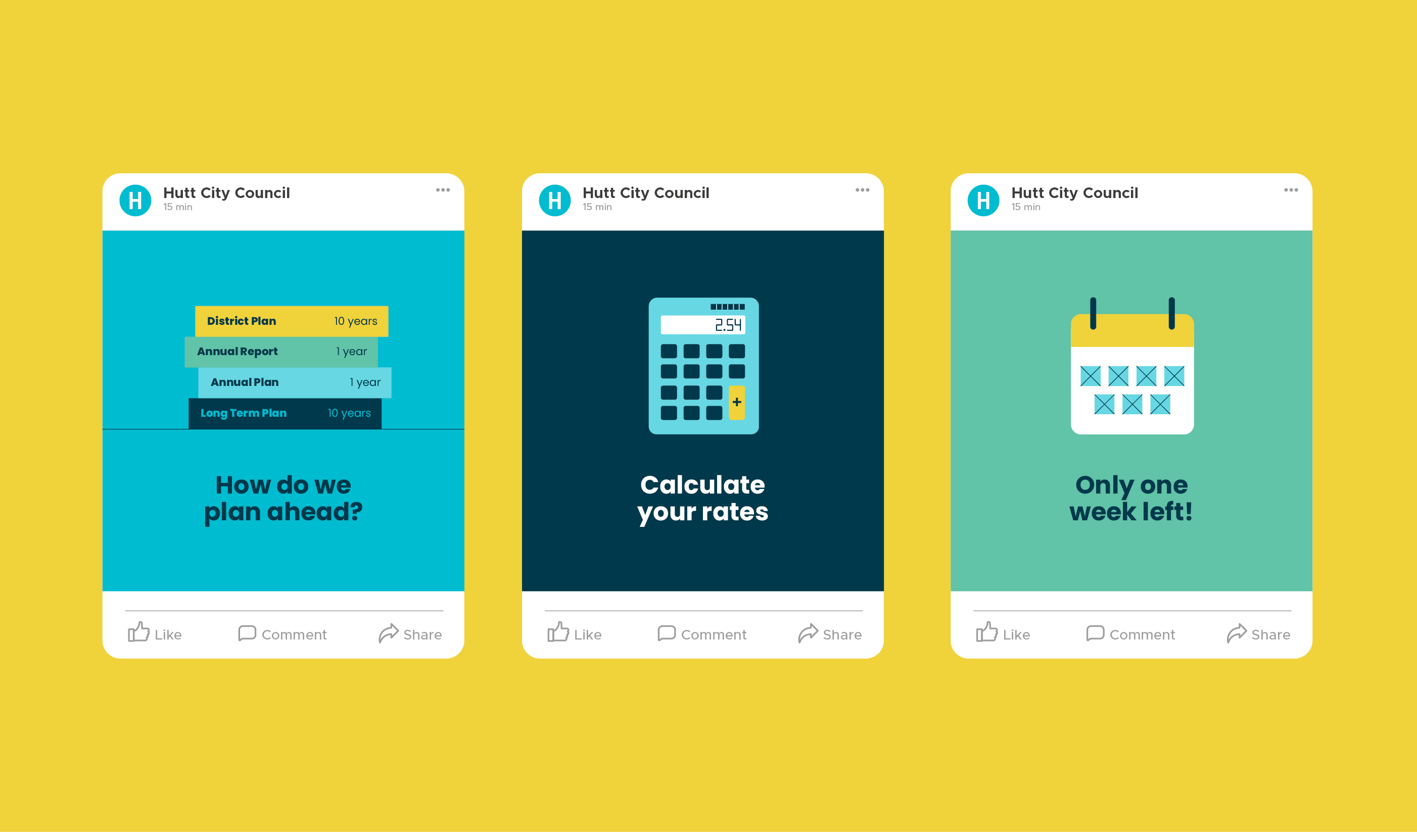
HCC published the proposed changes online, along with supporting information to help their community understand the decisions they were facing. The website was viewed by 1616 people during the consultation period.
HCC also published an online survey for our community to provide feedback on their proposals. They received 124 responses to the survey, and heard from people who sent emails and came to speak to their submission in person. They also had over 1000 people view the HCC online rates calculator to see the impact of the proposed Annual Plan on their rates bill.
