Consultation Document and Campaign for the 10 Year Plan
Animated complaints process infographic
School Carbon Emission Reduction Infographics
Emergency Toilet Campaign
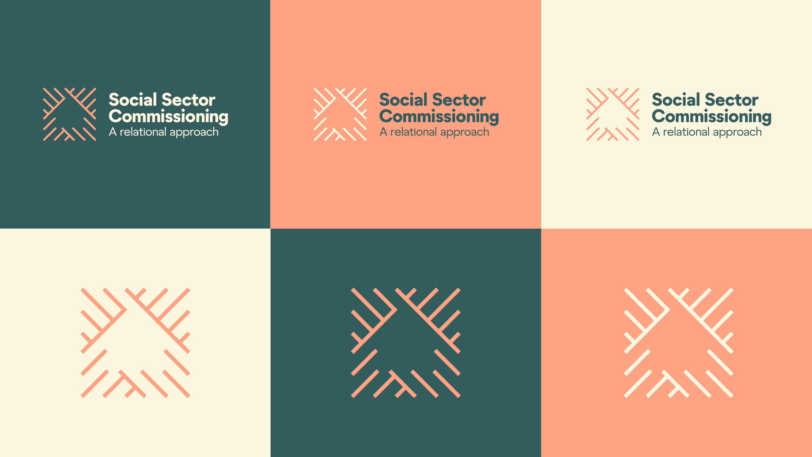
A visual identity transforming Social Sector Commissioning
Our design approach recognises that to successfully deliver the Action Plan, MSD need to communicate regularly with three key audiences:
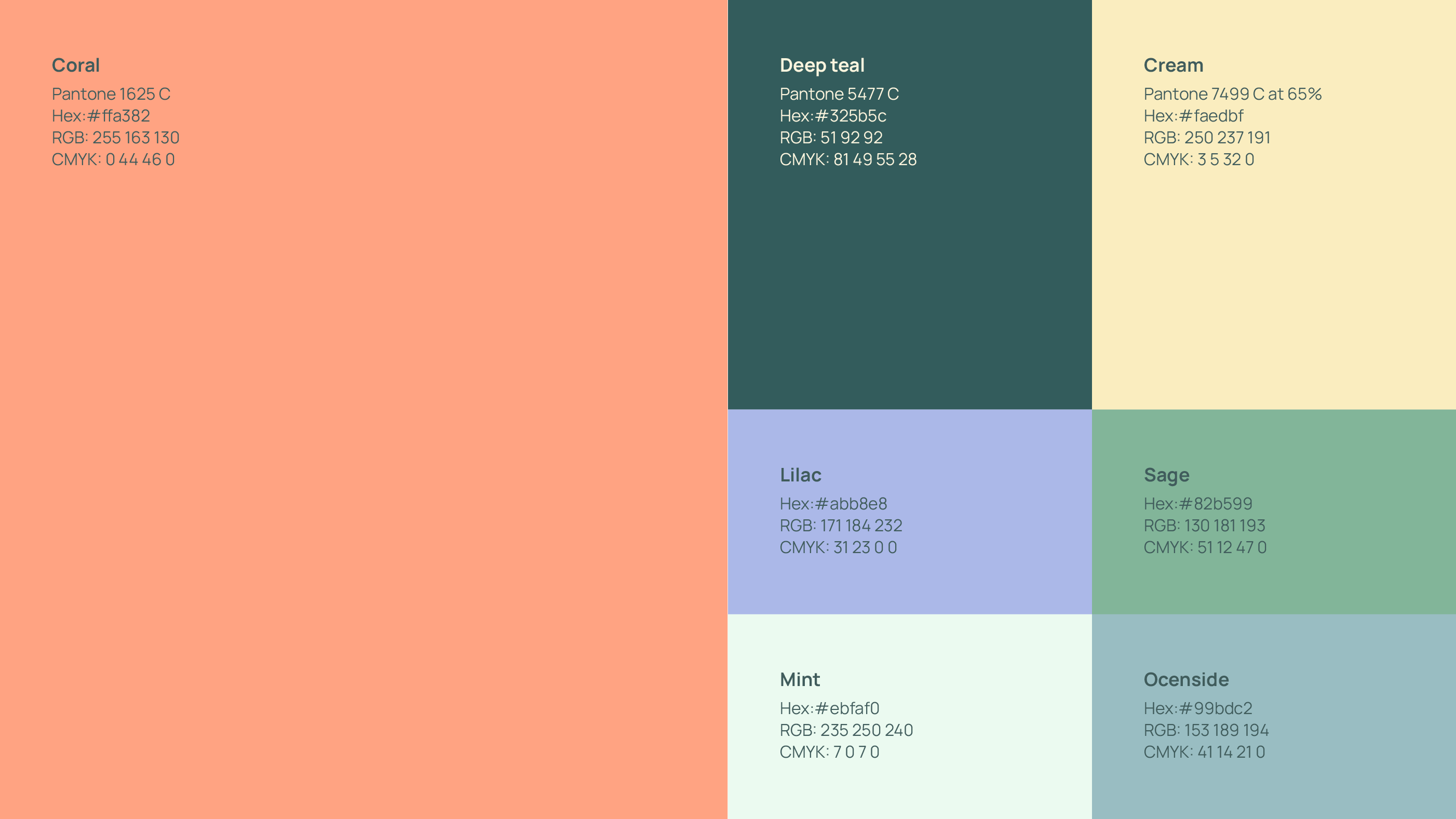
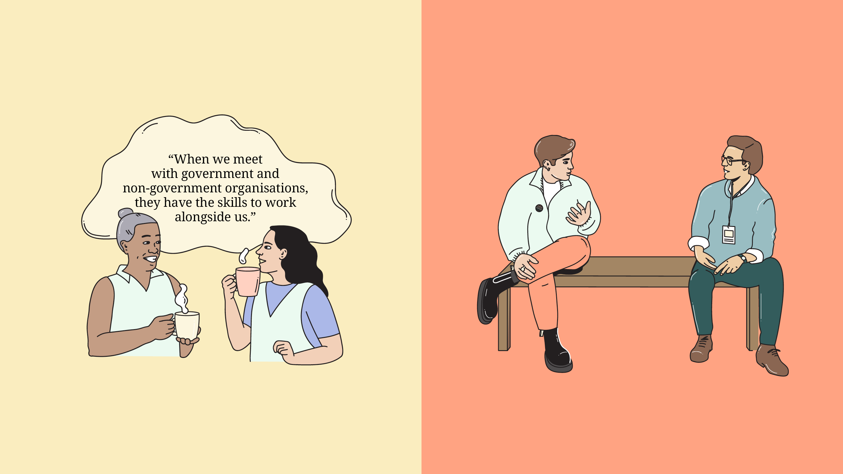
- The Social Sector: This includes non-government organisations, community organisations, iwi affiliated/trust organisations, and philanthropic organisations that receive government funding to deliver social supports. It was crucial for the logo to showcase the strength that comes with community.
- Government Agencies: We aimed to engage government agencies involved in delivering change specifically.
- Decision Makers: Our communication efforts also targeted decision makers who play a key role in the commissioning process.
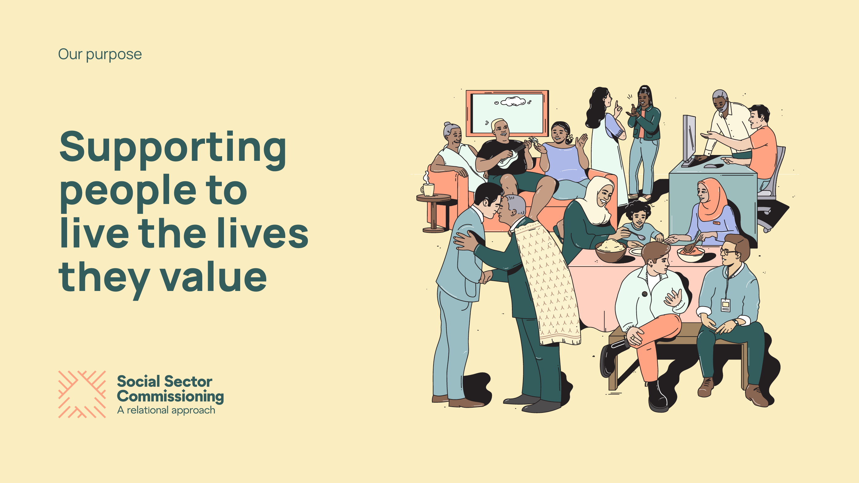
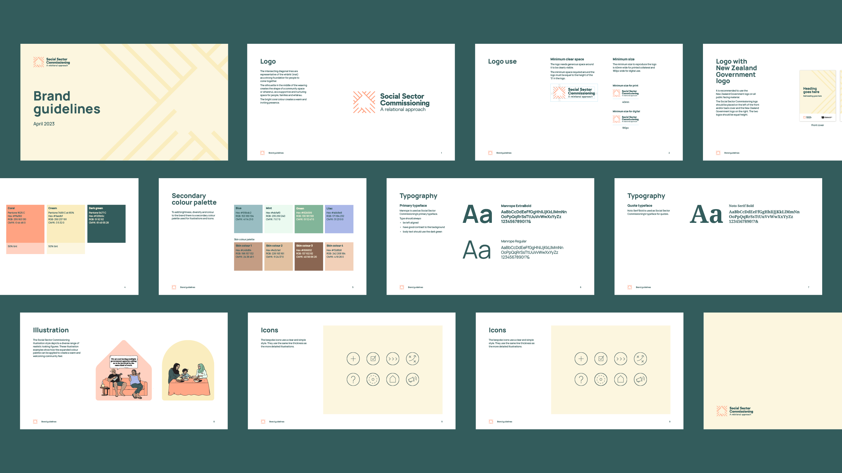
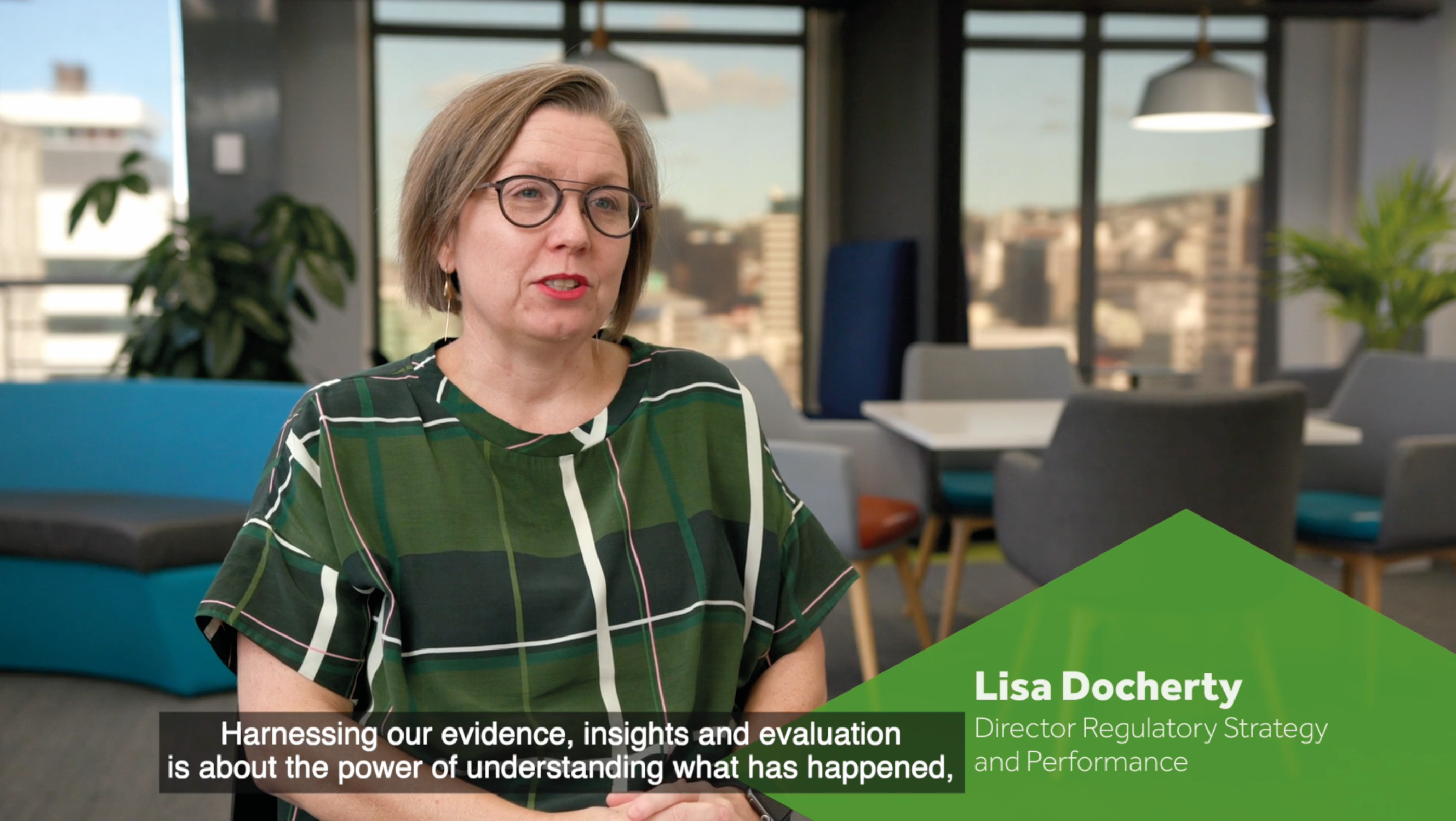
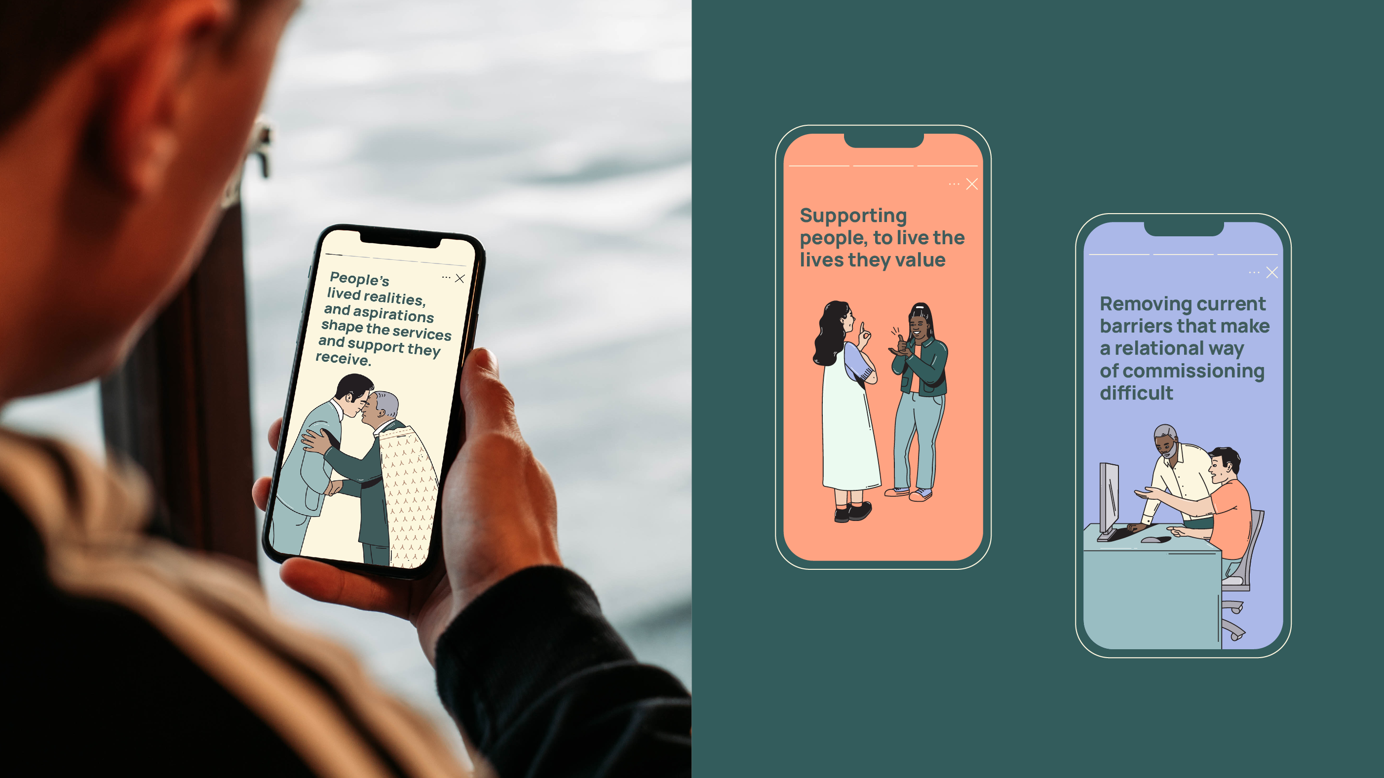
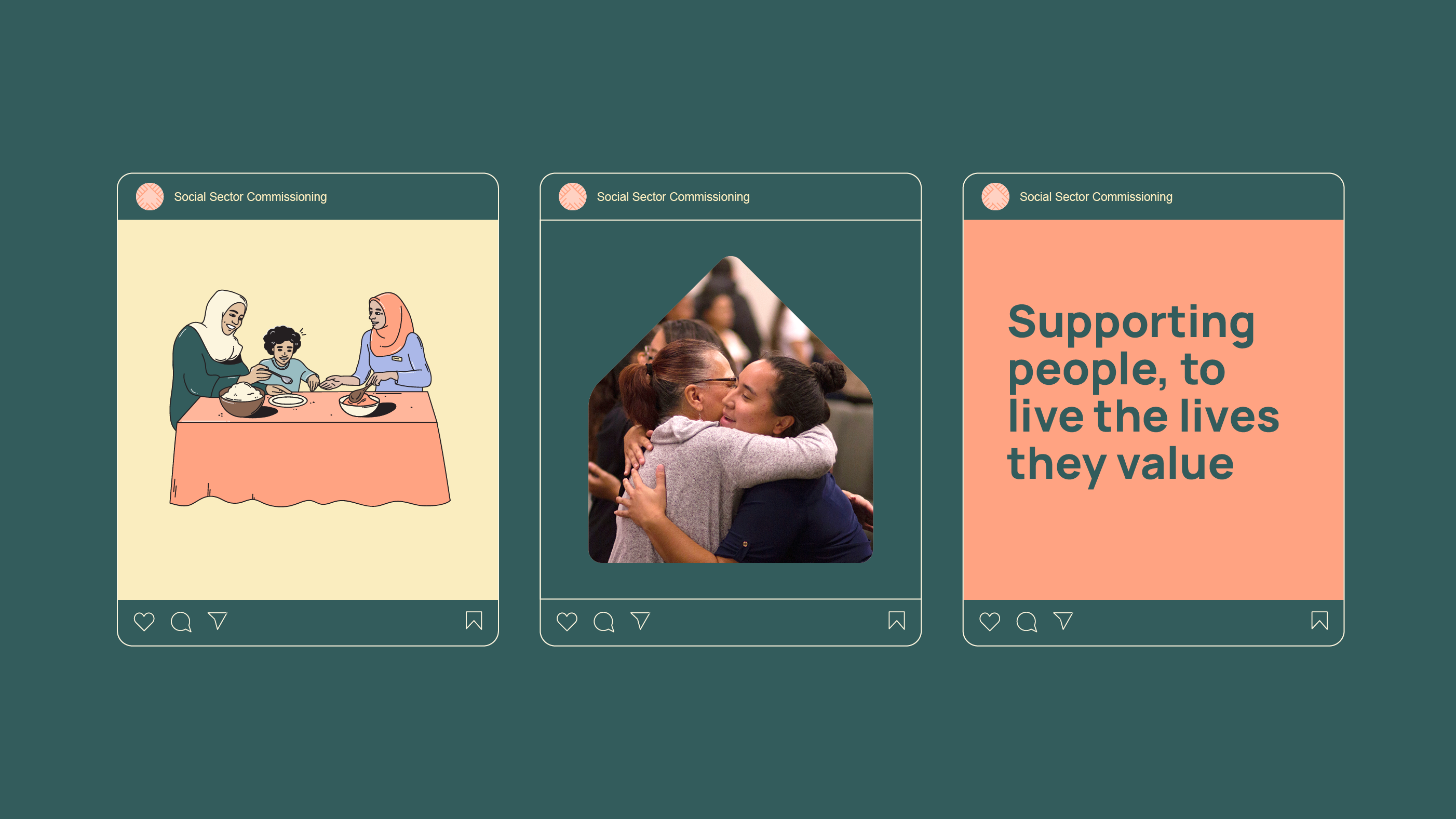
Our goal was to create an accessible and engaging document and summary for MSD that outlines the future direction of social sector commissioning. By doing so, we aimed to help the social sector understand the proposals and their implications on their work. An accessible and inviting design demonstrates the government’s commitment to take action, while infographics enhance the content and visualise key messages. These infographics simplify the complexity of the systems, making them clear and easy to understand.
The purpose of the document and summary was to set a clear high-level direction for the future of social sector commissioning. It emphasises the importance of government agencies, social service providers, communities, and other key stakeholders working together in a deliberate and transparent manner to improve the wellbeing of New Zealanders.
Collaboration for clarity:
To ensure the overall result was clear and accessible to the broad audience, we joined forces with our regular partners, plain language consultants Write, and also collaborated with professional translation services. This ensured information included across these resources could be easily shared and understood in both Te Reo Māori and English. We wanted to help the social sector understand the proposals, and any implications on the way they work, emphasising the value for everyone in the system and clearly explaining how MSD plans to achieve their goals.
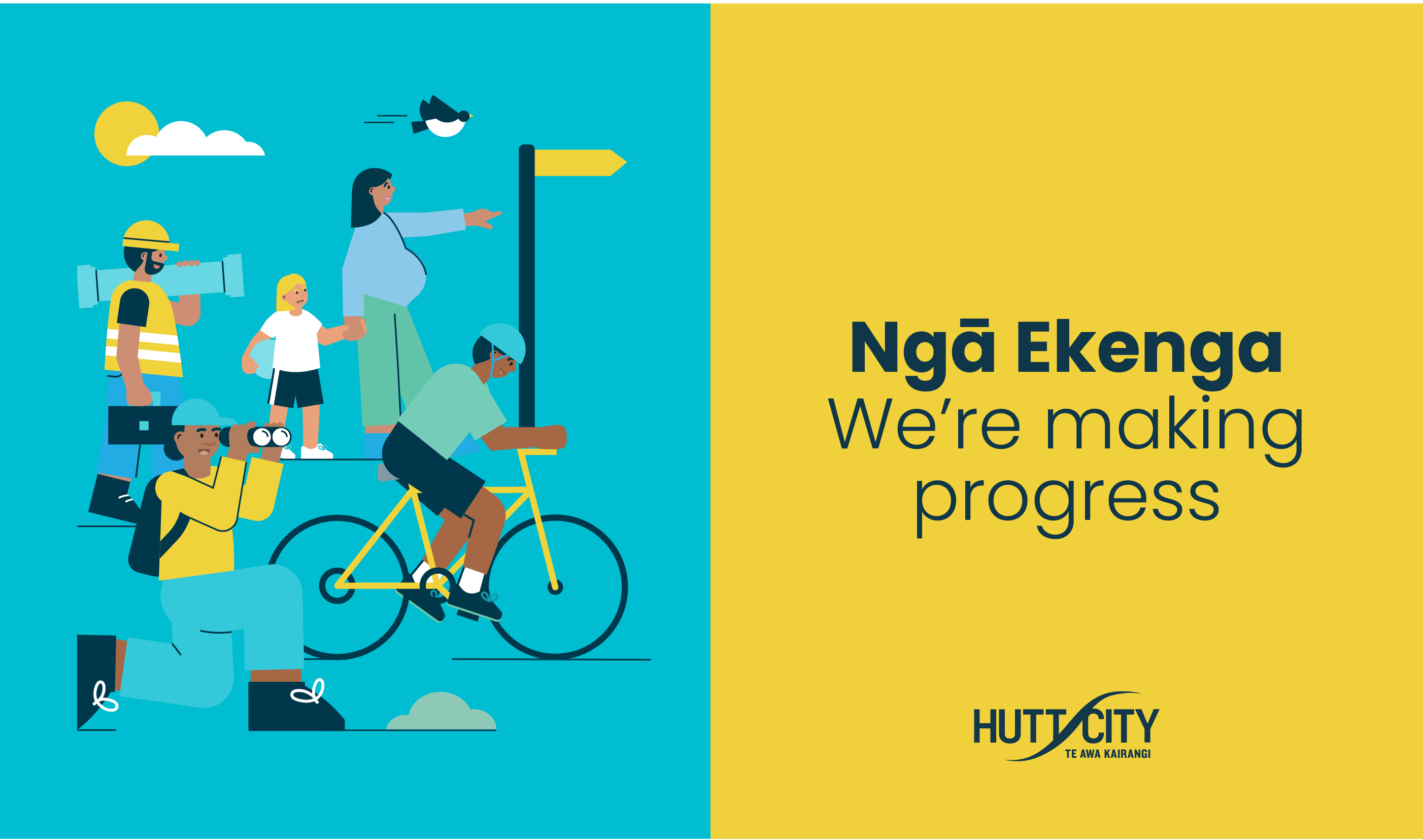
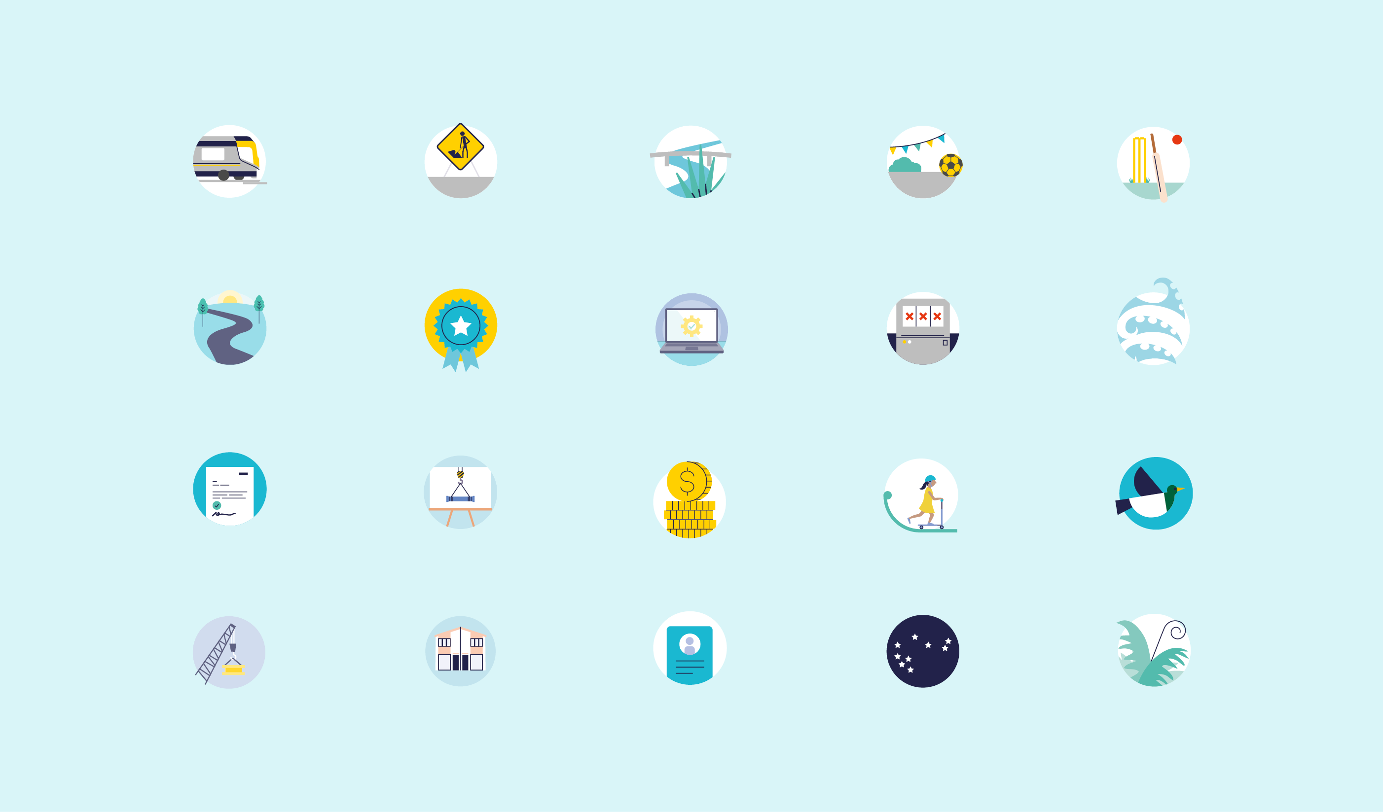
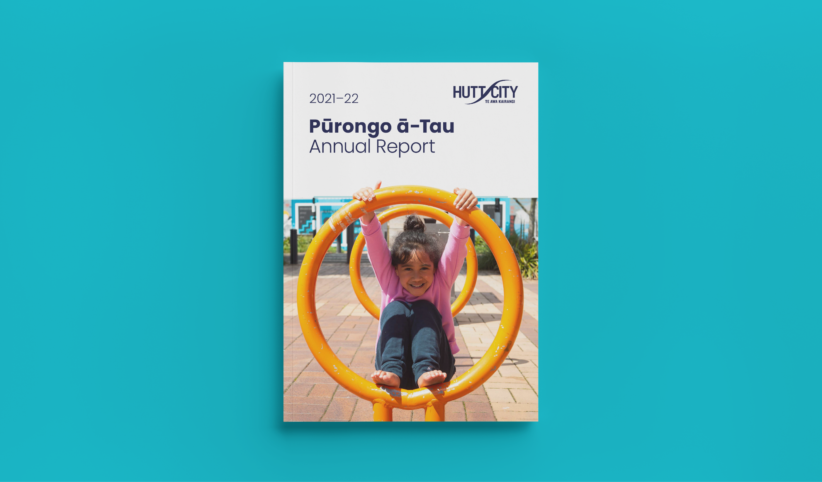
Branding the city – Visual language and information design
HCC wanted to show they were responding to the vision and aspirations of their community. Giving them a sense of the progress being made. The Annual Plan, like all the resources developed, has been created with the community in mind. Its aim is to be transparent about the council’s work, how it impacts their residents, outlining what’s next, and prompting engagement. Our visual language had to feature recognisable connections to the city and the people that live within it. The illustrations and photos included are representative of the diverse range of people living in Hutt City. Landmarks such as local shops, the Council building, even the ‘Welcome to Lower Hutt’ sign were all featured in the Plan too.
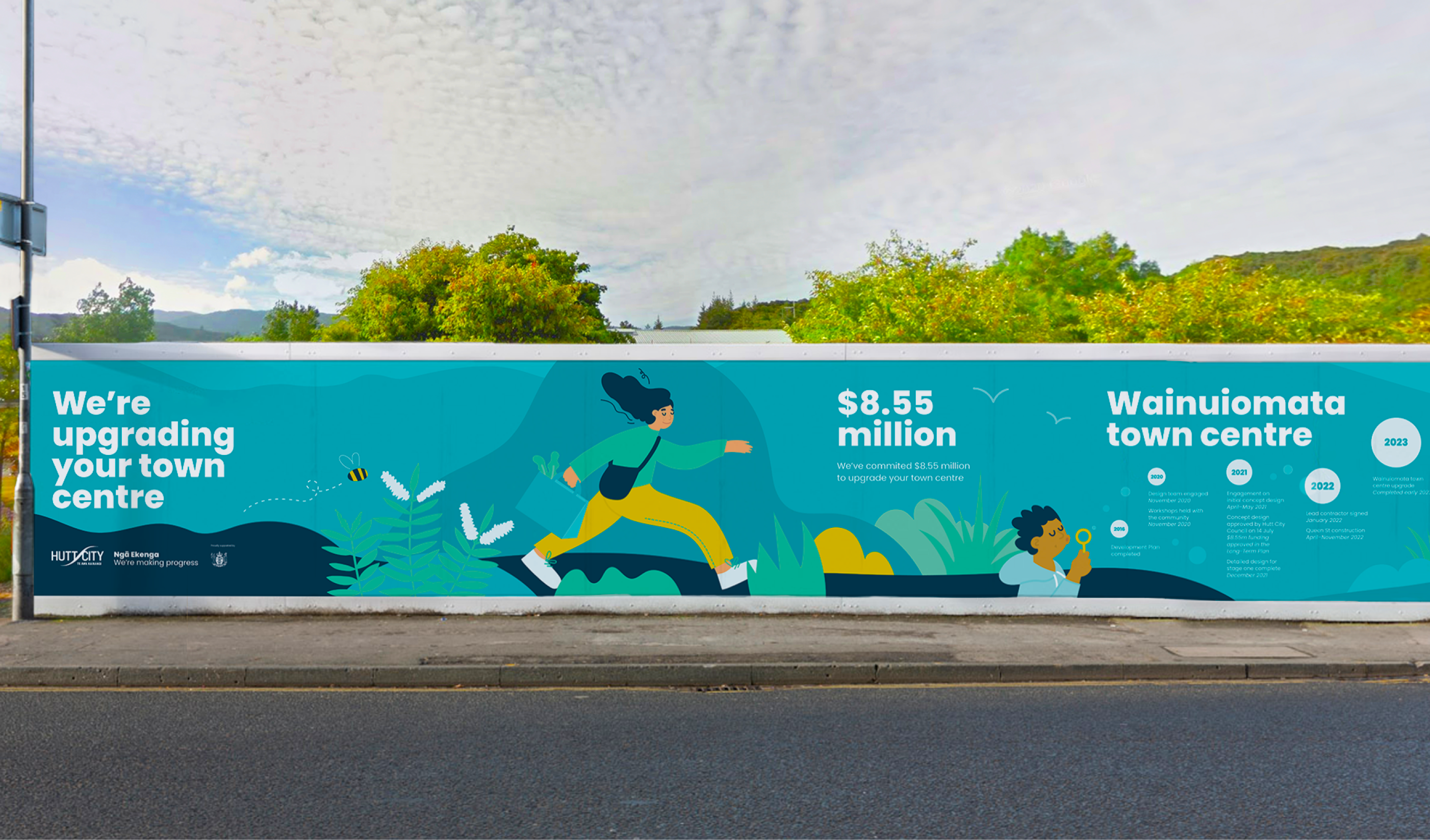
The visual billboards we designed help connect the community to the exciting HCC infrastructure projects in the works, and act as an effective way to boldly and clearly alert people to work happening in their area. Detailing in-situ; what the project is, how much money is being spent, the progress residents can expect to see, and when it can expect to be finished.
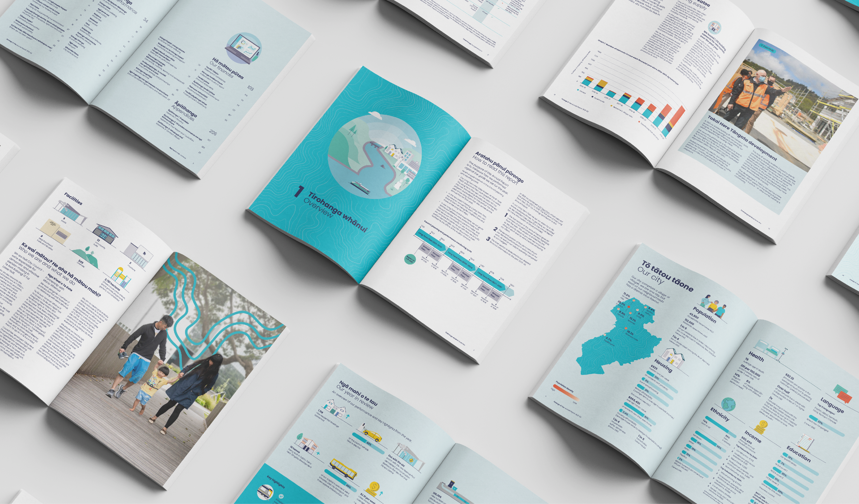
For the Pūrongo ā-Tau – Annual Report and summary we had to ensure the essential information stood out. So that navigation throughout the 200 page document was clear and easy, so HCC could effectively tell their performance story. The document needed visual design to assist in communicating the wealth of information inside. Using all the tools in our belt; a mix of photography, illustration, infographic spreads, clear design, and incorporating local landmarks and regional attributes, with a consistent visual style, we created a cohesive and engaging suite of resources for HCC that they’re proud to share with their community.
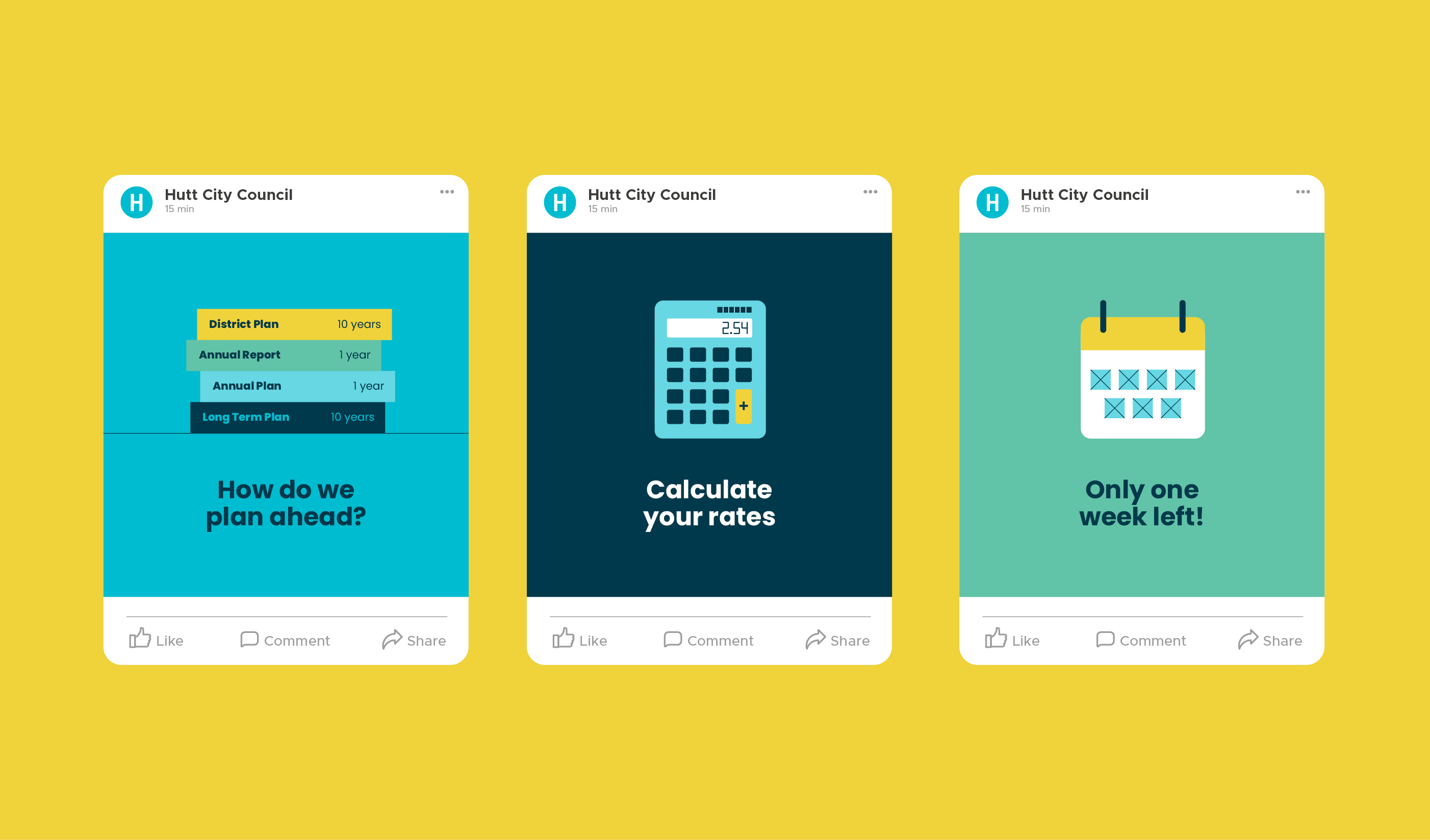
Consultation on the proposed changes to the Annual Plan was live from 31 March to 30 April 2023.
HCC published the proposed changes online, along with supporting information to help their community understand the decisions they were facing. The website was viewed by 1616 people during the consultation period.
HCC also published an online survey for our community to provide feedback on their proposals. They received 124 responses to the survey, and heard from people who sent emails and came to speak to their submission in person. They also had over 1000 people view the HCC online rates calculator to see the impact of the proposed Annual Plan on their rates bill.
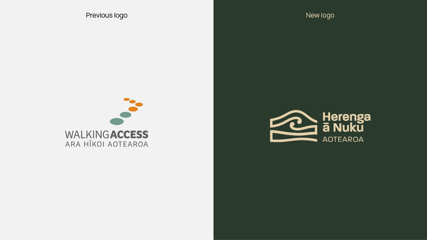
New brand creation
Neptune Explainer Animation
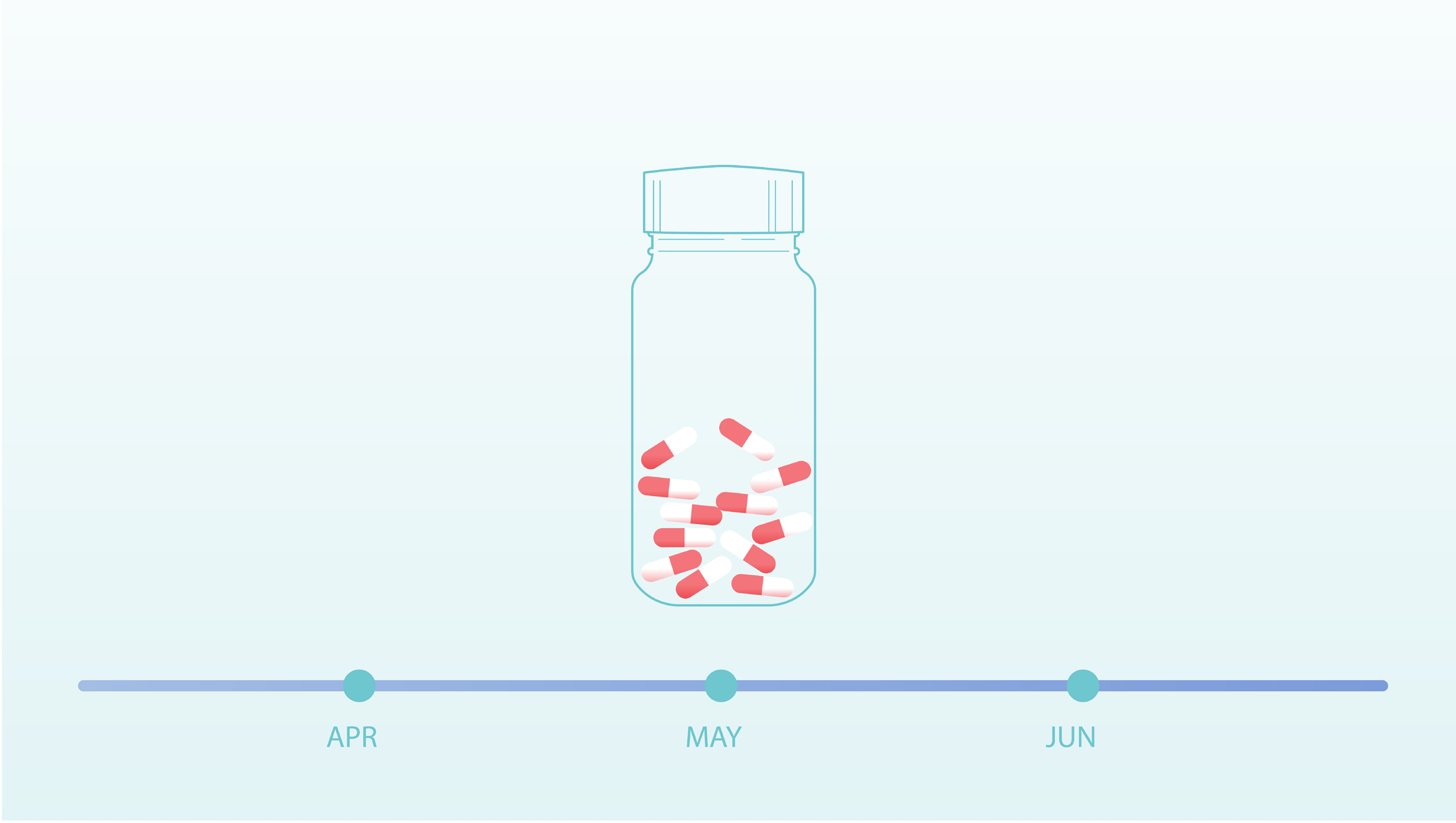
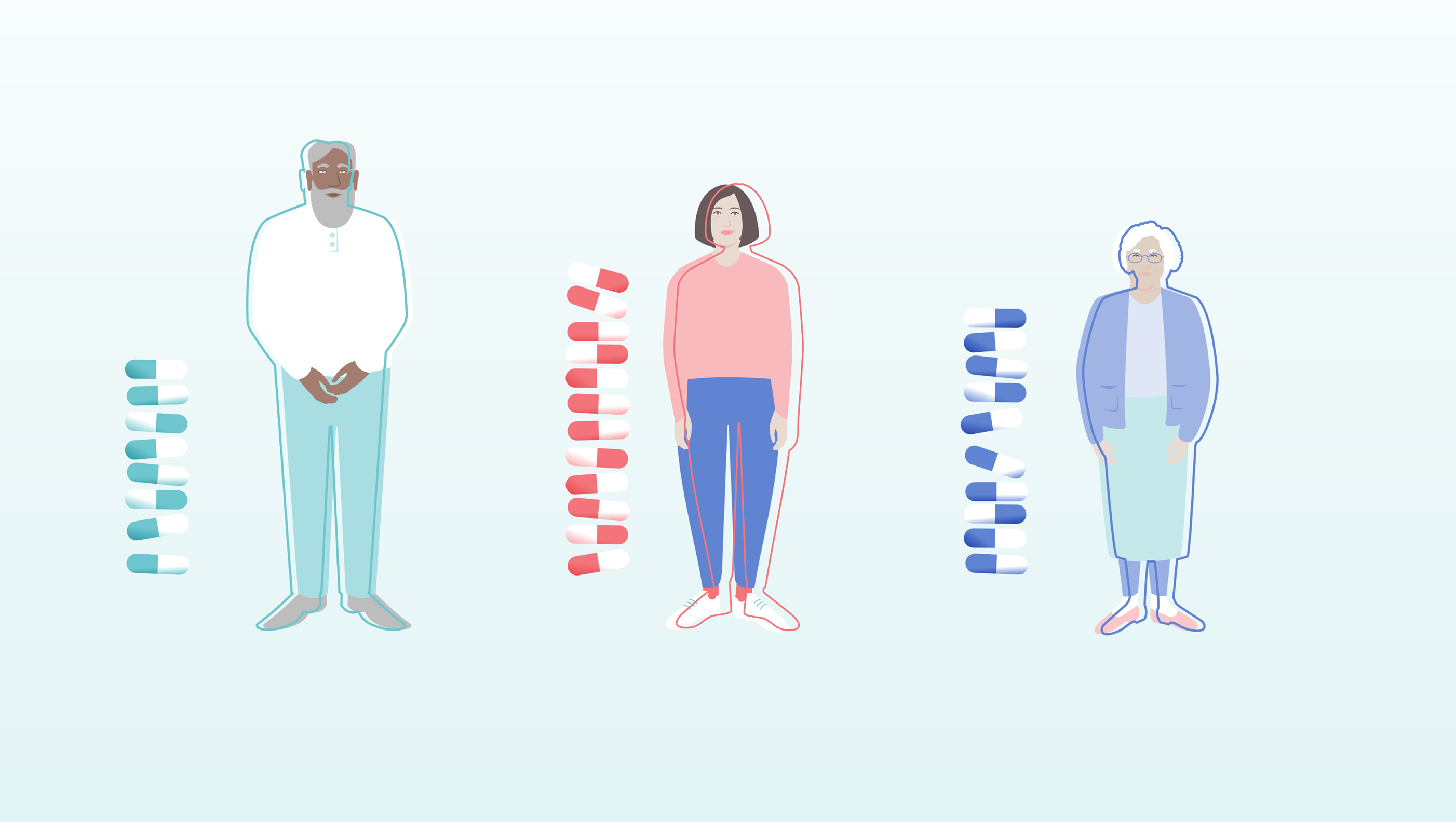
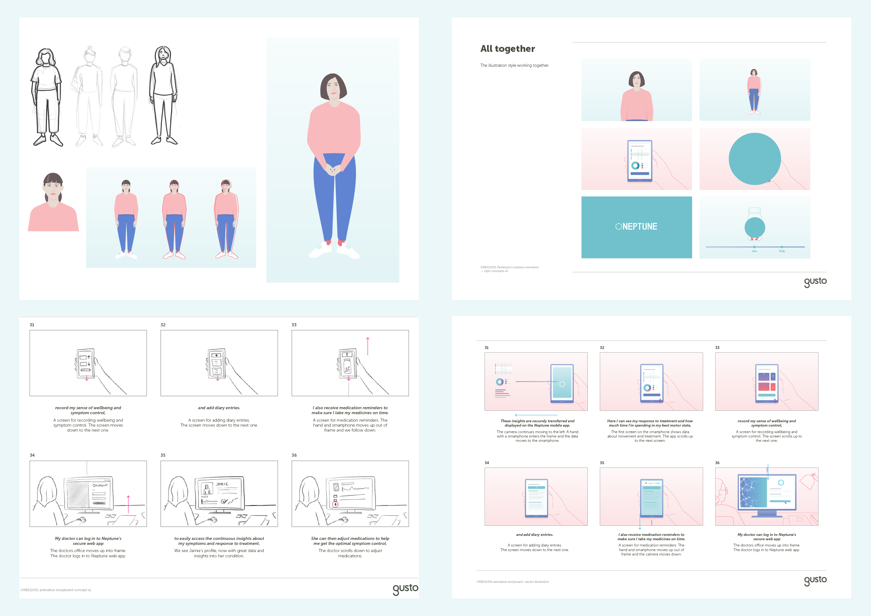
The illustration style is contemporary and clear, bringing a feeling of warmth to the use of medication and smart technology. Full colour illustrations are used to highlight important scenes, with supporting information illustrated as linework. The colours and gradients used build on the visual language established for the Neptune brand and UX design.
As the animation explains, every Parkinson’s patient is different and so too is their Parkinson’s journey. We follow the lead character, Jamie, on hers. We created a bold bright outline that moves on and off the character bodies to illustrate sensitive scenes of the experience and treatment of symptoms of Parkinson’s. When symptoms are under control, the line moves back to fit their silhouettes and fades away. Each character’s line moves uniquely to help reinforce the importance of personalisation of treatment.


This animation is an exciting extension of work Gusto has previously completed with Orbit Health. Our design of a clear and engaging pitch deck helped Orbit Health successfully secure funding from EIT Health to further their important work in digital health innovation, such as Neptune.
Behind the scenes: Our character development and storyboarding process.
Brand identity and website


Animated infographics explain how solar power works and provide their customers with valuable information on the benefits of solar power. Solar is made simple with Solarworx.

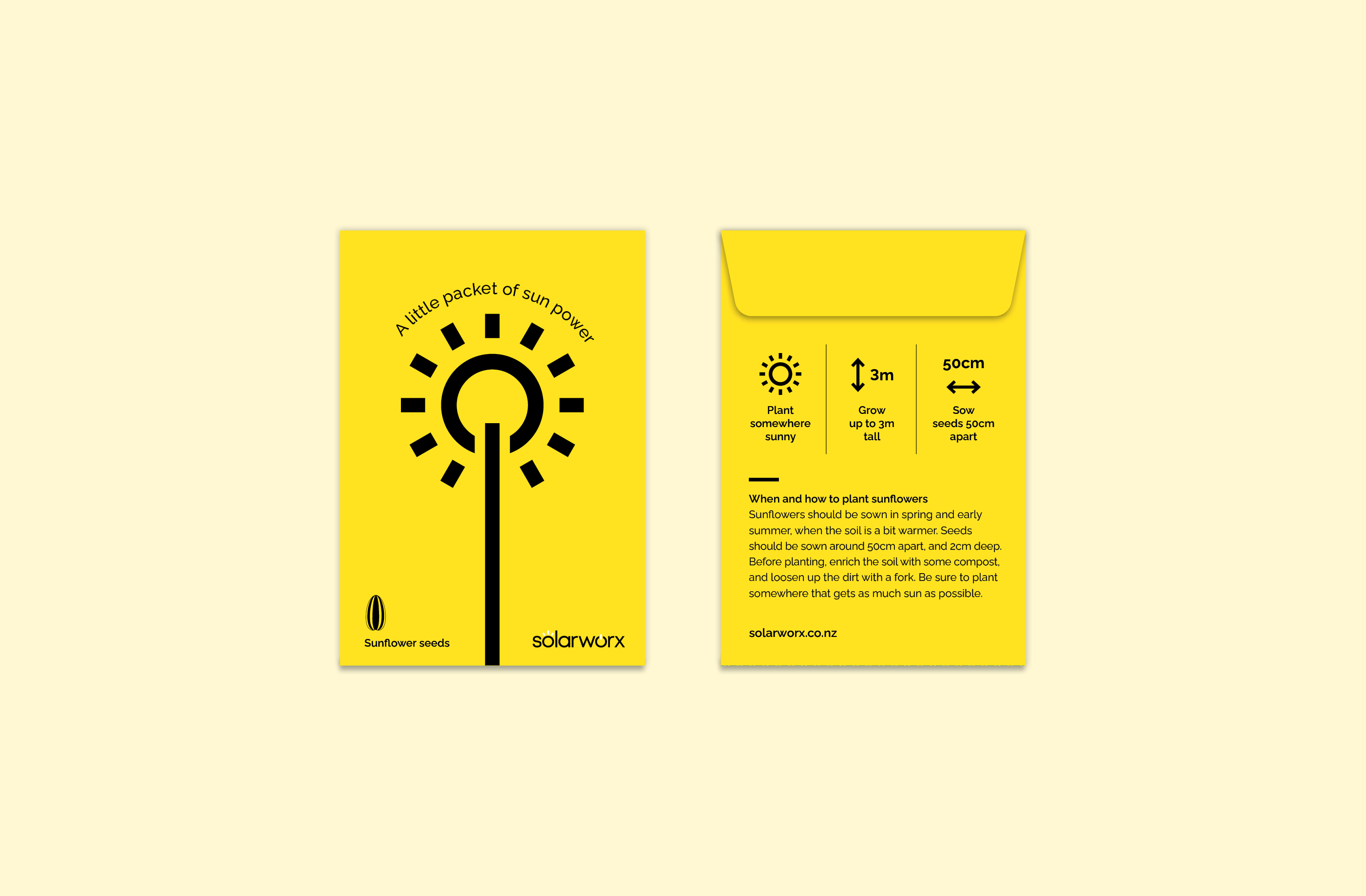
We created a sunflower seed packet as a fun giveaway item for customers that reinforces the Solarworx brand and the power of solar.

The website we designed and developed presents their unique point of difference and key messages in an environment that is easy to navigate, providing visitors with a great experience.
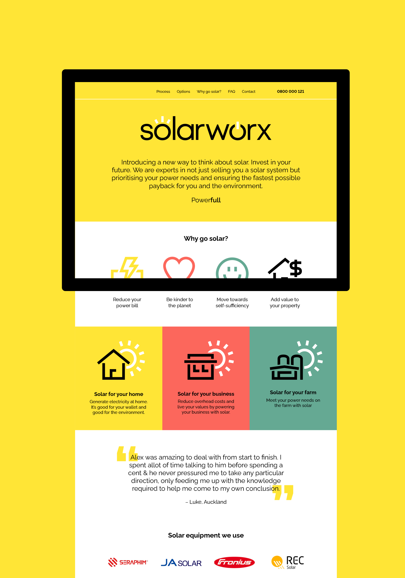
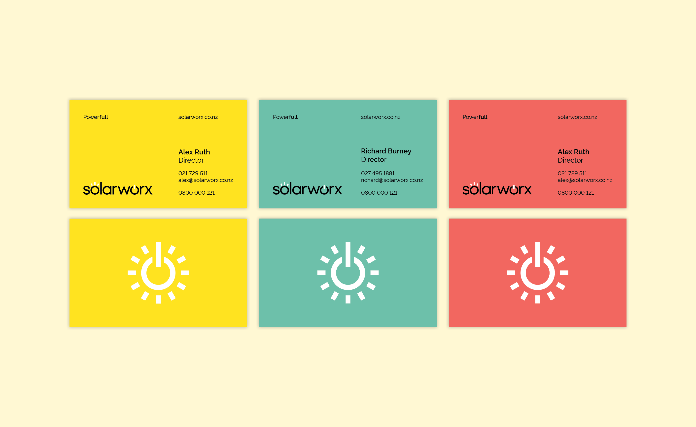
The bright, friendly brand separates Solarworx from its competitors. By using clear, easy to understand design, barriers or concerns their customers might have about going solar are reduced and Solarworx is seen as a company they can trust.
Government visual identity
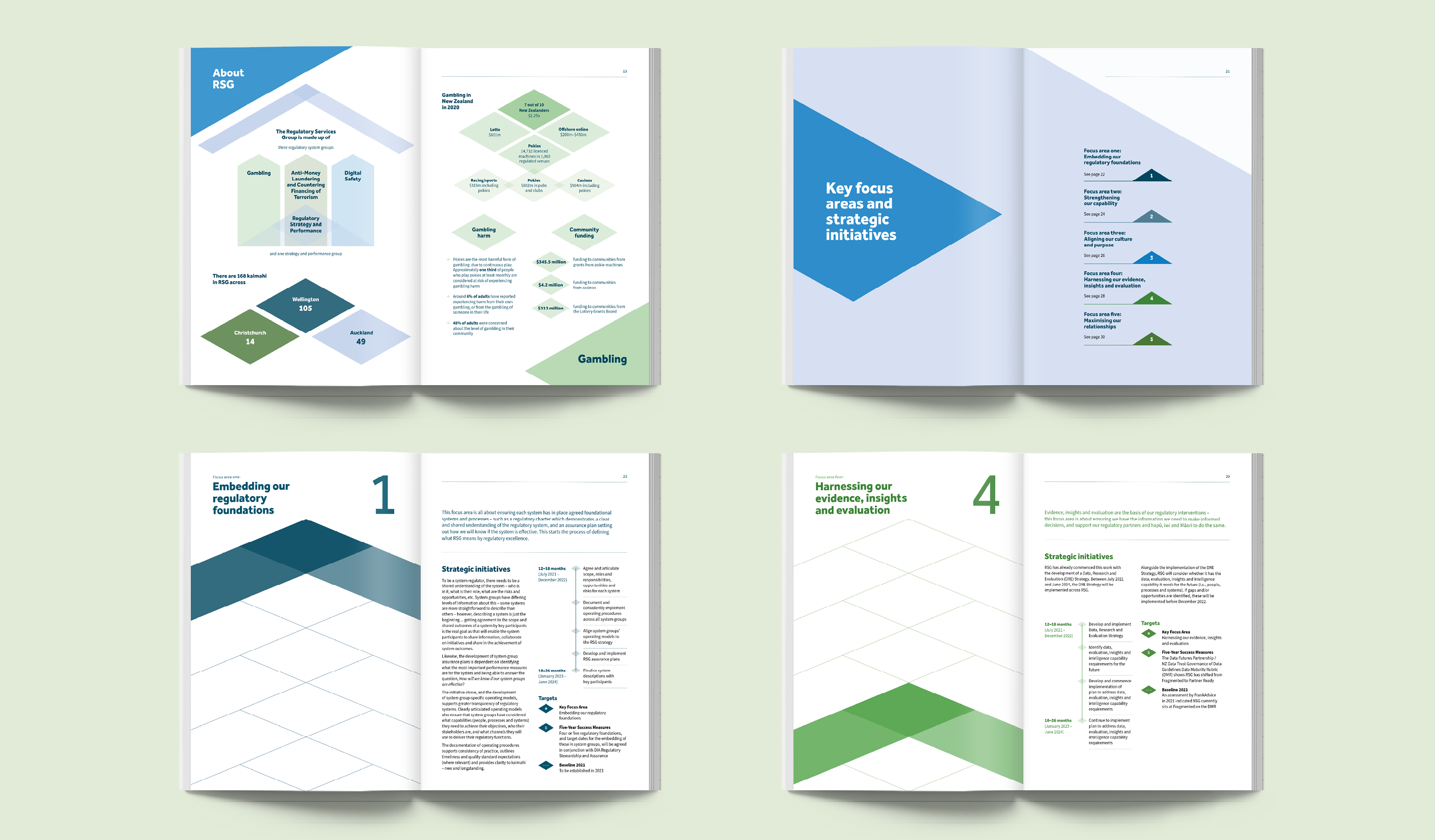
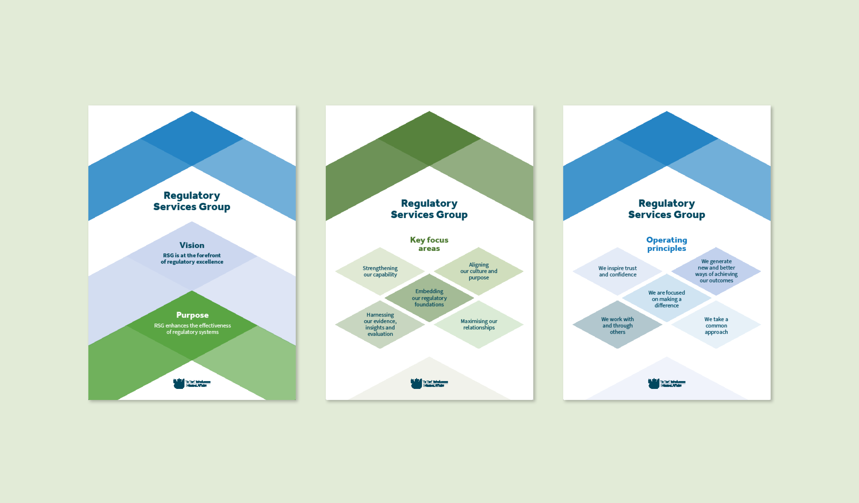
Our design concept for RSG’s government visual identity incorporates Māori design. It’s a fresh take on DIA’s raranga (weave) pattern, bringing together multiple woven strands with upward facing chevrons to signify excellence. We applied this design concept throughout the strategy document to guide the viewer through the information. Key information, such as focus areas, are highlighted. We designed a strategy-on-a-page so that RSG can quickly showcase its vision, purpose and principles. Posters for the DIA offices also share this information.
We produced a video to support the launch of the strategy, explaining RSG’s key focus areas. The design of the graphics connect directly to the strategy document, giving consistency for the audience.