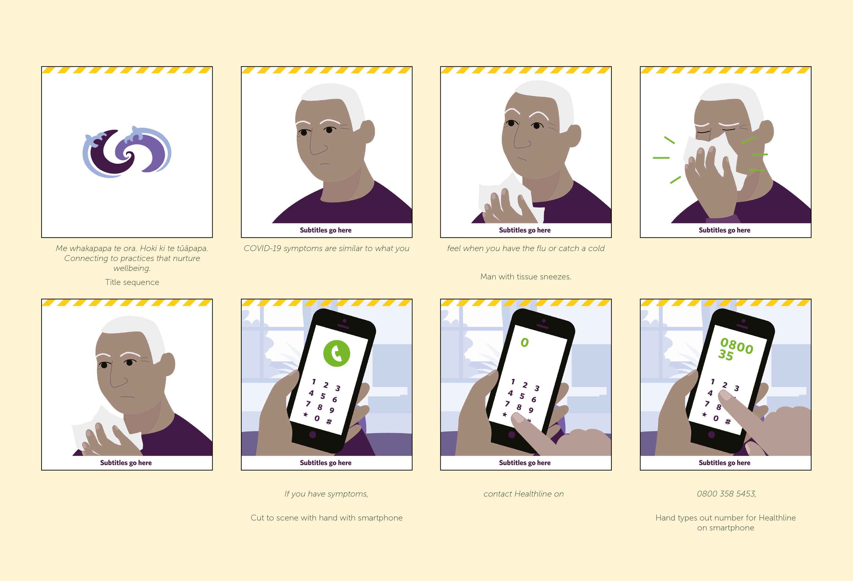
Hoki ki ngā tūāpapa – Back to basics animation campaign series
We created a beginning sequence using NDHB’s gifted Ngā Tātai Ihorangi branding to frame each message. Another familiar detail you’ll spot throughout these animations is the yellow COVID-19 branding. We used this as a transition device for the end sequence, ensuring people connect their broader wellbeing and the COVID-19 response.

The peppy voiceover and music track was repurposed from a recent radio campaign. It helps drive the animations along at a quick pace.
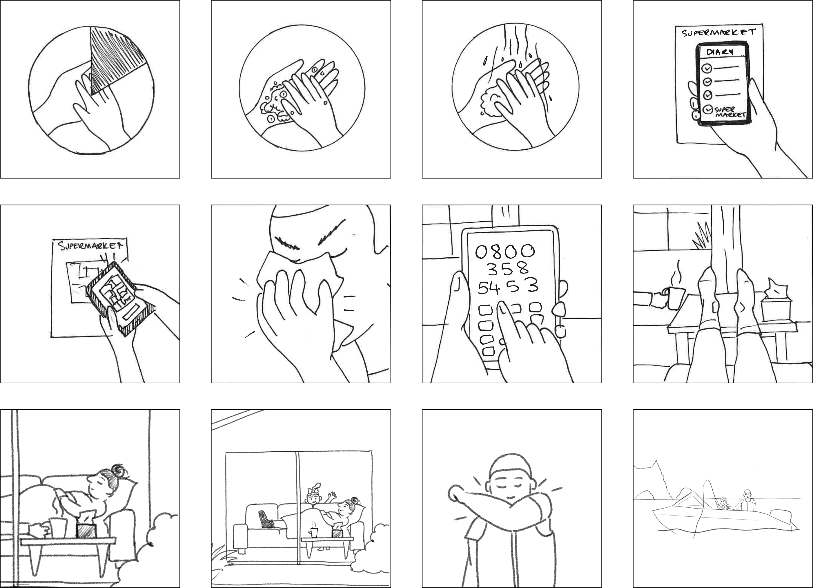
A selection of initial sketches for the storyboards
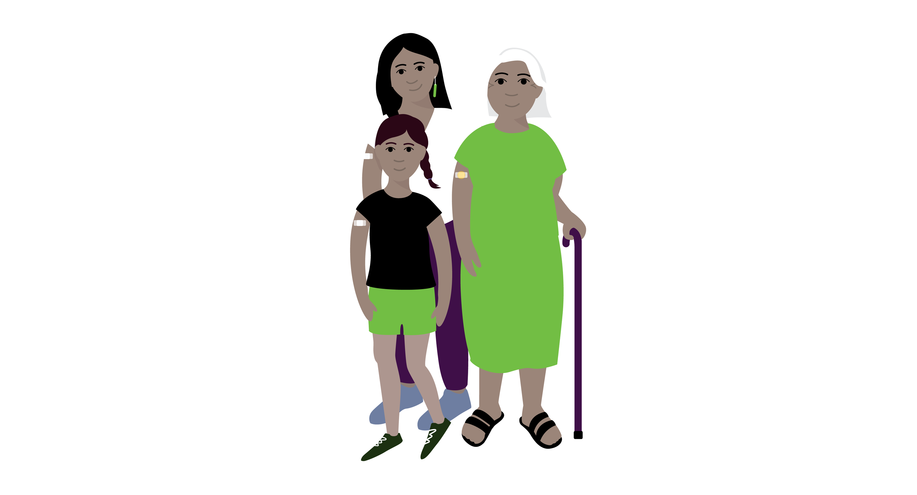
Character style concept design
For this project we also created fully illustrated storyboards to help the client visualise the animation
Northland District Health Board feedback:
“Throughout the process, the team at Gusto were excellent to work with, and they have done a great job. The design team members used their initiative and offered creative solutions, which has resulted in the production of six 30-sec animations for broadcast on digital platforms.”
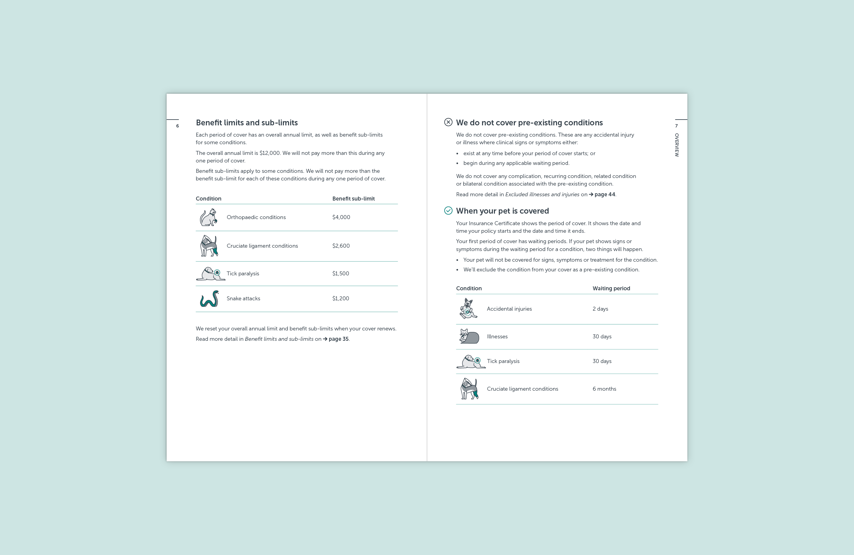
Pet health insurance policy document
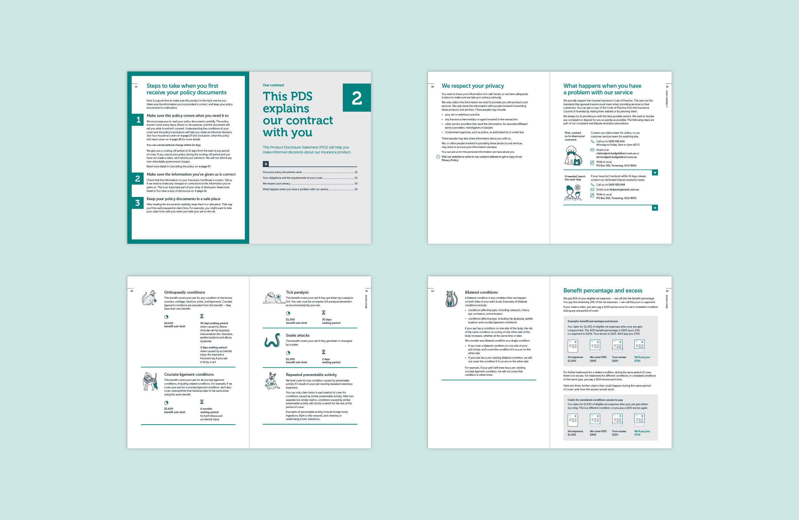
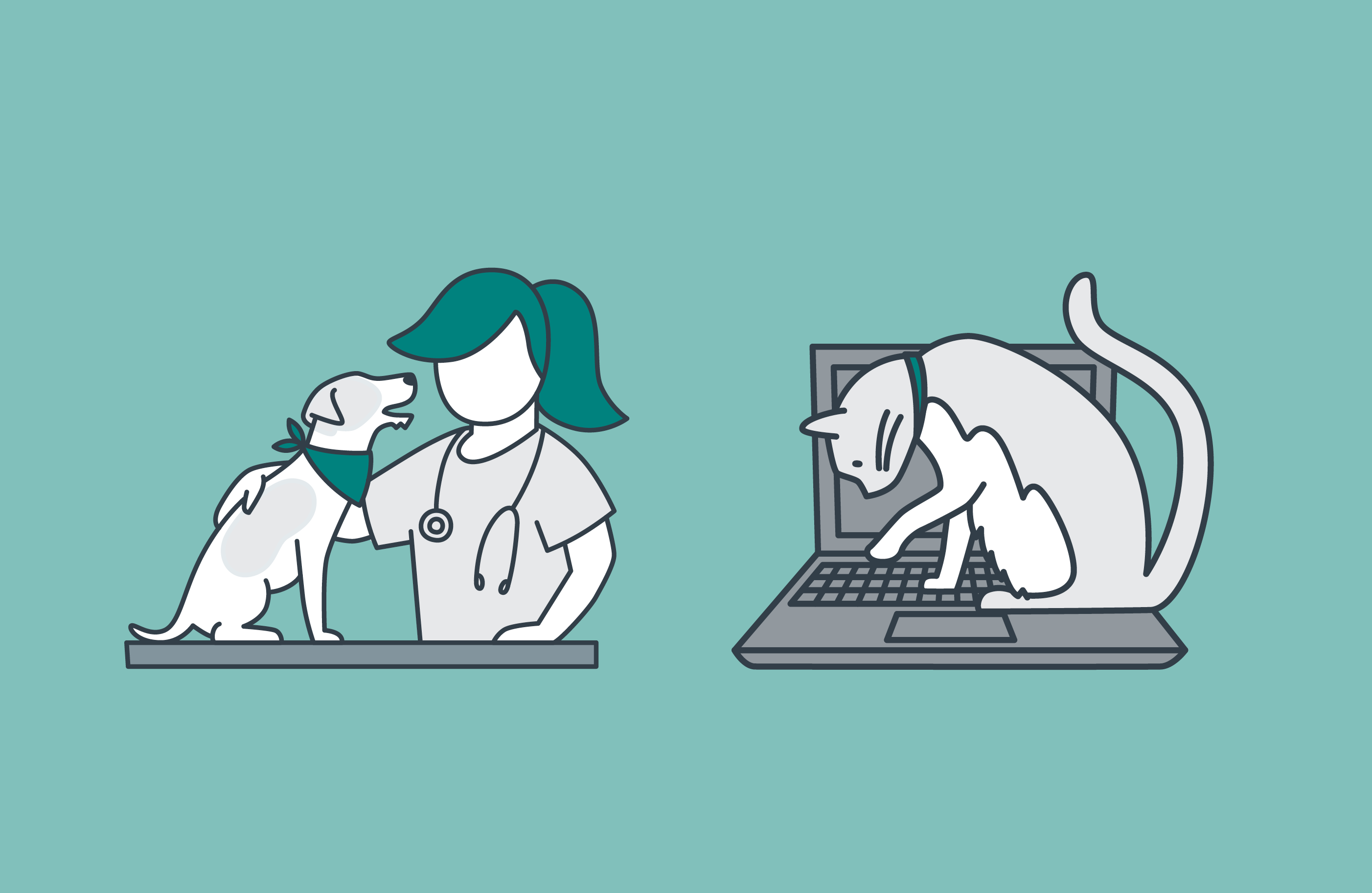
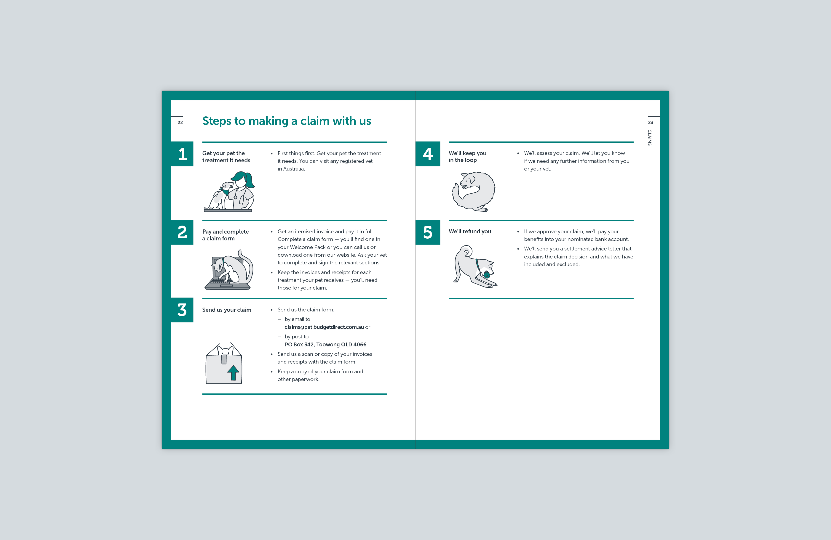
Infographics and illustrations will support the content and help to explain common customer trip ups, and communicate exclusions transparently.
The straightforward and clear design provides customers with peace of mind that they have chosen the right health insurance for their pet, and that it will meet their expectations if they ever need to claim.
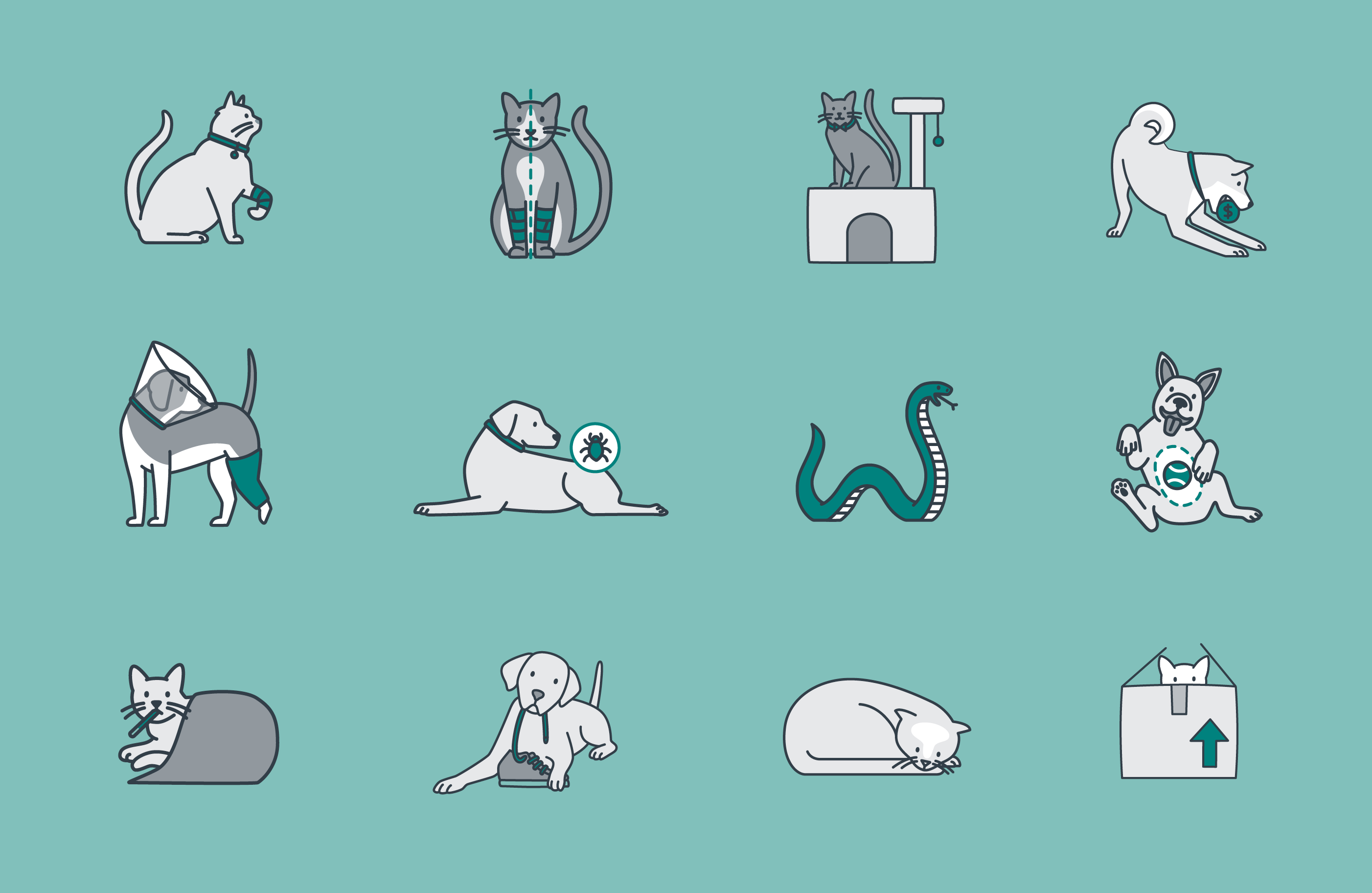
We worked closely with Write to ensure the pet health insurance policy document achieved the WriteMark Plain Language Standard.
View the full policy document on the Budget Direct website.
The Hidden Cost of Healthcare Infographic
#MakeItTheNorm Campaign animation
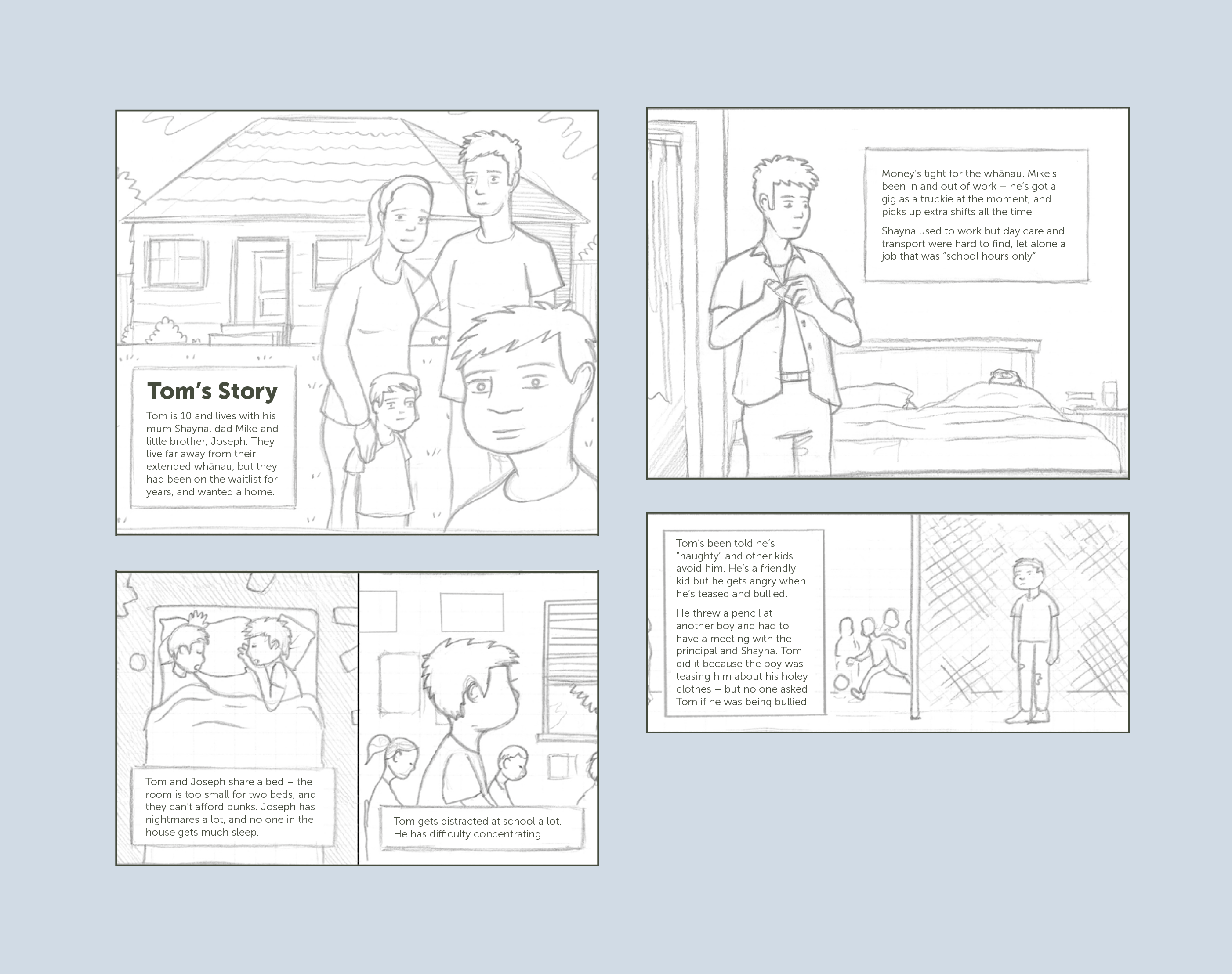
Inspired by the work of Toby Morris, we created a scroll-through animated illustration to be housed on their website. Using a graphic novel style, our illustration shows the experiences of Tom and his whānau. The illustration tells the story of how inequities in housing, school/work and whānau wellbeing impact on health outcomes.
We compiled the scroll-through as a series of gifs. These are used individually on RACP’s social media platforms as links to view the main story on the website. The imagery created for the animation is flexible in style so can be used across a variety of media.
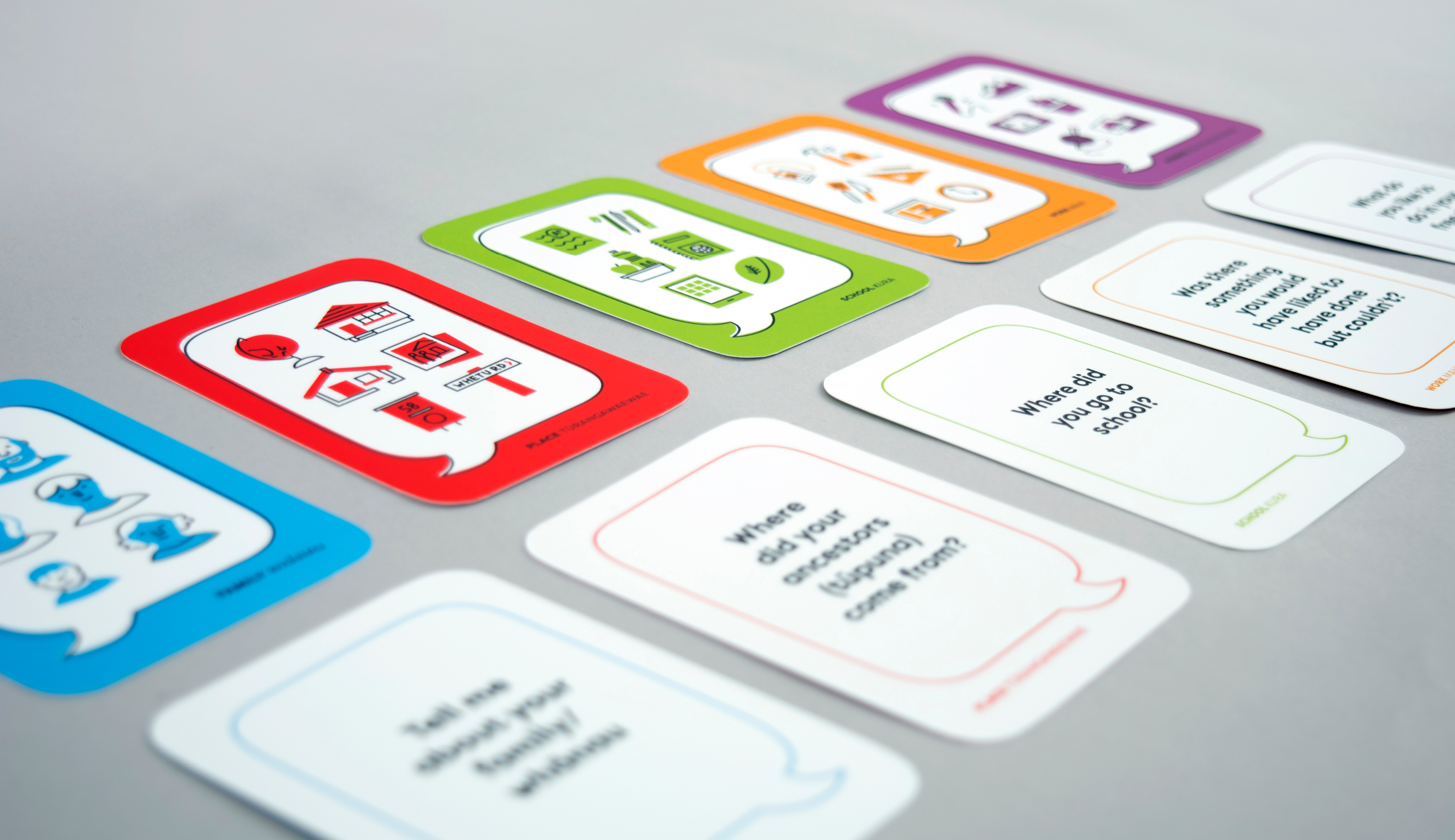
Kōrero mai ki ahau conversation cards
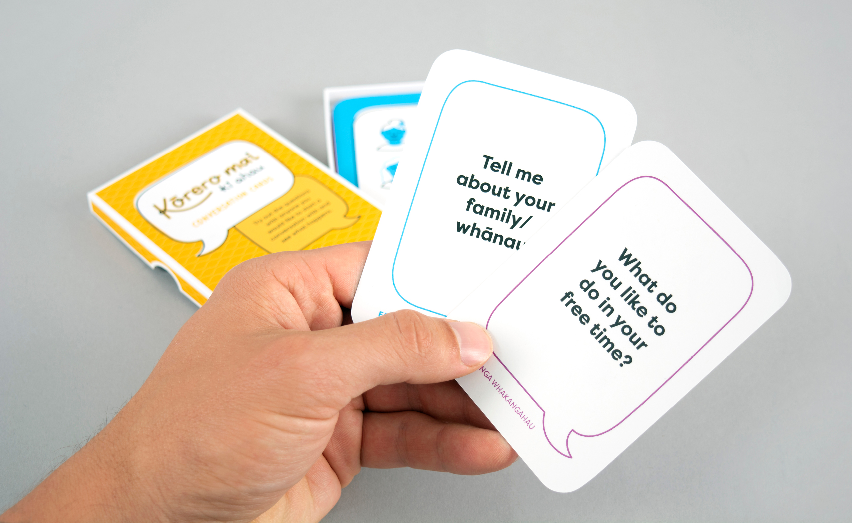
The cards are a prompt to try out questions with anyone you would like to start a conversation with. They cover five different categories: family/whānau, place/turangawaewae, school/kura, work/mahi, and hobbies/nga whakangahau.
We visually distinguished each category using a unique bright colour and illustrations. We used a hand-drawn illustration style to create a human feel, since these cards are about interaction between two parties.
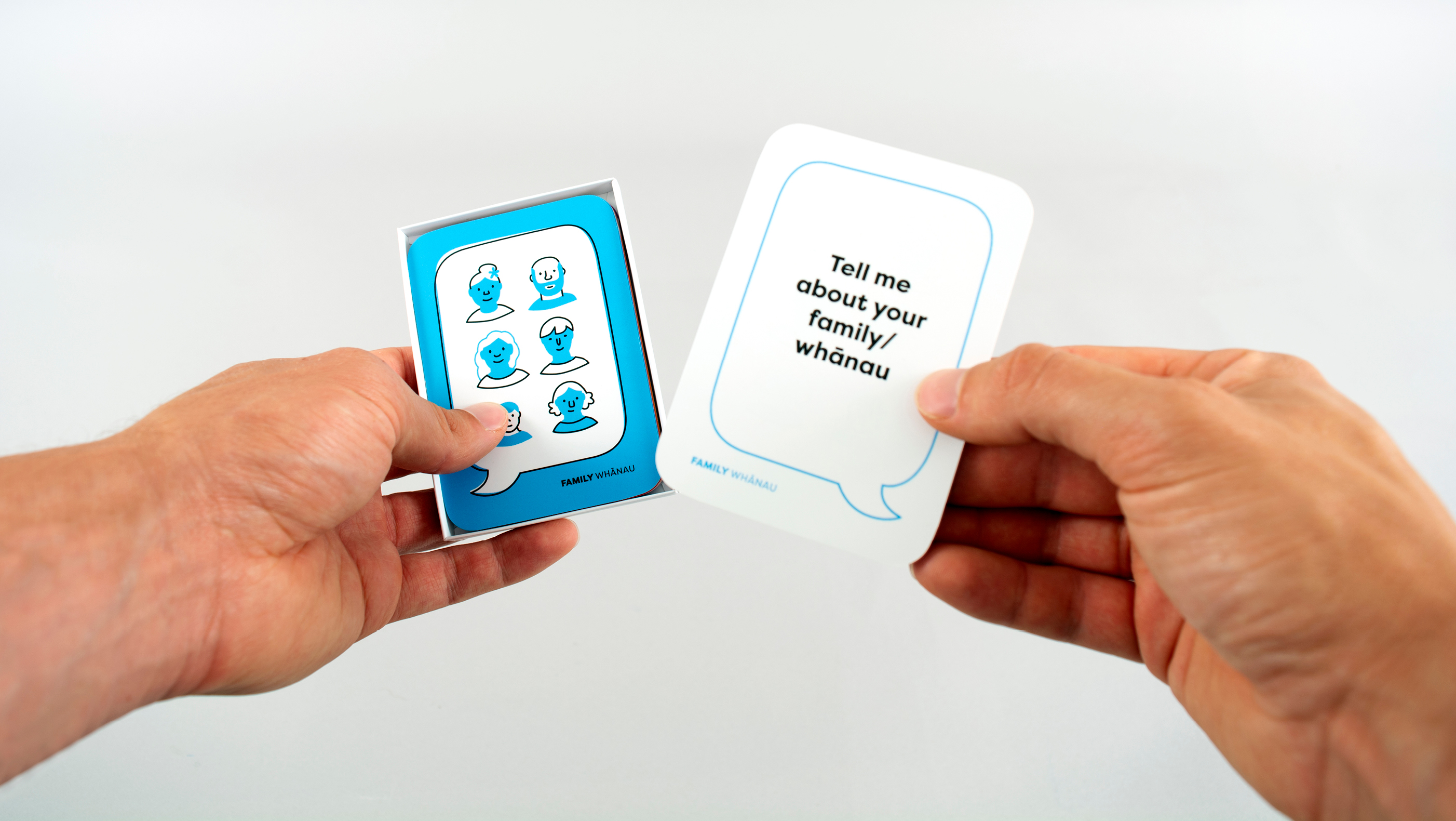
This special printed resource was unveiled at the Hui Fono event and will be given away at other Year of Lifelong Learning events throughout the year. The cards have already received great feedback on social media and people are eager to order their own packs to get the conversation started! The cards help people engage on a deeper level so they can learn from one another and build community.
Feedback from ACE Aotearoa:
‘The team at GUSTO were able to help us shape Kōrero Mai ki Ahau – an idea that came out of a concern that people need to “rediscover the art of conversation” and develop highly sought after soft skills. We were also thinking about the need to connect with elderly people on a deeper level and create a space where they might be encouraged to talk about early life experiences. We will be promoting the resource at the upcoming Gerontology Conference in April. The project was delivered with a small budget and in a very tight timeframe.’
Our story
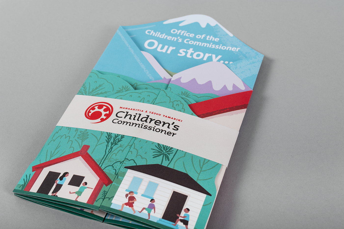
Our concept for the design was to create an unfolding diorama of a New Zealand landscape filled with information about OCC’s work so far and their goals for the upcoming year.
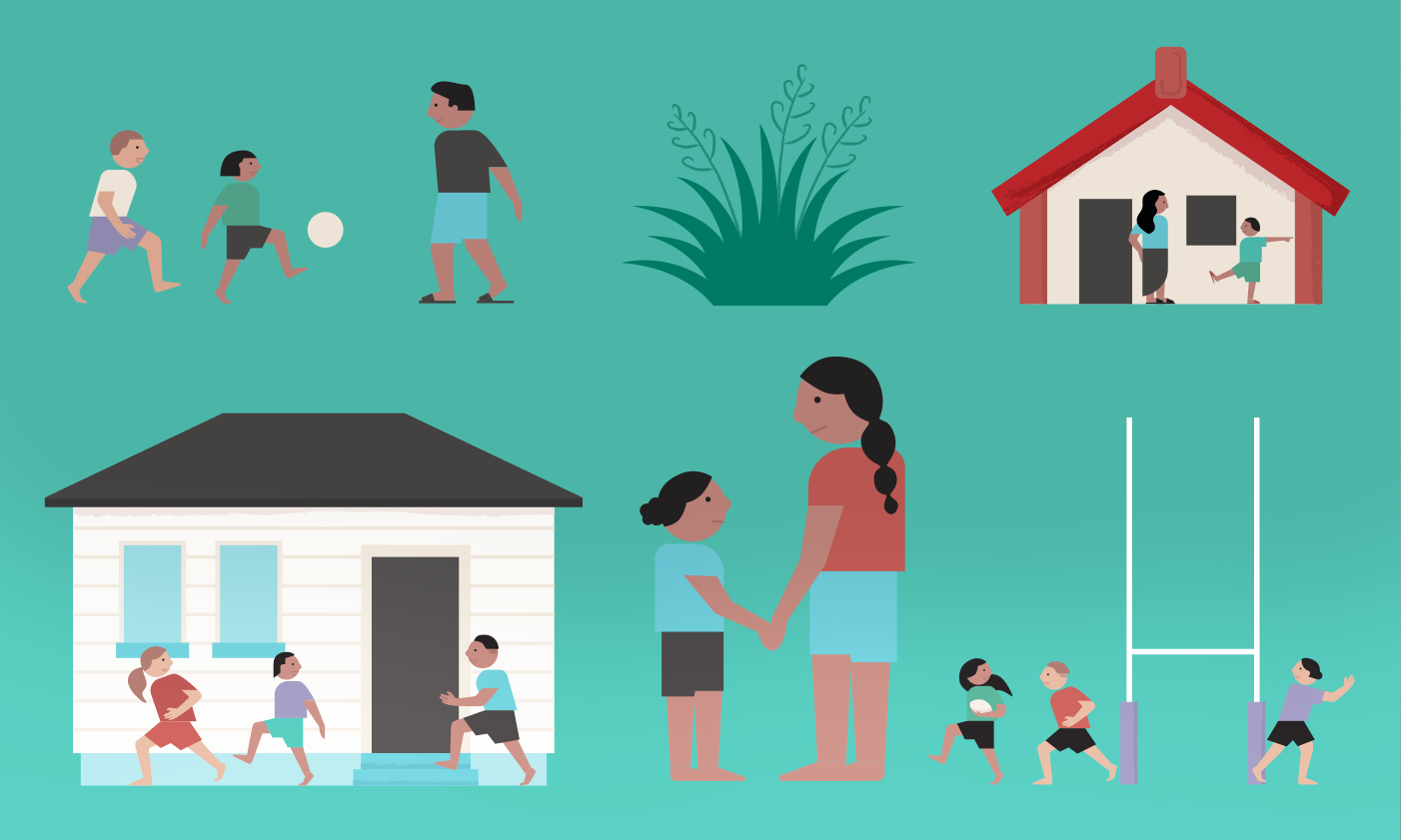
Using the OCC brand palette we developed an illustration style that showed kiwi kids doing a variety of activities, and included distinctly New Zealand background details.
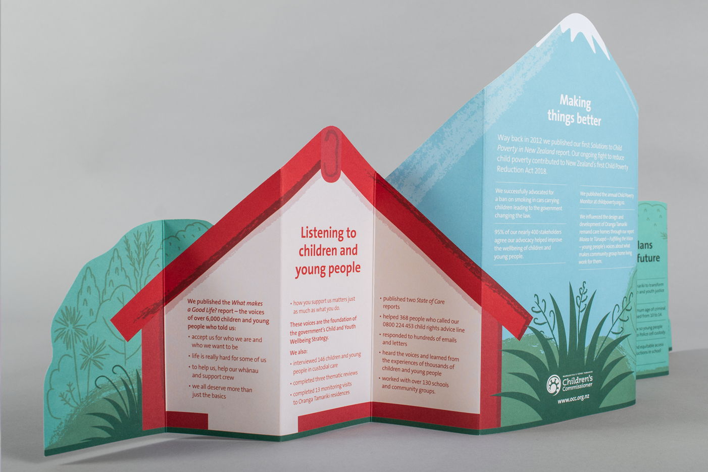
The design worked as both a small self-contained layered scene as well as the large diorama, allowing it to be displayed in two different formats.
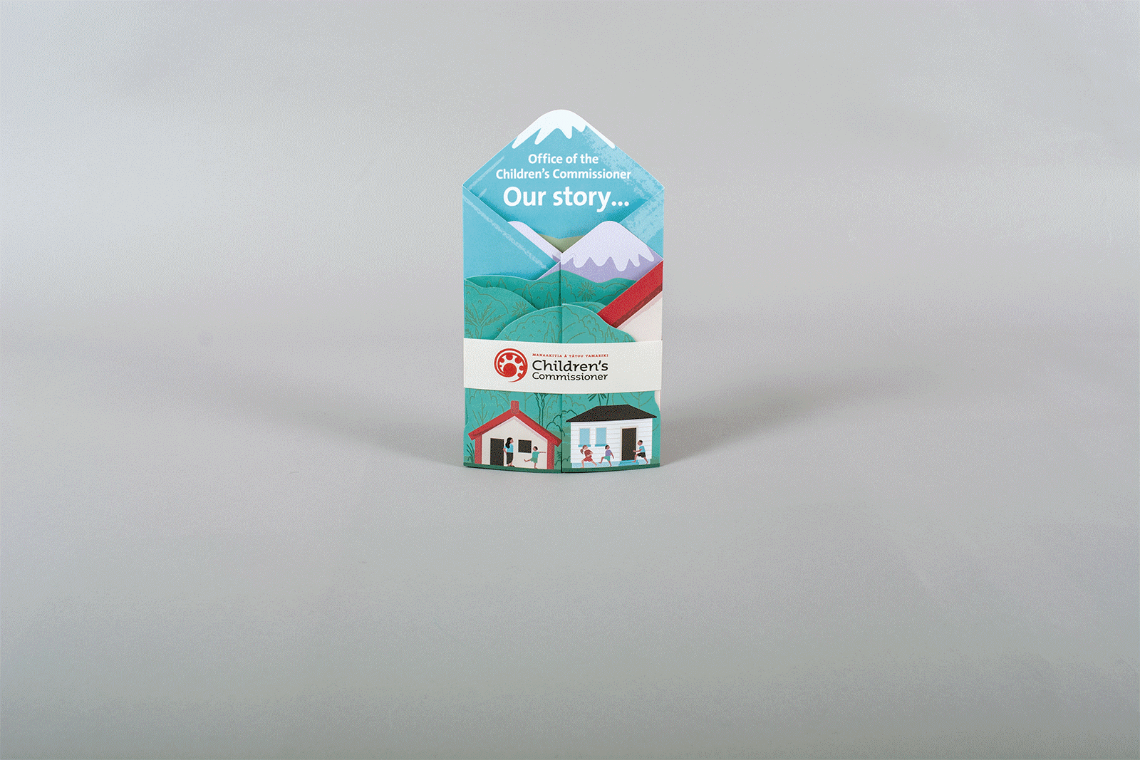
This job was a great way to explore the possibilities within the perimeters of brochure design and create something unique to the OCC brand. The final result was a design that OCC were proud to have part of their ongoing work for New Zealand children.
Office of the Children’s Commissioner feedback:
‘Your design team simply ‘got it’ right away and distilled our ideas into a beautiful and effective piece of storytelling. We love what you have created for us and it’s been a seamless experience to work with you.’
Future state illustration
FoodHQ is an innovation hub for food technology and agricultural businesses that combines the best in science, education and business. FoodHQ asked us to create a ‘future state’ illustration to bring their vision to life, to help attract grants and funding.
The illustration places Food HQ at the intersection of four distinct themes, a central hub for these diverse activities.
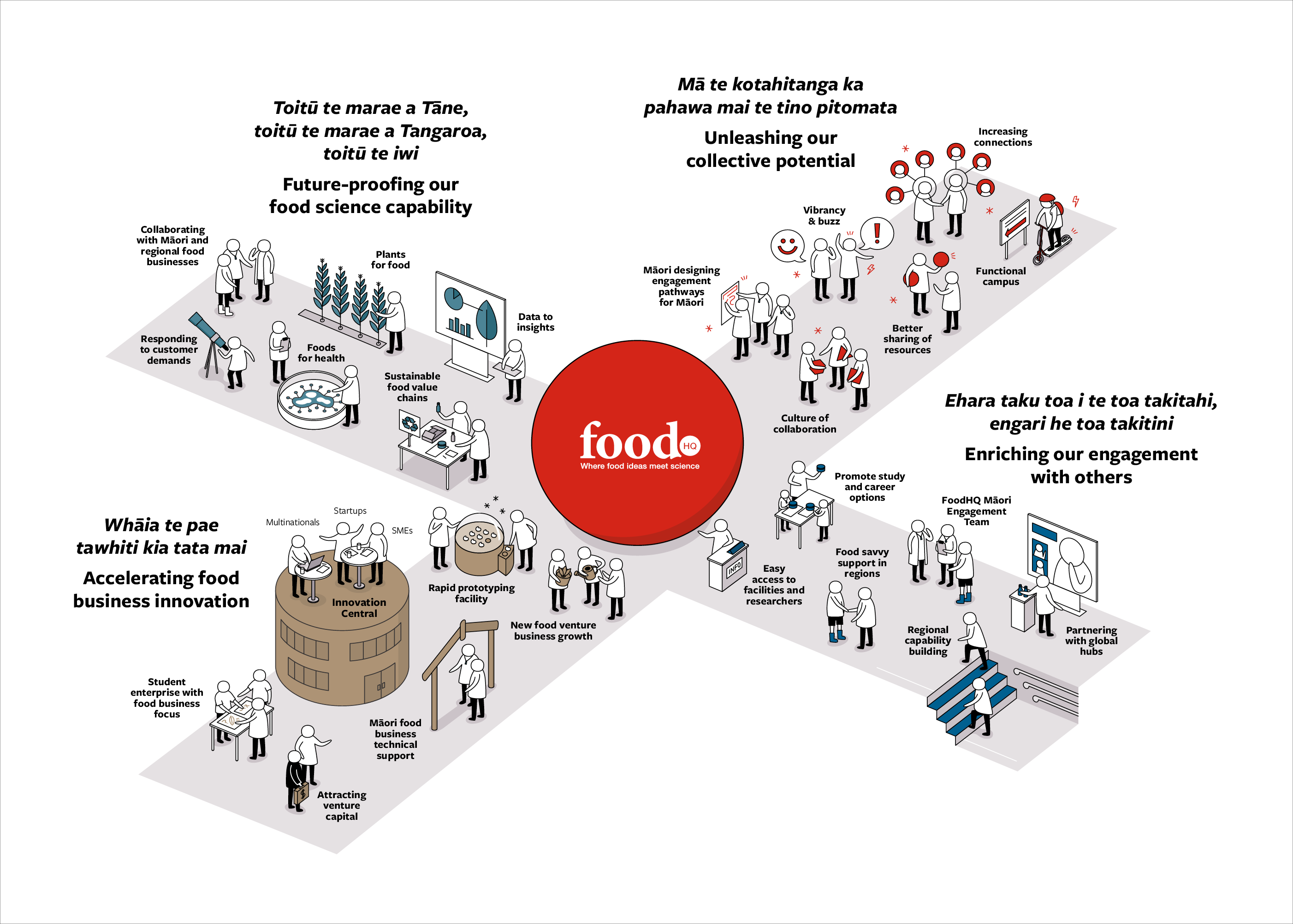
We began by working through sketches and developing each component, finding the best way to express each activity, before working up the final illustration. The characters are a step up from stick figures – non-specific yet full of movement and personality. We created a world for them using the FoodHQ brand colour palette, implementing it to help differentiate the varied roles within this collective of NZ companies, research and educational institutions that FoodHQ supports.
Here’s a time-lapse video showing the refinements and iterations we made to get to the final illustration:
Group Plan

We worked closely with WREMO to develop infographics that elevated the content and did not lose the intention of the text – often with infographics it can be tempting to take it too far and obscure the original meaning. We began with rough sketches of ideas for each infographic to quickly see what was going to work or not work before working towards the polished final versions.
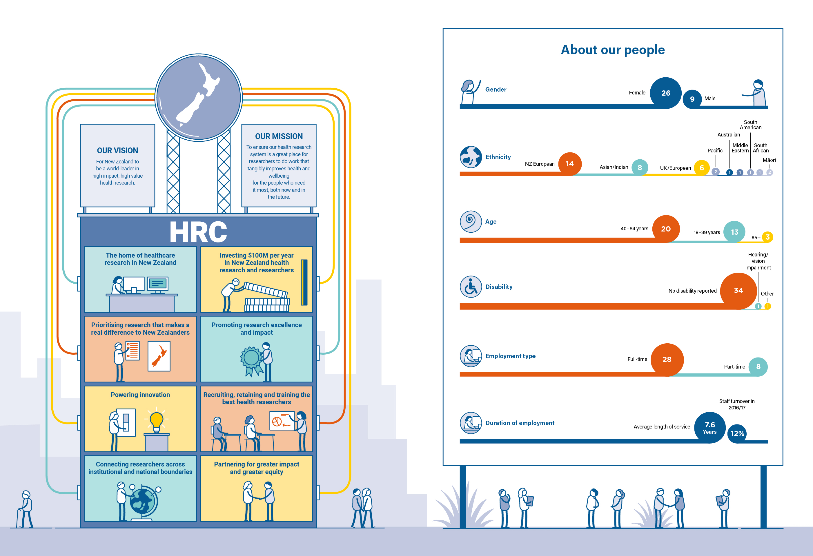
Annual Report
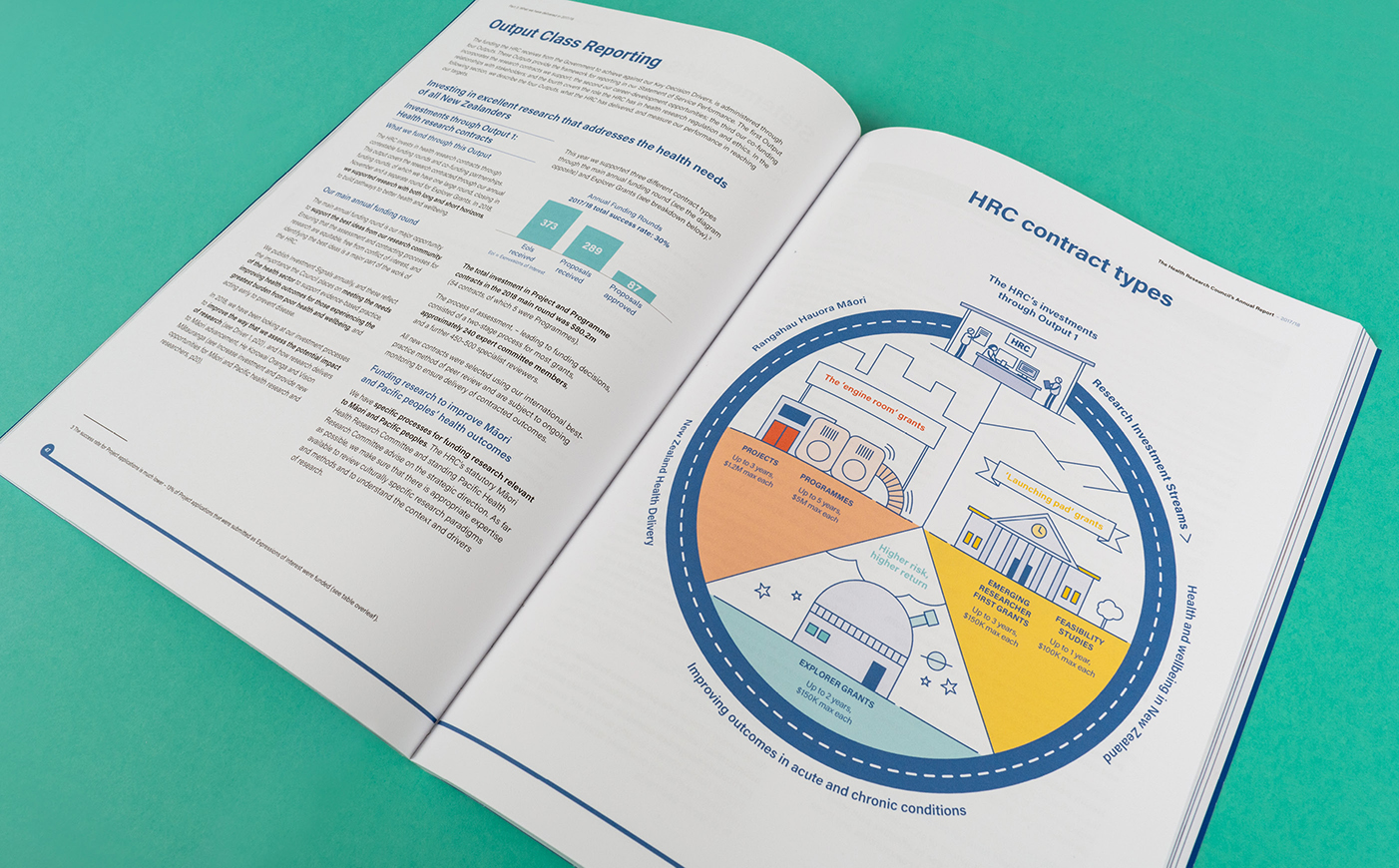
We decided to depict HRC’s infographics as actual physical systems which enabled the reader to instantly recognise how elements connected, flowed and benefited communities. We built an illustrated world from the colours, fonts and style of the HRC brand, injected with a story and visual interest that would engage the reader at both high and detailed levels.
![]()
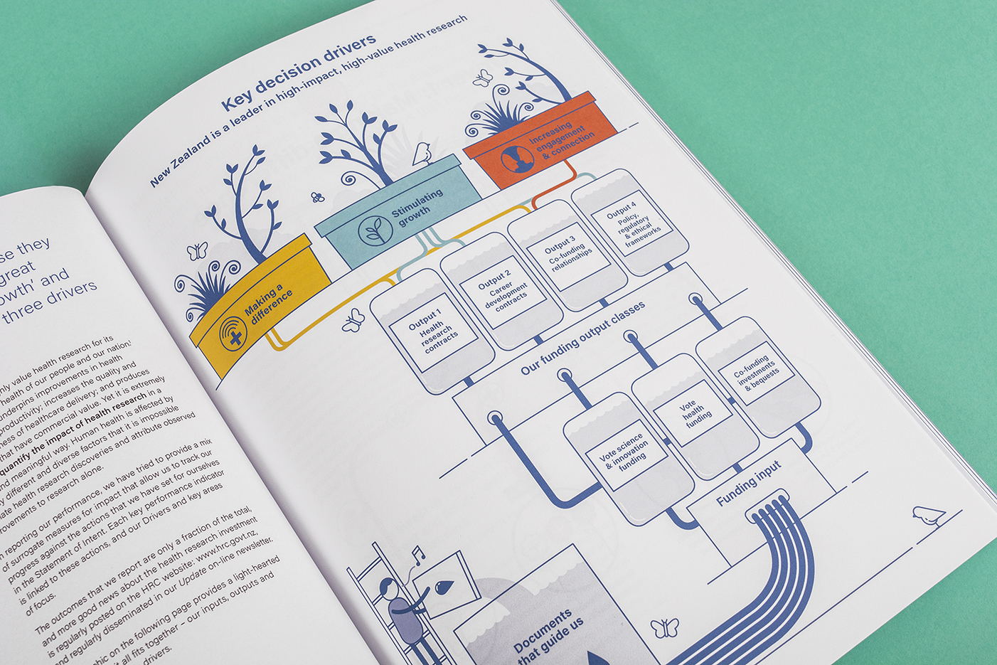
The outcome of the project was the creation of a unique and fresh suite of infographics and publications that established a new style, connected with the audience, and helped expand HRC’s brand personality. As well as making the annual report more engaging, the infographics can be reused in various formats to help HRC continue to tell their story of supporting the health of New Zealanders.
Feedback from Health Research Council of New Zealand (HRCNZ):
‘Working with Gusto has opened my eyes to the value of engaging a graphic artist to bring complex ideas to life. Gusto took our boring schematics and created fresh, modern images that conveyed our messages in a fun and really original way. Combining these with a fresh and modern layout delivered a document that is so much more impactful than we could have managed alone. The Gusto team are incredibly professional and flexible, working to time frames that we thought would be impossible. It was a pleasure to work with them.’
Infographic suite
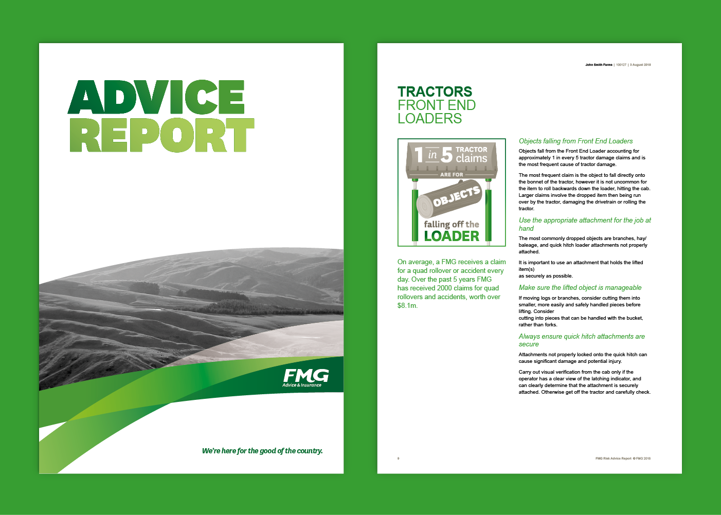
Being that FMG’s reports are discussed with the client face-to-face, the introduction of these illustrative infographics were designed to help prompt discussion. Pieces of important information have now been given much more attention, further clarifying for the client the relevant risks and data around their farm and household.
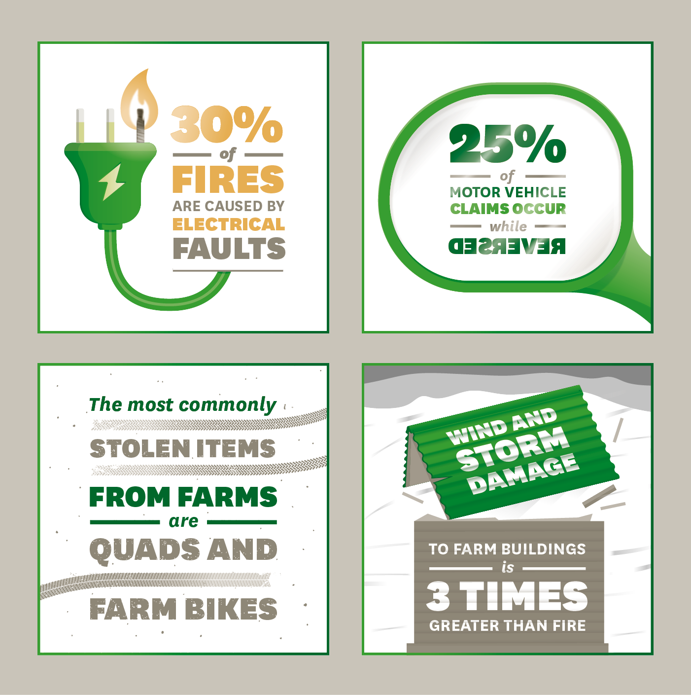
As farmers also rely on online communication, the next stage was to supply the infographic suite in a format for FMG’s website. They saw this as a perfect opportunity to bring these to life by turning them into animated gifs.
The way the static infographics were created made for a straight-forward conversion to animation. The addition of movement and storytelling allowed FMG to further reinforce the main message behind each statistic in an even more engaging way.
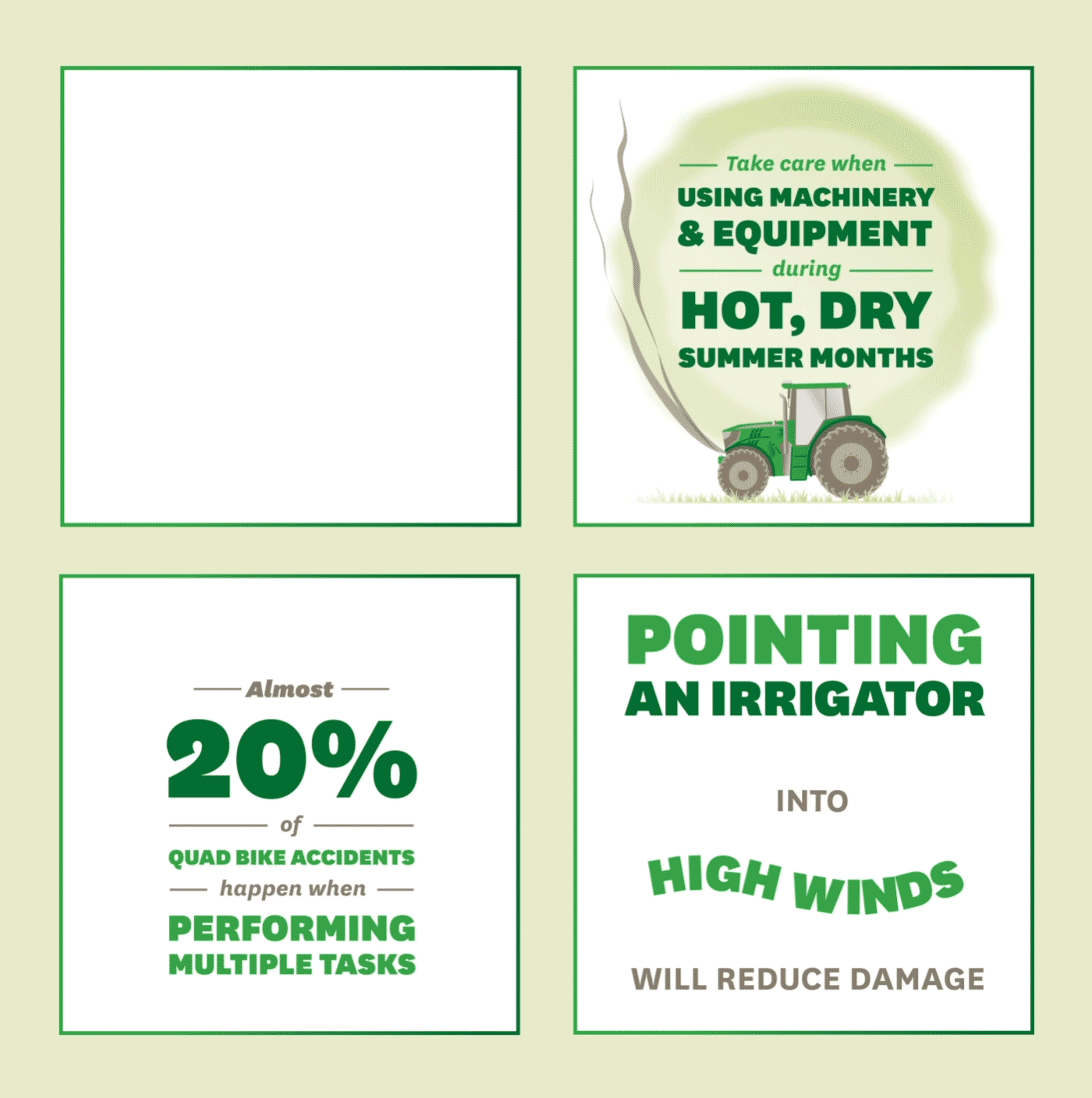
Starting with a list of claim statistics on a Word document, FMG now own a suite of infographic collateral that can be used across their print, website and social media platforms in a variety of ways. One of these animated infographics shared on the FMG Facebook page already has over 50,000 views!