Future state illustration
FoodHQ is an innovation hub for food technology and agricultural businesses that combines the best in science, education and business. FoodHQ asked us to create a ‘future state’ illustration to bring their vision to life, to help attract grants and funding.
The illustration places Food HQ at the intersection of four distinct themes, a central hub for these diverse activities.
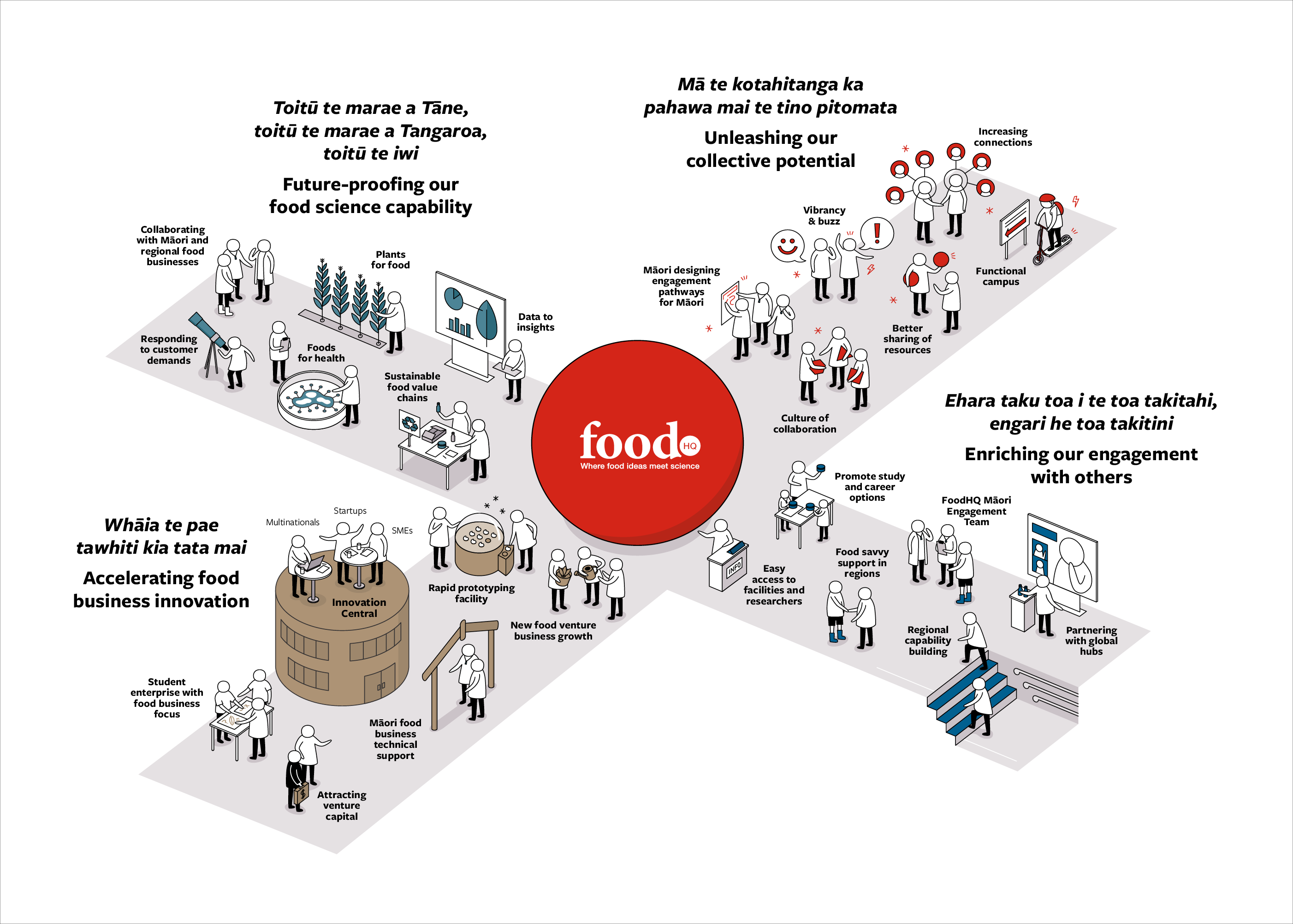
We began by working through sketches and developing each component, finding the best way to express each activity, before working up the final illustration. The characters are a step up from stick figures – non-specific yet full of movement and personality. We created a world for them using the FoodHQ brand colour palette, implementing it to help differentiate the varied roles within this collective of NZ companies, research and educational institutions that FoodHQ supports.
Here’s a time-lapse video showing the refinements and iterations we made to get to the final illustration:
Group Plan

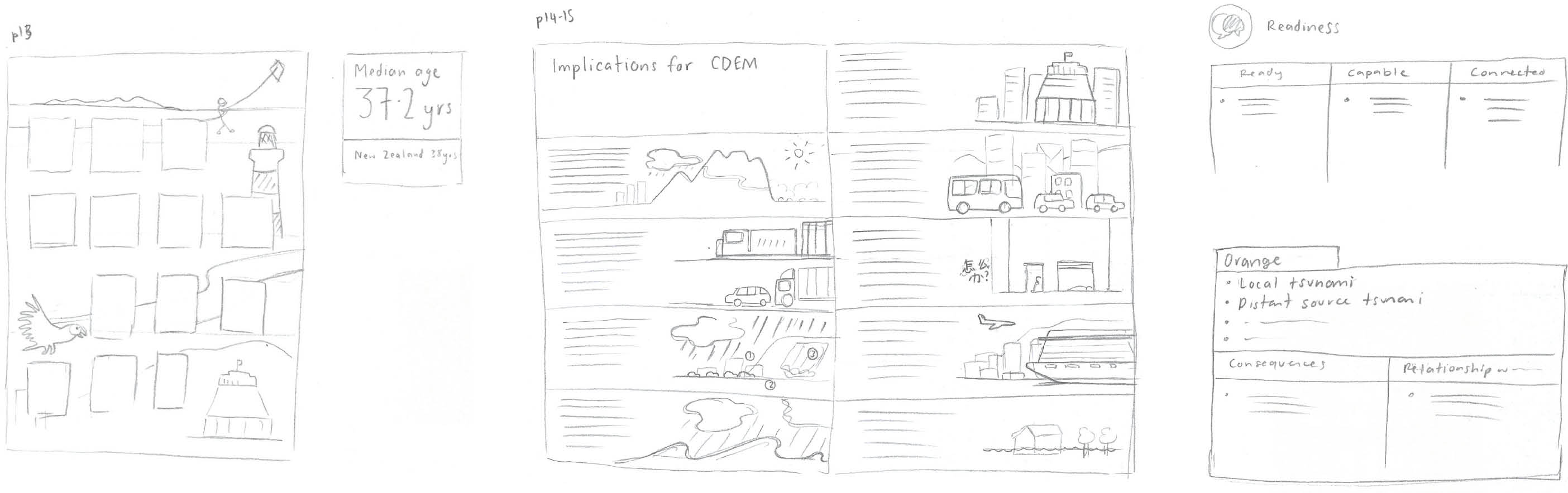
We worked closely with WREMO to develop infographics that elevated the content and did not lose the intention of the text – often with infographics it can be tempting to take it too far and obscure the original meaning. We began with rough sketches of ideas for each infographic to quickly see what was going to work or not work before working towards the polished final versions.

Annual Report
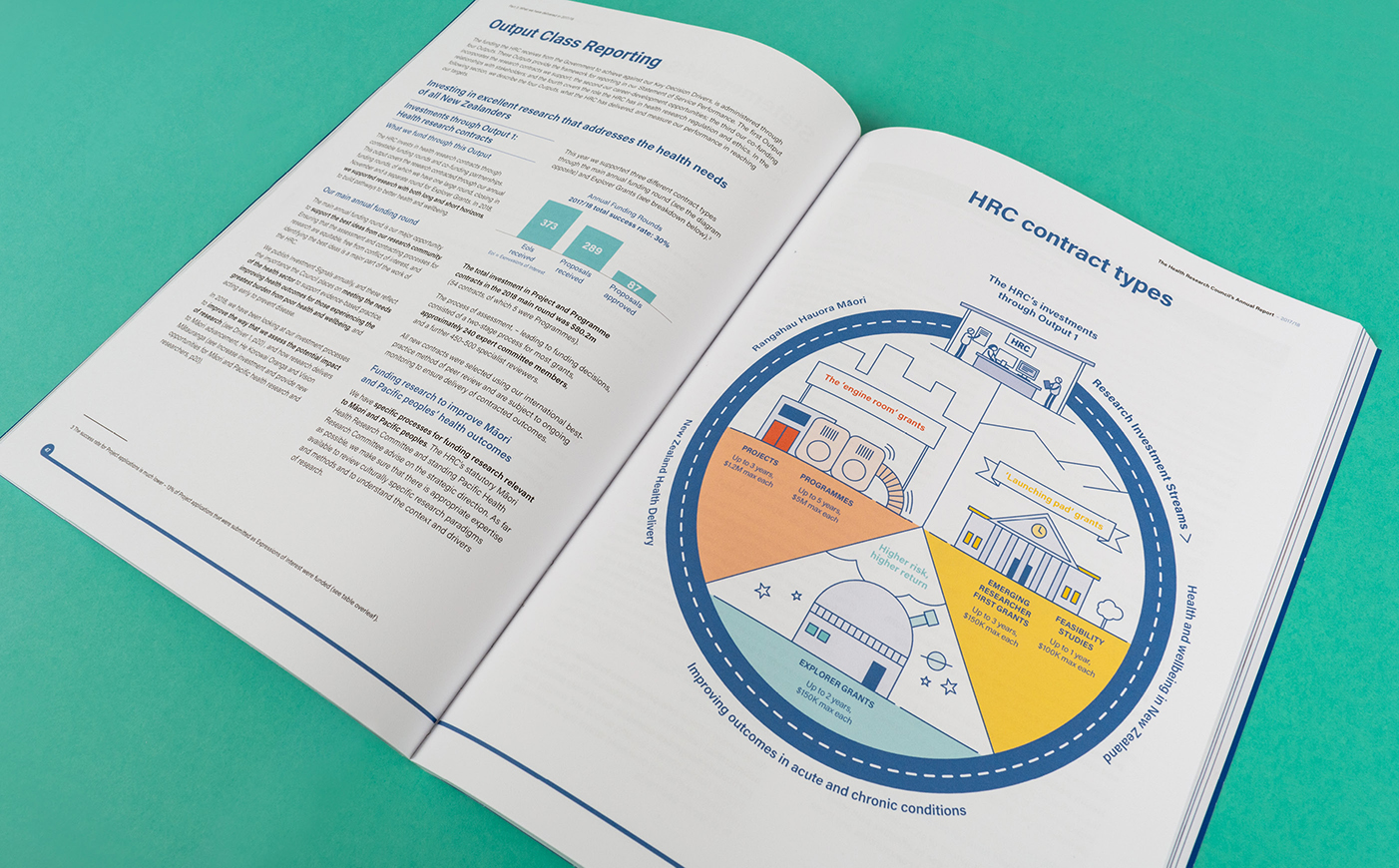
We decided to depict HRC’s infographics as actual physical systems which enabled the reader to instantly recognise how elements connected, flowed and benefited communities. We built an illustrated world from the colours, fonts and style of the HRC brand, injected with a story and visual interest that would engage the reader at both high and detailed levels.
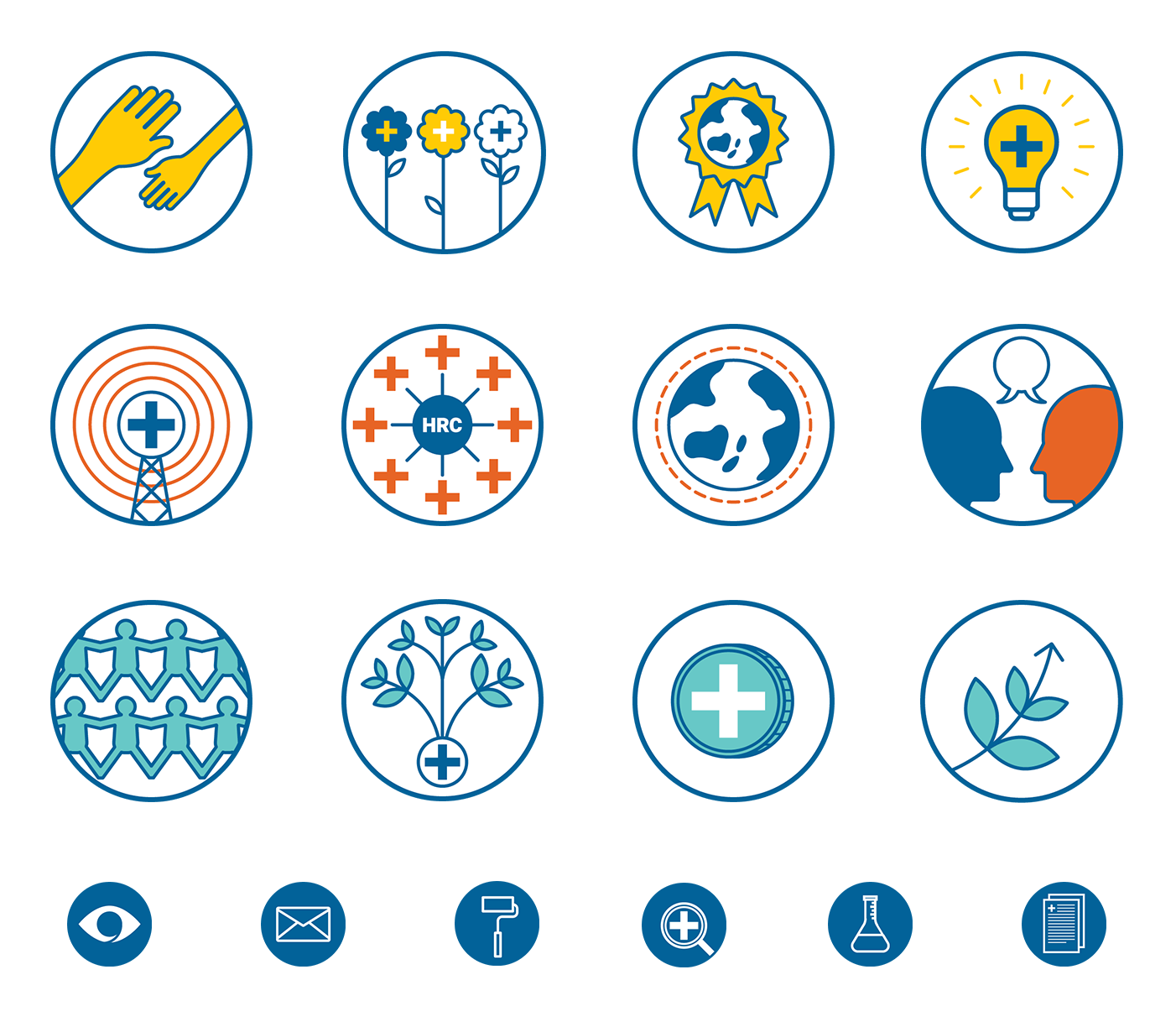
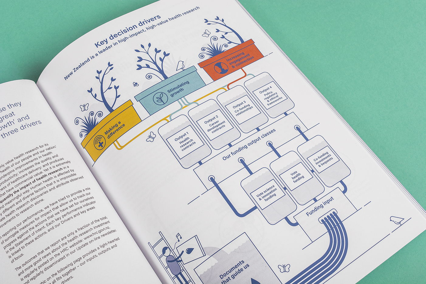
The outcome of the project was the creation of a unique and fresh suite of infographics and publications that established a new style, connected with the audience, and helped expand HRC’s brand personality. As well as making the annual report more engaging, the infographics can be reused in various formats to help HRC continue to tell their story of supporting the health of New Zealanders.
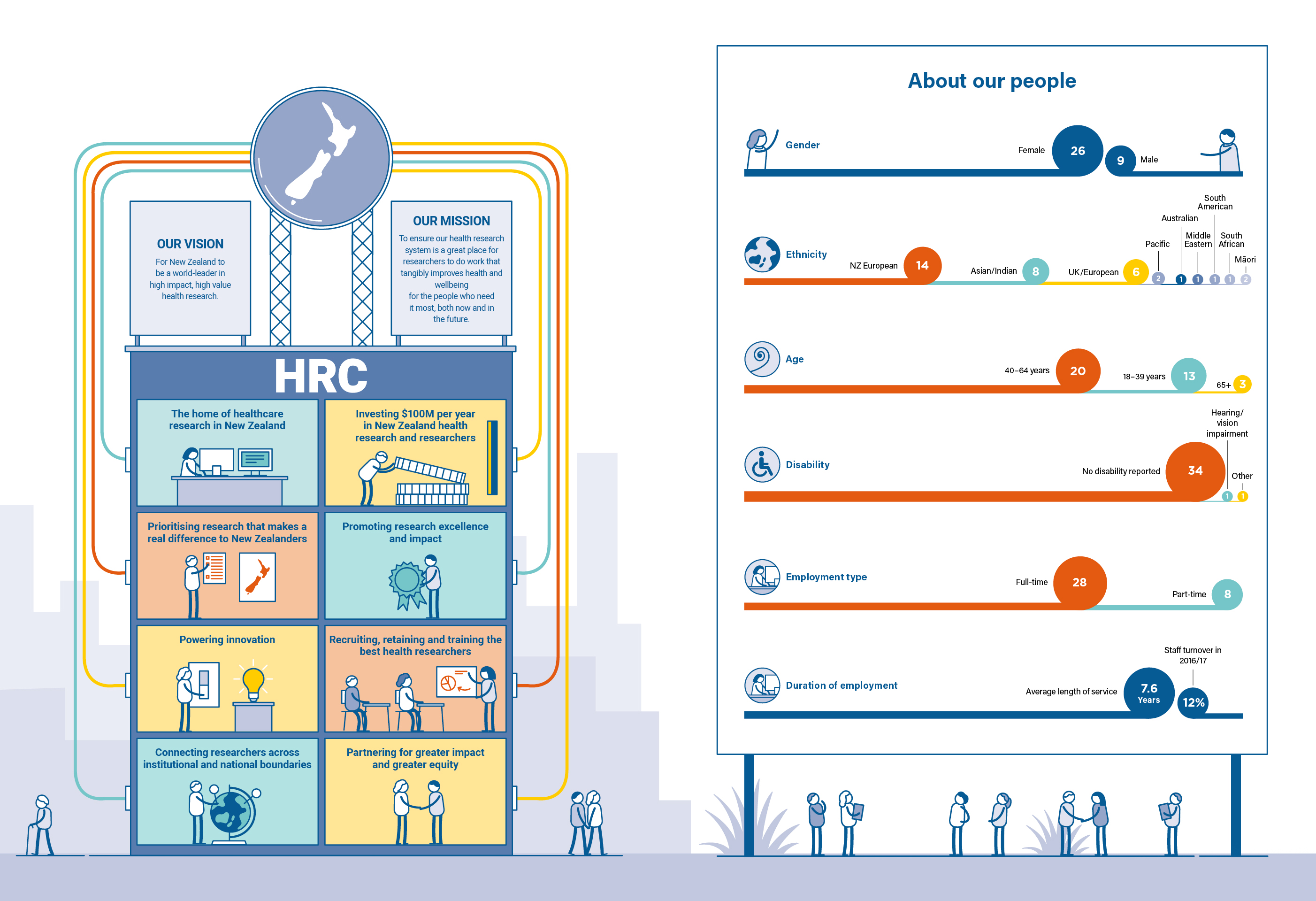
Feedback from Health Research Council of New Zealand (HRCNZ):
‘Working with Gusto has opened my eyes to the value of engaging a graphic artist to bring complex ideas to life. Gusto took our boring schematics and created fresh, modern images that conveyed our messages in a fun and really original way. Combining these with a fresh and modern layout delivered a document that is so much more impactful than we could have managed alone. The Gusto team are incredibly professional and flexible, working to time frames that we thought would be impossible. It was a pleasure to work with them.’
Infographic suite
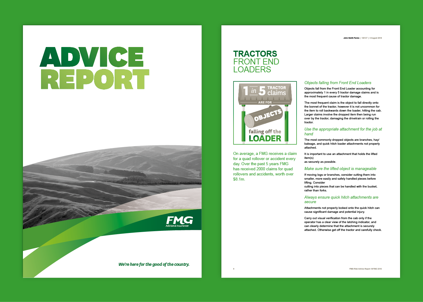
Being that FMG’s reports are discussed with the client face-to-face, the introduction of these illustrative infographics were designed to help prompt discussion. Pieces of important information have now been given much more attention, further clarifying for the client the relevant risks and data around their farm and household.
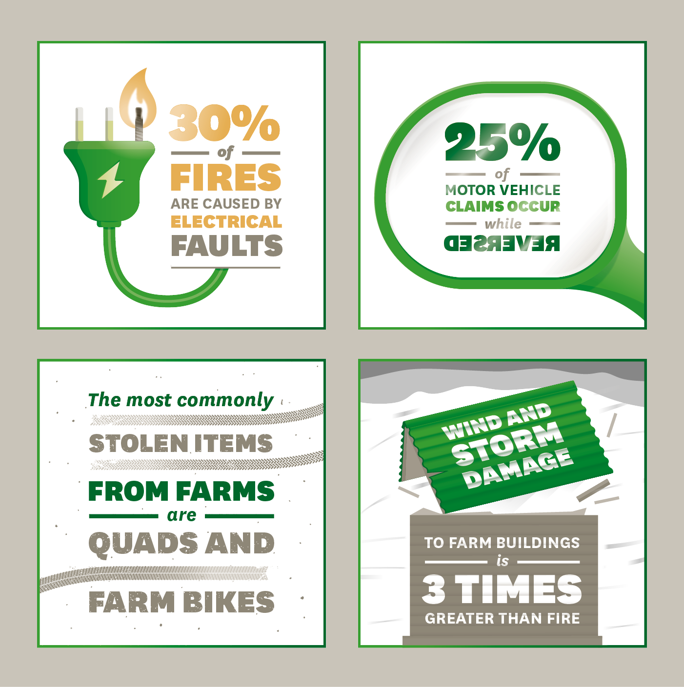
As farmers also rely on online communication, the next stage was to supply the infographic suite in a format for FMG’s website. They saw this as a perfect opportunity to bring these to life by turning them into animated gifs.
The way the static infographics were created made for a straight-forward conversion to animation. The addition of movement and storytelling allowed FMG to further reinforce the main message behind each statistic in an even more engaging way.
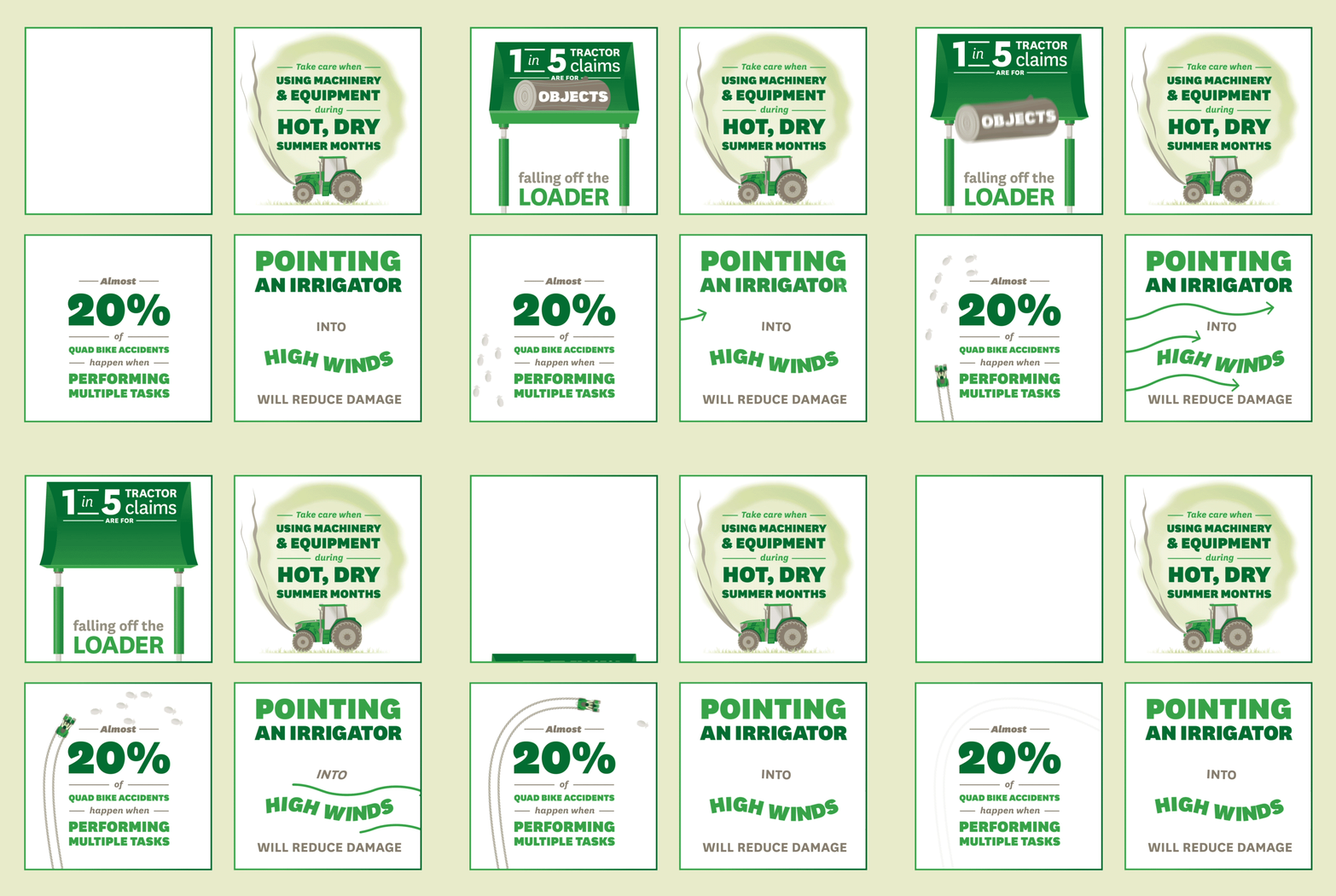
Starting with a list of claim statistics on a Word document, FMG now own a suite of infographic collateral that can be used across their print, website and social media platforms in a variety of ways. One of these animated infographics shared on the FMG Facebook page already has over 50,000 views!
Orthodontics information resources
Brochure for teens:
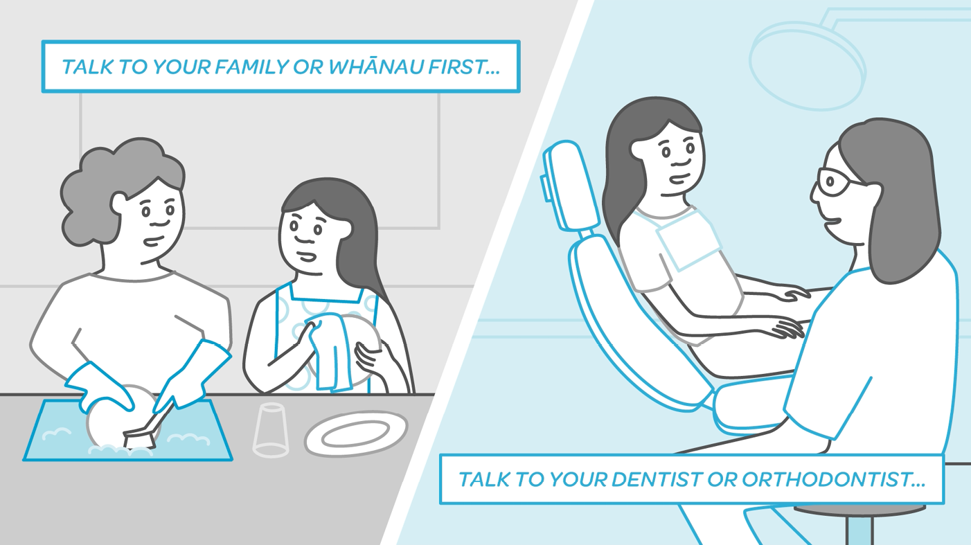
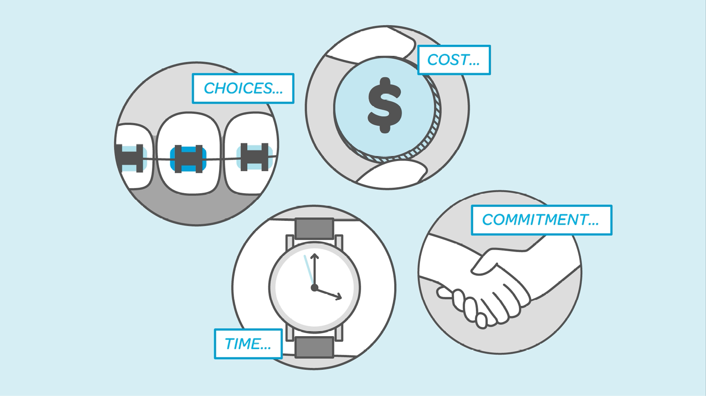
The teen brochure uses an illustration style inspired by comics and graphic novels, and is supplemented by an animated video to be used during consultation with a dentist or orthodontist.
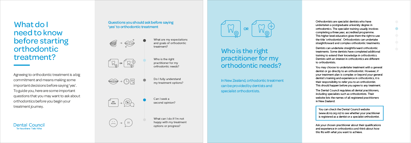
In comparison the adult brochure is much more refined, using a simple layout supported by icons to succinctly emphasise the important information.
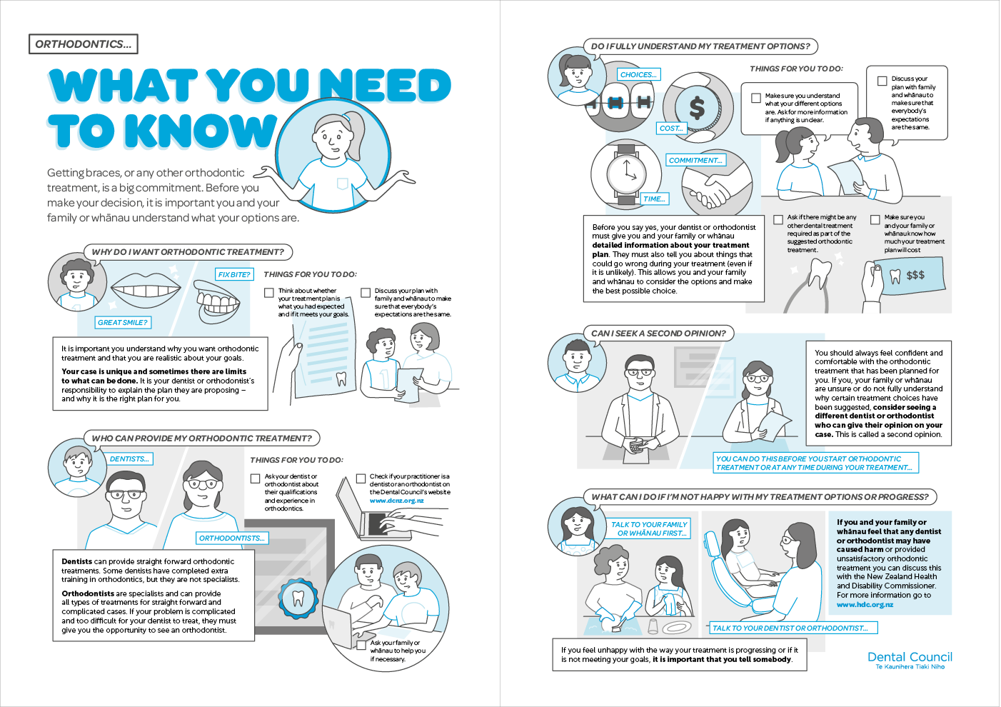
Brochure for adults:
Brand identity
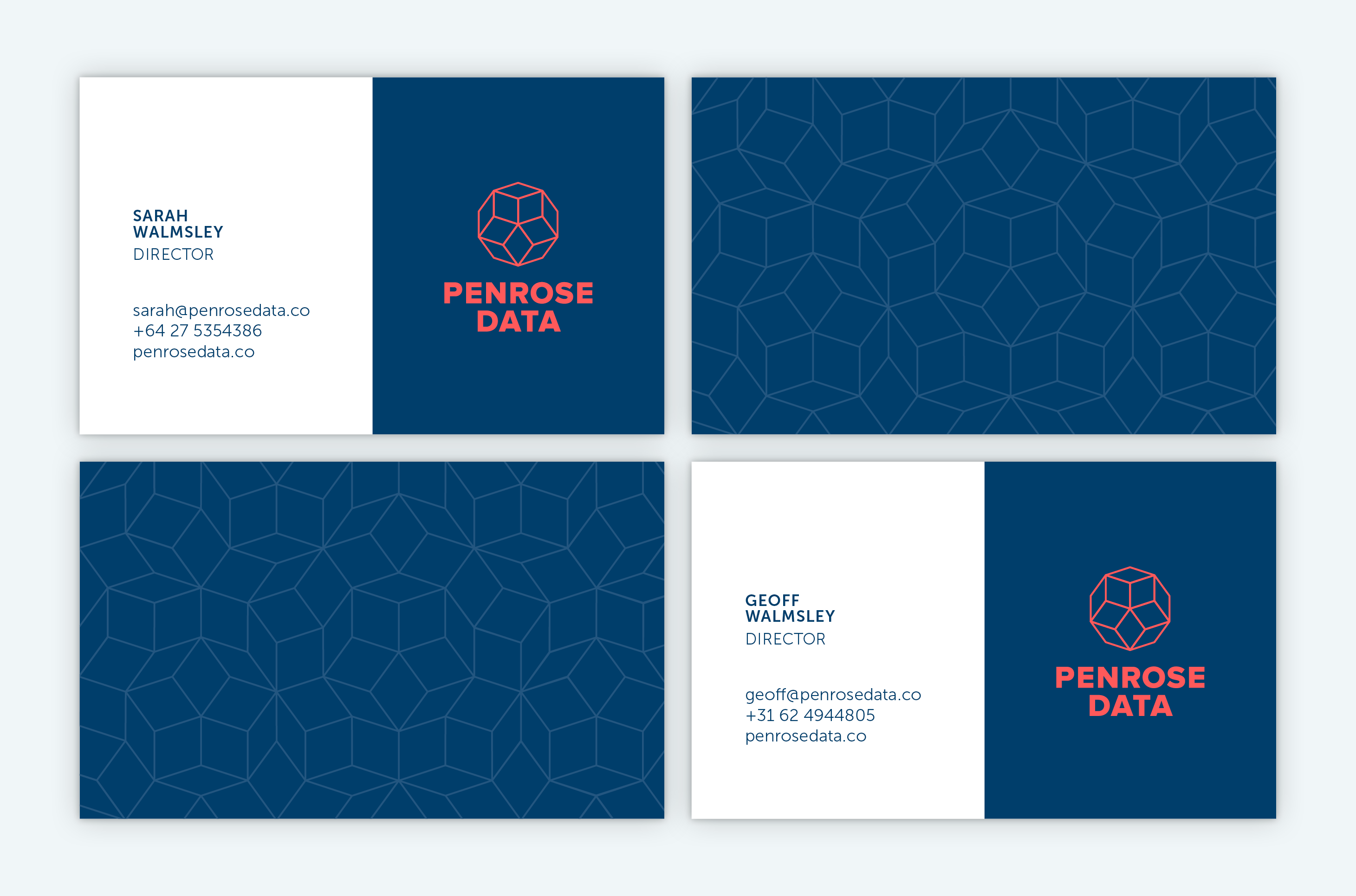
The logomark references the mathematician Sir Roger Penrose, who Penrose Data is named after. It uses a segment of the Penrose tile pattern to create a unique shape that evokes export boxes and diamonds, representing the ‘gems’ of information, cut-through and clarity Penrose Data can provide to enable exporters to be successful on the global stage.


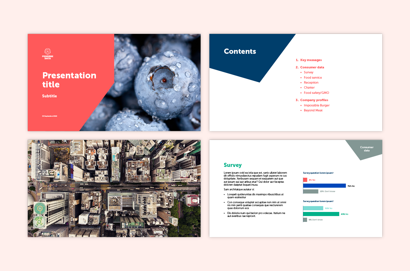
The brand is supported by an image library which showcases a modern perspective on export markets and consumers – no clichéd skylines here.
A bespoke icon set was developed for Penrose Data to use across presentations and collateral. The icons uniquely belong to the Penrose Data brand, using the same angles and lines as the logo.

The bold and consistent brand identity helps build Penrose Data’s reputation and establish their credibility within the analytics and consumer insights landscape.
Penrose Data feedback:
‘The Penrose Data team thoroughly enjoyed working with Gusto, and we were very impressed with the whole process from briefing to final deliverables. The Gusto team worked hard to ensure we got a brand identity that we are proud of, and it has helped us to go to the market with confidence and a strong sense of who we are.’
Brand refresh

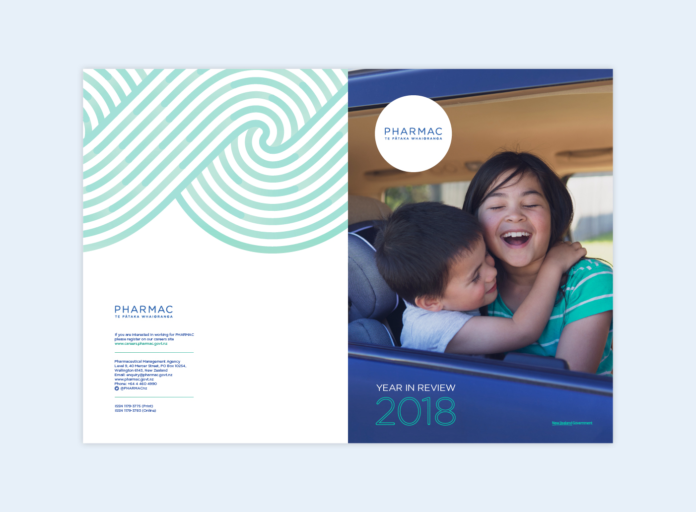
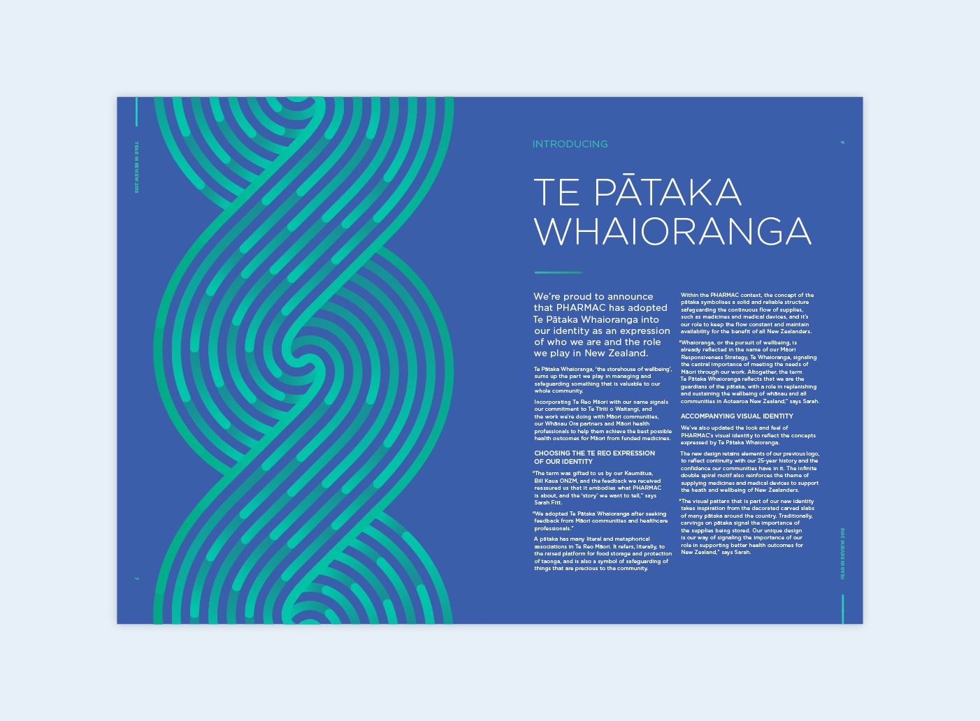
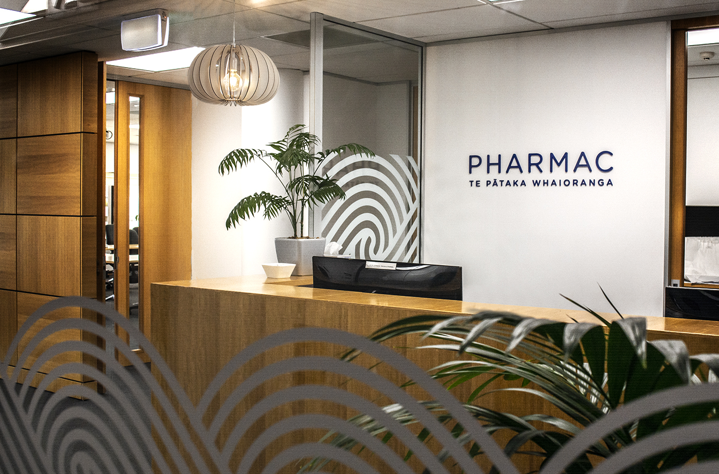
Brand refresh
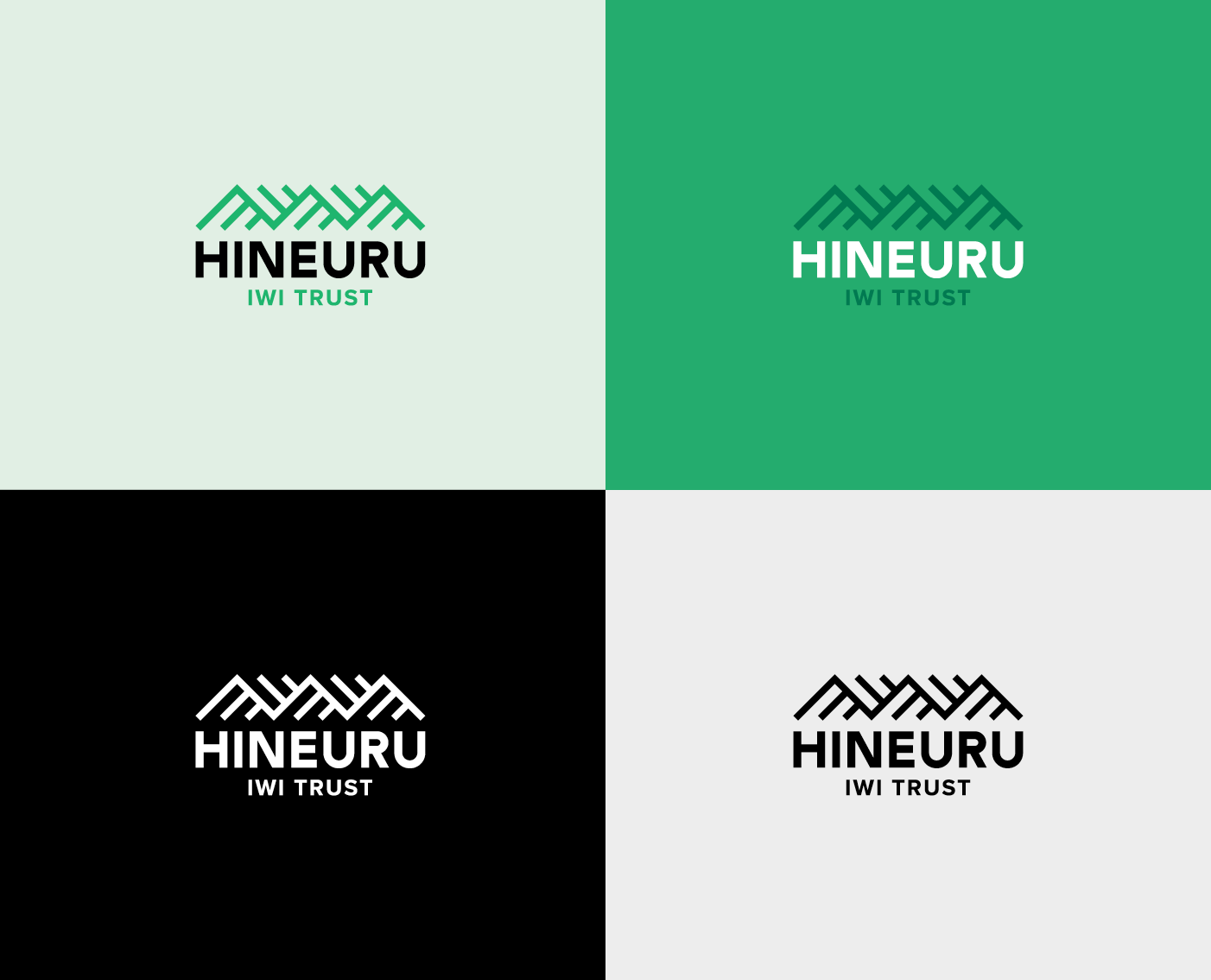
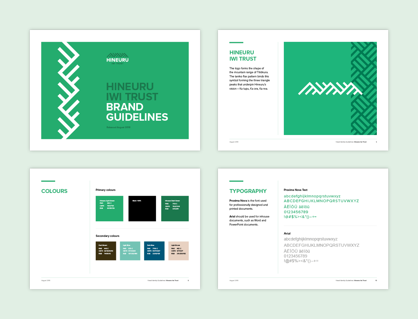
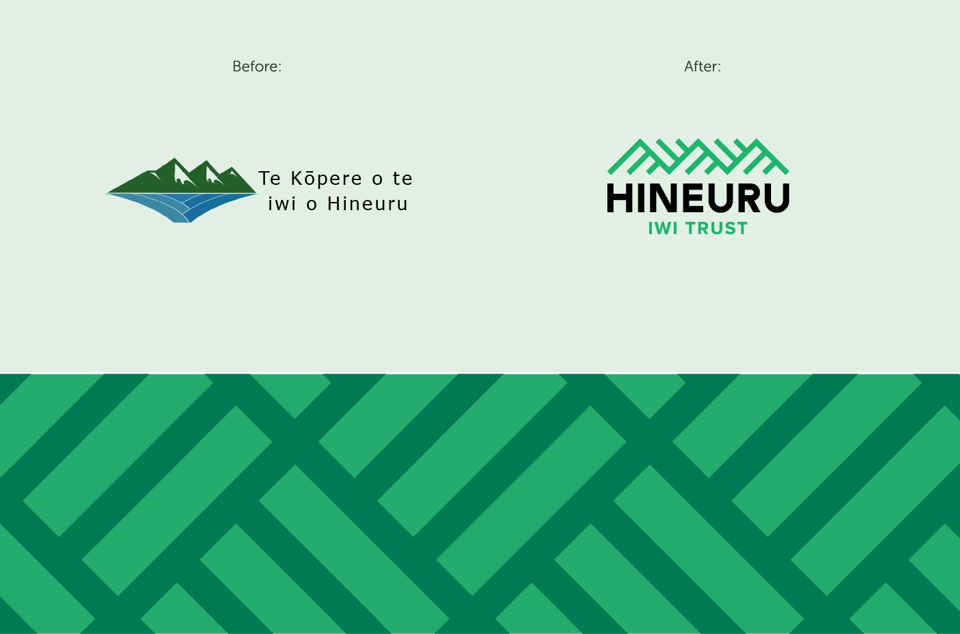
The three triangle peaks that underpin the design’s structure represent the pillars of Hineuru’s vision – Ka tupu, Ka ora, Ka rea / We grow, we thrive, we prosper. The diagonal lines of the design create dynamism and movement. The simplicity of the symbol emits confidence and clarity. The overall colour palette fuses natural land colours with contemporary modern style to show forward thinking and leadership. The logo motif is used to create a tessellated pattern reminiscent of the tāniko flax pattern.
Feedback from Hineuru Iwi Trust:
‘We engaged Gusto design to assist us in the process of rebranding our logo. The job was not easy but the team at Gusto design were excellent and extremely professional, providing practical and culturally appropriate advice. As an iwi entity, our logo is a critical part of our identity, as it captures and reflects who we are and where we are going. Gusto design presented proofs that were thoughtful, creative and reflected our cultural aspirations. I would highly recommend Gusto design to any organisation.’
Brand identity
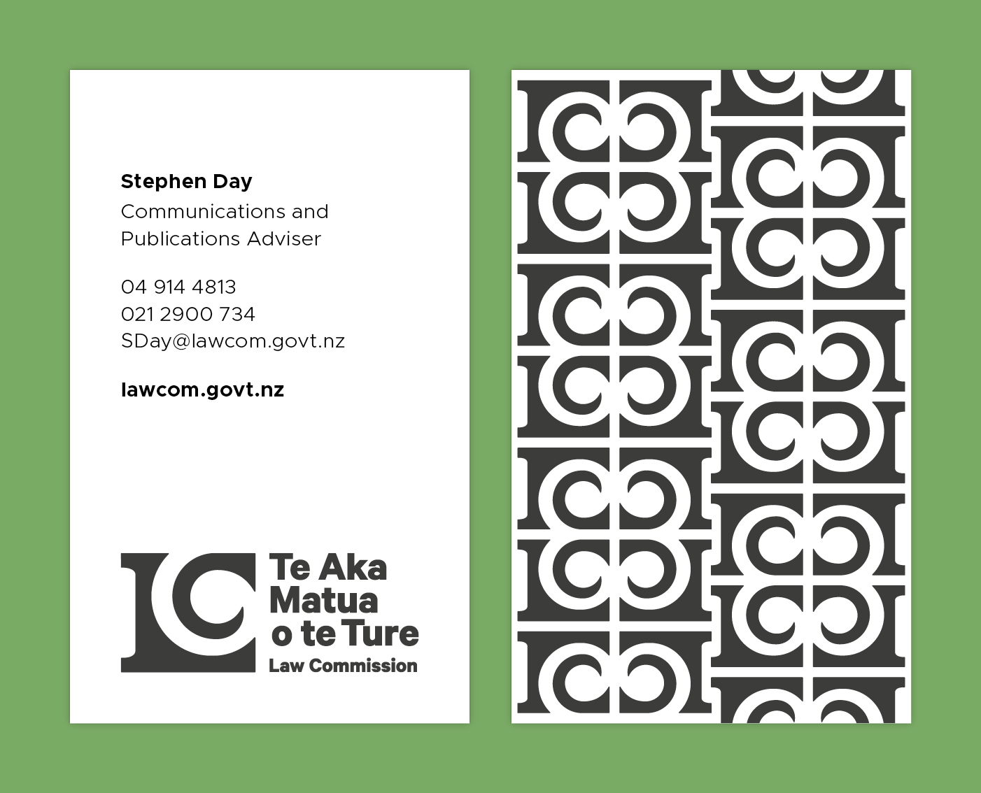
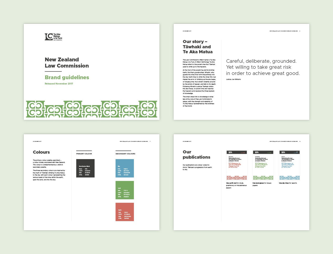
The Law Commission’s Māori name is Te Aka Matua o te Ture. In Māori mythology Te Aka Matua refers to the parent vine that Tāwhaki used to climb up to the heavens. For the logo we created a koru that is formed between the ‘L’ and ‘C,’ based on the parent vine Te Aka Matua, sitting nestled within a solid pillar motif. This visual relationship of geometric and organic elements working together in both the positive and negative space creates a feeling of harmony between the past and the ever-growing future.
For the colour palette we used a universal primary colour of black that is offset through the use of a distinct supporting palette. The three secondary colours, applied as a publication colour coding system, draw their inspiration from the myth of Tāwhaki climbing Ta Aka Matua to the sky, with each colour representing the various levels of the vine: within the earth, upon the land, and into the sky.
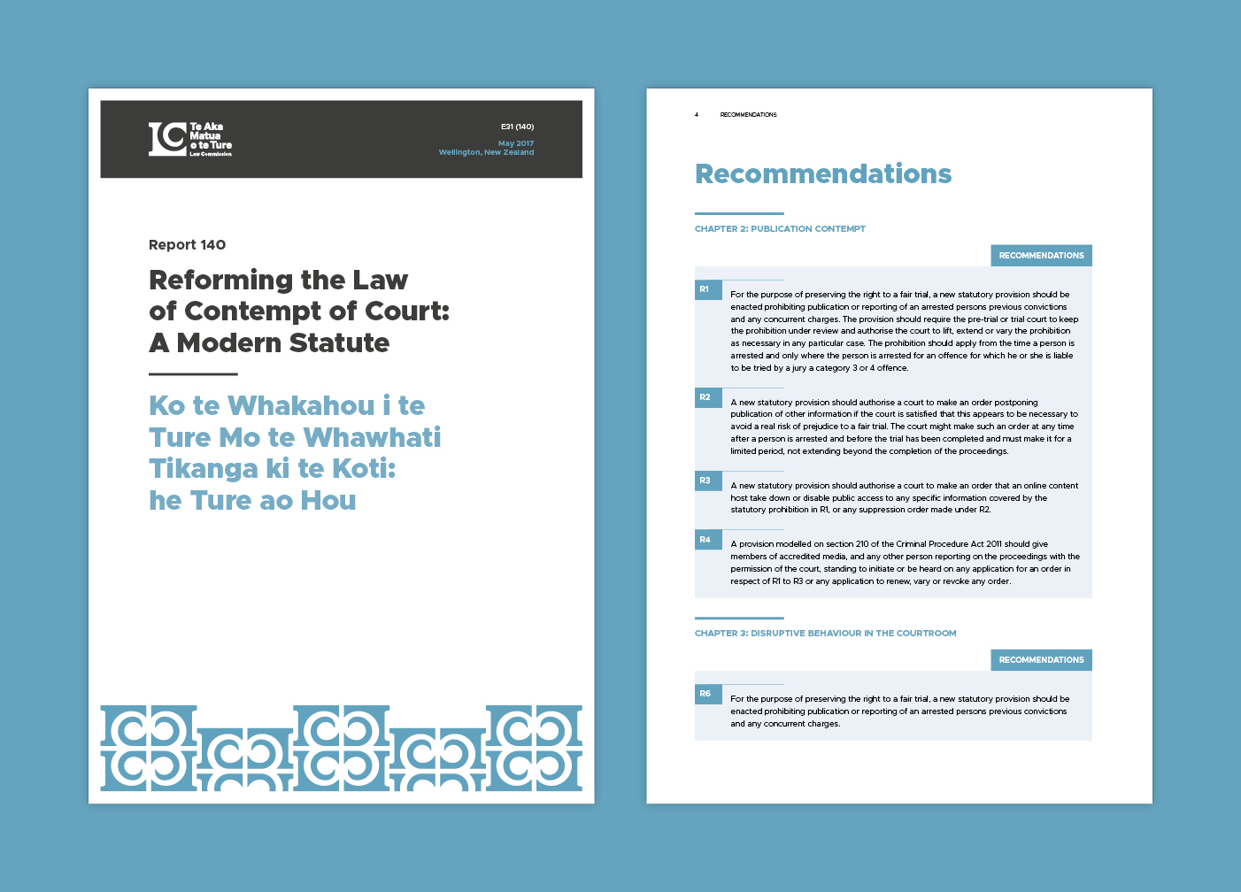

The logo motif is used to create a tessellated pattern reminiscent of Māori carvings and tukutuku panels. This pattern was applied to other areas of the branding to create an easily identifiable aesthetic while also carrying through the foundation concept of vines and growth.
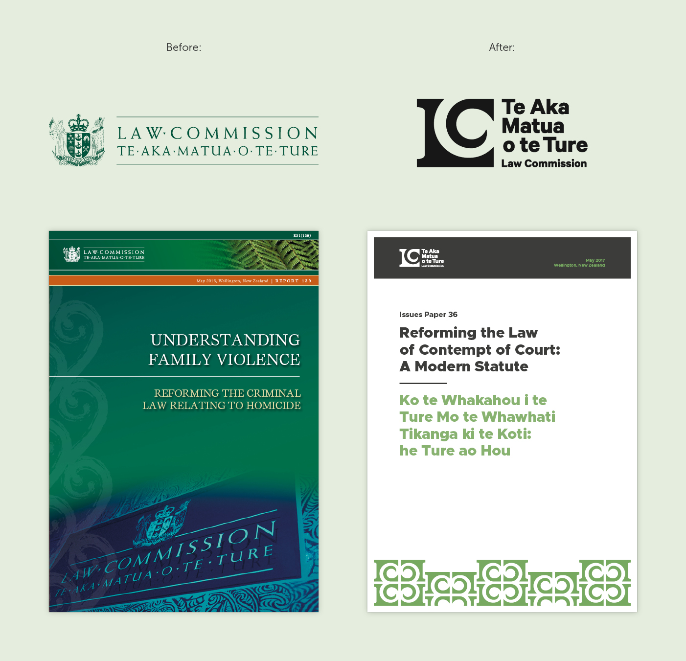
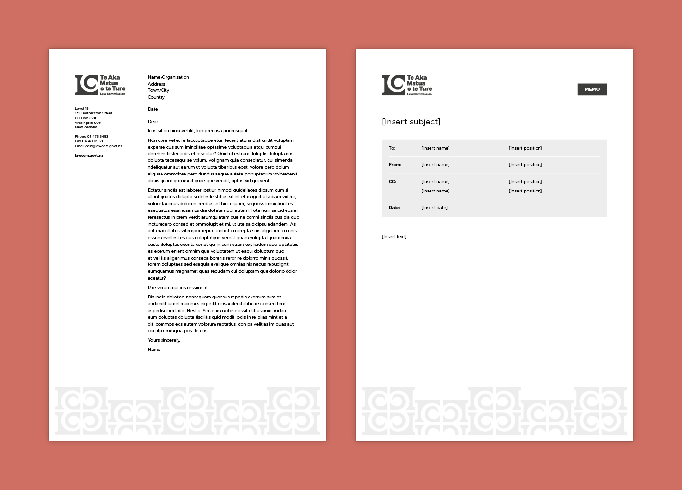
The brand refresh retained the respect and dignity that the Law Commission has built up over its thirty-year history, is visibly bicultural, accessible to people from all backgrounds, and has longevity so that the brand remains relevant and timeless.
The new visual identity expresses the Law Commission’s values, showing the strength and reliability of Te Aka Matua, and its direct link to knowledge.
The visual identity guidelines and design resources we created allow the Law Commission to communicate consistently and develop their own materials cohesively and cost effectively.
Brand identity and website
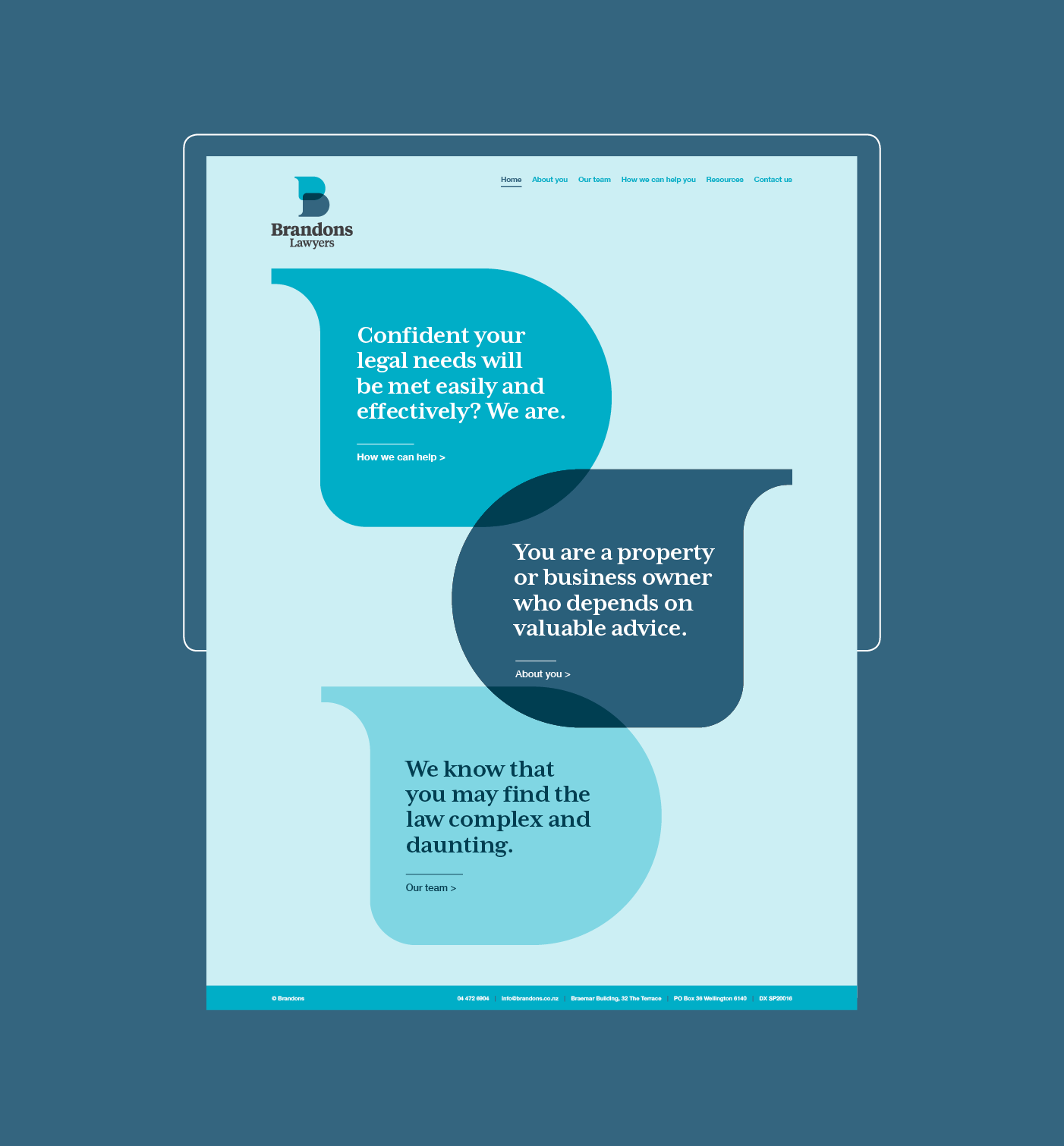
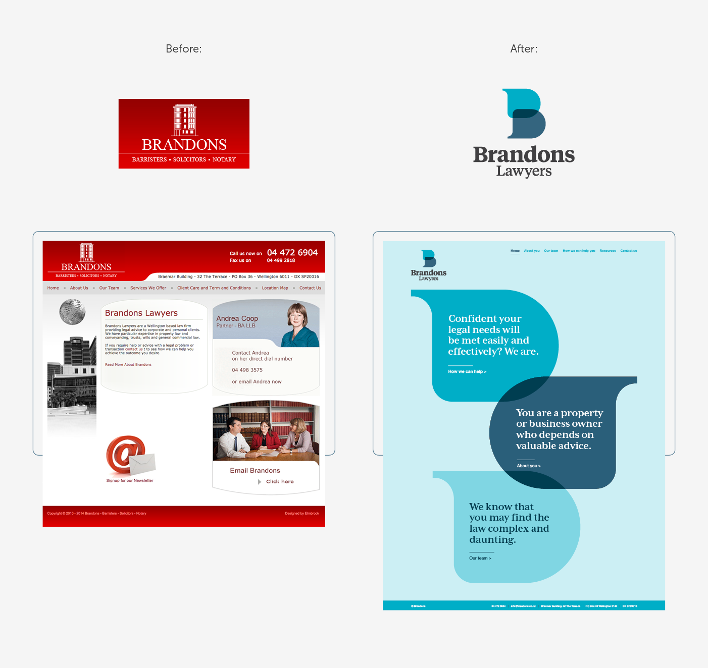
The logomark is a letter ‘B’ constructed from two speech bubbles that come together and overlap, suggesting the transparent and open discussion that is integral to Brandons’ working relationship with their clients.
The colour palette is fresh and inviting, serving to help to alleviate the daunting feelings that a potential client may have when considering contacting a law firm.
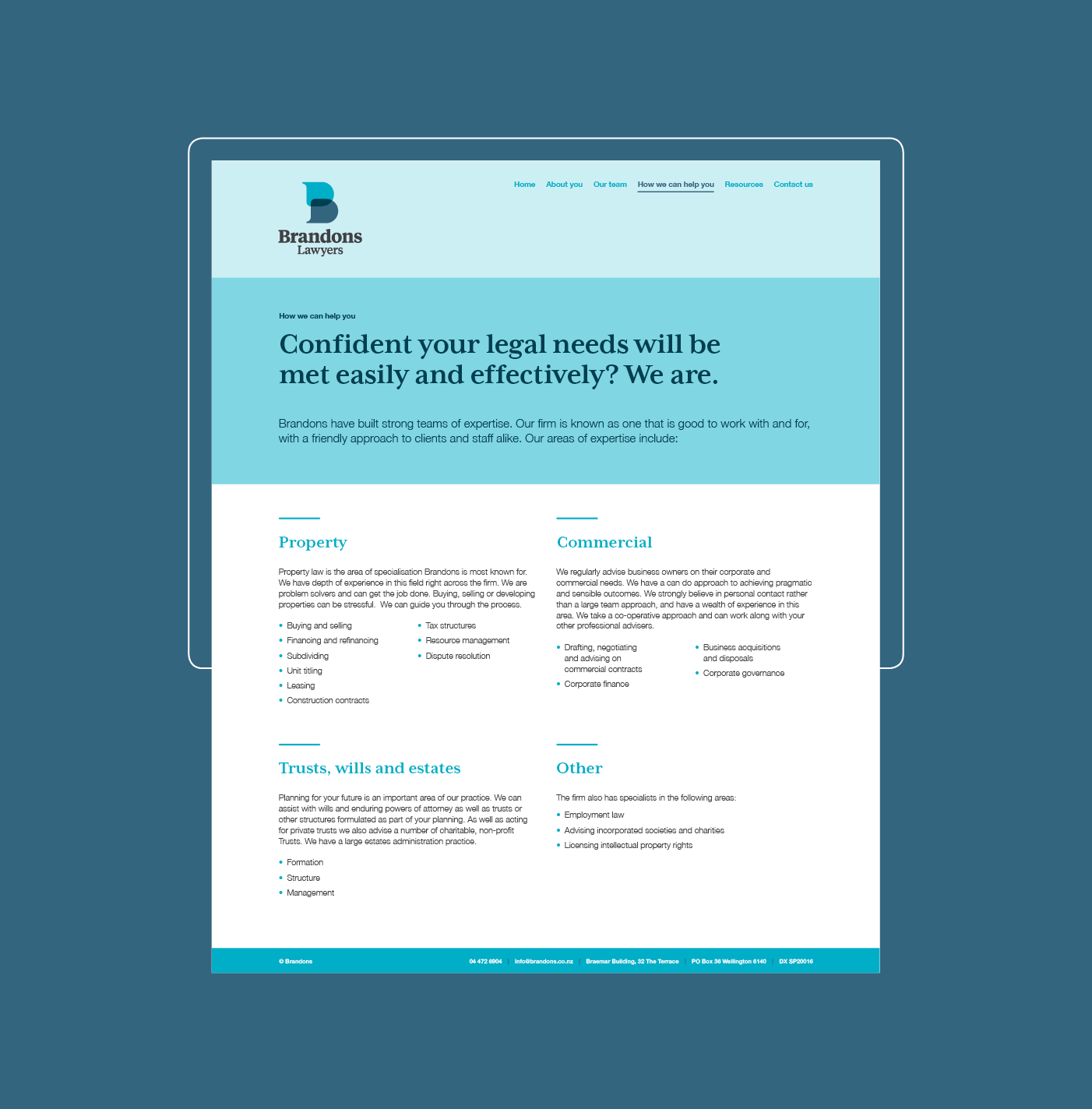
This sense of approachability continues into the website, with a shift in focus from the company to their clients – who are they, and what can Brandons do for them?
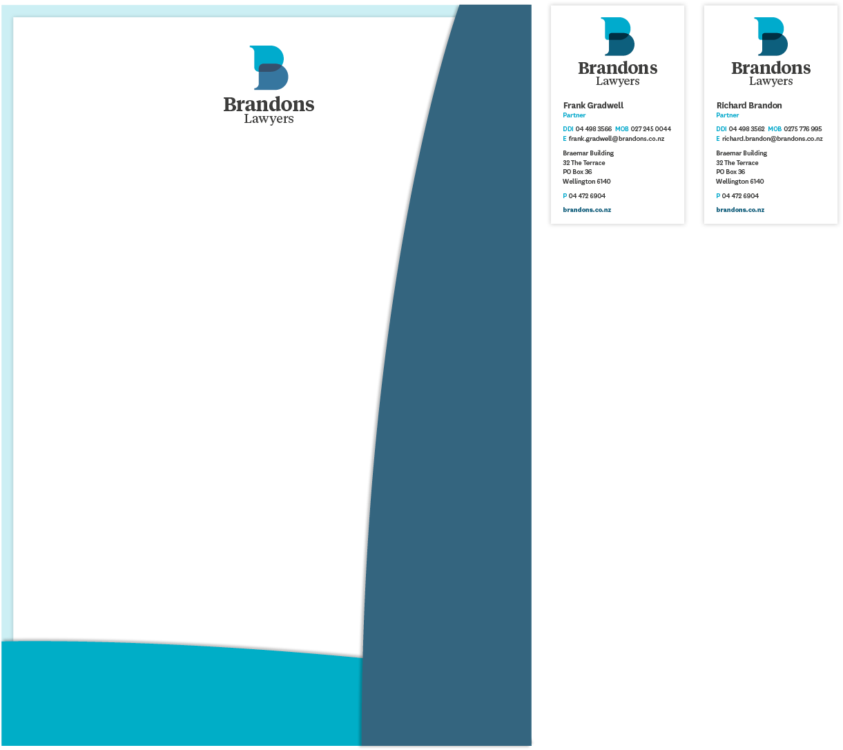
The result is a brand expression which is cohesive, modern and compelling, and supports Brandons’ approachable and friendly ethos.
Feedback from Brandons Lawyers:
‘Gusto provided an excellent service to our firm in developing our website. The team were very friendly and knowledgeable and I am delighted to recommend them.’