Brand identity and website
Brandons Lawyers
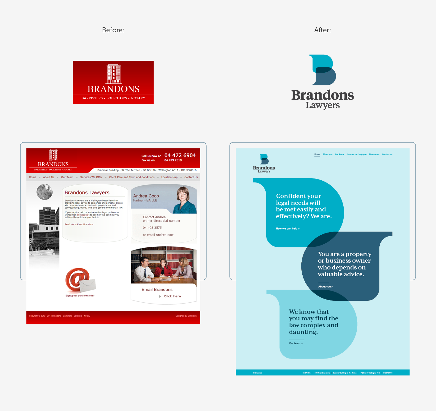
A fresh identity and website that gives an established business a modern edge.
Expertise
- Information design
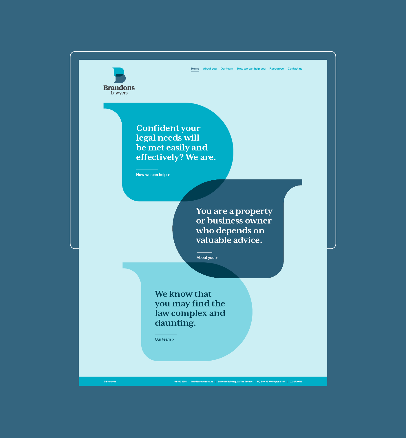
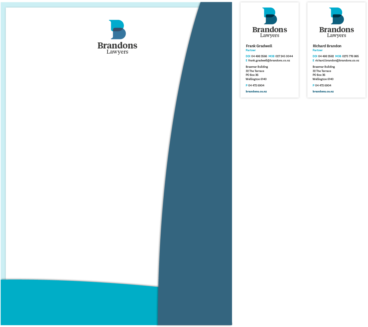
The logomark is a letter ‘B’ constructed from two speech bubbles that come together and overlap, suggesting the transparent and open discussion that is integral to Brandons’ working relationship with their clients.
The colour palette is fresh and inviting, serving to help to alleviate the daunting feelings that a potential client may have when considering contacting a law firm.
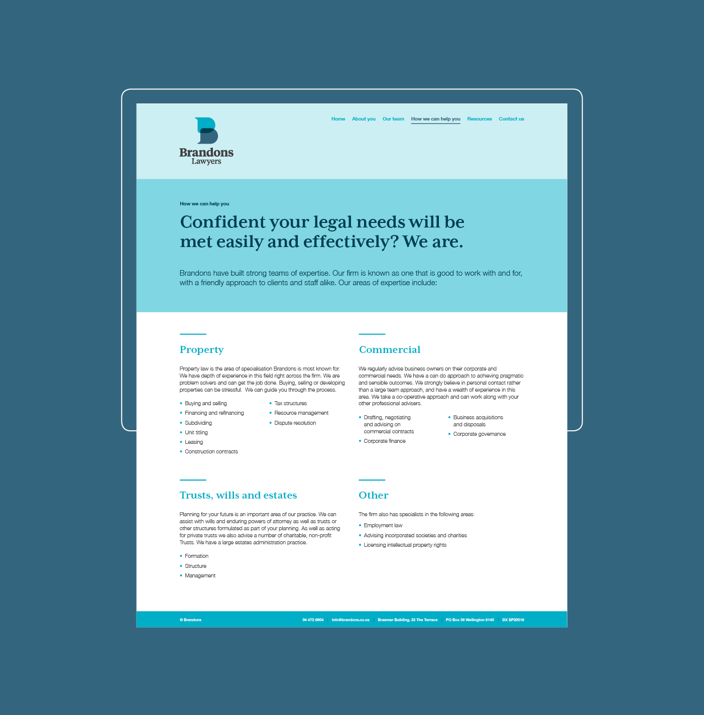
This sense of approachability continues into the website, with a shift in focus from the company to their clients – who are they, and what can Brandons do for them?
The result is a brand expression which is cohesive, modern and compelling, and supports Brandons’ approachable and friendly ethos.
Feedback from Brandons Lawyers:
‘Gusto provided an excellent service to our firm in developing our website. The team were very friendly and knowledgeable and I am delighted to recommend them.’
Keen to chat?
Get in touch with our team or have a look at our work to see if we’d be a good fit.


