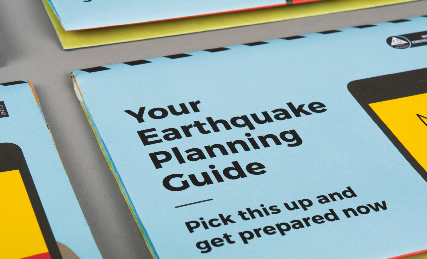
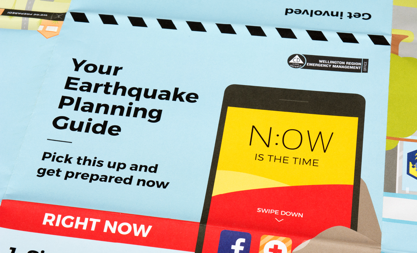
Your Earthquake Planning Guide
Wellington Region Emergency Management Office (WREMO)
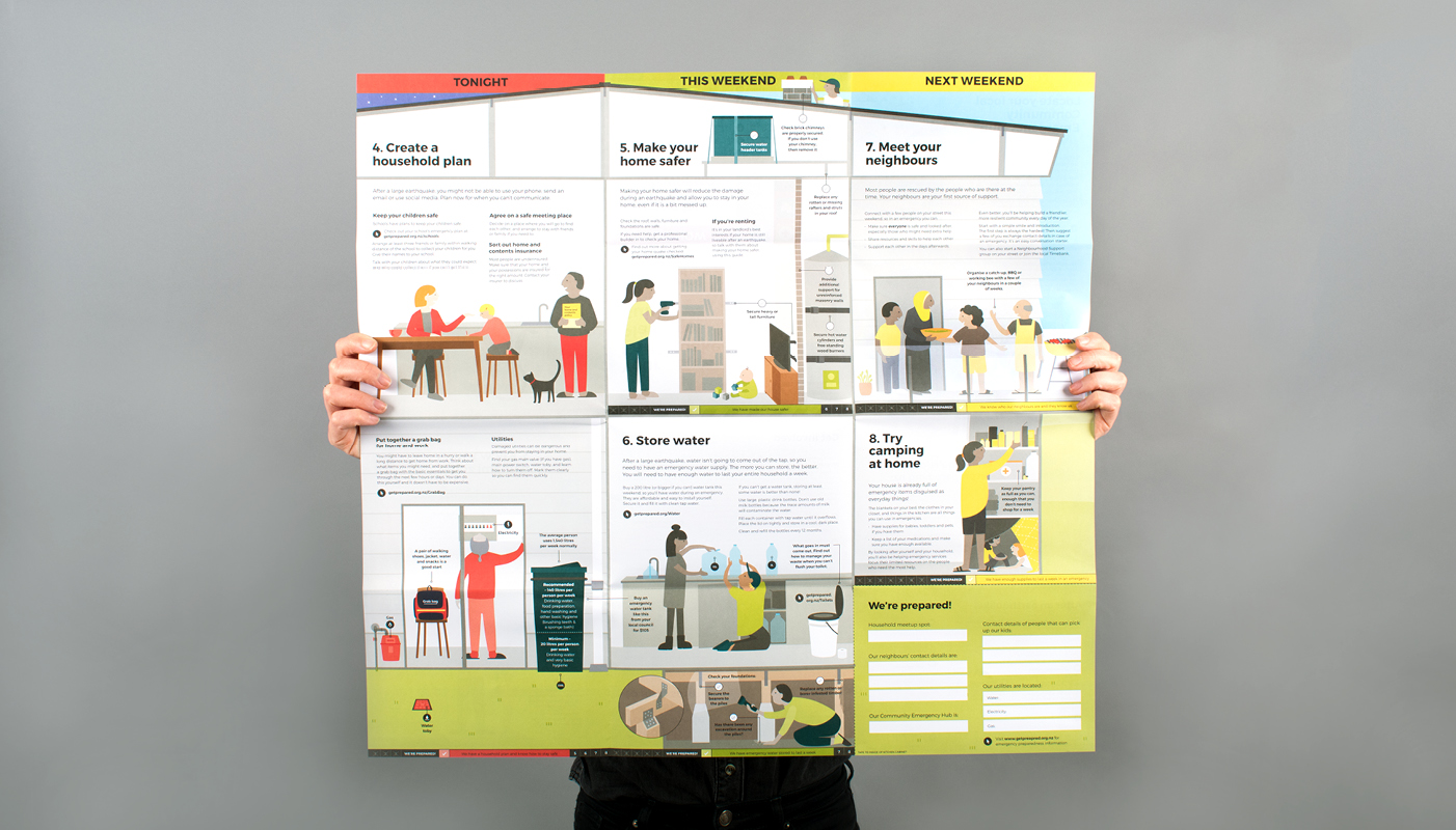
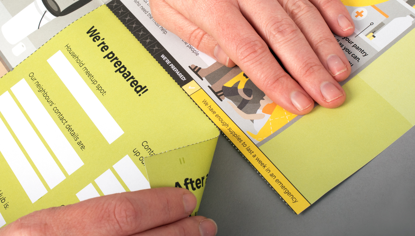
An illustrated step-by-step earthquake planning guide.
Wellington is a pretty wild place to live, and a large number of households are not sufficiently prepared for an emergency event.
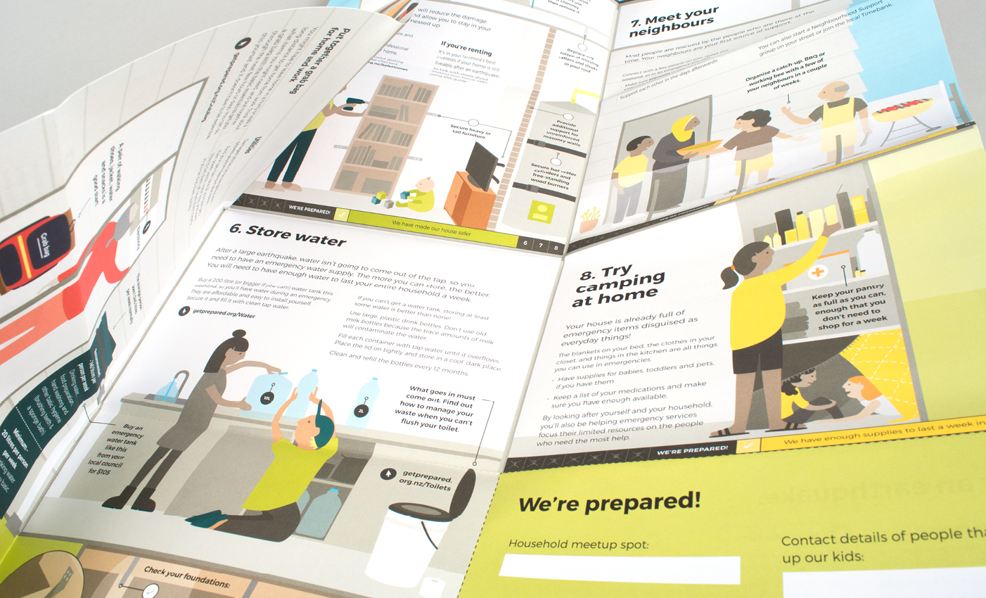
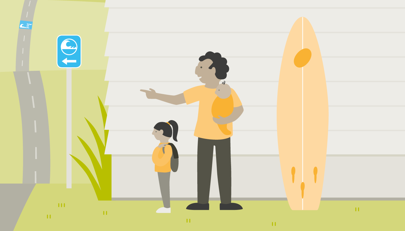
The guide is designed to be easy to understand and accessible to a wide audience, including people whose first language may not be English. Illustrations demonstrate the steps so that the words do not necessarily need to be read for them to understand the action to take.
The illustrative approach used for the guide makes the information friendlier to access, rather than seeming authoritative, to encourage engagement with the content.
The guide uses a bright, friendly colour palette, with a modern, readable font. Colour is used to separate out the time blocks which lead the audience through the guide to complete the steps. Simple infographics are used to highlight important information and draw the audience’s attention to these.
The guide’s illustrative, colourful and accessible style is designed for the audience to have maximum engagement with the guide in order for them to become prepared by actually completing the steps in the guide.
The guide won the EMPA Award for Excellence in Emergency Communication in the Readiness & Resilience category.
Feedback from Wellington Region Emergency Management Office (WREMO):
‘Excellent company and we have been very happy working with them on multiple projects. They are our first point of call when seeking amazing designs.’
Keen to chat?
Get in touch with our team or have a look at our work to see if we’d be a good fit.
