Brand refresh
Hineuru Iwi Trust
A brand refresh creating an active presence and new vision for the iwi.
Expertise
- Information design
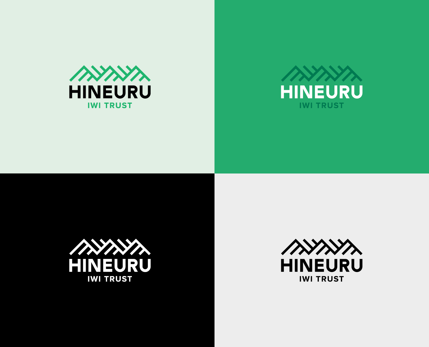
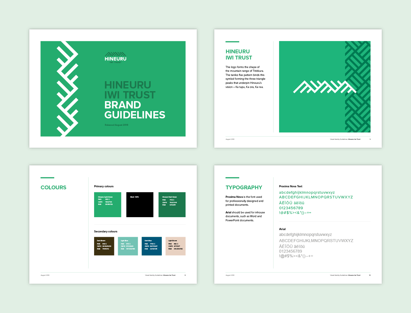
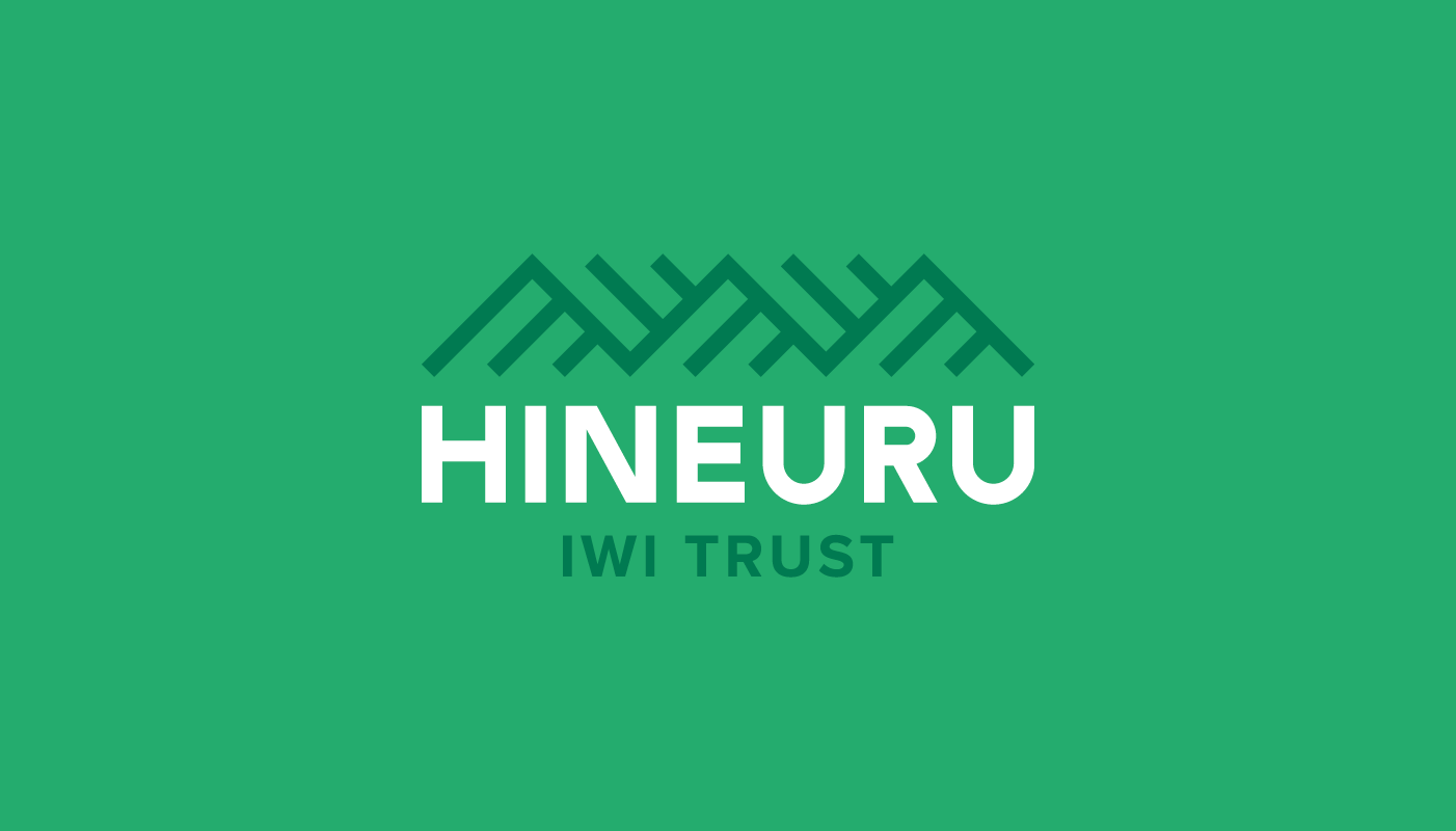
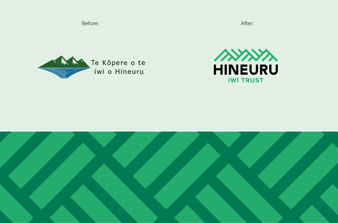
The three triangle peaks that underpin the design’s structure represent the pillars of Hineuru’s vision – Ka tupu, Ka ora, Ka rea / We grow, we thrive, we prosper. The diagonal lines of the design create dynamism and movement. The simplicity of the symbol emits confidence and clarity. The overall colour palette fuses natural land colours with contemporary modern style to show forward thinking and leadership. The logo motif is used to create a tessellated pattern reminiscent of the tāniko flax pattern.
Feedback from Hineuru Iwi Trust:
‘We engaged Gusto design to assist us in the process of rebranding our logo. The job was not easy but the team at Gusto design were excellent and extremely professional, providing practical and culturally appropriate advice. As an iwi entity, our logo is a critical part of our identity, as it captures and reflects who we are and where we are going. Gusto design presented proofs that were thoughtful, creative and reflected our cultural aspirations. I would highly recommend Gusto design to any organisation.’
Keen to chat?
Get in touch with our team or have a look at our work to see if we’d be a good fit.