Brand identity
Law Commission
A brand refresh that helps the Law Commission communicate more effectively with a wider audience
Expertise
- Information design
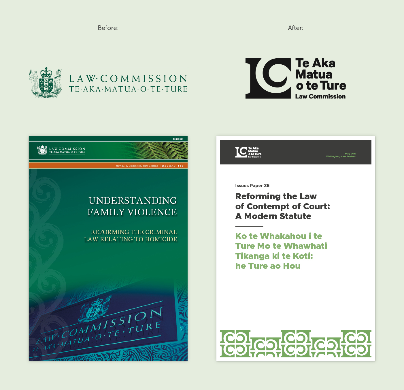
The Law Commission’s Māori name is Te Aka Matua o te Ture. In Māori mythology Te Aka Matua refers to the parent vine that Tāwhaki used to climb up to the heavens. For the logo we created a koru that is formed between the ‘L’ and ‘C,’ based on the parent vine Te Aka Matua, sitting nestled within a solid pillar motif. This visual relationship of geometric and organic elements working together in both the positive and negative space creates a feeling of harmony between the past and the ever-growing future.
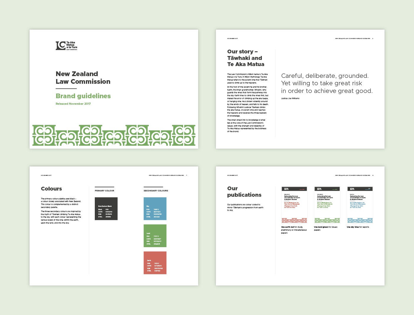
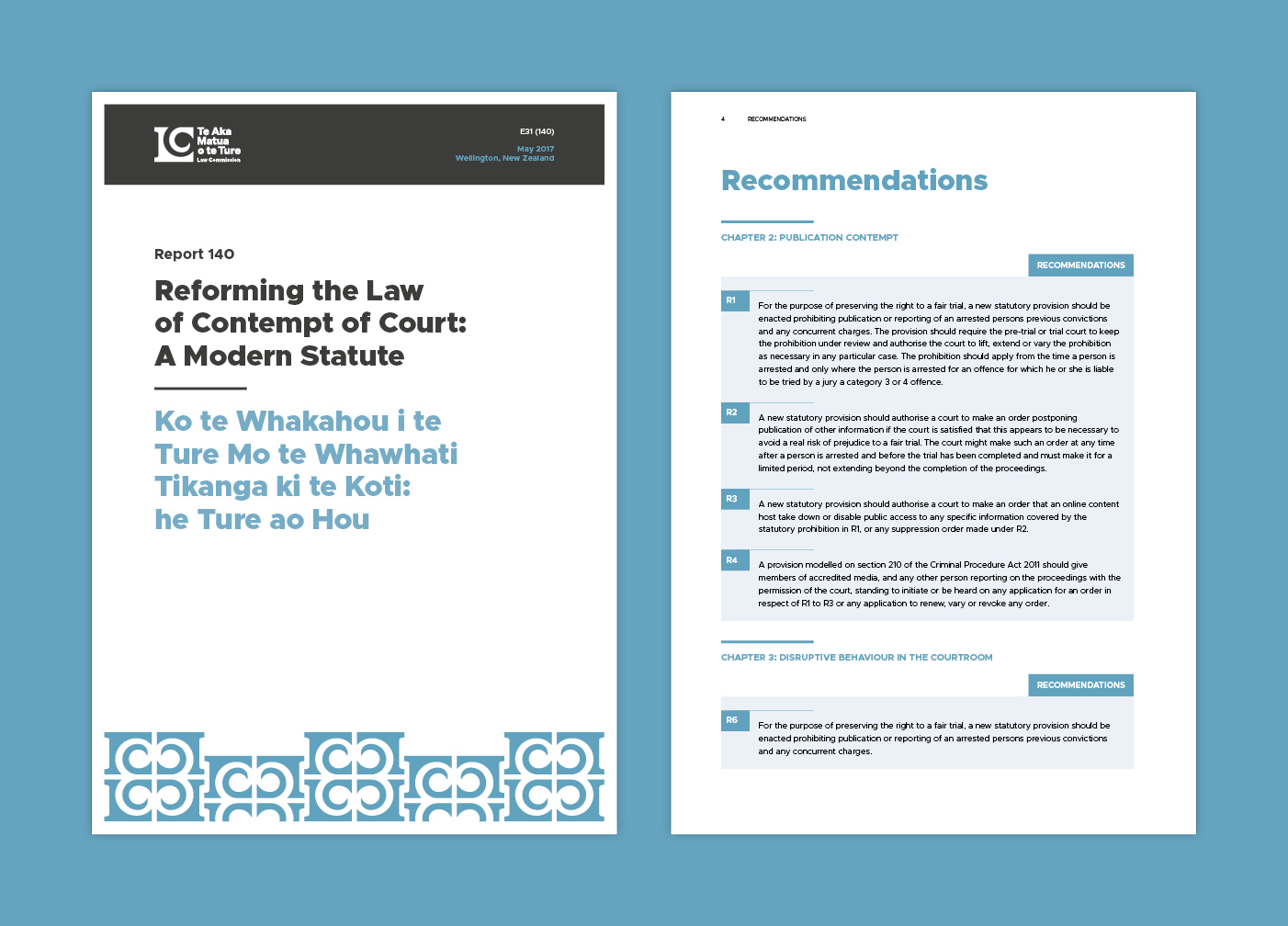
For the colour palette we used a universal primary colour of black that is offset through the use of a distinct supporting palette. The three secondary colours, applied as a publication colour coding system, draw their inspiration from the myth of Tāwhaki climbing Ta Aka Matua to the sky, with each colour representing the various levels of the vine: within the earth, upon the land, and into the sky.
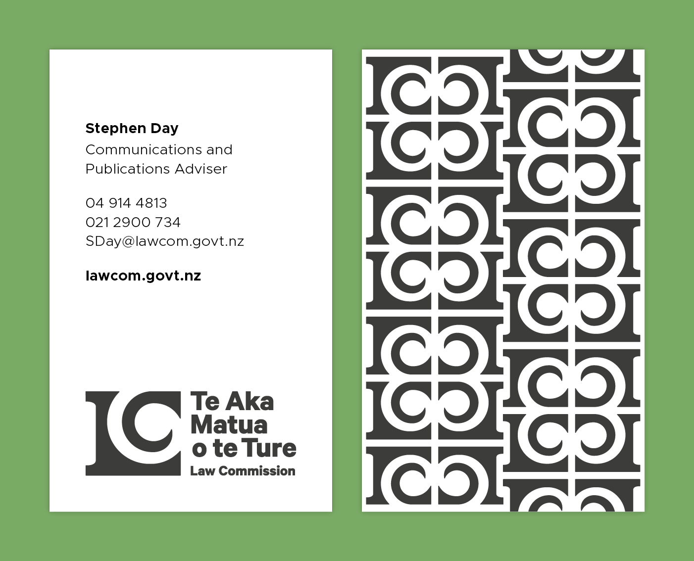
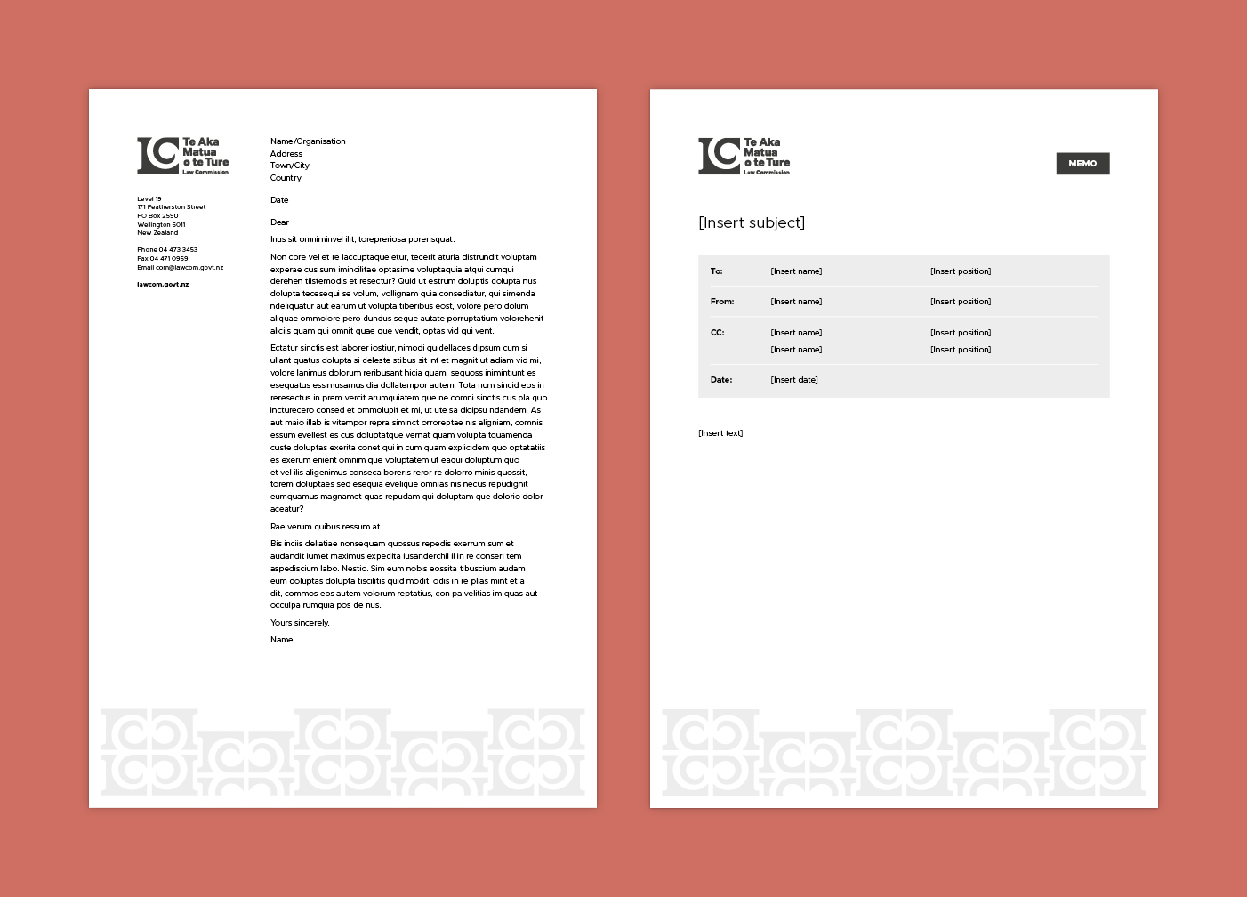
The logo motif is used to create a tessellated pattern reminiscent of Māori carvings and tukutuku panels. This pattern was applied to other areas of the branding to create an easily identifiable aesthetic while also carrying through the foundation concept of vines and growth.
The brand refresh retained the respect and dignity that the Law Commission has built up over its thirty-year history, is visibly bicultural, accessible to people from all backgrounds, and has longevity so that the brand remains relevant and timeless.
The new visual identity expresses the Law Commission’s values, showing the strength and reliability of Te Aka Matua, and its direct link to knowledge.
The visual identity guidelines and design resources we created allow the Law Commission to communicate consistently and develop their own materials cohesively and cost effectively.
Keen to chat?
Get in touch with our team or have a look at our work to see if we’d be a good fit.
