Neptune Explainer Animation
Orbit Health, Munich
An explainer animation about a revolutionary digital health innovation - designed to improve the lives of people living with Parkinson’s
Expertise
- Illustration
- Information design
- Animation
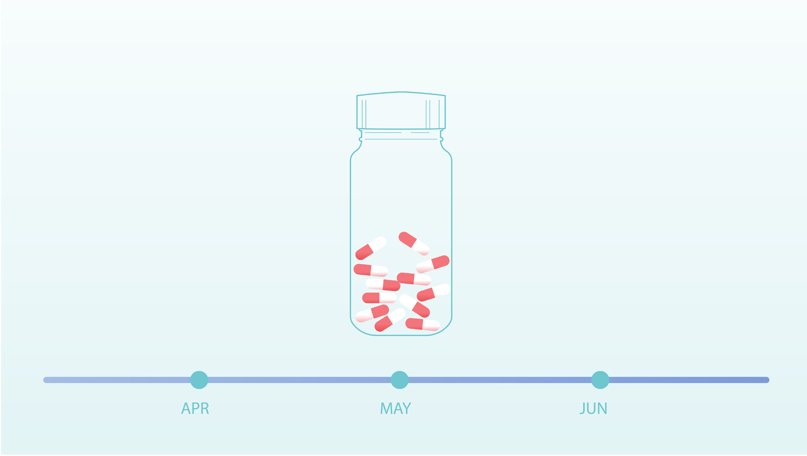
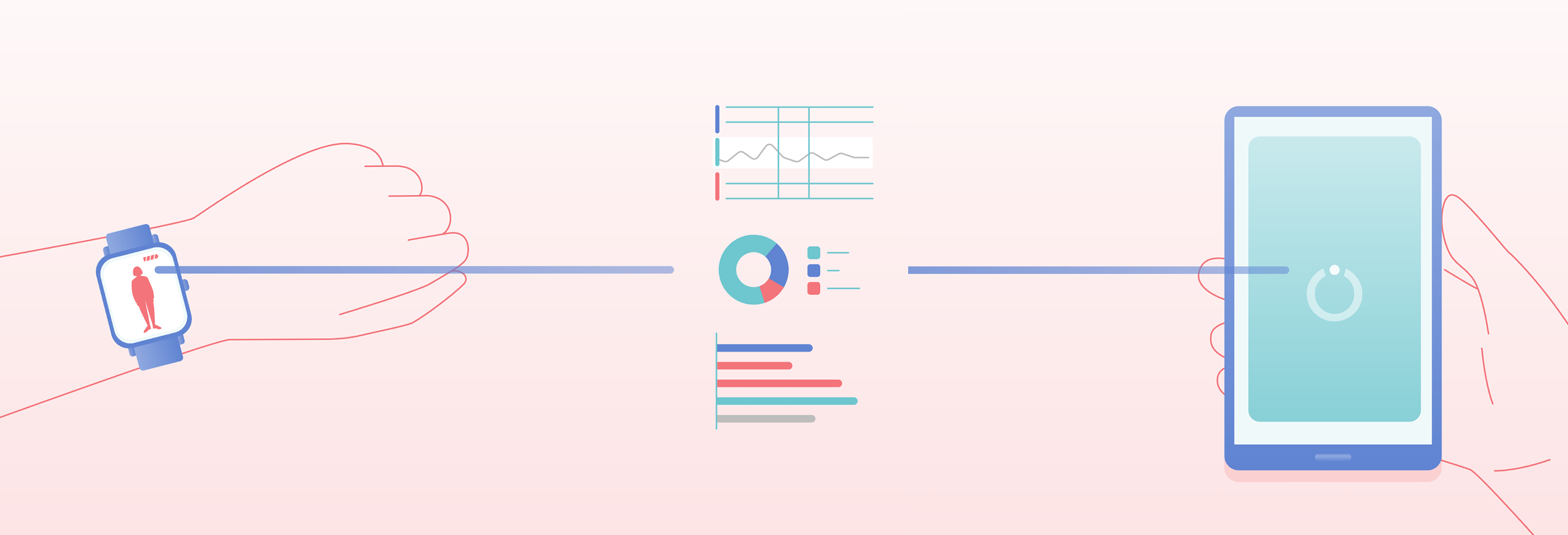
The illustration style is contemporary and clear, bringing a feeling of warmth to the use of medication and smart technology. Full colour illustrations are used to highlight important scenes, with supporting information illustrated as linework. The colours and gradients used build on the visual language established for the Neptune brand and UX design.
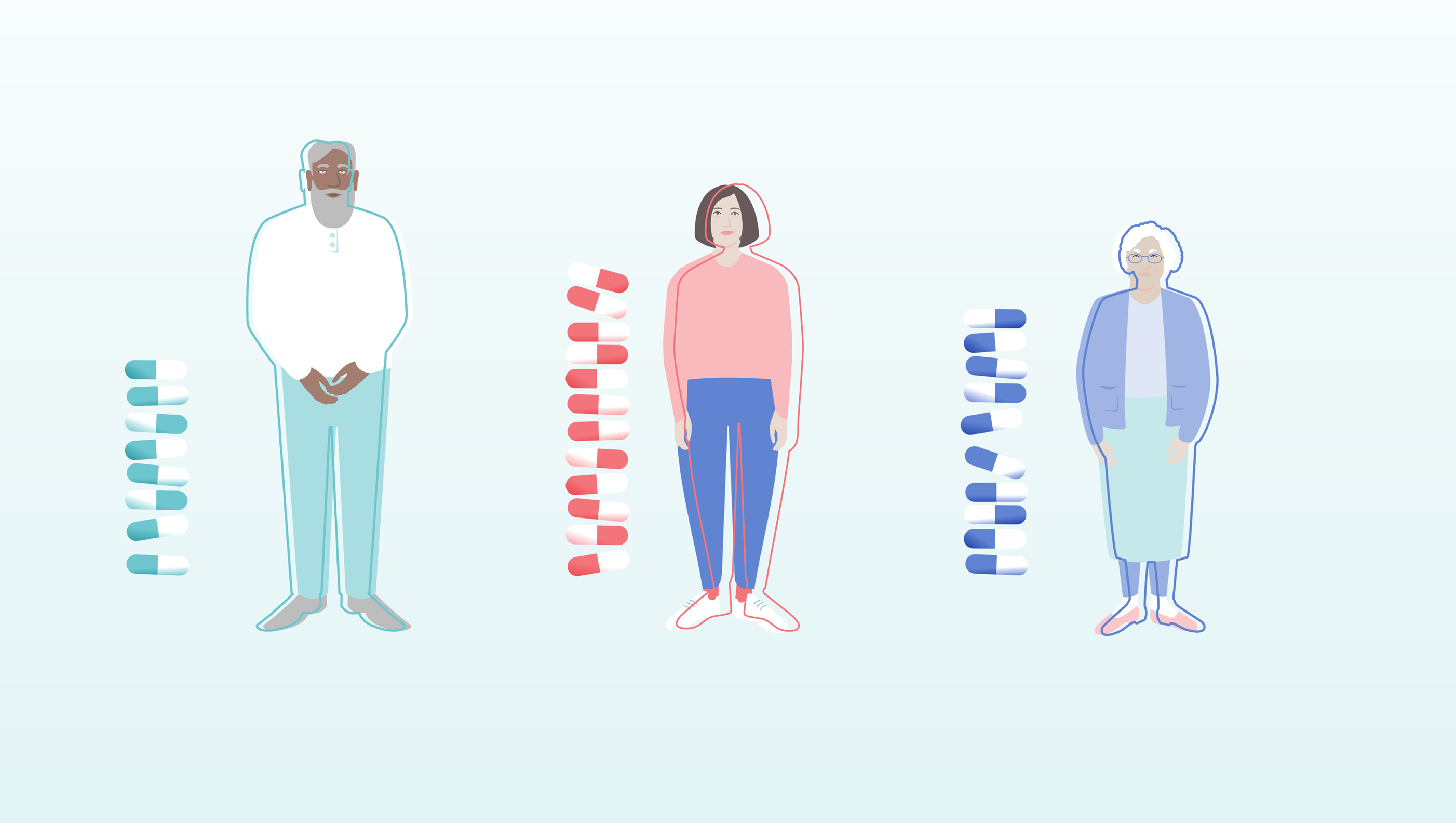
As the animation explains, every Parkinson’s patient is different and so too is their Parkinson’s journey. We follow the lead character, Jamie, on hers. We created a bold bright outline that moves on and off the character bodies to illustrate sensitive scenes of the experience and treatment of symptoms of Parkinson’s. When symptoms are under control, the line moves back to fit their silhouettes and fades away. Each character’s line moves uniquely to help reinforce the importance of personalisation of treatment.

This animation is an exciting extension of work Gusto has previously completed with Orbit Health. Our design of a clear and engaging pitch deck helped Orbit Health successfully secure funding from EIT Health to further their important work in digital health innovation, such as Neptune.
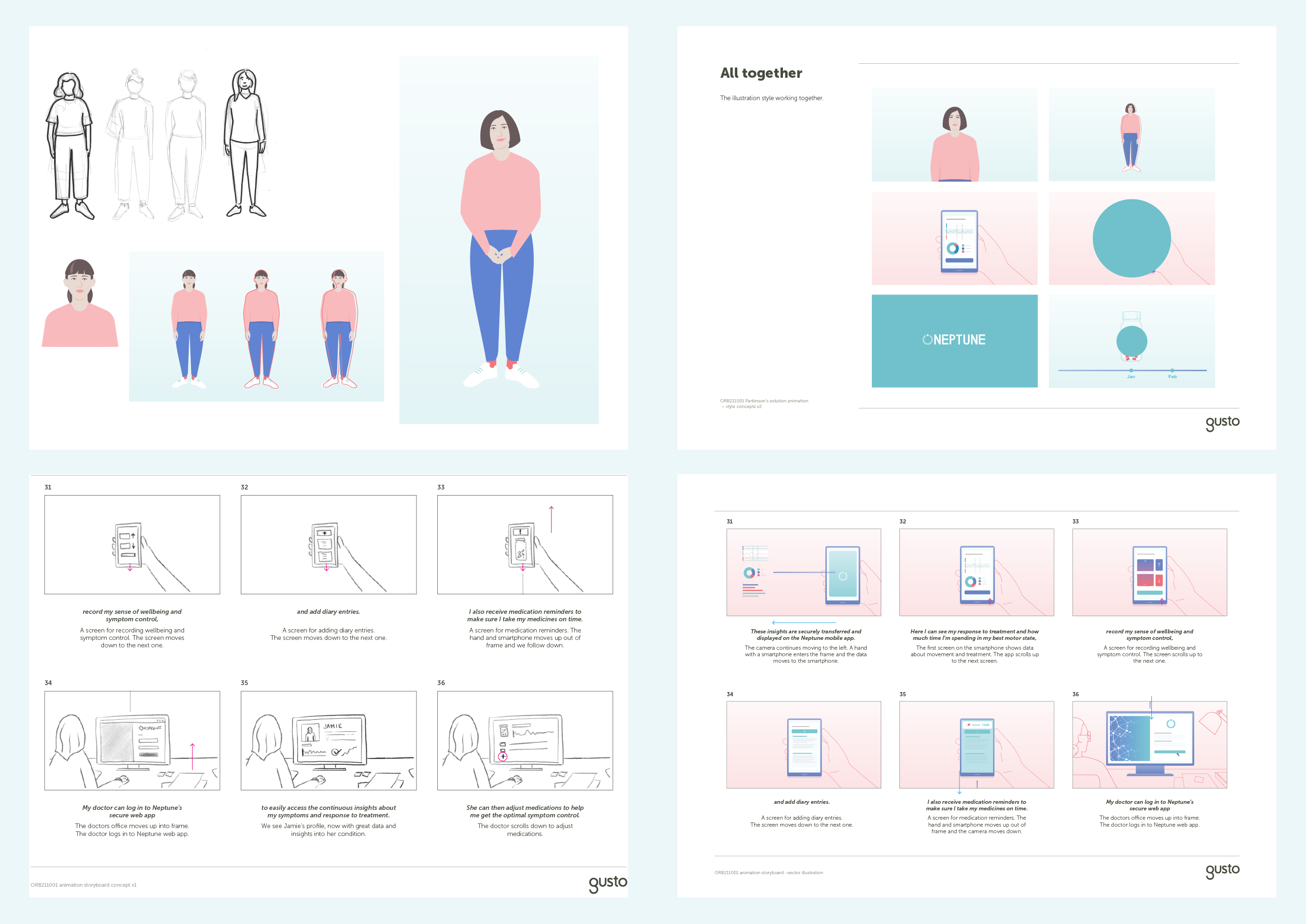
Behind the scenes: Our character development and storyboarding process.
Keen to chat?
Get in touch with our team or have a look at our work to see if we’d be a good fit.