
Total Diet Study summary infographic
Ministry for Primary Industries
Do you know what’s in your food? An infographic to explain the Total Diet Study.
Expertise
- Infographic design
- Illustration
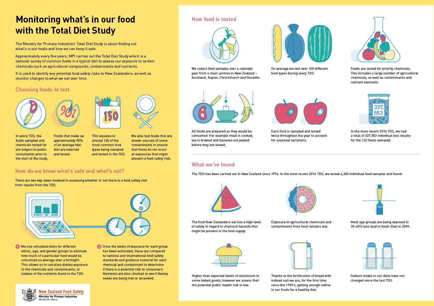
The brightly-coloured illustrations complement the messages in the text and help the reader to digest (pun intended!) the information provided.
Keen to chat?
Get in touch with our team or have a look at our work to see if we’d be a good fit.