Vector magazine refresh
Civil Aviation Authority
A modern design refresh of a long-running publication.
Vector magazine is a quarterly publication produced by the Civil Aviation Authority (CAA) that provides important information and insightful articles around the subject of general aviation.
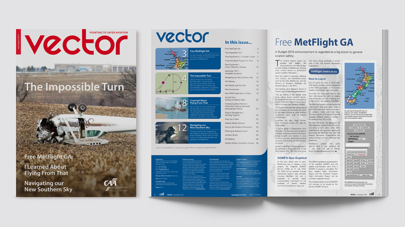 ^ The previous design of Vector.
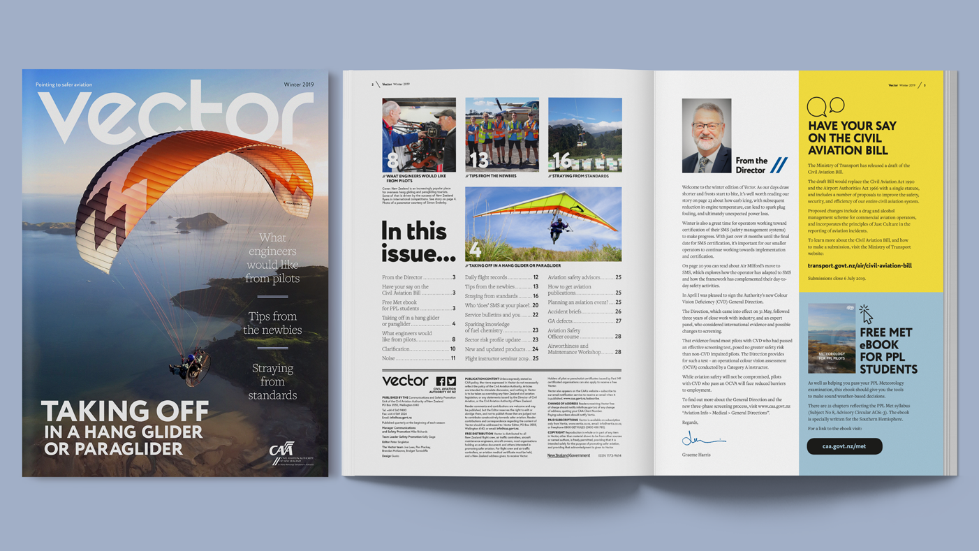
^ The refreshed design.
Since its first edition nearly 25 years ago, Vector has had a handful of refreshes to ensure it remains current and relevant in an ever-changing market. The team at Gusto has been producing Vector for much of that 25 years, so to say we’re familiar with its content and target audience is an understatement.
Recently we suggested to CAA that a design refresh of the magazine would be a great way to keep it current and maintain cohesion between the visual language of the publication and its written content.
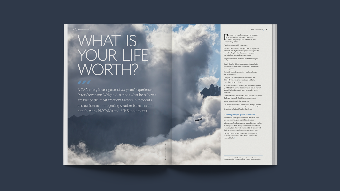
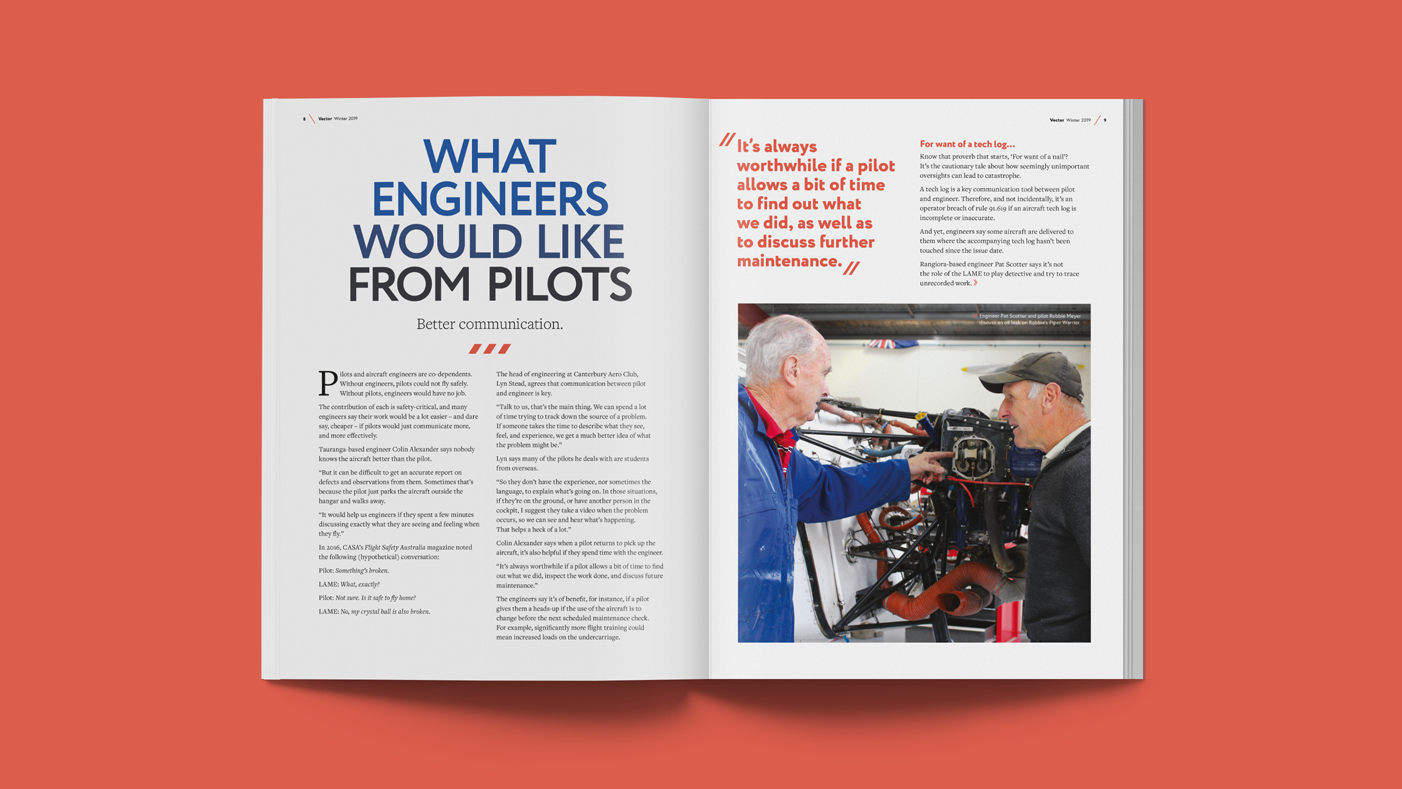
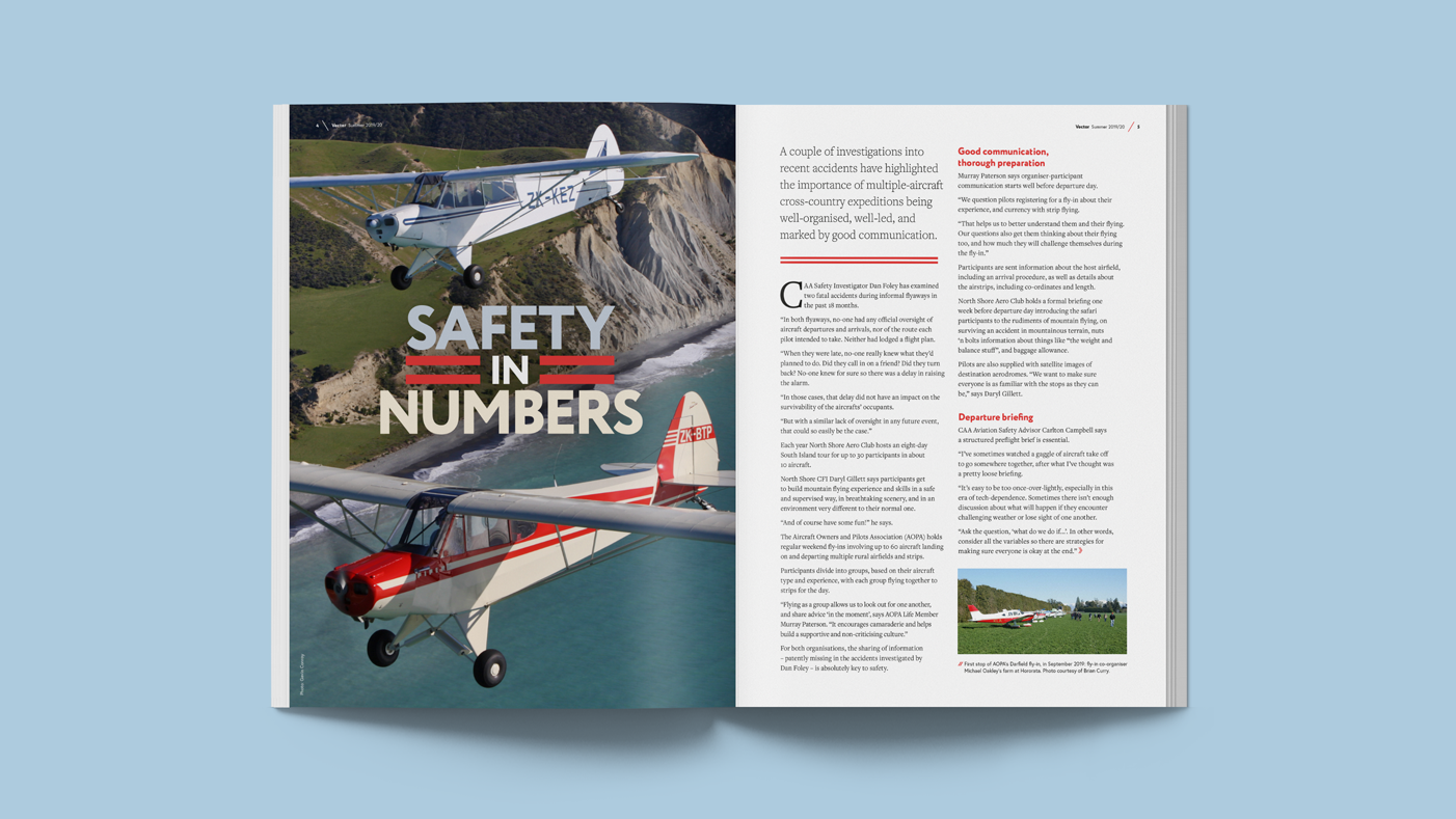
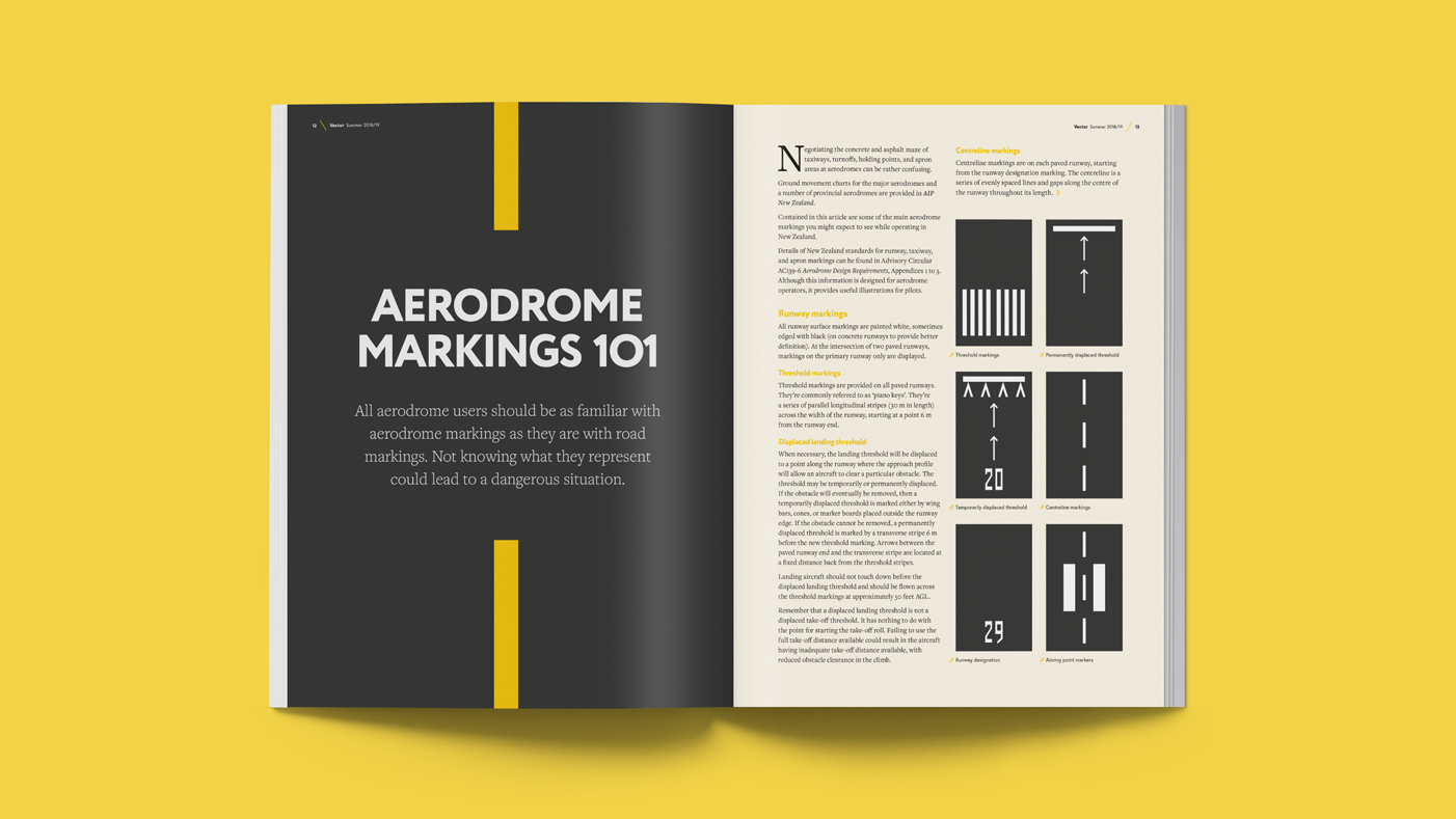
^ Spreads using the new design.
We created for them a comprehensive concept of how we envisioned this design refresh working, with the main changes being the treatment of new fonts and allowing the images more room to breathe. Changing to a heading font comprising of a large selection of weights made for greater variation in typographic treatments, while ensuring all the layouts still felt part of the same family.
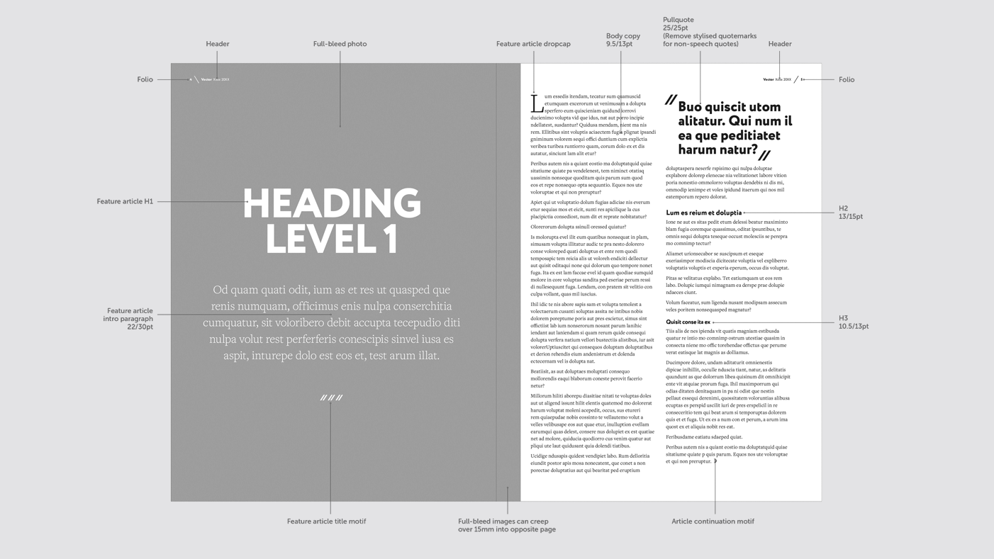
^ One of the layout guides as part of the refresh.
Within the new design there was also a focus on better integrating the article headings with their corresponding hero image. We also incorporated some simple CAA linear motifs to add some additional visual interest and align it with overall brand.
The physical design of Vector was also addressed by squaring the format of the magazine and choosing a satin-coated stock throughout. This, along with the updated design, gave Vector a unique look and feel (literally).
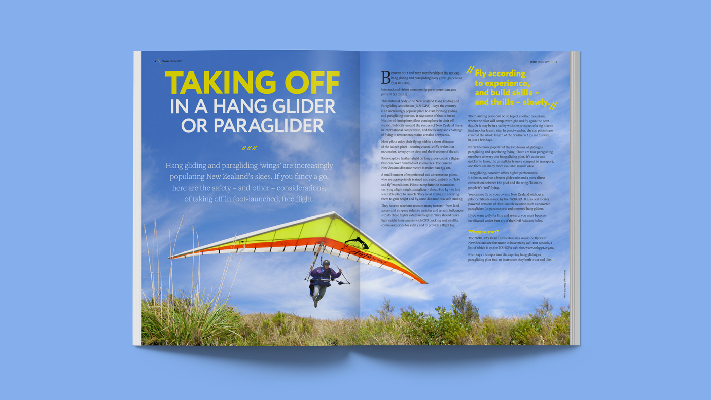 ^ A spread using the new design.
The refresh has been successful in giving Vector its own contemporary identity, while visually remaining part of the CAA brand and continuing to speak to new and existing audiences.
Keen to chat?
Get in touch with our team or have a look at our work to see if we’d be a good fit.
