Website visual redesign
Ministry for Primary Industries
Transforming a large complex website into one that is fresh, clear and easy to navigate
Expertise
- Website design
- UI/UX design
- Icon design
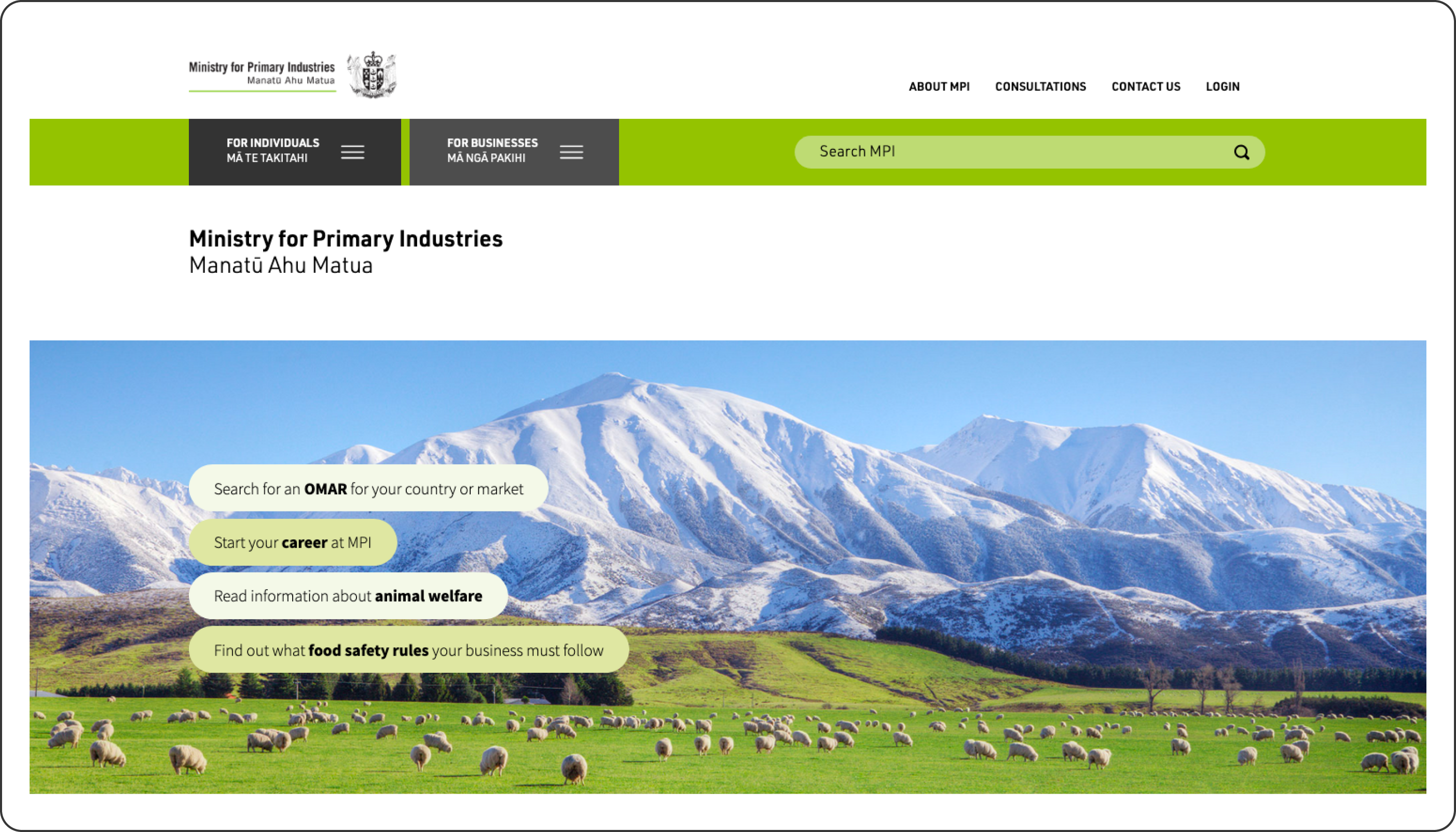
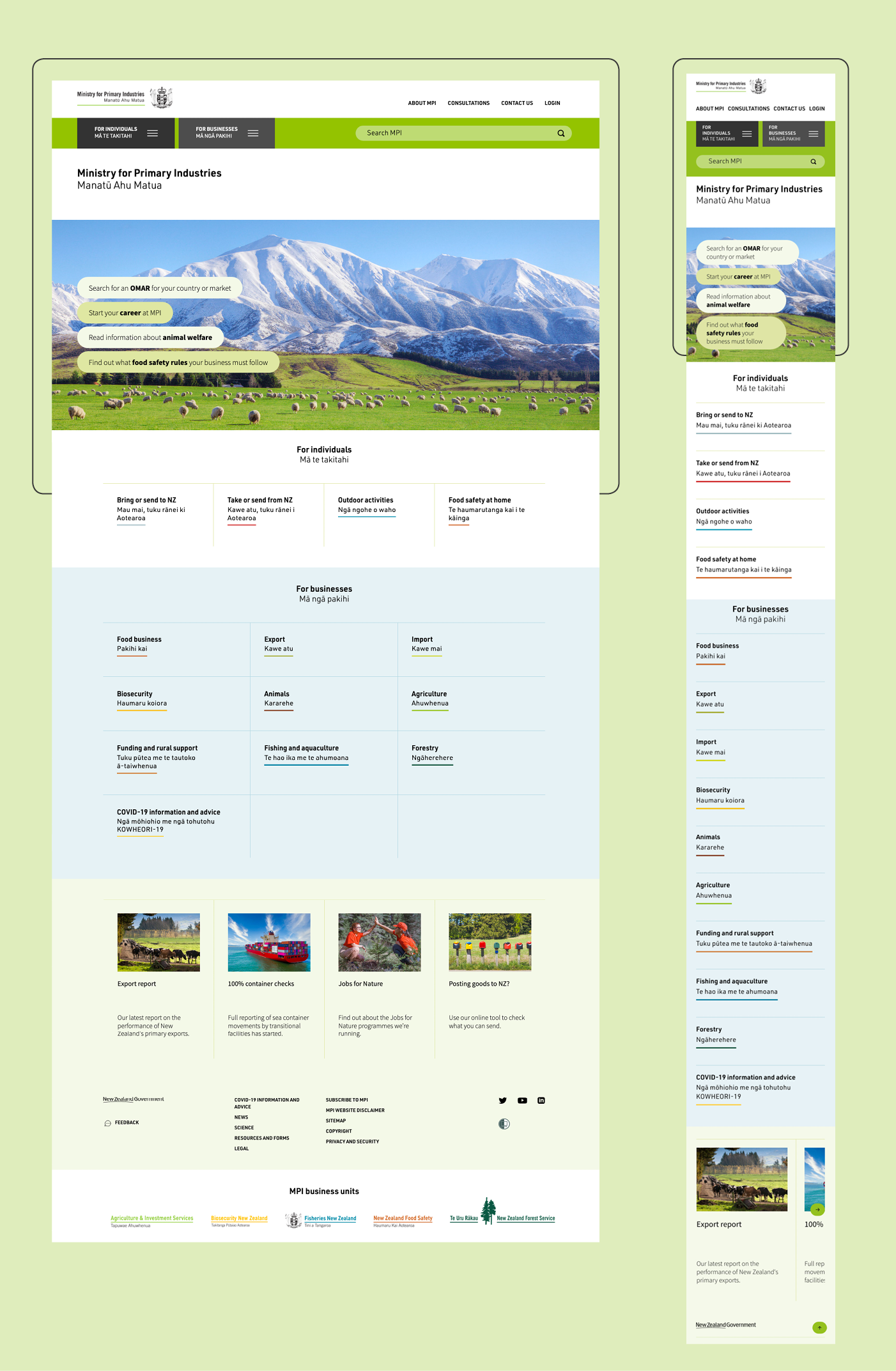
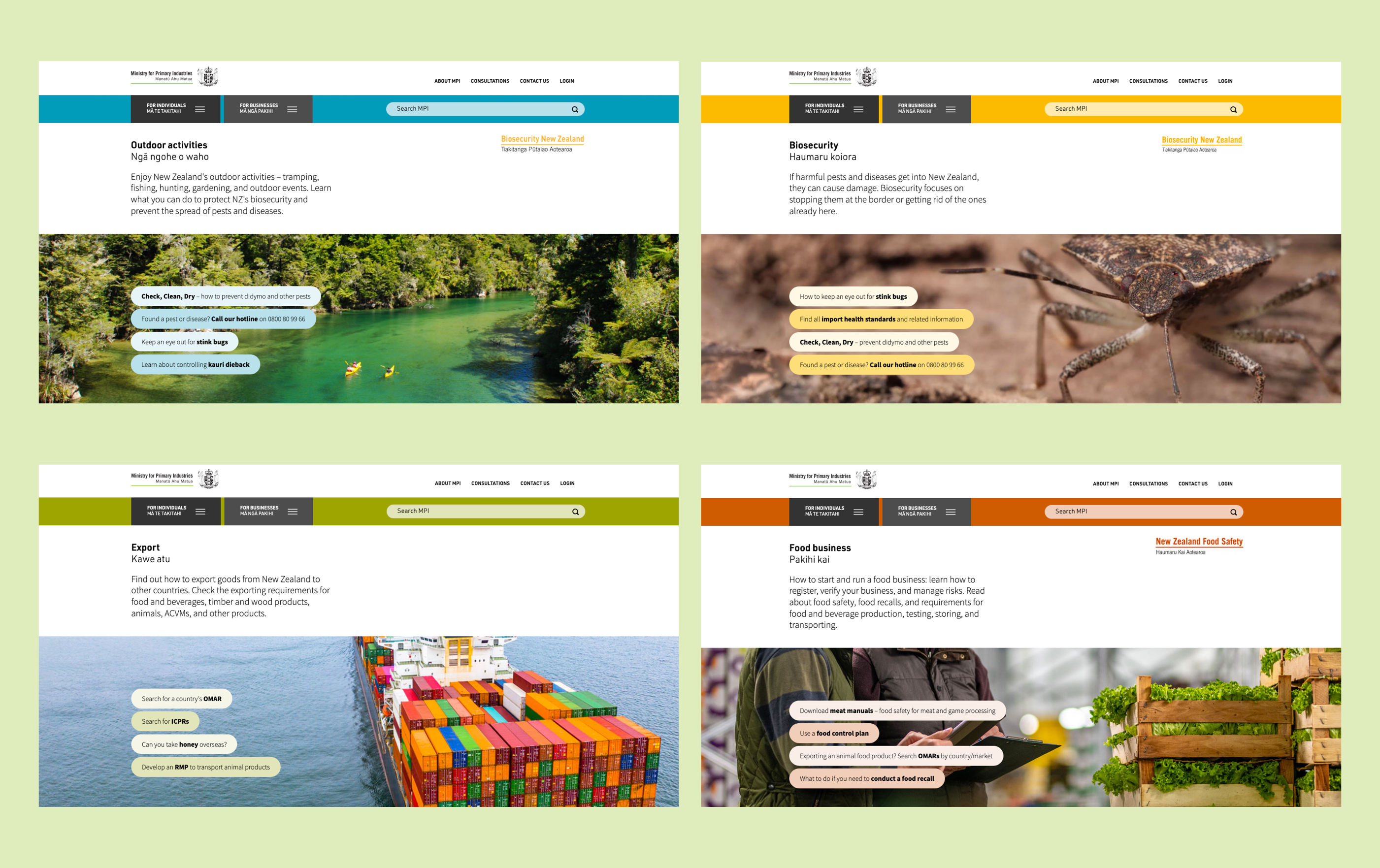
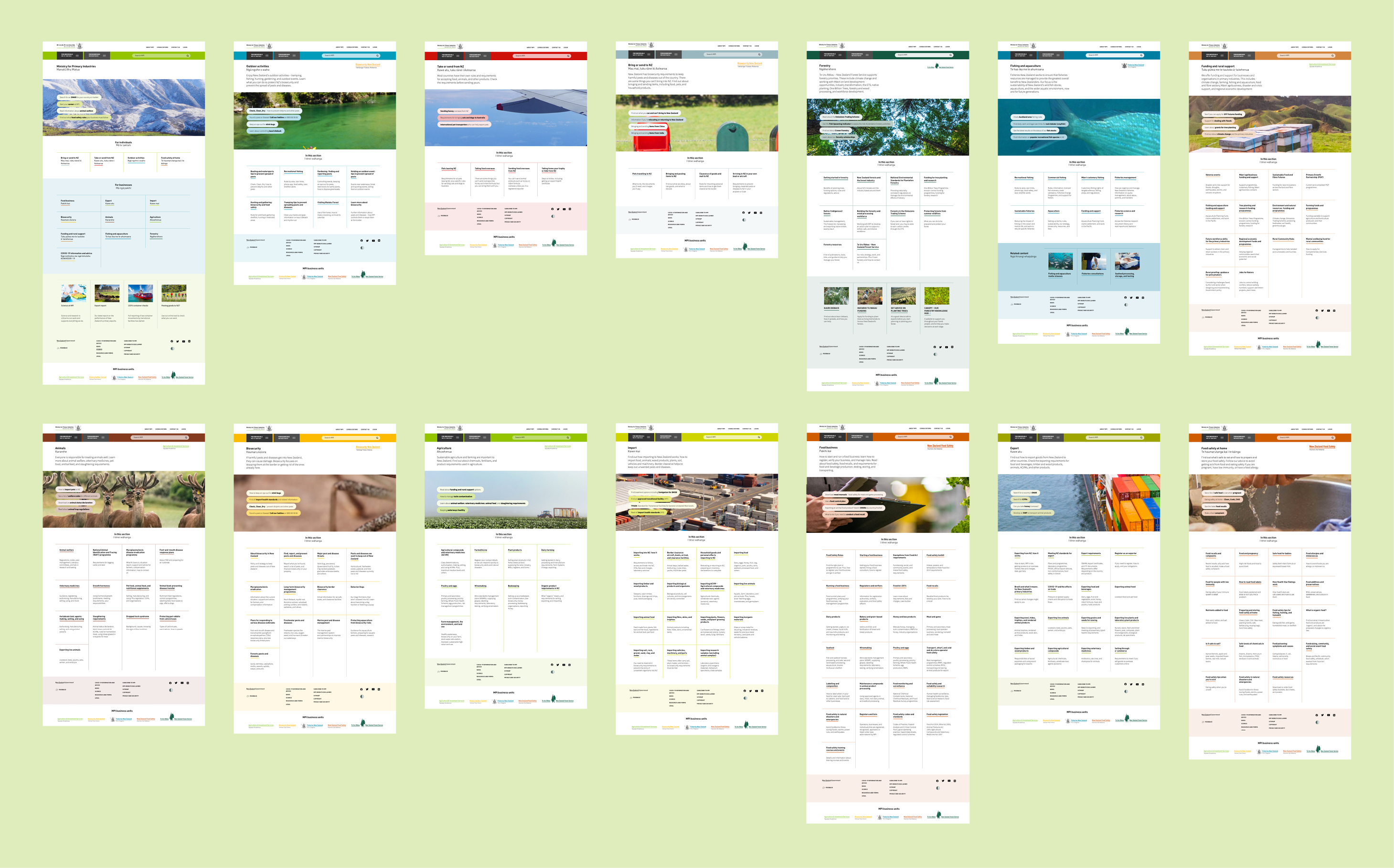
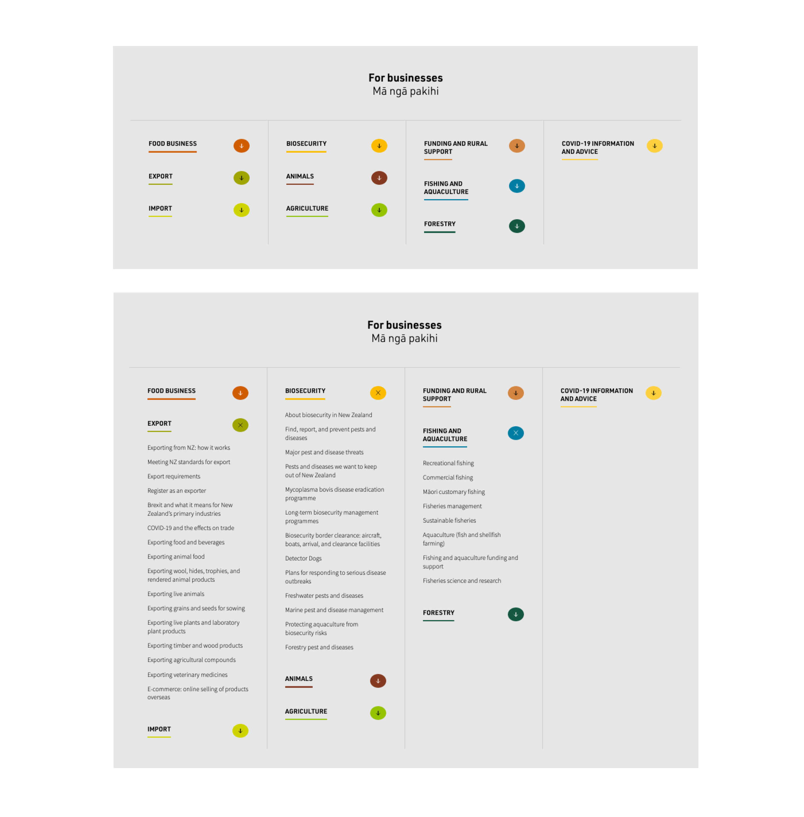
We approached this large scale website project with an information design lens. Reviewing and refining the essential details. Something as simple as colour coding makes this monster site easy to navigate by visually differentiating key categories.
We created a visual language that we applied consistently across over 1000 pages. This enables different users, whether they be individuals or businesses, to easily find what they’re looking for.
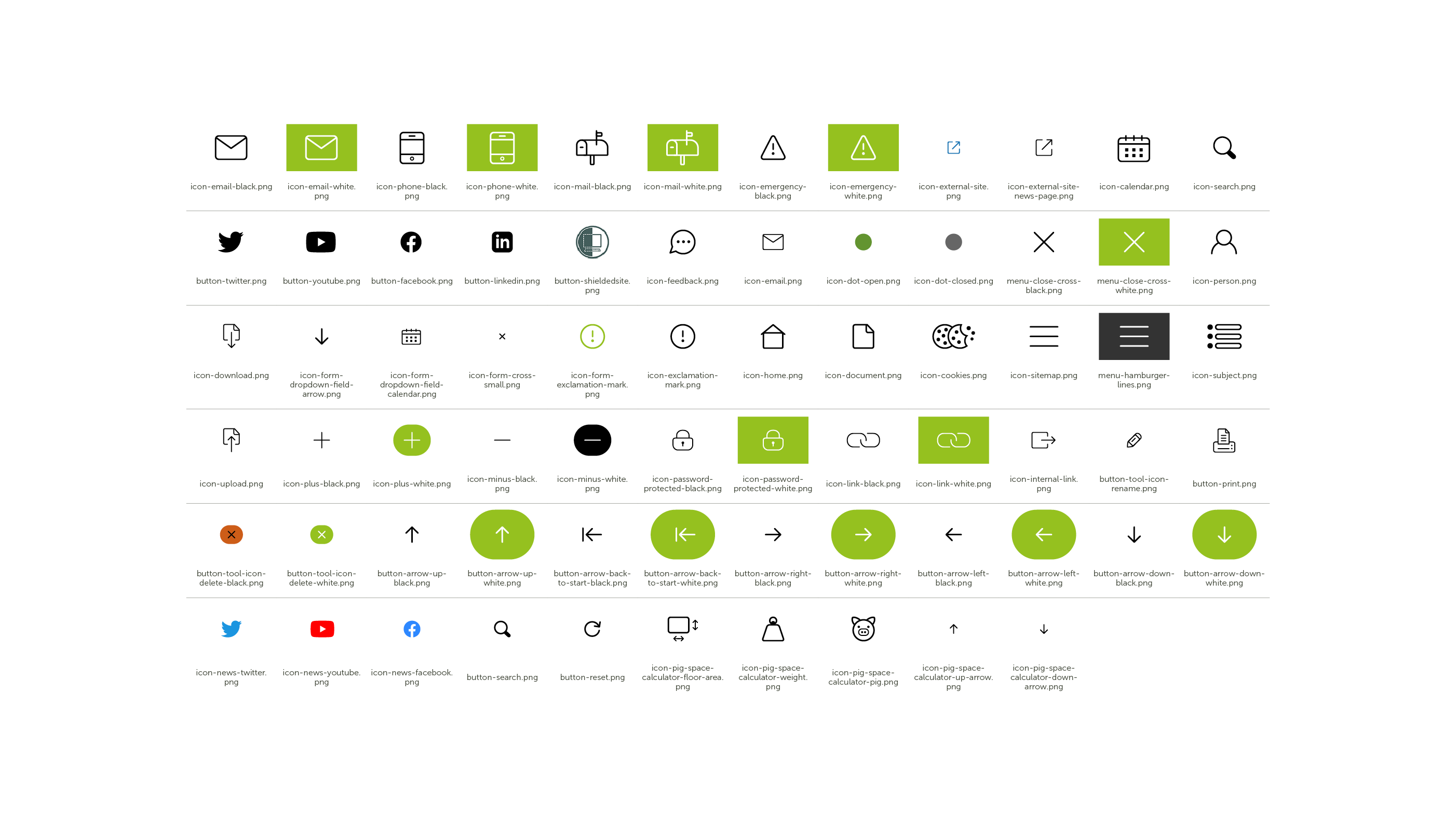
We created icons to draw attention to key repeatable information or actions across the site, providing the user with a consistent experience wherever they are on the site.
Through design each section of the site has its own unique identity, while still sitting within the overall aesthetic for the site. The modern design makes a large site welcoming for multiple audiences. And it’s easy for them to navigate and find what they are looking for.
MPI Feedback:
“The challenge we set Gusto was complex and they were up to the challenge. They listened to our requirements, were flexible with their delivery, and presented us with clean modern designs. We look forward to working with Gusto in the future.”
Keen to chat?
Get in touch with our team or have a look at our work to see if we’d be a good fit.
