A vital duo: health communication and design
In public health, clear and effective communication is essential for promoting wellbeing and healthy behaviours within communities. It can prevent widespread health problems, and even save lives.
Visual design plays a vital role by ensuring that health information is accessible, engaging, and easily understood by the public.
Here are some examples of the way design for health communication can create clarity, understanding and change.
Improve people’s wellbeing
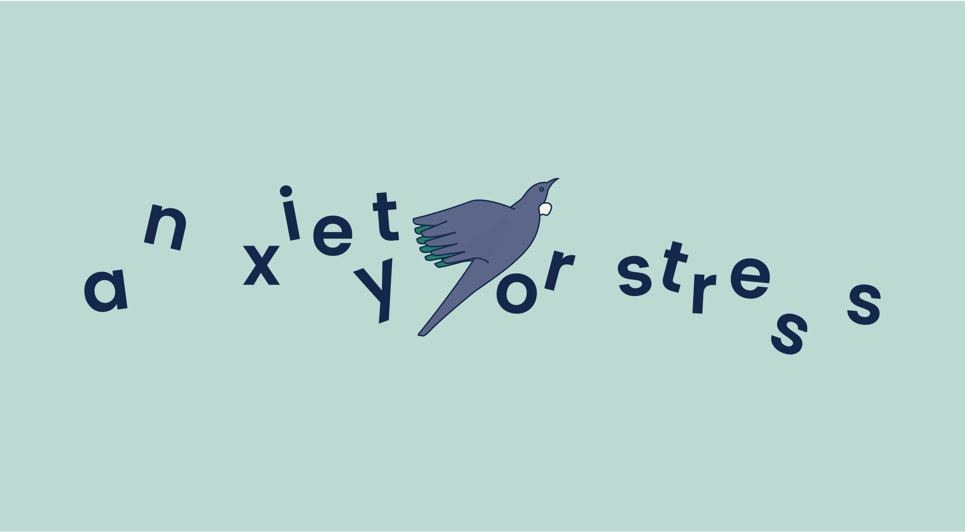
A calming, inclusive design sets the right tone for people looking for support to manage their wellbeing. The website and campaign we created used illustration to connect with different cultures, reassuring them that support is available to everyone.
Within the first few months of the campaign there were:
- 100,000+ unique visitors to the website
- 3 million+ views of the animated video ads
Website and campaign for the Access and Choice programme, Te Whatu Ora
Drive health equity
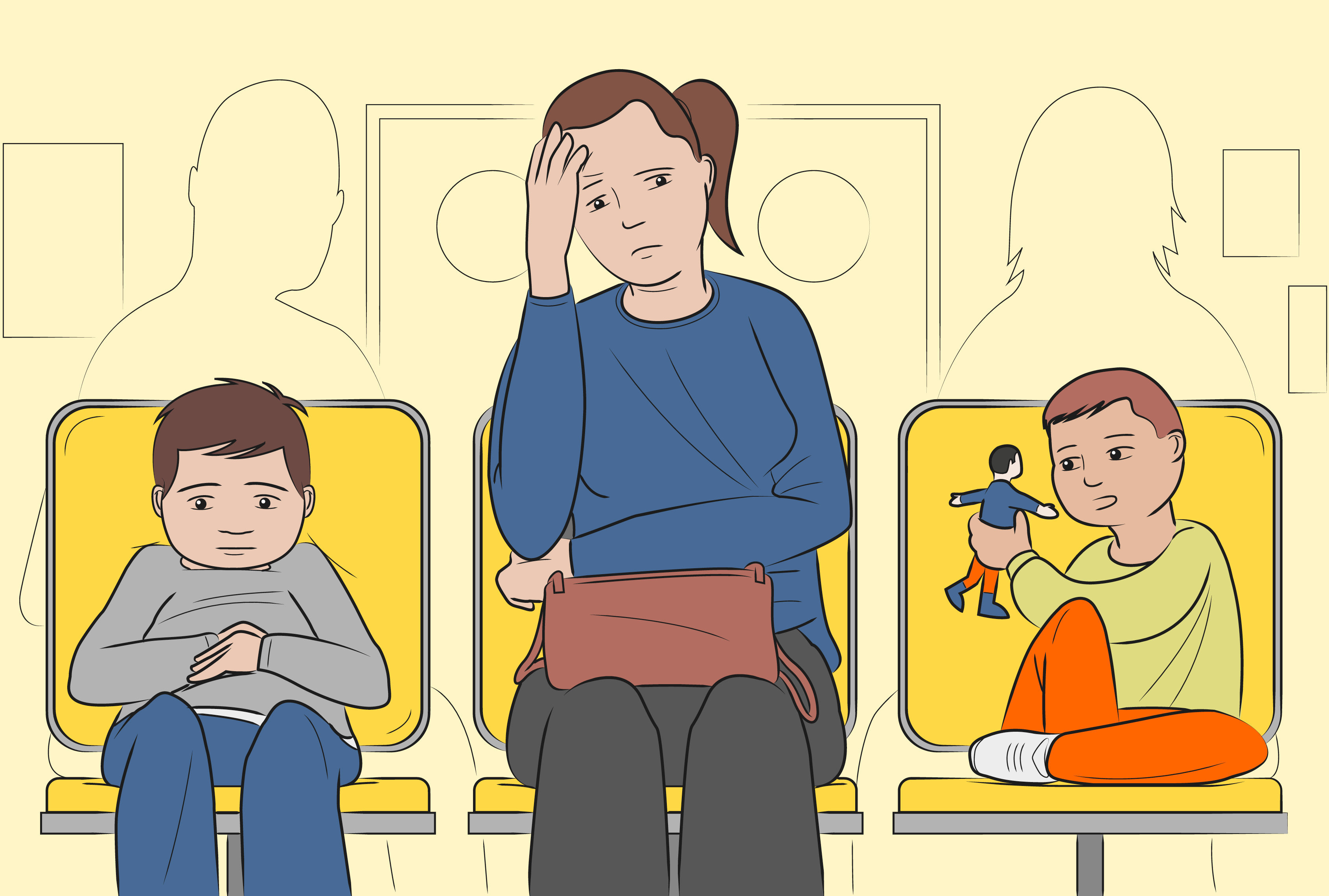
The graphic novel style captures the realities of many Aotearoa NZ whānau, and makes people think about what sort of country we aspire to be. The compelling illustrated story seeks to shift people’s thinking beyond the three-year election cycle and focus on actions to make long-term, sustainable change.
#MakeItTheNorm campaign animation for the Royal Australasian College of Physicians
Repurposing illustrations from a one-page summary infographic, we created engaging bite-sized social media graphics to extend key messages to an even broader audience.
Communicate complex health information
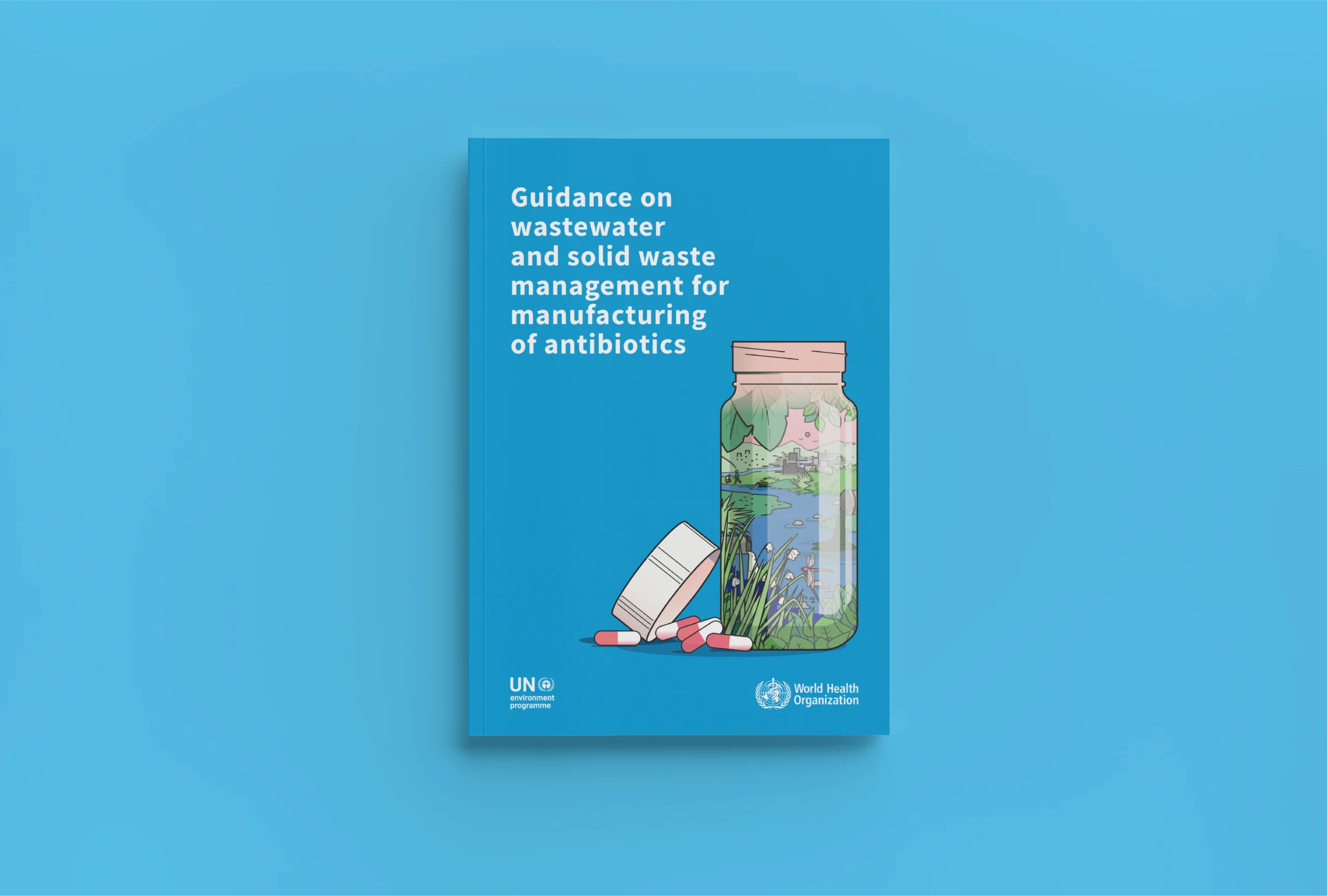
Complex information is clear and easy to navigate using colour coding, a logical document structure and visual cues for repeating content types. Illustration depicting the environmental and health impacts of antibiotic manufacturing gives the information an emotional weight and underlines the importance of this guidance.
Critical guidance on pollution from antibiotic manufacturing for the World Health Organization
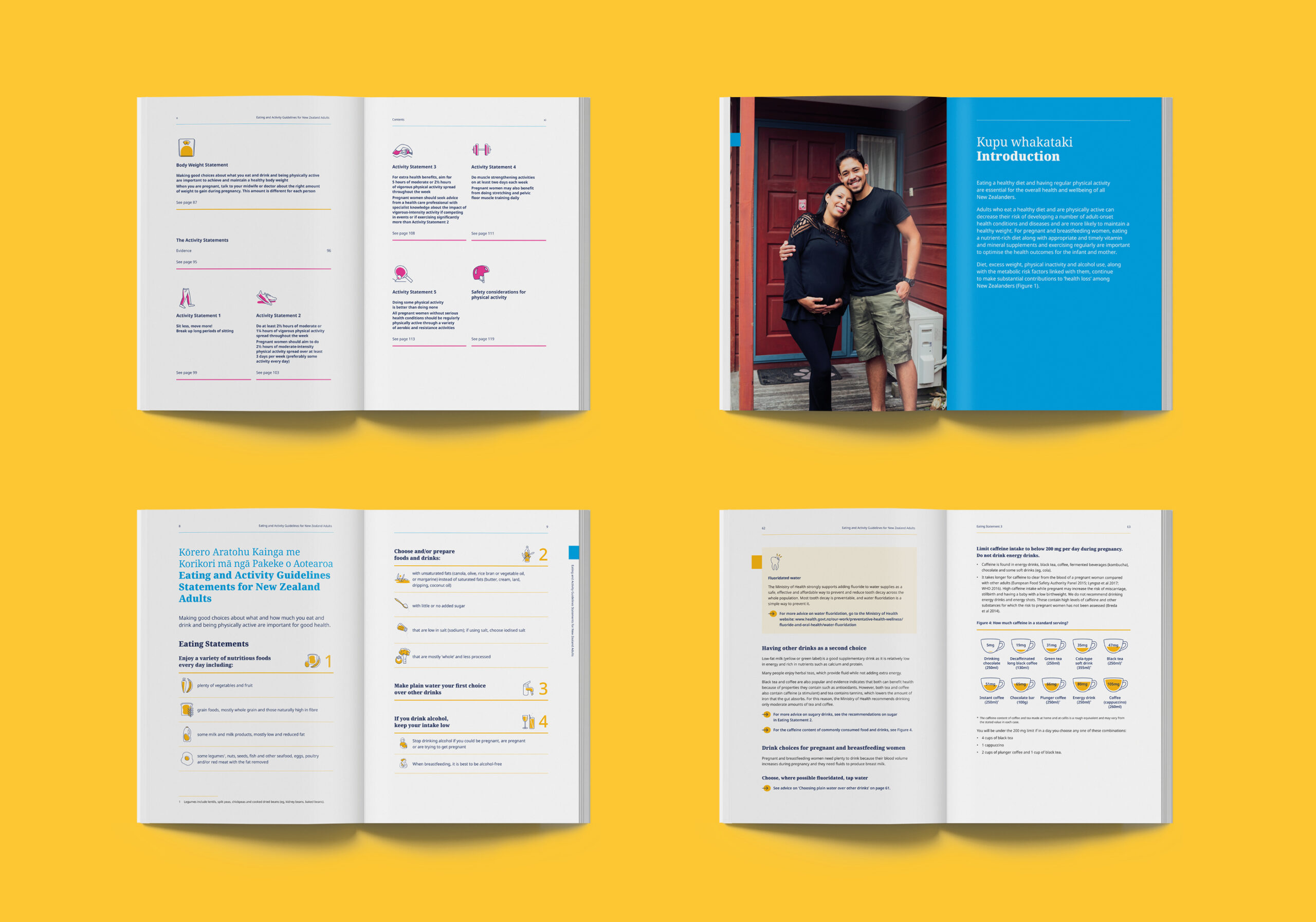
A consistent use of infographics, iconography, and typographic structure makes health recommendations easy to digest.
Eating and Activity Guidelines for the Ministry of Health
Keen to chat?
Get in touch with our team or have a look at our work to see if we’d be a good fit.


